AudioTyped UX – Chat-Style Transcripts for Podcasts
| 开发者 | audiotyped |
|---|---|
| 更新时间 | 2025年12月19日 20:10 |
| PHP版本: | 7.0 及以上 |
| WordPress版本: | 6.9 |
| 版权: | GPLv2 or later |
| 版权网址: | 版权信息 |
标签
下载
1.0.22
1.0.24
1.0.20
1.0.6
1.0.7
1.0.8
1.0.16
1.4.3
1.4.4
1.4.5
1.4.0
1.0.1
1.4.1
1.4.2
1.0.4
1.0.9
1.1.1
1.1.2
1.1.3
1.1.4
1.1.5
1.3.0
1.0
1.0.10
1.0.11
1.0.12
1.0.13
1.0.14
1.0.15
1.0.17
1.0.18
1.0.19
1.0.2
1.0.21
1.0.25
1.0.26
1.0.3
1.0.5
1.2.0
1.3.1
1.3.2
1.3.3
1.3.4
1.3.5
1.3.6
1.3.7
1.3.8
1.5.0
1.4.6
详情介绍:
AudioTyped UX provides clean, accessible, and structured transcript layouts for interviews, podcasts, co-host formats, research conversations, and other spoken-word content published on WordPress. The plugin improves readability through a chat-style layout with distinct speaker sections and optional avatars, helping readers follow conversations smoothly.
Video AudioTyped UX demo:
https://www.youtube.com/watch?v=6Uf4RMfmMr0
Traditional transcripts often appear as dense text blocks or hidden behind toggles. AudioTyped UX places transcripts front and center with a clear layout that supports accessibility and makes long-form conversations easier to navigate — including for deaf and hard-of-hearing users.
All layouts are created using pure HTML, ensuring full SEO crawlability and compatibility with assistive technologies.
Why AudioTyped UX?
- Improves readability of long conversations
- Supports accessibility for deaf and hard-of-hearing users
- Distinct speaker bubbles for clear separation
- Works for interviews, podcasts, journalistic content, research, NGOs, and education
- Fully HTML-based for optimal SEO
- Lightweight and easy to style
- Podcasters
- Journalists publishing interviews
- Researchers working with qualitative data
- NGOs sharing spoken-word content
- Educators and academic projects
- Corporate teams publishing internal or external transcripts
- Bloggers and content creators
- Clean chat-style bubble layout
- Optional speaker avatars
- Clear speaker identification
- Accessible HTML structure
- SEO-friendly markup
- Works with any theme
- No external libraries required
- Full search engine indexing
- Screen-reader compatibility
- Consistent structure for long transcripts
- Stable, lightweight performance
安装:
Local installation
- Upload the
/audiotyped-ux/folder and its contents to your wordpress plugin directory /wp-content/plugins/ - Login to your WordPress installation and activate the plugin on the wordpress plugin page
屏幕截图:
常见问题:
For which podcast transcripts I can make the settings?
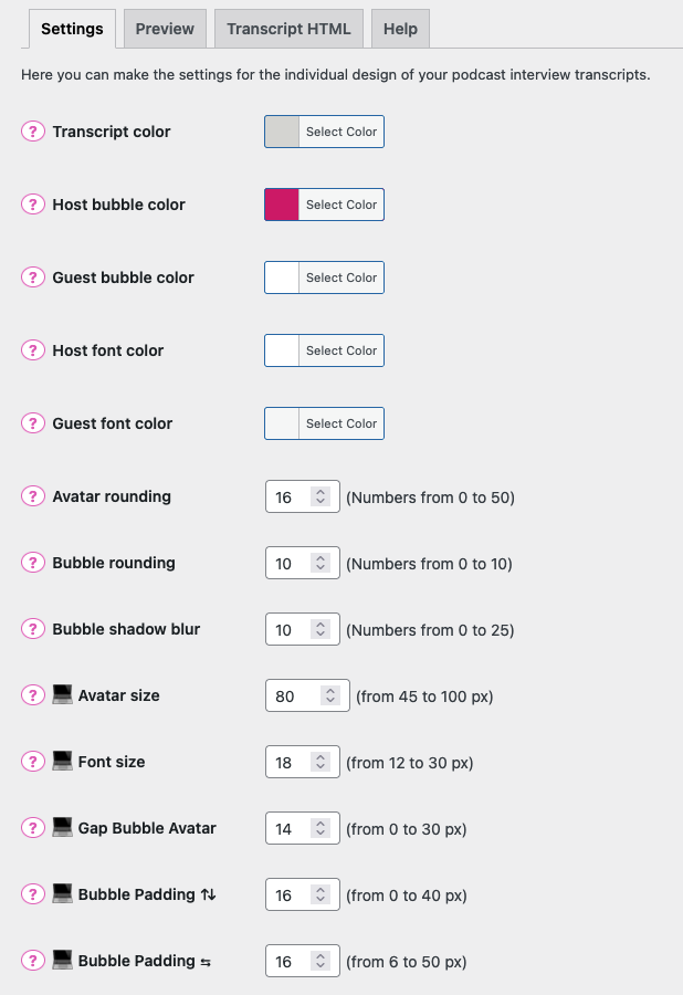
The settings are for interview transcripts with 2 speakers
Nothing happens, when I make settings, what's wrong?
Probably the transcript is not coded in the UX Interview Layout. Your interview transcript has to be coded in a specific HTML for the UX Interview Layout. Soon there will be a documentation with examples.
Is the UX layout still good for SEO?
Yes, because it's pure HTML Code, the content is crawlable for Google, Bing or other search engines
更新日志:
1.0.1 - 16th February 2019
- Add font size settings for mobile and desktop
- Add bubble box shadow blur settings
- Optimizing for better mobile layout
- Correction color with update for better mobile layout
- Update font size in bubbles
- Avatar size and gap between bubble and avatar for desktop
- Avatar default size for desktop
- New feature of mobile avatar image sizing
- Setting important default values
- Padding for speech bubbles, gap avatar and speech bubble for mobile
- Less margin between speaker name and spoken text
- Host and Guest speaker underlined
- only the version number
- correct transcript height
- transcript background color and padding
- transcript background color update
- only the version number
- transcript background color
- transcript layout corrections
- transcript and speaker layout
- break long words
- New preview tab to see how the transcript design is changing because of settings, New icon for each setting
- New plugin icons, help tab udpate
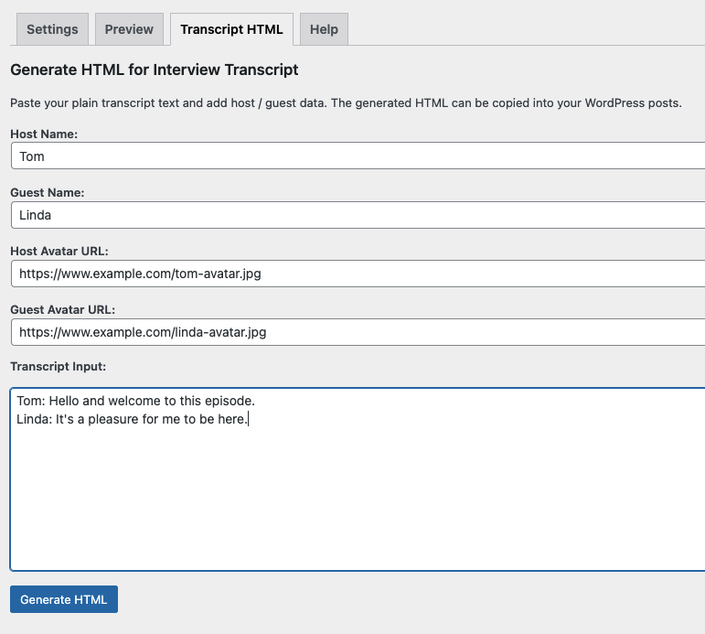
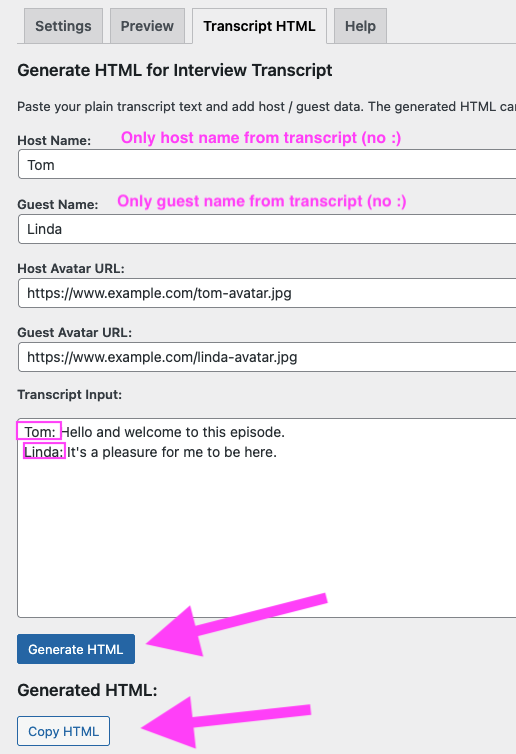
- New tab to generate HTML from interview text (2 speaker)
- Now also creates HTML for podcast interview transcripts with 3 speakers


