Awesome Sticky Header by DevCanyon
| 开发者 |
markzero
nikolicdragan |
|---|---|
| 更新时间 | 2015年11月2日 04:40 |
| PHP版本: | 4.2.2 及以上 |
| WordPress版本: | 4.3.1 |
| 版权: | GPLv2 or later |
| 版权网址: | 版权信息 |
详情介绍:
For support requests please use our dedicated support forums.
Get maximum control over your sticky header. Set your menu, submenus, secondary menu, search, your colors, backgrounds or transparency, your logo and much more!
Live preview of your settings changes in plugin's page in admin area. After you change menu position, link colors, backgrounds, you can see it immediately how will it look on your website.
If you need the whole header replacement including the sticky header, with Top and Bottom header parts and more menus and breadcrumbs, you can buy PRO version called Awesome Header or go to Playground to check out demos of what common features it offers.
Settings
Awesome Sticky Header by DevCanyon has long list of settings you can use to make your sticky header look the way you want.
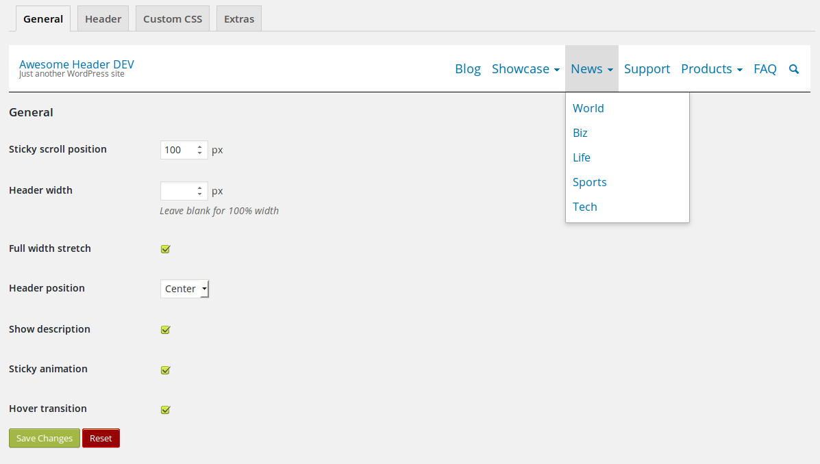
General
These are general settings for your sticky header.
- Sticky scroll position - when will your sticky header show, after how many pixels scrolled down
- Header width - inner content (container) width, so your header stretches 100% of the browser window width, but logo and menus match your website's content
- Full width stretch - whether or not your header stretches 100% of the browser window width
- Header position - your header can also be placed left/right if your theme hasn't content middle oriented, just like Twenty Fourteen theme
- Show description - show/hide site description (tagline)
- Sticky animation - slide sticky header from top or appear without sliding animation
- Hover transition - transition effect for link hover colors or backgrounds
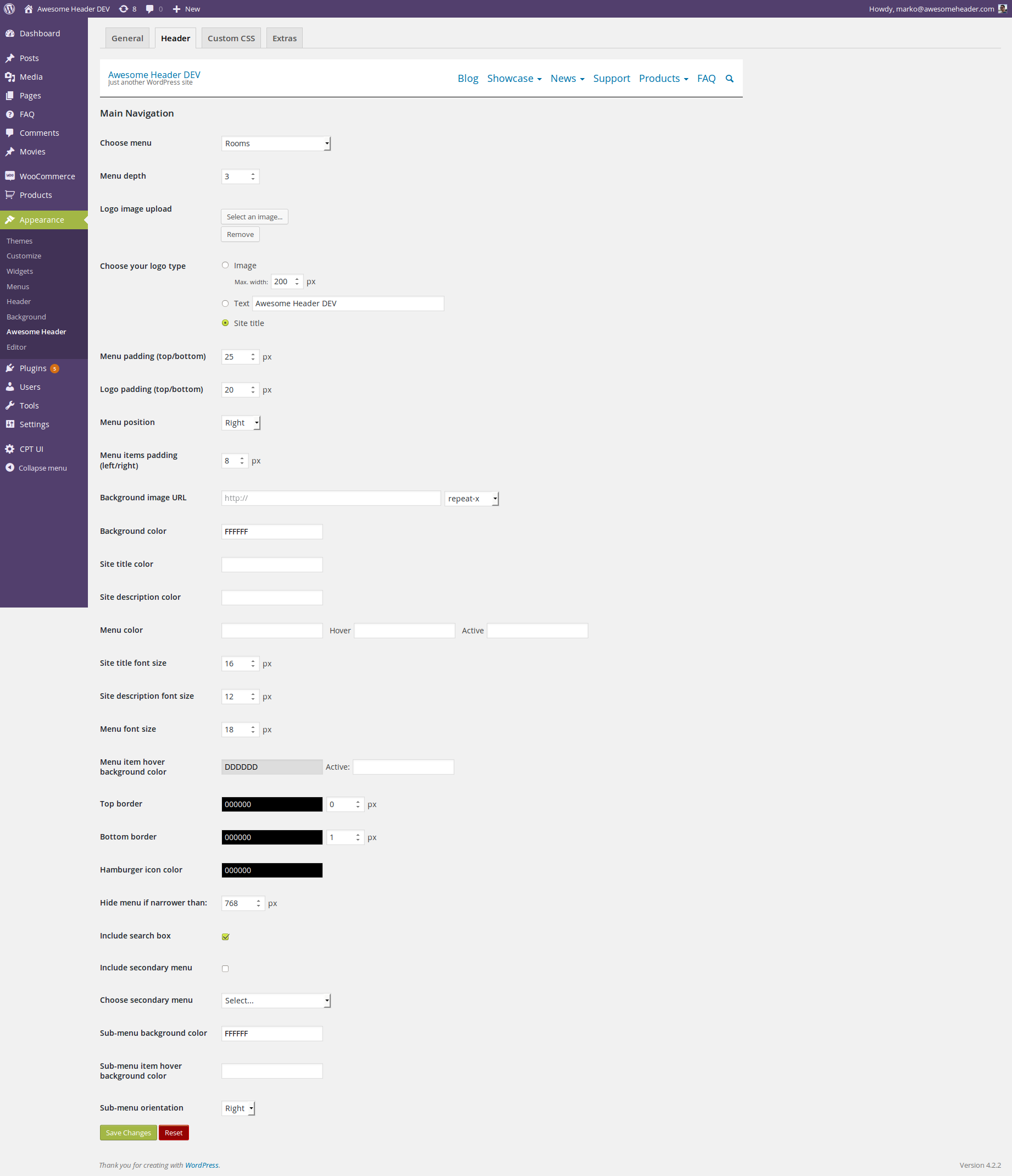
- Choose menu - if you have created at least one menu under Appearance -> Menus, you can choose which menu will go to sticky header
- Menu depth - three levels of navigation for sub-menu
- Logo image upload - upload image to be used as your logo
- Choose your logo type - logo can also be text link; if it's image, you can set max. width for it
- Menu padding (top/bottom) - decide how big is your sticky header by putting padding on top/bottom for main menu items
- Logo padding (top/bottom) - same as above but top/bottom extra space for logo/description
- Menu position - you can have menu centered; this way logo is centered too, above menu
- Menu items padding (left/right) - left/right distance of menu items - don't put them too close! ;)
- Background image URL - choose background image for your sticky header and/or set repeat pattern (e.g. repeat-x)
- Background color - choose background solid color
- Site title color - color of your logo if it's set as text type instead of image
- Site description color - color for your description text under logo (if enabled in general settings)
- Menu color - color for menu items
- Site title font size - font size for your site title if it's set as text type instead of image
- Site description font size - font size for your description text under logo (if enabled in general settings)
- Menu font size - font-size for menu items/sub-menu
- Menu item hover background color - main menu item's background color on hover effect
- Top border - top border color of sticky header; you can set width in pixels for it
- Bottom border - bottom border color of sticky header; you can set width in pixels for it
- Hamburger icon color - this plugin has ability to hide your menu on small screens and show this icon - set color for it; when it's clicked, menu is shown as drop-down
- Hide menu if narrower than - decide at which screen width your menu hides (becomes responsive)
- Include search box - at the end of menu you can have search icon which expands search form on hover
- Include secondary menu - true or false; secondary menu is additional menu which is seen as last menu item, which on hover displays one more menu (and can show more, which is doable through filters)
- Choose secondary menu - which menu goes as secondary
- Sub-menu background color - background color for the whole sub-menu
- Sub-menu item hover background color - hover color effect for sub-menu items
- Sub-menu orientation - your sub-menu items can expand to left side too!
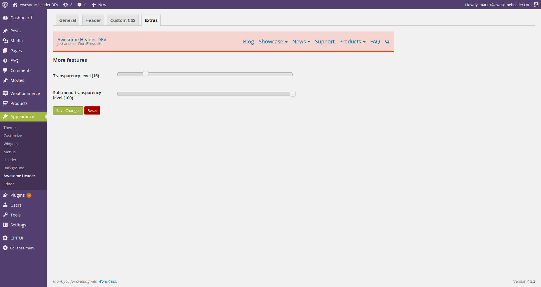
- Transparency level - background transparency for sticky header (value range is from 0 to 100); works only when solid background color is set as background color
- Sub-menu transparency level - background transparency for sub-menu (value range is from 0 to 100)
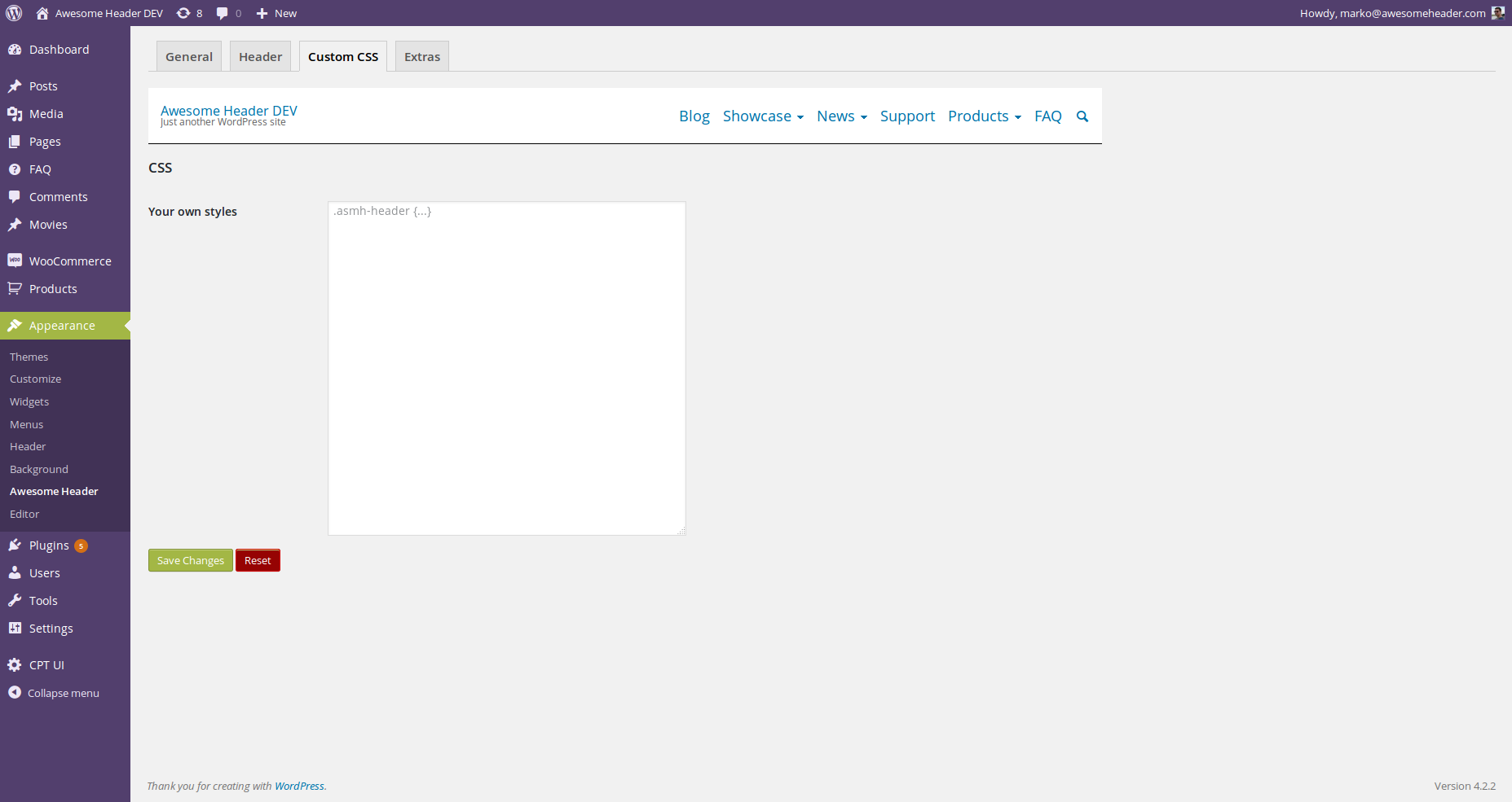
- asmh_middle_before - filter for content before sticky header's content
- asmh_middle_after - after sticky header's content
- asmh_nav_menu_item - single menu item
- asmh_middle_header - filter whole header's content
- asmh_middle - filter header container's content
- asmh_middle_menu_before - before main menu
- asmh_middle_menu_after - after main menu
- asmh_middle_menu - replace menu with something else - whole menu filter
- asmh_before_brand - add content before logo & tagline area
- asmh_after_brand - after logo & tagline area
- asmh_nav_collapse - hamburger icon filter - use your custom button for expanding responsive menu
- asmh_brand - filter logo (site title text or image)
- asmh_tagline - filter site description
- asmh_secondary_menu_before - for secondary menu add content before secondary menu
- asmh_secondary_menu - filter for secondary menu
- asmh_secondary_menu_after - add content after secondary menu
安装:
- Download the plugin from this page and extract it
- Copy the extracted awesome-sticky-header directory to \"/wp-content/plugins/\" directory
- Activate the plugin through the \"Plugins\" menu in WordPress dashboard
- Done! You can visit your website and start scrolling to see sticky header in action; Setup your sticky header from Appearance > Awesome Header
屏幕截图:
常见问题:
Where can I find settings?
In WordPress admin area, under Appearance -> Awesome Header.
Which PHP version do I need?
At least 5.4.
Is this plugin available as Composer package?
Yes, you can find this plugin at GitHub. You can also raise issues for possible improvements/ideas there.
更新日志:
1.0.4
- Added top margin for sticky header
- Added option to hide header before provided screen size
- Fix hover color on secondary menu item
- Fix secondary menu paddings
- Add hover/active menu link color
- Initial release.


