Block Collections
| 开发者 |
itmaroon
Web Creator ITmaroon |
|---|---|
| 更新时间 | 2025年12月27日 19:05 |
| PHP版本: | 8.2.10 及以上 |
| WordPress版本: | 6.8 |
| 版权: | GPL-2.0-or-later |
| 版权网址: | 版权信息 |
详情介绍:
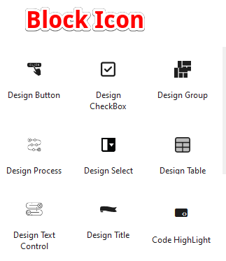
When this plugin is installed, the following 9 blocks are registered and can be used not only in the block editor but also in the site editor (tested on WordPress 6.4.2). In principle, each block can be configured with basic styles such as text color, background color, border, and white space, and in some cases it is also possible to set shadows and icons. There are also some that have simple animations set.
Below is a brief explanation of each block.
1 Design Title
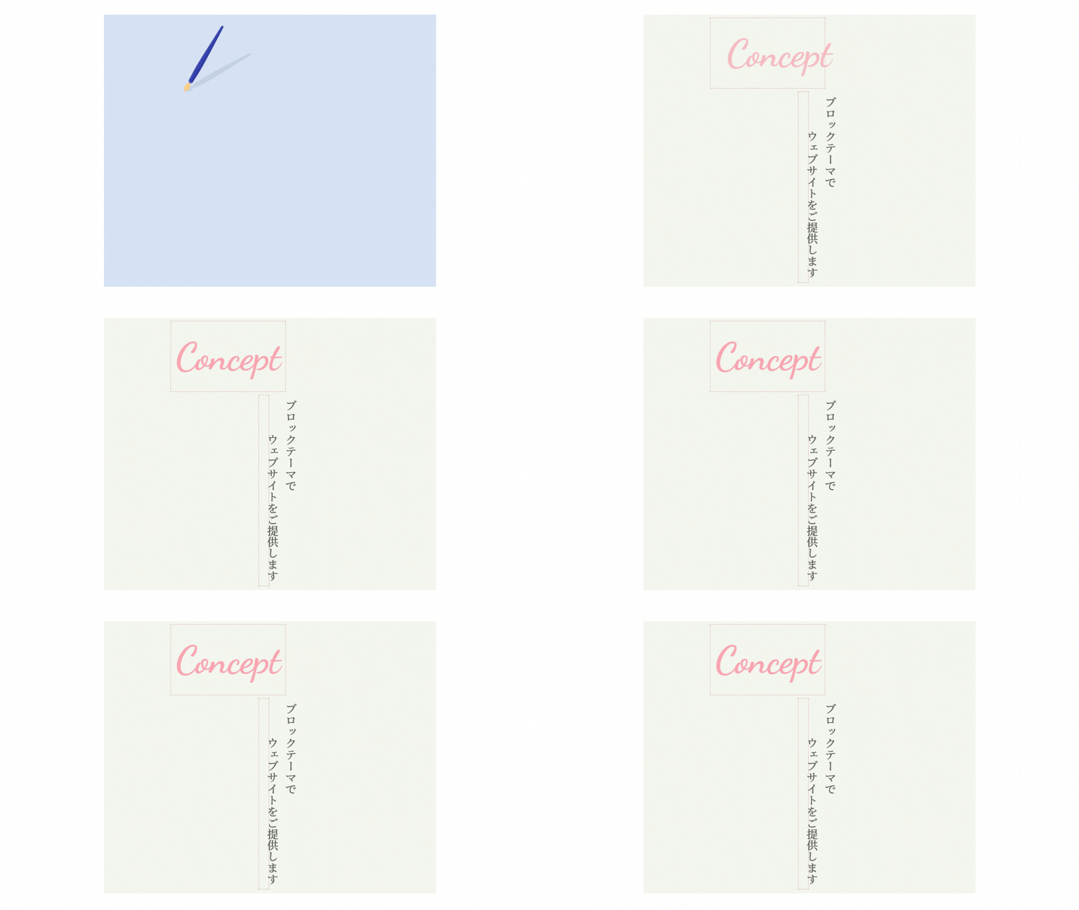
A block that allows you to style HTML heading tags. In addition to the normal style, we have prepared a type that allows you to insert a circular marker, and a type that allows you to add sub copies and icons.
2 Design Text Control
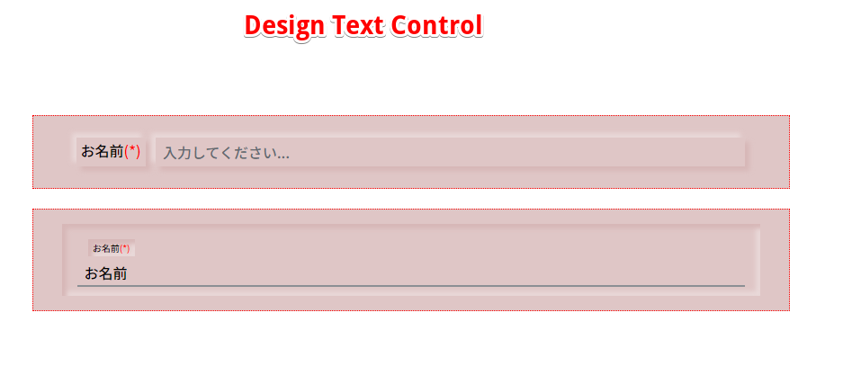
This is a block that allows you to style text controls and text area controls for HTML input elements. This time, we have prepared a normal box type and a line type. It is now possible to display required inputs, and it is a block that can be used for validation checks as an inner block of the Form Send Block.
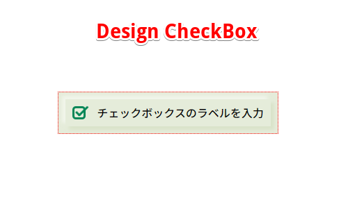
3 Design CheckBox
This is a block that allows you to style checkboxes in HTML input elements. Check animation. At the moment, we only have one type available, but we plan to gradually offer other variations in the future.
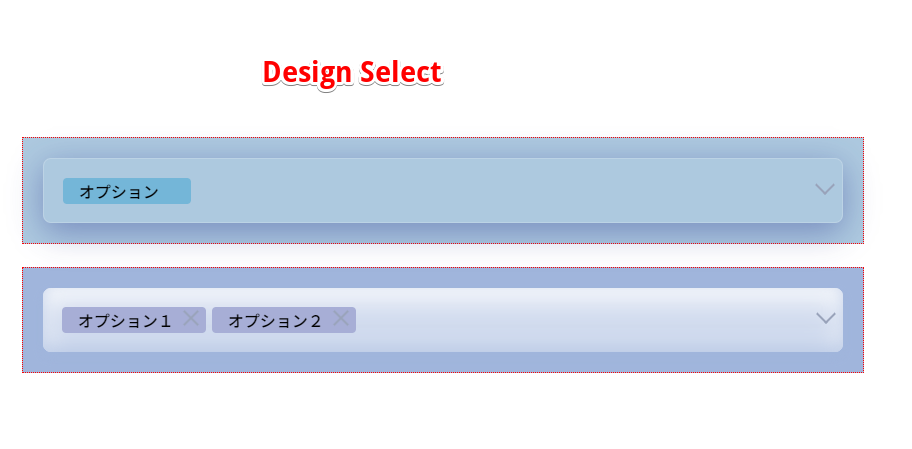
4 Design Select
A block that allows you to style HTML SELECT elements. It boasts that the selection element moves with a slightly fancy animation. Supports single selection and multiple selection.
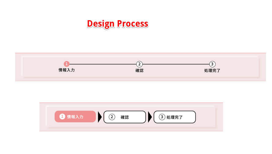
5 Design Process
A block for displaying the input process of form input. It is assumed that it will be used as an inner block for the Guest Contact Block, which will be released soon, and this block will not work on its own.
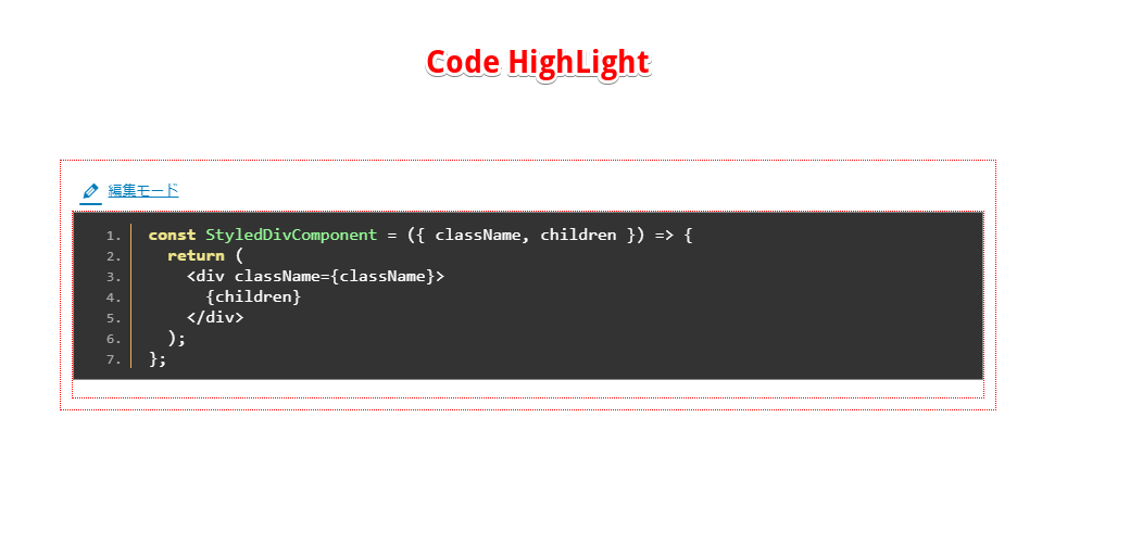
6 Code HighLight
This block allows you to enter code in the text area in edit mode and highlight it on the front end. This block uses the Google Code Prettify library for highlighting.
7. Design Table
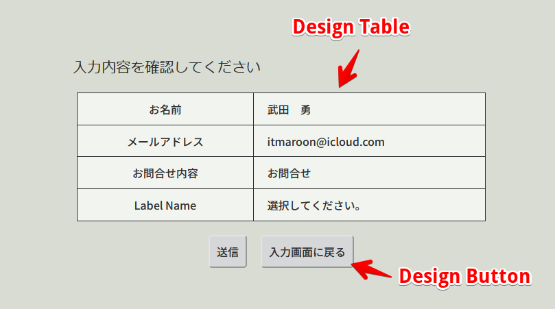
Displays the contents of a form object placed on a web page as a data source.
It is intended to be installed in the input confirmation form as an inner block of Form Send Blocks, which will be released soon.
8. Design Button
You can choose between regular buttons and submit buttons inside form elements. When you select the regular button, you can select a link to a fixed page and transition to that page.
9. Design Group
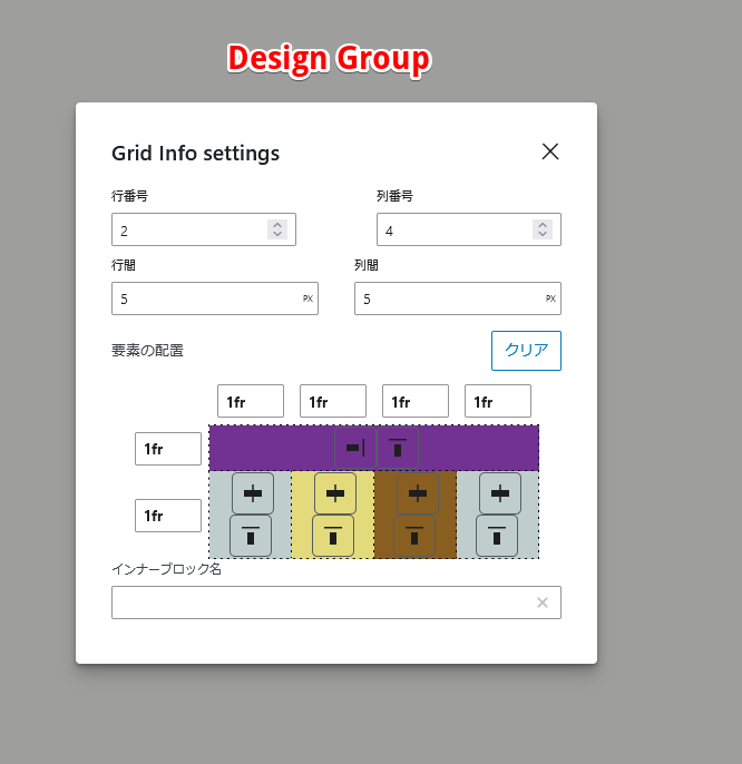
- Its main function is to store blocks and set their arrangement. The placement can be selected according to the CSS display property block, flex(row), flex(column), or grid. If you select grid, you can set various grid styles.
- Compatible with block themes, you can select contentSize and wideSize in the layout clause of theme.json, and you can also set the width to match the content width or freely set the width.
- By setting it to "Make it a menu", it will become a hamburger button in mobile mode (displayed on devices with a width of 767px or less), and when you click it, it will stick out from the left.
- These settings can be set separately for desktop mode (displayed on devices with a width of 768px or more) and mobile mode (displayed on devices with a width of 767px or less).
- By setting it to be movable, you can adjust the placement by dragging. With this feature installed, the old version of Draggble Box has been discontinued.
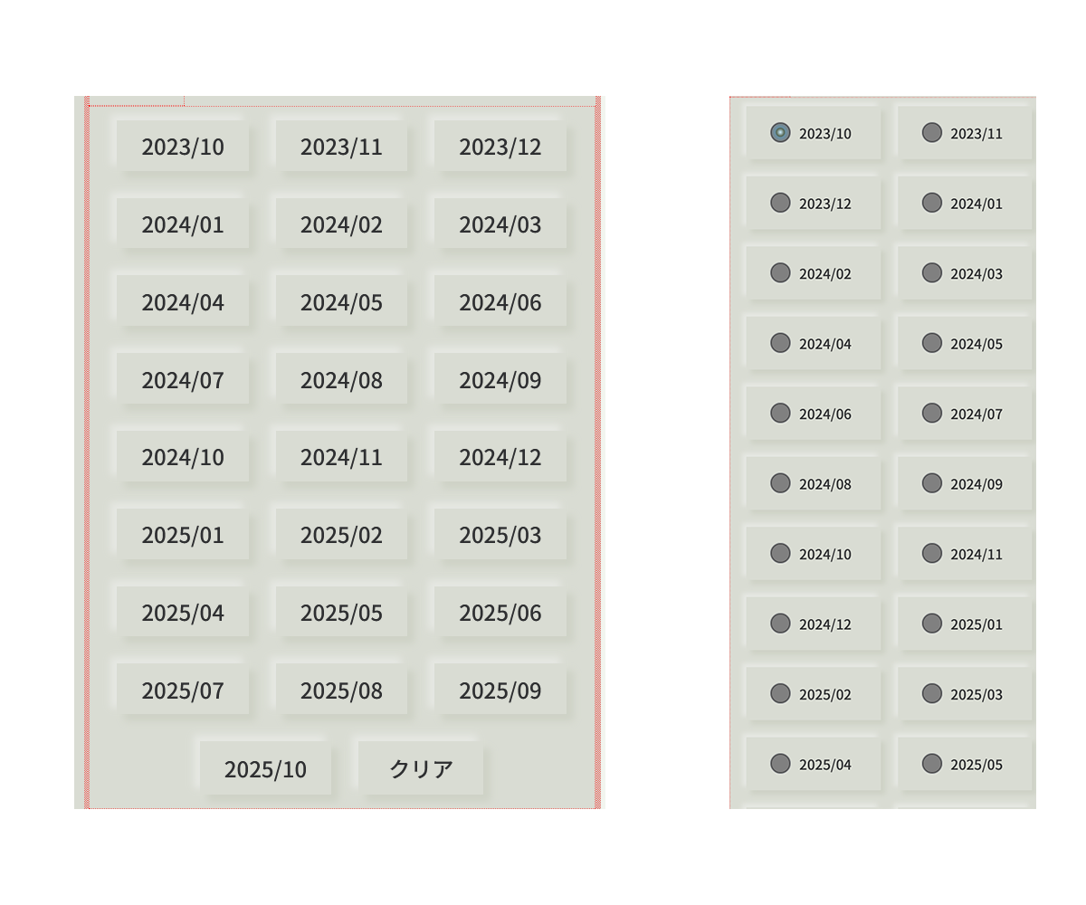
- Design Radio This block allows you to set styles for HTML radio button input elements. This time, we have prepared a normal radio button type and a button type. It is possible to add a button to deselect the element.
- Design Calender
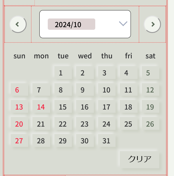
- This block allows you to select and enter a date from a calendar. You can choose the start day of the week to be Sunday or Monday.
- You can also set the display of holidays. To set holidays, you need to obtain an API key for the Google Calendar API. This plugin contains the ability to extend the core blocks: core/paragraph, core/image, core/table, core/list, and core/quote. The extended core blocks act as inner blocks of the blocks specified by the plugin, so they cannot function independently outside of the plugin.
- core/paragraph
- Added ability to set margins and padding.
- Added the ability to set line height.
- A function has been added that allows you to set a maximum height, and if the height exceeds that, a "See more" button will be displayed and displayed using that button.
- core/list
- Added ability to set margins and padding.
- Added the ability to set line height.
- Added the ability to set borderlines and rounded corners.
- core/quote
- Added ability to set margins and padding.
- Added the ability to set borderlines and rounded corners.
- Added the ability to set line height.
- core/table
- Added ability to set margins and padding.
- Added the ability to set borderlines and rounded corners.
- core/image
- Added the ability to choose whether to fit the size to the parent element.
- Added ability to set margins and padding.
- Added the ability to set the image size.
安装:
- From the WP admin panel, click “Plugins” -> “Add new”.
- In the browser input box, type “Block Collections”.
- Select the “Block Collections” plugin and click “Install”.
- Activate the plugin.
- Download the plugin from this page.
- Save the .zip file to a location on your computer.
- Open the WP admin panel, and click “Plugins” -> “Add new”.
- Click “upload”.. then browse to the .zip file downloaded from this page.
- Click “Install”.. and then “Activate plugin”.
屏幕截图:
更新日志:
1.7.2
- Design Group now appears in the foreground when a fixed position is selected, and can be toggled on or off in the editor.
- I set a click event on the Design Button and inverted the isClick attribute.
- Fixed an error that occurred when additional class names were deleted in Design Title.
- Flex-grow, flex-shrink, and flex-basis can now be set for items treated as flex items in the Design Group. In addition, by setting min-width: 0;, items will shrink regardless of the size of their child elements when they are set.
- In Design Group, className can now be explicitly saved as an attribute value.
- Added the ability to set form on the root DOM element of the Design Group.
- Fixed issue whereby when you select submit in the Design Buuton, the data-key attribute is set on the button element instead of the ID.
- It is now possible to set an ID for the Design Title.
- In the Design Title logon type, the redirect destination after logout processing has been changed to the page from which it was called.
- When the Design Group position becomes absolute, it can now be toggled on and off.
- When the DOM type of Design Group is form, it is now possible to set an ID for the form.
- Added a new mode for numeric input to Design Text Control. Also, the width of the input element can now be set.
- Change the submit type DOM element of Design Button from input element to button element.
- Added the ability to set animation effects to the Design Title to indicate processing is in progress.
- Added functions for entering passwords and postal codes to Design Text Control.
- The Design Process display has been improved to accommodate patterns such as user registration.
- We added logged-in user to the title type of Design Title, and added the ability to select login/logout links to the link type.
- The icon addition function for Design Title has been updated to include the ability to display images or avatars in addition to FontAwesome.
- Regarding the method of loading composer components, a mechanism has been introduced that does not conflict with other plugins. Accordingly, the composer components have been updated.
- Operation check with WordPress 6.8
- Fixed the issue where the icon inverted display was not displayed properly when selecting a block.
- Fixed the home URL for the link settings of Design Title to be set by front-end rendering.
- In Design Block, when a holiday overlapped with a Saturday, the date style was changed to the Saturday style. This has been corrected so that it will be the holiday style.
- Added a function to display tooltips on Design Buttons.
- Change the element that sets the shadow of the Design Title from the h element to its parent element.
- Added a function to generate an event that indicates that the display of the date button has been completed due to the display month of the Design Calendar being changed.
- Fixed the issue where the Google Calendar API Key for obtaining holiday data for Design Calendar was not displayed after reloading.
- Fixed an issue where tooltips were not displayed in the site editor for Design Button and Design Calendar.
- Added the ability to set wrapping for Design Title.
- Added functionality to allow links to be set in Design Groups.
- Fixed a problem with the validation check when the link type was set to URL in Design Title and an HTML format string was entered.
- Fixed a bug in displaying updated results when setting the title type to date in Design Title.
- Fixed Design Checkbox so that the cursor becomes a pointer when hovering over the label (front-end only).
- When flexbox was selected in the Design Group, a feature was added to allow wrapping.
- Organized the function to fit to parent element in the core/image extension.
- It is now possible to set padding and margins around the outer border of a Design Group.
- The absolute position setting in the Design group now allows you to set center alignment vertically and horizontally.
- Fixed a bug where the focus would be lost while entering the Design Title title and it would become impossible to enter the title.
- Fixed an issue where Design Group sizing did not reflect free size in mobile mode.
- Removed centering of blocks when Design Group's "Slide Parallax" is turned on, making it impossible to set centering.
- Fixed page of Design Title and Design Button and combo box for selecting archive page have been fixed due to improvement of PageSelectControl and ArchiveSelectControl.
- Fixed bug in save.js of Design Title
- Fixed an issue where the root div element was wrapped twice in front-end rendering of Design Title.
- Added the ability to add position:relative to the figure element of higher-order components of core/image.
- We've made it possible to set a disabled attribute for the Design Button, and accordingly to set the button color and text color when disabled. Also, when using the button type, a flag is set for the isClick attribute when the button is clicked.
- Design CheckBox now allows the value of the checkbox element to be stored in the block attribute.
- We have launched Design Radio.
- The modal display function used in Design Select has been made into a React component, making it available for use in the newly established Design Radio.
- We have created a new Design Callender.
- We have added icons to the display type of Design Button, and you can now select icons from Font Awesom.
- Fixed the way props are passed to LabelBox components in Design Text Ctrl and Design Select.
- Added the ability to set the label position for Design Text Ctrl and Design Select.
- Added No Link to the link type of Design Button.
- Changed the unit of the circle position setting of the circle marker style in Design Title from % to px
- Added the ability to set the line height of input text in Design Text Control
- Added date to the title type of Design Title. Also, you can select the date format.
- Added URL to the link type of Design Title. This link type checks whether the input string is in URL format and automatically sets it as the link destination.
- Added a setting to display a "See more" button to the core paragraph extension block. The block can be set to a maximum height, and if the scroll height exceeds that, the button will be hidden with a gradient.
- Fixed an issue where the vertical and horizontal positions of Design Group elements as flex containers were not set correctly.
- The horizontal alignment of the Design Button can now be set to right, center, or left.
- Modified to be compatible with WordPress 6.5.
- PHP class management is now done using Composer.\ GitHub\ Packagist
- I decided to make functions and components common to other plugins into npm packages, and install and use them from npm.\ npm\ GitHub
- The following block now supports font size responsiveness.
- Subcopy of Design Title
- Lable of Design CheckBox
- Design Table headings and data
- Design Process progress number and progress information
- Text inside the button of Design Button
- Design Select labels and options
- Design Text Control labels and input text
- Added the following functions to core/image functions:
- You can now choose to fit the image to the block size.
- The size of the block can now be specified using the ratio to the parent element, etc.
- Added the following features to Design Group
- Added functionality to become swiper-slide for Slide MainView of Slide Blocks (coming soon)
- Added the ability to retain attributes to create a parallax effect within the Slide MainView slide of Slide Blocks (coming soon) Bug fixes
- Fixed a bug where higher-order component functions were not enabled when adding core/image.
- Added the ability to generate DOM elements as swiper slides in Design group
- New option to set block width to full width of viewport in Design group
- The position property (static, fixed, absolute, sticky) can now be set for Design group.
- Added the ability to set animation to Design Group
- Added a module that allows you to add functionality using core blocks as higher-order components.
- Added the ability to display images and pseudo-elements on Design Buttons
- Added the ability to specify archive pages and free URLs for Design Button links.
- Vertical writing can now be set for Design Title. Bug fixes
- Fixed an issue where the archive page of the root domain WordPress site would be displayed when a fixed page was selected as the link destination type of Design Button.
- Fixed a bug where the font color of Design Title was rewritten to the theme color.
- Fixed text domain from 'itmar_block_collections' to 'block-collections' to match plugin slug.
- Fixed an issue where the 'Block validation failed' error occurred in the Design Title sub-copy style.
- Fixed an issue where the sidebar wording for setting the submenu position was not internationalized.
- Corrected the issue where range control could only be set in 100px increments when selecting Free in the block width settings, so it can now be changed in 10px increments.
- Fixed an issue where the site title and tagline of the root domain site were displayed in Design Title for WordPress sites installed on subdomains.
- Fixed an issue where blocks from the previous version remained in the cache when upgrading.
- Design Title
- You can now select the type of text to display, not only the characters input by the user, but also the site title and catchphrase set in the general settings.
- This block can now be made into a link. The following types of link types are available.
- Link to fixed page
- Link to archive page
- Link to any URL
- Link to display submenu With these features, you can now utilize this block as a menu item.
- In the subcopy style, subcopies can now be placed vertically and horizontally. With this, you can now easily create menu items with icons and subtitles.
- Added the ability to set underline animation.
- Design Text Control
- In mobile mode (displayed on devices with a width of 767px or less), the label is now placed at the top right of the input box when using the default style.
- Design CheckBox
- Equipped with a function to set whether to continue processing as an inner block of Form Send Blocks that will be released soon.
- Design Select
- Now displayed with a label.
- When placed as an inner block of Form Send Blocks, which will be released soon, the label name of the selected option is now retained as an input value.
- Design Process There are no changes
- Code HighLight Fixed a bug in the block editor where the code was not displayed in editor mode when mounting a block.
- Design Table This is a new block added in this version.
- Design Button This is a new block added in this version.
- Design Group This is a new block added in this version.
