Linux 软件免费装
Banner图

Core Framework

开发者 coreframework
更新时间 2024年3月27日 02:24
PHP版本: 7.4 及以上
WordPress版本: 6.4.3
版权: GPLv2
版权网址: 版权信息

标签

css stylesheet framework oxygen bricks

下载

1.3.10

详情介绍:

Hey there! If you're tinkering with WordPress and have a knack for making sites look just right, you might like what we've cooked up with Core Framework. It's like a Swiss Army knife for your CSS woes but way easier to use and with a lot more fun involved. What's Cooking? ✅ Make It Yours: Ever felt boxed in by CSS frameworks? We get it. That’s why we made Core Framework as customizable as a build-your-own pizza. You start with our base (which is pretty awesome on its own), and then add, tweak, or remove anything you don’t need. It’s all about making it fit your project like a glove. ✅ Play Well with Others: Whether you’re team Gutenberg, all about Bricks, or an Oxygen fan, we’ve got your back. Core Framework slides right into your workflow, making it that much smoother to sprinkle your design magic everywhere. 
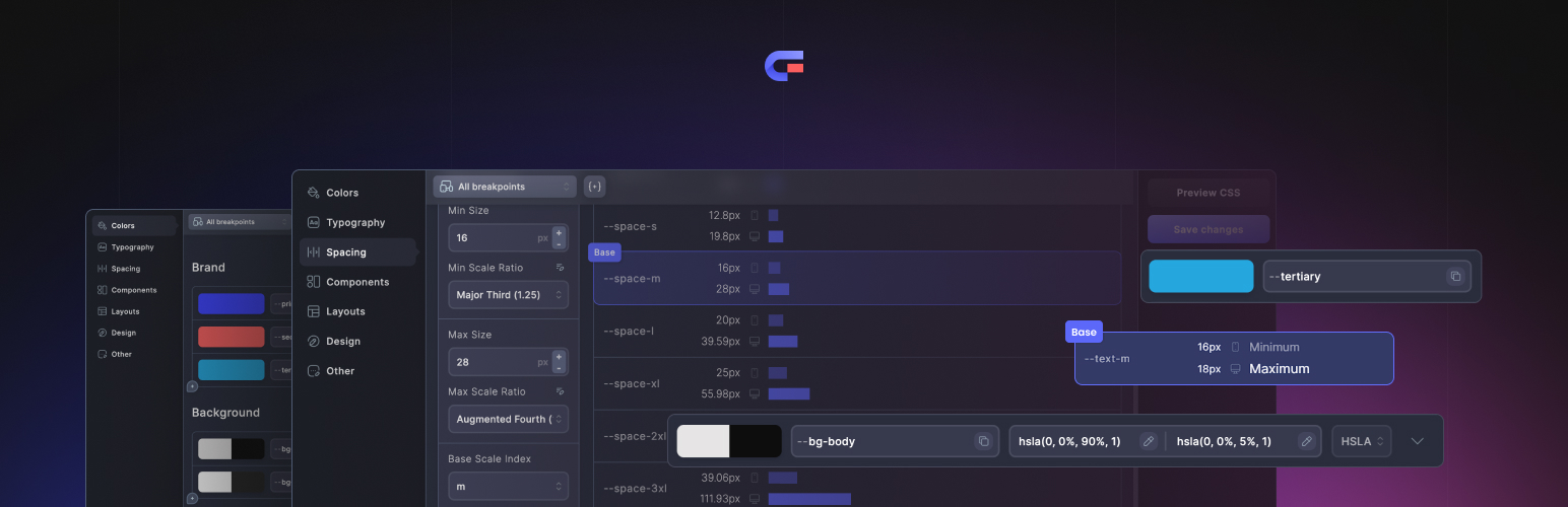
✅ A Dash of This, A Dash of That: Organize your colors, manage those borders, and set your typography scale just right. We’re all about making the tedious tasks a piece of cake, so you can focus on the fun parts of design. ✅ Components Galore: Reusable components are your best friends. Buttons, input styles, cards - you name it, we help you keep it all neat and tidy, ready to be reused whenever you need them. ✅ Join the Club: With over 4,000 buddies already in the Core Framework family, you’re in good company. Our marketplace is like a treasure chest of our ecosystem, full of add-ons, UI kits, and templates. Plus, you’re more than welcome to contribute as an author! Who’s It For? From solo freelancers to big-time agencies, if you’re crafting websites, you’ll feel right at home with Core Framework. It’s all about making your life a bit easier and a lot more creative. Easy Peasy Setup Getting started is as simple as installing any WordPress plugin. Find Core Framework in your dashboard, hit "Save" after making changes, and voila! The framework is live on your site. Learn more about all settings in our documentation portal. Customize to Your Heart’s Content Inside Core Framework, everything can be tweaked. Colors, classes, variables - mix and match them to create something that’s uniquely yours. Need a Hand? Our support crew is here for you via Intercom on our site, and our docs are always available for a quick how-to or when you’re in the mood for some light reading. Simply contact us at any time using the Intercom at the Core Framework website or in our Facebook community group. Keeping It Fresh We’re always rolling out updates and staying on top of WordPress changes to make sure you’ve got the smoothest ride possible. Find out about every Core Framework update in our changelog. From Friends You Trust Brought to you by the folks behind Motion.page, we’ve been around the block and we’re here to stay. We love hearing from our users, so don’t be shy! Come On In, The Water’s Fine Core Framework isn’t just about making sites look pretty (although it does that pretty well). It’s about enjoying the process, exploring new possibilities, and being part of a community that gets it. So, why not give it a whirl?

安装:

Installing the plugin
  1. In your WordPress admin panel, go to Plugins > New Plugin, search for Core Framework and click “Install now“.
  2. Alternatively, download the plugin and upload the contents of core-framework.zip to your plugins directory, which usually is /wp-content/plugins/.
  3. Activate the plugin.
  4. In your WordPress admin panel, go to Core Framework > Addons and enable or activate your preferred page builder integration.
  5. Click the 'Save' button to confirm and push the framework live.

屏幕截图:

  • Manage colors effortlessly using our visual GUI, that allows you to set up your colors, organize them, generate shades and tints, and more.
  • Perfectly calculated typography fluid scale, automatically responsive and consistent on all devices.
  • Not only typography, but also spacing needs to be perfectly calculated and automatically responsive.
  • Visually edit and organize reusable elements like buttons, inputs, cards, and anything else.
  • Manage your utility classes and variables to reuse across your project. Anything can be tweaked, added or removed.
  • Less than 12kB out of the box and editable to be even lighter. The output CSS is as clean as it gets.
  • Super-charge your WordPress experience with the power of our included Gutenberg addon.

更新日志:

1.3.10 March 26, 2024 FIXED Resolve issues with server side caching with LiteSpeed Cache 1.3.9 February 19, 2024 ADDED Grid templates in Variable Ui (Bricks Builder). Select colors from the Variable Ui by right-clicking on the colour picker pop-up trigger in the Bricks Builder. Wrap CSS declarations containing the :hover pseudo-selector with @media (hover: hover). This setting prevents hover styles from appearing on touch devices. This feature is disabled by default. IMPROVED Prevent minimum font sizes being larger than maximum. After selecting the colour using Variable UI colour previews on hover are temporally disabled (Bricks Builder). Increase allowed manual font and spacing size to 2000px. 1.3.8 February 5, 2024 ADDED Auto generate margin classes, eg. .margin-top-auto, .margin-left-auto, etc. IMPROVED Tweak paste component tooltip. Improved sanitisation. Optimize database calls. FIXED Allow underscores in variable names. Ensure latest variables are loaded into Variable UI and variable dropdown. 1.3.7 January 22, 2024 FIXED Don't open Variable Ui in certain fields in Oxygen Builder. Fix overflow in components preview. Zip archive incompatibility with WordPress 6.4.3. 1.3.6 January 22, 2024 FIXED Incompatibility of custom theme toggle icon in Bricks Builder (reported with Feather Icons). Custom variables created in the colors category will appear in the Colour tab of the Variable UI (Bricks and Oxygen). Fixes miscalculations introduced in version 1.3.5 1.3.5 January 17, 2024 ADDED Add option to include comments in the stylesheet. [#75] Add option to disable applying variable preview and auto changing unit on hover in Oxygen builder. FIXED Calculations for fluid input were not updated with latest configuration on save. [#84] Disable Autosuggestion of variables in icon size component in Oxygen Builder. Resolved an issue in certain WordPress multisite configurations where saving changes were not updating stylesheet. Hide admin notices on Core Framework page. Certain variable configurations were not prefixed in the root declarations. IMPROVED Quicker save time. Various other fixed and improvements. 1.3.4 December 13, 2023 FIXED Variable UI couldn't be opened in certain project configurations. Incorrect dark mode color schema property in generated CSS. 1.3.3 December 7, 2023 ADDED Implement easing gradients to create create smooth linear-gradients. This option is disabled by default and can be toggled on in preferences. Add core_framework_exclude_pages filter that allows excluding pages from loading framework. Added getStylesheetUrl, getStylesheetPath, and getStylesheetVersion functions in the Helper class. Read more. 1.3.2 November 15, 2023 FIXED Variable UI couldn't be opened in some cases. Tabbed navigation could result in duplicate autocomplete dropdowns. 1.3.1 November 14, 2023 ADDED Added option to open Variable UI using right click both in Oxygen and bricks builder. IMPROVED Variable suggestions are now sorted based on relevancy, for example autosuggestions in font size inputs will show fluid font size variables first. Applies to both Oxygen and Bricks add-on. Navigate back in the CSS rows using tab + shift. FIXED Autocomplete dropdown compatibility issues with Advanced Themer plugin. Adding state to the component could result in editing multiple states at the same time. 1.3.0 November 13, 2023 ADDED Visual Variable UI modal in Oxygen and Bricks builder addon. Open by holding down ⌘/Alt and clicking on an input. Preview class on hover in Oxygen builder. Variable dropdown with autocomplete and preview on hover in Oxygen Builder. Added settings pages for each add-on: Enable and disable features: apply a class on hover, toggle preview dark mode, variable dropdown, variable UI. Added focus-visible component state. Added option to duplicate group. IMPROVED Scroll to the selected variable in the variable dropdown in Bricks Builder. Increase the maximum number of generated spacing and typography variables. The dropdown suggests color variables in raw color input in Bricks. Improved dropdown position in Bricks. Persistent previewed theme in Components. FIXED Incorrect generated variable with double -- chars in helper's getVariables() method. 1.2.9 October 30, 2023 FIXED Add a missing variable prefix to custom variables in the Bricks Builder autosuggestion dropdown. 1.2.8 October 25, 2023 ADDED Added the ability to use a custom icon in the theme toggle Bricks element. IMPROVED Framework stylesheet loaded in the Gutenberg preview has a higher priority. This fixes compatibility issues with Greenshift components (e.g. "Advanced Core Button Block"). Categorise settings in the Theme Toggle element for Bricks. FIXED Component modifier classes (e.g. .btn.small) were not visible in Gutenberg integration. 1.2.7 October 16, 2023 ADDED Added Wordpress Multisite support. Added CoreFramework\Helper which can be used by plugin developers to access the list of variables and classes. IMPROVED Previewed theme is now persistent on reload and is shared between frontend and builder preview. This change affects theme preview button in Gutenberg, Oxygen and Bricks builders. Allow more digits in custom scale ratio in spacing and typography calculators. FIXED Added missing aria-label to the Theme Toggle elements (Bricks builder, Oxygen builder, Gutenberg). Under certain conditions both cf-theme-dark and cf-theme-light class was added to the html element inside of Bricks builder preview iframe. 1.2.6 September 25, 2023 FIXED Reduced API requests within the Gutenberg add-on. Fixed an incorrect property in the bold class. This class will be automatically corrected on save. Increase the maximum value of the 'Max Screen Width' preference to 4000px. Shades and tints for dark mode were not generated under certain conditions. Set stage for UI kit preset import. Reorder Gutenberg add-on ui - move applied classes section to the top. 1.2.5 September 10, 2023 FIXED Fixed an issue with overlapping text in tabs in the Gutenberg add-on when the "Show button text labels" Wordpress preference is enabled. Fixed an error that could occur when trying to update the plugin on a site that has moved between domains. The framework stylesheet had the wrong order in the Bricks builder iframe, resulting in style differences between the Bricks builder preview and the frontend. 1.2.4 September 4, 2023 ADDED Add Theme toggle block (Gutenberg add-on). Control size, colour and icon type. Add preview dark mode button to the page and site editor. Add variables autocomplete with a dropdown to Bricks builder integration (resave required after the update). Supports every input that accepts variables. Hover over a variable to preview it. 1.2.3 August 23, 2023 FIXED Incorrect variable value in color classes when using \'--\' characters in color name. Incorrect behaviour of \'theme-invert\' class in light mode. 1.2.2 August 21, 2023 FIXED Text size classes not regenerating clamp value on save when using a manual typography and root font size 100%. IMPROVED Cleaned up the CSS output to always display variables instead of clamps, plus a last resort REM fallback. Size of the stylesheet is now showing a minified and gzipped size. 1.2.1 August 18, 2023 FIXED Incorrect value of of .width-auto class. In some cases, importing a project file created with older versions may result in manual typography sizes being reset. 1.2.0 August 17, 2023 ADDED Learn how to use the new Dark Mode feature Dark Mode Create a dark mode variant of any color. Including shades, tints and transparent variants. Quickly add a theme toggle with dedicated Bricks and Oxygen elements. Toggle any specific section by adding a class .theme-inverted Choose a preferred default theme or set it automatically based on system settings. Preview dark mode in Oxygen and Bricks builder with button in the builder UI. Preview components in dark mode. Colors for backgrounds, text, border and shadow for both Light / Dark mode Visual preview of classes on hover in Bricks Builder Addon Z-Index utility classes eg. .z-index-10 , .z-index-100 , etc. Position classes .sticky , .fixed Utilities .display-none , .visible , .hidden Relative width clases, eg. .width-50 , .width-60, etc. Screen classes, .screen-width (100vw), .screen-height (100vh) Components .divider , .checkbox , .radio In order to see new classes, you may need to reset the framework to default (from the Preferences pane). The update itself will not attempt to write to your saved framework. IMPROVED Components default styles and output Dark / Light mode toggle in component previews Remove prefix from generated colour classes selector. For example colour variable named --bg-primary would generate background class .bg-primary instead of .bg-bg-primary Refined PostCSS config - expose variables in all declarations, make clamp fallback shorter. Improve components preview to ensure previewed css matches generated file. Display three inputs for checkbox and radio input in Components. Add missing states in component editor, :checked and :valid Hide Wordpress notices when in Core Framework interface FIXED Fixed issue with previewing :before and :after in component editor. Fixed overflow issues with Menus in component editor. Performance improvements in Wordpress admin dashboard. Fixed issue with styles being applied to Gutenberg Editor UI. Fixed issue when Column Span or Row Span classes were used together with Column Start or Row Start 1.1.0 July 28, 2023 Learn more about the new Manage Project screen here. New \"Manage Project\" view, replacing the previous Import / Export view: Import parts of the project with a side by side view. Reorder sections between categories. Import the project remotely from the web app with a link. Add functionality to import and export individual colours, colour groups, fluid spacing configuration, fluid typography configuration, individual components, classes and variable groups. Resolved an issue related to saving the project on specific database configurations. Fixed a bug that was causing media queries to be improperly generated when using new variables in media query mode. Repositioned Core Framework in the menu bar. Resolved a problem where theme colours were disappearing in Gutenberg when the child theme was activated. Fix the issue with breakpoints not being removed correctly. 1.0.4 July 11, 2023 Fixed an issue of duplicate colours in Gutenberg (noticed in Kadence and GeneratePress themes). Fixed an issue of overwriting theme colours (noticed in GeneratePress). 1.0.3 July 7, 2023 Load prefixed stylesheet in Gutenberg editor, resulting in improved specificity of classes. Fixed an issue with a missing prefix in the variable name of the main colour in Oxygen and Bricks Integrations. Fixed an issue with incorrect colour ID in Oxygen causing incorrect colour assignment. Oxygen colour sync now uses variables instead of hex values. Improved drag\'n\'drop feature in the component editor by adding a drag handle. Fixed autocomplete filtering when using shorthand for variables - \'--\'. Fixed the issue of unnecessary loading of CSS in the Gutenberg integration. Fixed an issue with inserting space into the component variant selector. Added a tooltip, advising to push changes after enabling an add-on. Fixed an issue of selector specificity in the Oxygen builder iframe - affecting element selectors. Fixed an issue with FOUC when hovering over a class in Gutenberg widget. Fixed an issue with class sync when multiple integrations are enabled. Fixed an issue with the visibility of group icons in Gutenberg. 1.0.2 July 4, 2023 We have fixed an issue with the search function in the Gutenberg component. 1.0.1 July 4, 2023 Fixed an issue where Oxygen Builder was not detected in certain cases. Resolved an error that occurred when deleting a variant of a component with associated states. 1.0.0 July 3, 2023 Production Launch