CPO Shortcodes
| 开发者 | wpchill |
|---|---|
| 更新时间 | 2020年11月5日 19:59 |
| PHP版本: | 5.6 及以上 |
| WordPress版本: | 5.5 |
| 版权: | GPLv3 or later |
| 版权网址: | 版权信息 |
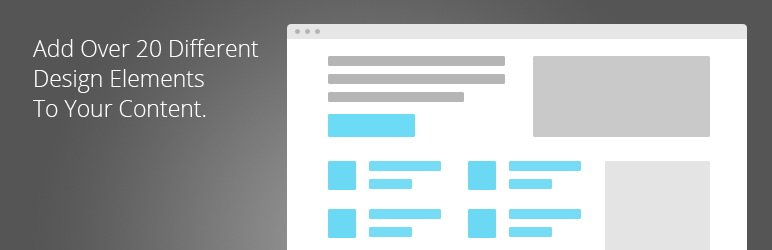
详情介绍:
- Accordions
- Animation areas
- Buttons
- Dropcaps
- Focus boxes
- Google Maps
- Icon Boxes
- Item lists
- Leading paragraphs
- Notifications
- Number Counters
- Optin Forms (Mailchimp)
- Progress Bars
- Separators
- Tabbed content
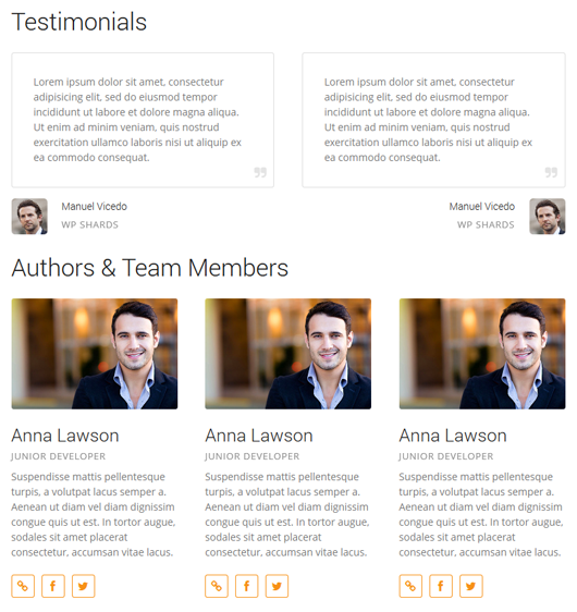
- Testimonials
- Team Members
- Sections
- Separators
- Spacers
- Column Layouts - Lay out your content in up to 6 columns at a time, including multiple combinations.
- Post Listings - Create lists of any kind of post anywhere, either as a list or in grid format. You can create your own portfolio listing this way.
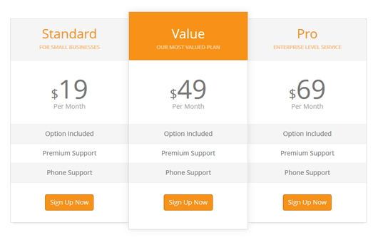
- Pricing Tables - Display your prices with a beautifully-designed pricing table, flexible enough that you can tweak it to maximize conversions.
- Content Slideshows - Create slideshows with virtually anything in them, including images, text, and even other shortcodes too.
- Registration & Login Forms - Create and embed beautiful registration forms to create a vibrant community around your website.
- Compatible with the vast majority of themes out there
- Responsive elements that adapt to the current screen size
安装:
- Download the ZIP file
- In your WordPress admin area, go to Plugins > Add Plugin, and select Upload Plugin
- Upload the ZIP file and installation will commence
- Activate the plugin through the 'Plugins' menu in WordPress
- Make sure to check the Settings > CPO Shortcodes page before using it right away!
- You are now ready to use the shortcodes from the WordPress Visual Editor
- Download the ZIP file and unpack it
- Upload the entire cpo-shortcodes to the /wp-content/plugins/ directory
- Activate the plugin through the 'Plugins' menu in WordPress
- Make sure to check the Settings > CPO Shortcodes page before using it right away!
- You are now ready to use the shortcodes from the WordPress Visual Editor
屏幕截图:
常见问题:
HELP! My shortcodes are not working!
Go to Settings > CPO Shortcodes and see what the Shortcode Prefix is. This prefix is meant to avoid conflicts with other plugins (in case you have a plugin that also has a --button-- shortcode). Simply make sure the shortcodes you are using correspond to the prefix in there. For example, if your prefix is ct, then you should use the ct_button shortcode. If you have an empty prefix, you can use just button.
How To Use Shortcodes
Writing Shortcode Syntax Shortcodes are fairly simple to write. They act very much like an HTML tag, but using square brackest ([]) instead of the less-than and greater-than signs. A shortcode may be self-closing or it can enclose some other piece of content, like so: [custom_shortcode] [custom_shortcode]This is some content.[/custom_shortcode] A shortcode may also support one or more attributes indicating a particular value. This is normally used so the shortcode can be further configured and its behavior customized: [custom_shortcode attribute1=”value” attribute2=”value”] Common Issues With Shortcodes Albeit shortcodes are very flexible, they can also break rather easily if you format them the wrong way in the visual editor. This is particularly important when creating a page with many shortcodes, since it can get messy really fast. You should always keep in mind the following: Do Not Nest The Same Shortcode Even when using the latest version of WordPress, the shortcode parser has a lot of issues trying to read the same shortcode when nested in more than one level. At all times, you should avoid inserting a shortcode directly within the same one. This is an example of a nested shortcode: [custom_shortcode] [custom_shortcode]This is some content.[/custom_shortcode] [/custom_shortcode] Always Separate Attributes With A Space Attributes in a shortcode must be separated by a space, or the editor won’t recongize it as valid and it won’t be parsed. You should avoid writing syntax such as title=”name”number=”2? make sure it’s right. Watch Out For Uneven Line Breaks When using the visual editor, WordPress will convert every line break into a paragraph block (by adding tags onto each piece of content). The problem comes when you add a shortcode and separate it into many lines in an inconsistent manner. One example would be: [custom_shortcode]First line of my content. Second line of the content. [/custom_shortcode] In this case, the shortcode parser can have trouble with the paragraph tags, since the first line will be counted as a single paragraph but will not distinguish between the beginning of the content and the opening tag. This issue can be solved by formatting the same content in the following, consistent manner: [custom_shortcode] This is some content. It has two lines. [/custom_shortcode]
Accordion
[[accordion title="Title" state=""]Contents[/accordion]] Example [accordion title="Title of Accordion" style="boxed" state='closed']This is a normal accordion. It can contain any kind of HTML markup just like the rest of the post. This means it can also embed images, media, and HTML tags normally.[/accordion] [accordion title="Title of Accordion" style="boxed" state='open']This is an open accordion. It will load in its opened state.[/accordion] Accordion Attributes [definition title="title"]The title you wish to give the accordion.[/definition] [definition title="state"]Determines the initial state of the accordion. Can be closed, open.[/definition] [definition title="style"]Determines the appearance of the accordion. Can be normal, boxed.[/definition] [definition title="group"]Indicates which group this accordion belongs to. You can assign any arbitrary name to any number of accordions. All accordions belonging to the same group can only have a single one open at all times.[/definition]
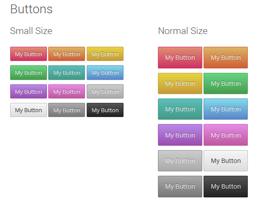
Buttons
[[button size="small" color="green" url="http://google.com" icon="angle-right"]Small Button[/button]] Example [button icon="magic" url="#"]Sample Button[/button] Button Attributes [definition title="description"]Adds a small description underneath the button's text.[/definition] [definition title="url"]The full, absolute URL to where the button should take the user.[/definition] [definition title="size"]Determines the overall size. Possible values are small, normal, medium, large, or huge.[/definition] [definition title="color"]Sets the text color for the button. Can be a CSS color word (red, blue), or a hex representation. Defaults to white.[/definition] [definition title="background"]Sets the background color for the button. Can be a CSS color word (red, blue), or a hex representation.[/definition] [definition title="gradient"]Sets a secondary background color for the button. When used along with the background attribute, a vertical gradient will result. Can be a CSS color word (red, blue), or a hex representation.[/definition] [definition title="position"]Determines the position layout. Can be none, left, center, or right.[/definition] [definition title="border"]Determines the border styling of the button. Must be specified in CSS syntax.[/definition] [definition title="target"]Determines the target attribute of the button.[/definition] [definition title="rel"]Determines the rel attribute of the button.[/definition] [definition title="icon"]Defines an icon to be displayed in the button. The icon name should be one from the Font Awesome Cheatsheet, minus the prefix.[/definition]
Client Grids
[[clients images="42,55,64"]] Example [clients columns="2" images="26134,26135,26136,26137"] Client Grid Attributes [definition title="images"]A list of comma-separated IDs of attachments. each attachment will be used as a single slide.[/definition] [definition title="columns"]sets the number of columns[/definition]
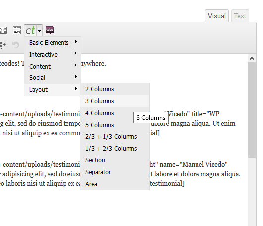
Columns
Two Columns [[column_half]Two Columns[/column_half]] [[column_half_last]Two Columns[/column_half_last]] Three Columns [[column_third]Three Columns[/column_third]] [[column_third]Three Columns[/column_third]] [[column_third_last]Three Columns[/column_third_last]] Four Columns [[column_fourth]Four Columns[/column_fourth]] [[column_fourth]Four Columns[/column_fourth]] [[column_fourth]Four Columns[/column_fourth]] [[column_fourth_last]Four Columns[/column_fourth_last]] Five Columns [[column_fifth]Five Columns[/column_fifth]] [[column_fifth]Five Columns[/column_fifth]] [[column_fifth]Five Columns[/column_fifth]] [[column_fifth]Five Columns[/column_fifth]] [[column_fifth_last]Five Columns[/column_fifth_last]] Two Thirds Columns [[column_two_thirds]Five Columns[/column_two_thirds]] [[column_third_last]Five Columns[/column_third_last]] Three Fourths Columns [[column_three_fourths]Five Columns[/column_three_fourths]] [[column_fourth_last]Five Columns[/column_fourth_last]] Example [column_half style="fit"][message][/column_half] [column_half_last style="fit"][message][/column_half_last] [column_third][message][/column_third] [column_third][message][/column_third] [column_third_last][message][/column_third_last] [column_fourth][message][/column_fourth] [column_fourth][message][/column_fourth] [column_fourth][message][/column_fourth] [column_fourth_last][message][/column_fourth_last] [column_fifth][message][/column_fifth] [column_fifth][message][/column_fifth] [column_fifth][message][/column_fifth] [column_fifth][message][/column_fifth] [column_fifth_last][message][/column_fifth_last] [column_two_thirds][message][/column_two_thirds] [column_third_last][message][/column_third_last] [column_three_fourths][message][/column_three_fourths] [column_fourth_last][message][/column_fourth_last] Column Attributes The column shortcodes ending in _last are used to control the right margin of a column, so that they have some space between them. Be sure to always mark the last column in a row with _last, otherwise the layout will break! [definition title="style"]Determines the style of the columns. Can be used to control the width of margin-- for example, fit-style columns will have no margins between each on of them. Can be normal, narrow, or fit.[/definition]
Counters
[[counter title="Title" color="#f90" number="243" icon="twitter" size="normal"]Counter Description[/counter]] Example [counter title="Facebook" color="#3b5998" number="243" icon="facebook-sign" size="normal"]Fans[/counter] Accordion Attributes [definition title="title"]The title you wish to give the accordion (Defaults to a static title).[/definition] [definition title="number"]The numeric value for the counter.[/definition] [definition title="size"]The size of the counter element. Can be normal, small, medium, large.[/definition] [definition title="color"]The color of the counter icon. Can be a valid CSS color or a hexadecimal value.[/definition] [definition title="icon"]The icon of the counter element. Can be any valid icon name from the Font Awesome library, minus the font prefix.[/definition]
Custom lists
[[list background="#ff9900" icon="check" style="round"]List contents[/list]] Example [list background="#ff9900" icon="check" style="round"]First element.[/list] [list background="#ff9900" icon="check" style="round"]Second element.[/list] [list background="#ff9900" icon="check" style="round"]Third element.[/list] List Attributes [definition title="color"]The color for the icon. Defaults to white.[/definition] [definition title="background"]Sets the background color for the icon. Can be a CSS color word (red, blue), or a hex representation.[/definition] [definition title="gradient"]Sets a secondary background color for the icon. When used along with the background attribute, a vertical gradient will result. Can be a CSS color word (red, blue), or a hex representation.[/definition] [definition title="icon"]The icon of each element of the list. Corresponds to the Font Awesome Cheatsheet, minus the icon- prefix.[/definition] [definition title="style"]The appearance for each element in the list. Can be square, round, or normal.[/definition]
Dropcaps
[[dropcap color="#ff9900" style="square"]L[/dropcap]]etter. Example [dropcap color="#ff9900" style="square"]L[/dropcap]orem ipsum dolor sit amet, consectetur adipisicing elit, sed do eiusmod tempor incididunt ut labore et dolore magna aliqua. Ut enim ad minim veniam, quis nostrud exercitation ullamco laboris nisi ut aliquip ex ea commodo consequat. Duis aute irure dolor in reprehenderit in voluptate velit esse cillum dolore eu fugiat nulla pariatur. Dropcap Attributes [definition title="color"]The color for the dropcap letter.[/definition] [definition title="style"]The style for the dropcap letter. Can be normal, square, or round.[/definition]
Definition Lists
Definitions are great for creating your very own glossary, or outlining a particular set of bullet points with ease. They are comprised of a simple title and a description, which can contain other shortcodes as well as HTML. You can see them in use throughout this documentation page. [[definition title="Title"]The Description[/definition]] Example [definition title="Title"]The Description for this definition element.[/definition] Definition List Attributes [definition title="title"]The title for the definition element.[/definition]
Focus Boxes
[[focus background="#5ecae5" gradient="#639ac6" color="dark"]]Content[[/focus]] Example [focus background="#5ecae5" gradient="#639ac6" color="dark"]Lorem ipsum dolor sit amet, consectetur adipisicing elit, sed do eiusmod tempor incididunt ut labore et dolore magna aliqua. Ut enim ad minim veniam, quis nostrud exercitation ullamco laboris nisi ut aliquip ex ea commodo consequat. Duis aute irure dolor in reprehenderit in voluptate velit esse cillum dolore eu fugiat nulla pariatur. Excepteur sint occaecat cupidatat non proident, sunt in culpa qui officia deserunt mollit anim id est laborum.[/focus] Focus Box Attributes [definition title="color"]Sets the color for the box, meant for light or dark backgrounds. Can be light or dark.[/definition] [definition title="background"]Sets the background color for the button. Can be a CSS color word (red, blue), or a hex representation.[/definition] [definition title="gradient"]Sets a secondary background color for the button. When used along with the background attribute, a vertical gradient will result. Can be a CSS color word (red, blue), or a hex representation.[/definition] [definition title="style"]Sets a particular style for the box. Can be normal, shadow.[/definition]
Inline Features
Feature blocks are comprised of a title, a block of content, and an accompanying icon or image. They are very useful when describing your services or outlining the details of a topic, and you can customize their appearance and layout just about any way you want to. [[feature title="Feature Title" icon="flag"]Content[/feature]] Example [feature style="normal" icon="ok-sign" color="#fff" background="#54c57c" gradient="#82c054" title="Title Of Feature Block"]Phasellus placerat, nisl sed pulvinar pharetra, ligula sapien tincidunt arcu, et mattis lorem purus vitae ligula. Nunc ultricies sapien ac suscipit fringilla.[/feature] Feature Attributes [definition title="title"]Specifies the title of the featured block.[/definition] [definition title="icon"]The name of the icon to be used. It should correspond to the name in the Font Awesome cheatsheet, minus the 'icon-' prefix.[/definition] [definition title="image"]Specifies an image URL to be used instead of an icon.[/definition] [definition title="background"]Defines the background color for the icon. Must be specified in hexadecimal format (#123456).[/definition] [definition title="gradient"]Defines a secondary color for the background of the icon. If the background attribute is also set, the result will be a vertical gradient tone. Must be specified in hexadecimal format (#123456).[/definition] [definition title="color"]Defines the color of the icon. Must be specified in hexadecimal format (#123456).[/definition] [definition title="style"]Defines the appearance of the feature. Can be normal, horizontal, vertical, boxed.[/definition]
Image Slideshows
[[slideshow effect="fade" speed="800" timeout="6000" pager="none" navigation="none" ] [slide]Lorem ipsum dolor sit amet, consetetur sadipscing elitr, sed diam nonumy eirmod tempor invidunt ut labore et dolore magna aliquyam erat, sed diam voluptua. At vero eos et accusam et justo duo dolores et ea rebum. Stet clita kasd gubergren, no sea takimata sanctus est Lorem ipsum dolor sit amet. Lorem ipsum dolor sit amet, consetetur sadipscing elitr, sed diam nonumy eirmod tempor invidunt ut labore et dolore magna aliquyam erat, sed diam voluptua. At vero eos et accusam et justo duo dolores et ea rebum. Stet clita kasd gubergren, no sea takimata sanctus est Lorem ipsum dolor sit amet. Lorem ipsum dolor sit amet, consetetur sadipscing elitr, sed diam nonumy eirmod tempor invidunt ut labore et dolore magna aliquyam erat, sed diam voluptua. At vero eos et accusam et justo duo dolores et ea rebum. Stet clita kasd gubergren, no sea takimata sanctus est Lorem ipsum dolor sit amet.[/slide] [slide]Lorem ipsum dolor sit amet, consetetur sadipscing elitr, sed diam nonumy eirmod tempor invidunt ut labore et dolore magna aliquyam erat, sed diam voluptua. At vero eos et accusam et justo duo dolores et ea rebum. Stet clita kasd gubergren, no sea takimata sanctus est. At vero eos et accusam et justo duo dolores et ea rebum. Stet clita kasd gubergren, no sea takimata sanctus est Lorem ipsum dolor sit amet.[/slide] [/slideshow]] Example [slideshow effect="fade" speed="800" timeout="6000" ] [slide]Lorem ipsum dolor sit amet, consetetur sadipscing elitr, sed diam nonumy eirmod tempor invidunt ut labore et dolore magna aliquyam erat, sed diam voluptua. At vero eos et accusam et justo duo dolores et ea rebum. Stet clita kasd gubergren, no sea takimata sanctus est Lorem ipsum dolor sit amet. Lorem ipsum dolor sit amet, consetetur sadipscing elitr, sed diam nonumy eirmod tempor invidunt ut labore et dolore magna aliquyam erat, sed diam voluptua. At vero eos et accusam et justo duo dolores et ea rebum. Stet clita kasd gubergren, no sea takimata sanctus est Lorem ipsum dolor sit amet. Lorem ipsum dolor sit amet, consetetur sadipscing elitr, sed diam nonumy eirmod tempor invidunt ut labore et dolore magna aliquyam erat, sed diam voluptua. At vero eos et accusam et justo duo dolores et ea rebum. Stet clita kasd gubergren, no sea takimata sanctus est Lorem ipsum dolor sit amet.[/slide] [slide]Lorem ipsum dolor sit amet, consetetur sadipscing elitr, sed diam nonumy eirmod tempor invidunt ut labore et dolore magna aliquyam erat, sed diam voluptua. At vero eos et accusam et justo duo dolores et ea rebum. Stet clita kasd gubergren, no sea takimata sanctus est. At vero eos et accusam et justo duo dolores et ea rebum. Stet clita kasd gubergren, no sea takimata sanctus est Lorem ipsum dolor sit amet.[/slide] [/slideshow] Slideshow Attributes [definition title="images"]A list of comma-separated IDs of attachments. each attachment will be used as a single slide.[/definition] [definition title="effect"] Specifies the type of transition for the slideshow. Can be any of the following: fade cover uncover scrollHorz scrollVert scrollLeft scrollRight [/definition] [definition title="speed"]Specifies the speed of each transition, in milliseconds.[/definition] [definition title="timeout"]Specifies the waiting time between transitions, in milliseconds.[/definition] [definition title="pager"]Shows paging controls. Can be none, circle.[/definition] [definition title="navigation"]Shows next/prev navigation controls. Can be set to none, normal.[/definition]
Image Banners
[[banner image="26166" position="bottom" style="round" color="dark" url="#"]Content[/banner]] Example [banner image="26166" position="bottom" style="round" color="dark" url="#"] An Image Banner Add any kind of content here. [/banner] Button Attributes [definition title="content"]The content of the banner image. Can have HTML as well as other shortcodes.[/definition] [definition title="image"]Indicated the image to be used as the banner. Must be an ID indicating the attachment post for the current wordPress install.[/definition] [definition title="url"]The full, absolute URL to where the image should take the user.[/definition] [definition title="size"]Determines the overall size. Possible values are small, normal, medium, large, or huge.[/definition] [definition title="color"]Sets the text color for the button. Can be a CSS color word (red, blue), or a hex representation. Defaults to white.[/definition] [definition title="background"]Sets the background color for the button. Can be a CSS color word (red, blue), or a hex representation.[/definition] [definition title="gradient"]Sets a secondary background color for the button. When used along with the background attribute, a vertical gradient will result. Can be a CSS color word (red, blue), or a hex representation.[/definition] [definition title="position"]Determines the position layout. Can be top or bottom.[/definition] [definition title="align"]Determines the alignment of the content. Can be left, center, or right.[/definition] [definition title="border"]Determines the border styling of the image. Must be specified in CSS syntax.[/definition]
Google Maps
[[map latitude="27.174526" height="400" longitude="78.042153" color="#798565"]] Example [map latitude="27.174526" longitude="78.042153" color="#798565" height="300"] Map Attributes [definition title="color"]The color hue for the map.[/definition] [definition title="height"]The height in pixels of the map.[/definition] [definition title="latitude, longitude"]The coordinates for the map. You can obtain them from an address using a service such as LatLong.[/definition]
Leading Paragraphs
[[map latitude="27.174526" height="400" longitude="78.042153" color="#798565"]] Example [map latitude="27.174526" longitude="78.042153" color="#798565" height="300"] Map Attributes [definition title="color"]The color hue for the map.[/definition] [definition title="height"]The height in pixels of the map.[/definition] [definition title="latitude, longitude"]The coordinates for the map. You can obtain them from an address using a service such as LatLong.[/definition]
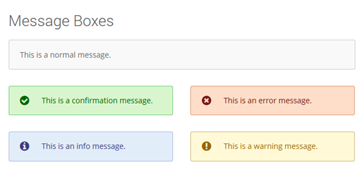
Message Boxes
[[message type="info"]Message Contents[/message]] Examples [message]This is a normal message.[/message] [message type='info']This is an info message.[/message] [message type='ok']This is a confirmation message.[/message] [message type='error']This is an error message.[/message] [message type='warning']This is a warning message.[/message] Message Attributes [definition title="type"]Specifies the type of message that will be shown. Possible values are normal, info, ok, error, warning (defaults to normal)[/definition]
Optin Forms
[[optin url="URL" captcha="URL"]] Examples [optin url="#" firstname="Your Name" size="medium" style="horizontal"] Optin Attributes [definition title="url"]Takes the URL of the action attribute in the form tag of your Mailchimp form. You should extract this from your Mailchimp account using the Embedded Forms generator.[/definition] [definition title="captcha"]Takes the name attribute of the CAPTCHA field in your Mailchimp form, to prevent bots from signing up to your list.[/definition] [definition title="email"]Specifies the title of your email field.[/definition] [definition title="firstname"]Specifies the title of your first name field. If blank, the field will not be used.[/definition] [definition title="lastname"]Specifies the title of your last name field. If blank, the field will not be used.[/definition] [definition title="submit"]Specifies the title of the submit button in your form.[/definition] [definition title="style"]Determines the layout of your form. Can be horizontal, vertical.[/definition] [definition title="size"]Determines the size of your form. Can be normal, medium, large.[/definition]
Post Lists
[[posts columns="2" style="list" author="none" excerpt="none" comments="none"]] Examples [posts columns="2" number="4" style="list" author="none" excerpt="none" comments="none"] Post List Attributes [definition title="type"]Specifies the post type to be queried. Defaults to post.[/definition] [definition title="number"]Specifies the number of posts to retrieve.[/definition] [definition title="columns"]Specifies the number of columns of the list.[/definition] [definition title="style"]Specifies the appearance of the list. Can be list, grid.[/definition]
Pricing Tables
[pricing title="Title" price="10" coin="€" url="URL" urltitle="Go"]Contents[/pricing] Example [column_half] [pricing title="Advanced" subtitle="example option" type="highlight" color="#f80" price="39.00" description="Per Month" before="$" after=""]Lorem ipsum dolor sit amet, consetetur sadipscing elitr, sed diam eirmod tempor invidunt ut labore et dolore.[/pricing] [/column_half][column_half_last] [pricing title="Basic" subtitle="example option" price="19.00" description="Per Month" before="$" after=""]Lorem ipsum dolor sit amet, consetetur sadipscing elitr, sed diam eirmod tempor invidunt ut labore et dolore.[/pricing] [/column_half_last] Pricing Attributes Pricing items are ideally used in conjunction with columns, so that you may have multiple pricing options side-by-side. Be aware that each pricing item should be placed in its own column, by using the columns shortcode. [definition title="title"]Determines the heading of the item.[/definition] [definition title="subtitle"]Determines the subheading of the item.[/definition] [definition title="price"]Sets the price value for the item. Can be any text.[/definition] [definition title="before"]Allows you to add text before the price value, such as '$'.[/definition] [definition title="after"]Allows you to add text after the price value, such as '/month'.[/definition] [definition title="color"]Determines the color scheme for the column. If used, the title and subtitle will appear white.[/definition] [definition title="type"]Determines the overall style for the column. Can be highlight.[/definition] [definition title="description"]Adds a small description underneath the price.[/definition]
Progress bar
[[progress value="30" title="HTML/CSS" background="#e08f27" gradient="#cc3290"]] Example [progress value="30" title="HTML/CSS" background="#e08f27" gradient="#cc3290"] Progress Bar Attributes [definition title="value"]The actual value of the bar, which determines how filled up it is. It can range from 0 to 100.[/definition] [definition title="size"]The size of the bar. Can be small, normal, medium or large.[/definition] [definition title="icon"]The icon for the progress bar. Can be any icon from the Font Awesome library minus the icon- prefix.[/definition] [definition title="title"]The title tag for the progress bar.[/definition] [definition title="background"]The background color of the bar.[/definition] [definition title="gradient"]The gradient color of the bar.[/definition]
Spacers
[[spacer height="40"]] Example A spacer will create a gap between two elements, across the entire content. You can use it to separate blocks of text or to create additional whitespace, should you need it. Dropcap Attributes [definition title="height"]Determines the height of the spacer, in pixels. Defaults to 25 pixels.[/definition]
Separators
[[separator title="A full separator with all elements." icon="map-marker" style="narrow" color="#f91" top="Go Back Up"]] Example [separator title="A full separator with all elements." icon="map-marker" color="#f91" top="Go Back Up"] Separator Attributes [definition title="title"]Specifies a small footnote for the separator.[/definition] [definition title="icon"]Sets an icon located at the center of the separator. Must be any icon from the Font Awesome library, minus the fa- prefix.[/definition] [definition title="style"]Controls the appearance of the separator. Can be normal, dashed, dotted, thick, narrow.[/definition] [definition title="color"]Determines the color of the separator icon.[/definition] [definition title="top"]Adds a small link text pointing to the top of the page.[/definition]
Tabbed Content
[[tabs style="horizontal"] [tab title="Title"]Content of tab[/tab] [/tabs]] Example [tabs style="horizontal"] [tab title="First Tab"]Lorem ipsum dolor sit amet, consectetur adipisicing elit, sed do eiusmod tempor incididunt ut labore et dolore magna aliqua. Ut enim ad minim veniam, quis nostrud exercitation ullamco laboris nisi ut aliquip ex ea commodo consequat. Duis aute irure dolor in reprehenderit in voluptate velit esse cillum dolore eu fugiat nulla pariatur. Excepteur sint occaecat cupidatat non proident, sunt in deserunt mollit anim id est laborum.[/tab] [tab title="Second Tab"]Lorem ipsum dolor sit amet, consectetur adipisicing elit, sed do eiusmod tempor incididunt ut labore et dolore magna aliqua. Duis aute irure dolor in reprehenderit in voluptate velit esse cillum dolore eu fugiat nulla pariatur. Excepteur sint occaecat cupidatat non proident, sunt in culpa qui officia deserunt mollit anim id est laborum.[/tab] [tab title="Last Tab"]Lorem ipsum dolor sit amet, consectetur adipisicing elit, sed do eiusmod tempor incididunt ut labore et dolore magna aliqua. Ut enim ad minim veniam, quis nostrud exercitation ullamco laboris nisi ut aliquip ex ea commodo consequat. Duis aute irure dolor in reprehenderit in voluptate velit esse cillum dolore eu fugiat nulla pariatur. [/tab] [/tabs] Tab Group Attributes [definition title="style"]Determines the overall position of the tabs. Can be horizontal or vertical.[/definition] Single Tab Attributes [definition title="title"]Determines the title of the tab. Each tab must have a different one.[/definition]
更新日志:
- Various fixes and updates
- Better sanitization
- Improved performance by selectively loading assets
- New shortcode: Definition lists!
- Fixed minor errors in the shortcode generator
- Fixed responsive styles for narrow and fit columns
- New shortcode: Login form!
- Fixed PHP warnings as well as faulty generator links
- Minor fixes
- New shortcode: Registration form!
- Changed the settings page to use the native WordPress Settings API.
- Overhauled the shortcode generator and added a revamped interface.
- Reorganized some of the shortcodes in the visaul editor button.
- Added better handling of defaults.
- Changed the Cycle library to Cycle 2.
- Optimized performance by loading JS scripts only when needed
- Fixed the section shortcode not being included.
- Added missing shortcodes to the visual editor generator.
- Added a new shortcode: mailchimp optin form.
- Added a new shortcode: animation area.
- Added a new shortcode: clearing div.
- Fixed the icon generator not displaying properly.
- The plugin has been completely revamped with many new features.
- Buttons now have background colors, gradients, icons and borders.
- Notices have renamed to Focus Boxes, meant to highlight content. Notices still work as a shortcode but are not supported.
- Focus Boxes now have gradient backgrounds.
- Accordions can now be set as as part of a group, allowing only a single one to remain open.
- Inline features can now have multiple icon sizes, colors, backgrounds, and borders.
- Team members have been upgraded with new contact info, layout, and social features.
- Testimonials can now be placed facing left or right.
- Counters have been streamlined.
- Added more options to progress bars, such as gradients.
- Custom lists no longer affect a UL HTML element. They are now a single list item for flexibility purposes.
- Separators now have icons, descriptions, and various styles.
- Added more options to the posts shortcode to better filter queries.
- Attributes that now take an image can have either a full URL or a post ID.
- Cleaned styles and improved overall CSS.
- Added background colors, gradients, icons and borders to focus boxes.
- Added a setting to specify a shortcode prefix in order to avoid conflicts.
- Changed JS files to use the TinyMCE version 4.X API.
- Fixed team shortcodes and added animation, timeout, and speed parameters to slideshows
- Fixed minor CSS issues and markup corrections
- Plugin release, yay!