CSS Breakpoint
| 开发者 | andreadegiovine |
|---|---|
| 更新时间 | 2019年5月4日 22:22 |
| 捐献地址: | 去捐款 |
| PHP版本: | 7 及以上 |
| WordPress版本: | 5.1.1 |
| 版权: | GPLv2 or later |
详情介绍:
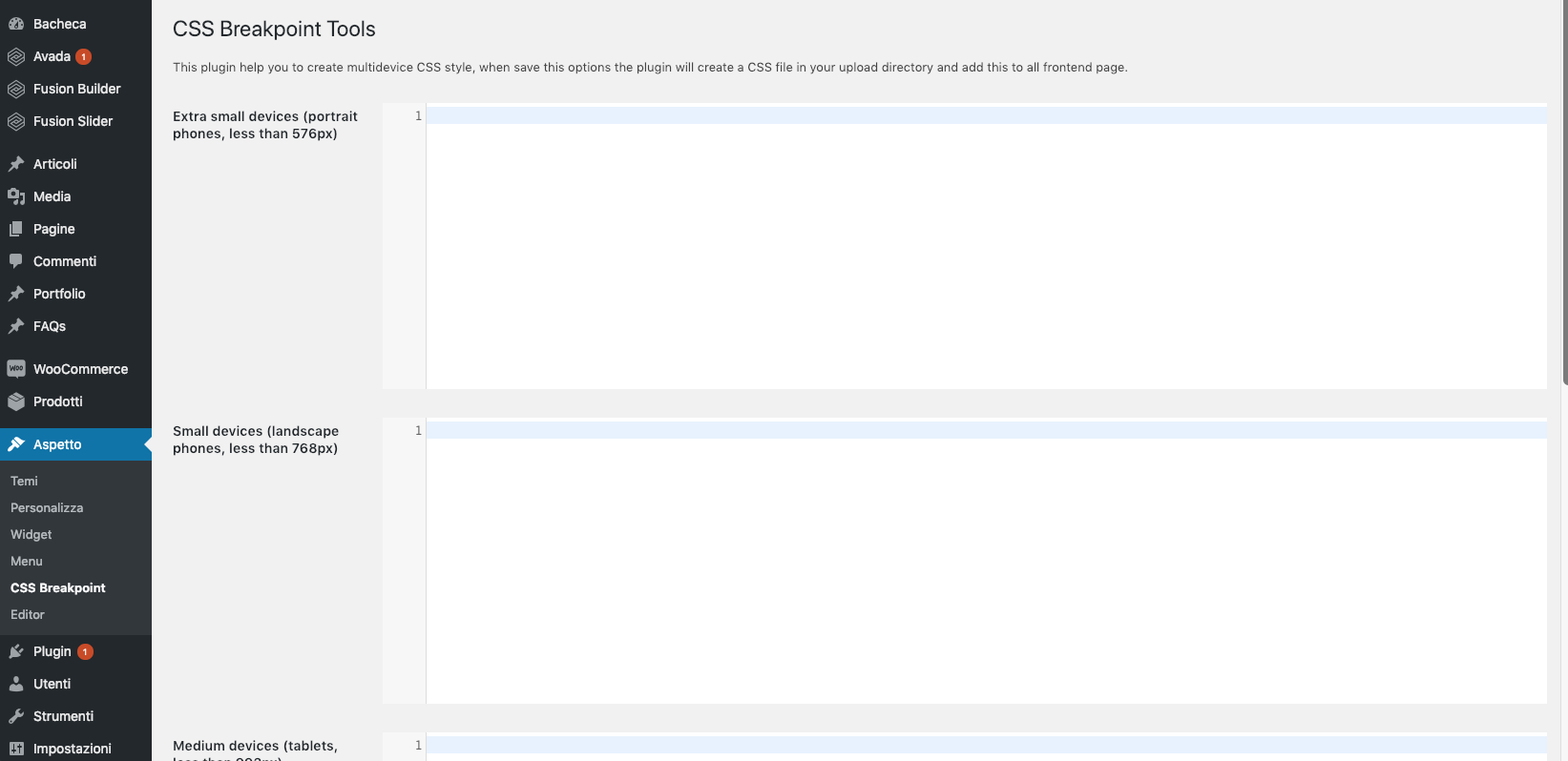
Set CSS styles for 4 different devices (small phones, phones, tablets, desktops) easily:
- Extra small devices (portrait phones, less than 576px)
- Small devices (landscape phones, less than 768px)
- Medium devices (tablets, less than 992px)
- Large devices (desktops, less than 1200px)
安装:
Upload the CSS Breakpoint plugin to your blog, Activate it.
1, 2, 3: You're done!
屏幕截图:
常见问题:
Can I reduce the size of the logo for mobile devices?
Yes sure! Just enter the styles in the "768px" section.
Can I increase the size of the post title for desktops?
Yes sure! Just enter the styles in the "1200px" section.
更新日志:
0.1.0
- Improve ux.
