Device Mockups
| 开发者 |
mrdink
phikai |
|---|---|
| 更新时间 | 2017年9月18日 10:42 |
| PHP版本: | 3.7 及以上 |
| WordPress版本: | 4.8.1 |
| 版权: | GPLv2 or later |
| 版权网址: | 版权信息 |
详情介绍:
Show your work in high resolution, responsive device mockups using only shortcodes. Wrap images, videos, or any other content within a few simple shortcodes to display them within any of the pre-packaged devices mockups, which are easily selectable from within the editor.
Documentation
Available shortcodes
- [device][/device]
- [browser][/browser]
- type: imac|iphone6|iphone6-plus|iphone5s|iphone5|s3|lumia920|ipad|nexus7|surface
- color: black|white|gold|silver
- orientation: portrait|landscape
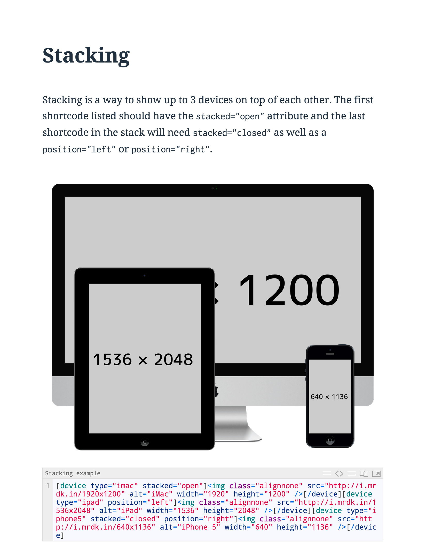
- stacked: open|closed
- position: left|right
- link
- width: (px or %)
- hide: left|right
- scroll: false
- gallery: false
- type: chrome|firefox|safari
- link
- width: (px or %)
- gallery: false
- Add gallery="true" to your device|browser shortcode
- Add your images within your device
- Add a
<div>around each image within the device
- iPhone 6 – 1334×750
- iPhone 6 Plus – 1920×1080
- iPhone 5s – 1136×640
- iPhone 5 – 640×1136
- iPad – 2048×1536
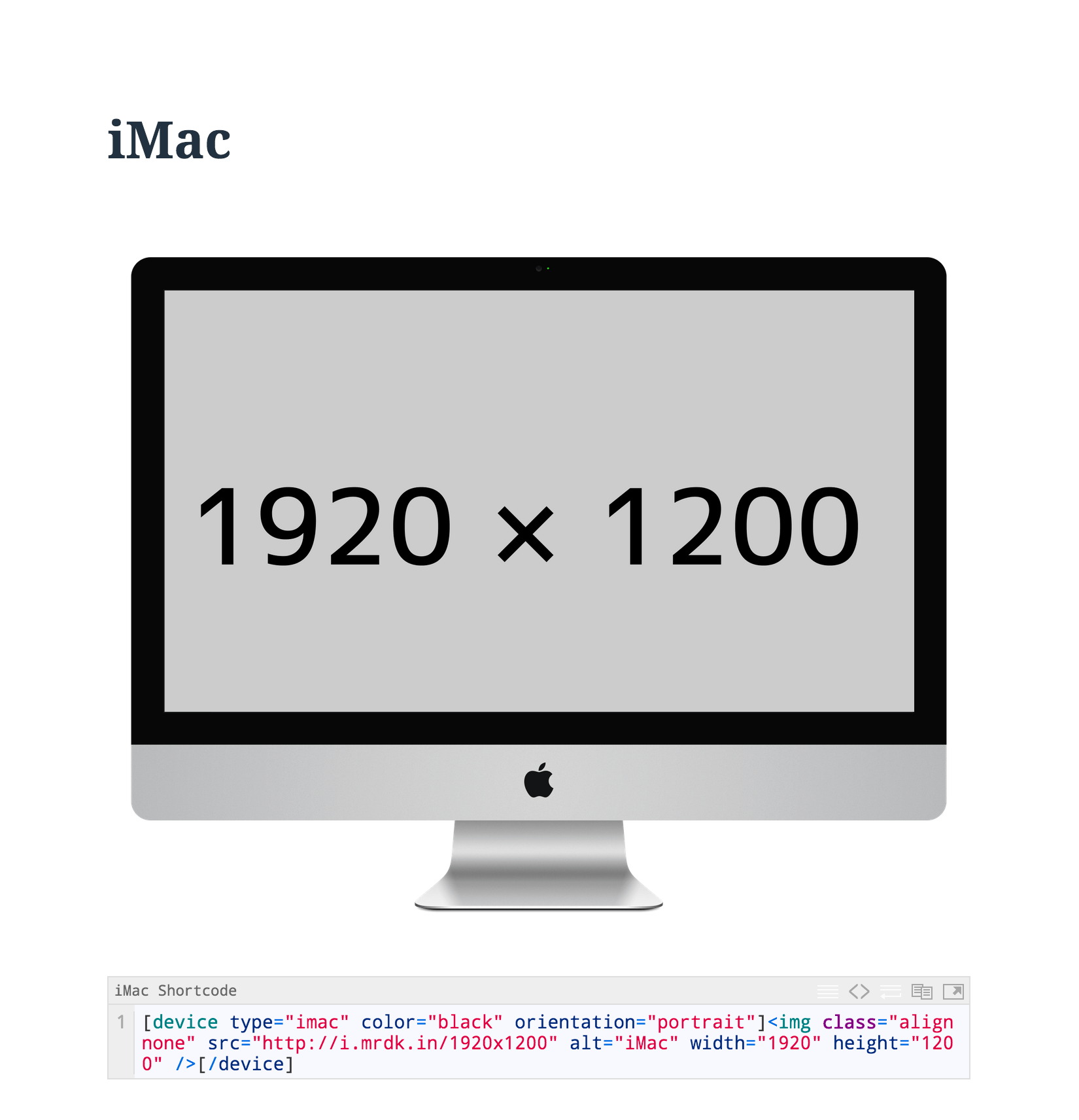
- iMac – 1920×1200
- Macbook Pro – 1440×900
- Galaxy S3 – 720×1280
- Nexus 7 – 1920×1200
- Surface – 1920×1080
- Lumia 920 – 768×1280
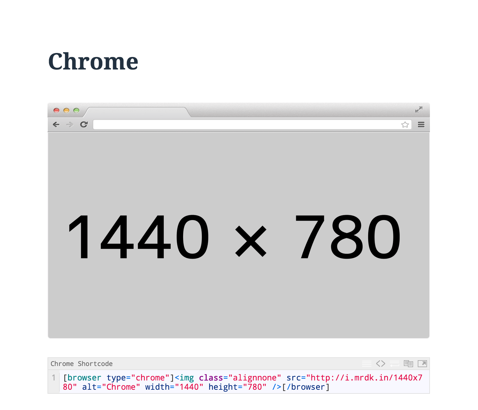
- Chrome – 1440×900
- Firefox – 1440×900
- Safari – 1440×900
安装:
- Upload the plugin files to the
/wp-content/plugins/device-mockupsdirectory, or install the plugin through the WordPress plugins screen directly. - Activate the plugin through the 'Plugins' screen in WordPress
屏幕截图:
更新日志:
1.8.2
- added filters back to fix the gallery
- Added composer to grab latest wpcs and phpcs
- Removed shortcode filter
- More code optimization to meet WordPress Coding Standards
- Removed [dm-gallery] shortcode and replaced it with a simpler way to create a gallery
- Simplified CSS by using @extend
- More code optimization
- updated code to reflect WordPress Coding Standards
- optimized images to help save on loading time
- this release is mainly to clean up code so that I can start working on future updates
- adding ability to scroll within the device
- cleaned up code
- added support for jetpack videos
- optimized output to work better with other shortcodes i.e. page builders
- removed conditional statements to check for if shortcode is used to enqueue and moved enqueue within the shortcode function
- shortcodes will work within widgets now
- semi-major update
- re-wrote entire code base
- styles and scripts only enqueue when shortcodes are used
- re-organized tinymce button
- switched to slick.js for gallery slider
- added internalization
- pull request from @irazasyed to fix the custom url to the plugin dir
- removed README.md
- added FlexSlider
- fixed a CSS issues with iPhone 6
- fixed stacking button in editor
- reverted to node-sass
- updated file structure
- URL fix in the readme.txt
- image optimization
- added iPhone 6, iPhone 6 Plus, and iPhone 5s
- added an attribute to hide the left or right of the device (currently doesn't work with stacking) - idea credit to @raphaelkross
- added browsers (chrome, firefox, and safari)
- added hiding but currently in beta
- added documentation link to plugin
- and much more
- added icons to support WP 4.0 installer (Created by @timm3h)
- added more browser prefixes
- fixed a bug reported by Barn2Media
- added width attribute. (Example width="80%" or width="400px")
- note that
widthisn't for overall width ofstackeddevices. I suggest wrapping thestackeditems in a div and applying a max-width
- added the ability to wrap a link around a device screen
- added missing styles for stacked devices
- added the unminified CSS file and removed Neat
- added conditionals for data attributes
- added screenshot for shortcodes button
- added version string to CSS
- fixed a conditional statement that was outputting classes that weren't needed
- added TinyMCE button for predefined shortcodes
- formatting fixes for readme.txt :)
- readme.txt fixes
- Initial commit


