Easy Responsive Shortcodes
| 开发者 | wpcmsdev |
|---|---|
| 更新时间 | 2014年10月24日 08:20 |
| PHP版本: | 3.9 及以上 |
| WordPress版本: | 4.0 |
| 版权: | GPLv2 or later |
| 版权网址: | 版权信息 |
详情介绍:
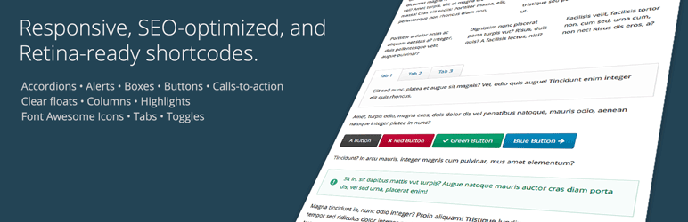
This plugin provides a full set of easy-to-use shortcodes for creating columns, buttons, tabs, icons, and much more. It's been designed especially for use in responsive themes, but should work fine in any theme, whether responsive or not. It's also fully Retina-display ready, and search engine optimized. The plugin is designed to be fast, easy, and lightweight, and does not bring along any massive frameworks like Bootstrap that slow down your site.
The plugin currently supports the following items, with more on the way:
- Accordion
- Alert
- Box
- Button
- Call-to-action
- Clear floats
- Columns
- Highlight
- Icon (via Font Awesome)
- Tabs
- Toggle
display: none in the bundled CSS, which can have negative SEO effects as well.
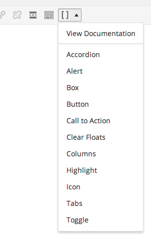
There will be an editor button added to your post editor toolbar, allowing you to quickly insert the example code of any of the shortcode elements into your editor window.
Finally, we've included a LESS CSS source file, so if you're into that type of thing, you can easily change the plugin's colors to your liking merely by adjusting a few LESS variables and re-compiling.
We'd love to hear your feedback. Let us know what you think! Also be sure to sign up for our email newsletter at wpcmsdev.com.
安装:
Install like any other plugin:
- Go to Plugins > Add New, search for "Easy Responsive Shortcodes", and install.
- Or: Download the plugin's ZIP file, Go to Plugins > Add New > Upload, and upload the plugin.
- Or: Download the plugin's ZIP file, unzip it, and upload it using FTP to
/wp-content/pugins/.
屏幕截图:
其他记录:
If you're a theme developer, we've made it simple for you to integrate this plugin into your theme, and style it to match your theme's look-and-feel. Just add theme support for the plugin (see below), and the plugin's included CSS styles will be disabled, giving you as the developer complete stylistic control, without interference from the plugin's CSS styles that would normally be active.
To disable the plugin's bundled CSS styles, add theme support for
wpcmsdev-easy-responsive-shortcodes to your theme setup function:
add_theme_support( 'wpcmsdev-easy-responsive-shortcodes' );
Also, if your theme already includes the Font Awesome icon set, you can indicate that by declaring support for it in your theme, in which case the plugin will not attempt to load its own bundled copy of Font Awesome in addition to yours.
add_theme_support( 'font-awesome-icons' );常见问题:
Q: What are the available colors that I can use for the color parameters?
A: You can use the following colors:
- black
- blue
- gray
- green
- orange
- red
- violet
- yellow
Usage
Here is the syntax for each of the shortcodes, along with an example. In addition to the parameters listed below, each shortcode can accept a "class" parameter, allowing you to give any element a unique CSS class. Required parameters are marked with an asterisk.
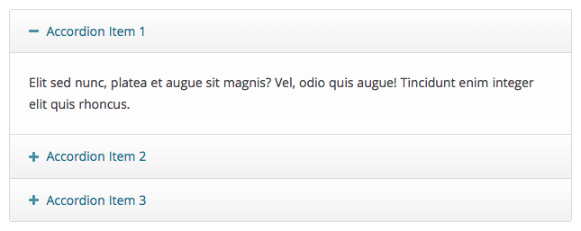
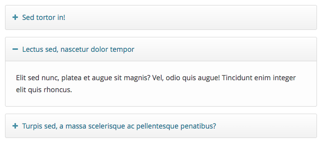
Accordion
Shortcodes: accordion, accordion_item
Accordion Item Parameters:
- title*: The title of the accordion item.
[accordion] [accordion_item title="Accordion Item 1 Title"] Accordion item 1 content goes here. [/accordion_item] [accordion_item title="Accordion Item 2 Title"] Accordion item 2 content goes here. [/accordion_item] [accordion_item title="Accordion Item 3 Title"] Accordion item 3 content goes here. [/accordion_item] [/accordion]
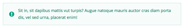
Alert
Shortcode: alert
Parameters:
- color: The alert box color.
- icon: The alert box icon.
[alert color="red" icon="exclamation-circle"] Alert text goes here. [/alert]
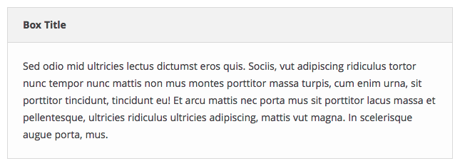
Box
Shortcode: box
Parameters:
- title: The title of the box.
[box title="Box Title"] Box text goes here. [/alert]
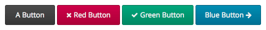
Button
Shortcode: button
Parameters:
- color: The button color.
- rel: The button rel attribute, i.e.
nofollow - target: The button target, i.e.
_blankto open the link in a new window. - title: The button title attribute (tooltip).
- url*: The button URL.
[button color="red" url="http://domain.com"]Click Me![/button]
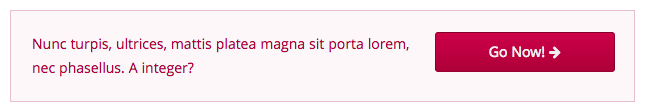
Call-to-action
Shortcode: call_to_action
Parameters:
- button_color: The call-to-action button color.
- button_icon: The call-to-action button icon.
- button_icon_position: The call-to-action button icon position (left/right).
- button_text: The call-to-action button text.
- button_url: The call-to-action button URL.
- color: The call-to-action box color.
- layout: The call-to-action box layout style (horizontal/vertical)
[call_to_action color="red" button_text="Go Now!" button_url="http://domain.com" button_color="black"] Call-to-action text goes here. [/call_to_action]
Clear floats
Shortcode: clear_floats
Example:
[clear_floats]
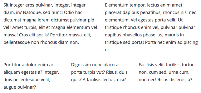
Columns
Shortcodes: columns, column
Column Parameters:
- width: The column width.
- one-half
- one-third
- two-thirds
- one-fourth
- three-fourths
- one-fifth
- two-fifths
- three-fifths
- four-fifths
[columns] [column width="one-third"] Column 1 text goes here. [/column] [column width="one-third"] Column 2 text goes here. [/column] [column width="one-third"] Column 3 text goes here. [/column] [/columns]
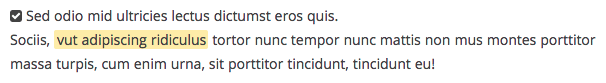
Highlight
Shortcode: highlight
Parameters:
- color: The color of the highlight.
- text_color: The color of the highlighted text.
[highlight color="yellow" text_color="red"]Highlighted text content goes here.[/highlight]
Icon
Shortcode: icon
Parameters:
- color: The icon color.
- id*: The Font Awesome icon ID, i.e. "soccer-ball".
[icon id="soccer-ball" color="orange"]
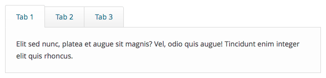
Tabs
Shortcodes: tabs, tab
Tab Parameters:
- title*: The tab title.
[tabs] [tab title="Tab 1 Title"] Tab 1 text goes here. [/tab] [tab title="Tab 2 Title"] Tab 2 text goes here. [/tab] [tab title="Tab 3 Title"] Tab 3 text goes here. [/tab] [/tabs]
Toggle
Shortcode: toggle
Parameters:
- title*: The toggle title.
更新日志:
1.0.1
- Fixed the
clear_floatsshortcode
- Initial release.