Fluid Design System for Elementor
详情介绍:
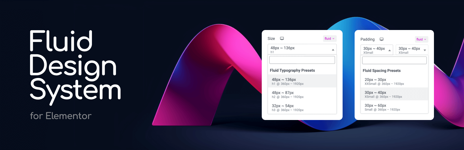
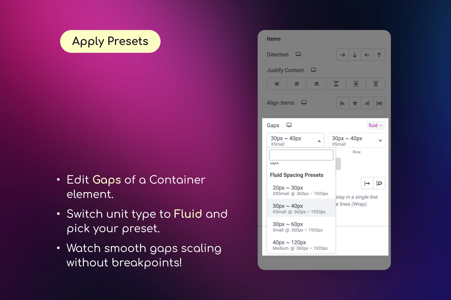
- Define minimum and maximum values for typography or spacing.
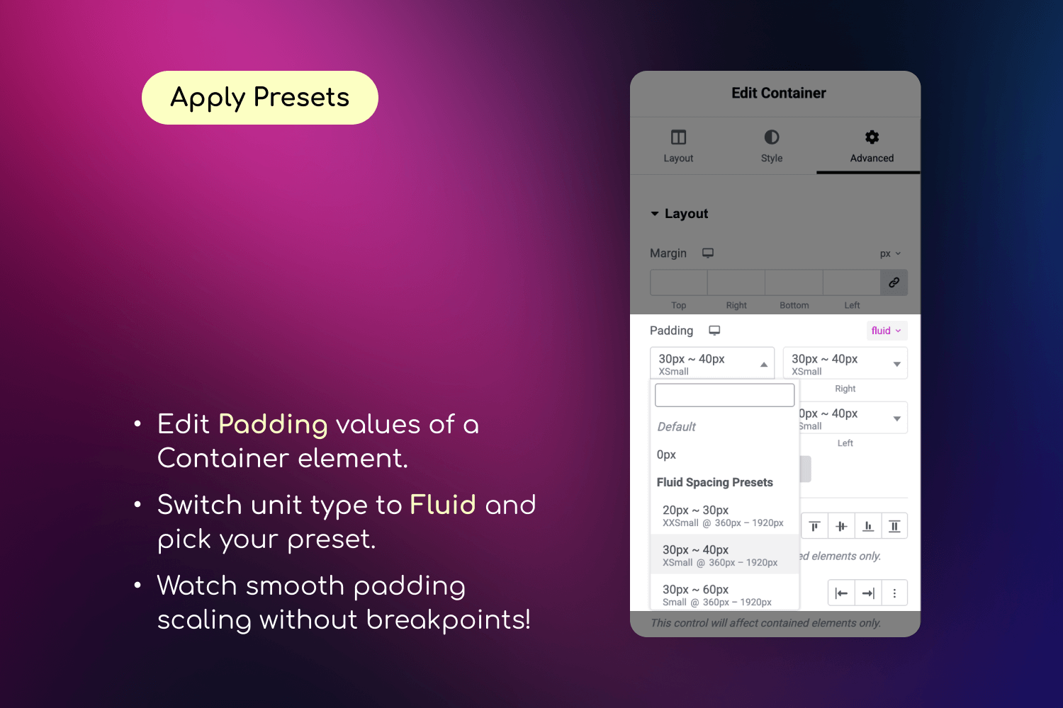
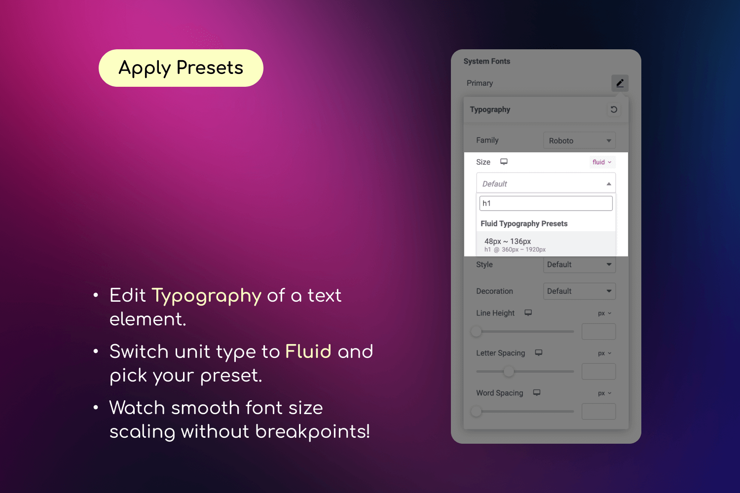
- Apply those values using a new "fluid" unit inside any Elementor control.
- Watch your design scale smoothly—no coding or media queries required.
- Organize your presets into custom groups (e.g. "Border Radius", "Thumbnail Sizes") for better management. Say goodbye to manually tweaking every breakpoint. Say hello to automatic, intelligent design scaling with organized preset management.
安装:
- Install and activate the plugin from the Plugins screen in WordPress.
- Make sure Elementor plugin is installed and activated
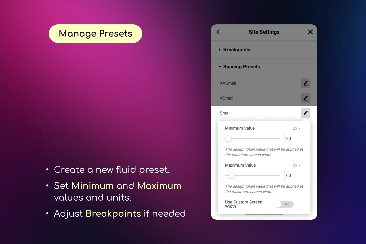
- Go to Elementor Editor > Site Settings > Fluid Typography & Spacing to create your presets
- Select "fluid" unit in Elementor controls to use your presets
- Once applied, your designs will fluidly scale across all screen sizes!
屏幕截图:
常见问题:
Do I need to know CSS to use this plugin?
No coding or CSS knowledge required. Everything is managed through Elementor's familiar interface.
Will this work with my Elementor widgets?
Yes! The fluid units are available in any Elementor control that supports "custom" units, including typography, spacing, paddings, margins, gaps and more.
Will this work with my current theme?
Yes! The plugin works with any WordPress theme, including the default Hello theme by Elementor.
Will this slow down my website?
No! The plugin uses Elementor's native CSS generation system, ensuring optimal performance. The fluid calculations are done once during CSS generation, not during page load.
How is this different from using viewport units like vw or vh?
Viewport units (like vw) scale based on the entire screen width, but they have no upper or lower limit — which can lead to text or spacing being too small on mobile or too large on desktops. Fluid units in this plugin use CSS clamp() behind the scenes, which means you define a minimum and maximum value. The result scales smoothly between those values — giving you precise, predictable, and accessible designs across all screen sizes.
Can I use different units (px, em, rem) in my presets?
Yes! You can mix different units in your presets, like using "3em" as a minimum value and "160px" as a maximum value.
Can I use custom breakpoints for different presets?
Yes! You can set global breakpoints or define custom breakpoints for each individual preset. The default values (360px to 1920px) are just suggestions - you can set any values that work best for your design.
Does this plugin support AI agents / MCP?
Yes. On WordPress 6.9+ with the MCP Adapter plugin active, the plugin registers a fluid-design-system MCP server for managing presets and preset groups. AI agents like Claude Code can list, create, update, move, and delete presets programmatically. See the Developer Reference for connection details.
What browsers are supported?
The plugin uses the CSS clamp() function, which is supported by all modern browsers, including:
- Chrome 79+
- Firefox 75+
- Safari 13.4+
- Edge 79+
- Opera 66+
- iOS Safari 13.4+
- Android Chrome 79+
更新日志:
- fixed: the preset dialog could be closed with the Escape key while saving, hiding save errors
- fixed: the Save button in the "Edit Preset" dialog could stay disabled on slow connections
- fixed: preset groups created outside the editor now appear in the save dialog without reloading
- fixed: retrying after a failed save could create duplicate presets
- improved: preset names display consistently after saving
- fixed: presets created or edited directly in the editor could disappear after saving Site Settings
- fixed: fatal error when Elementor is deactivated while the plugin is active (WordPress 6.9+)
- improved: overall stability and reliability
- added: preview the smallest and largest screen sizes of a fluid value while editing, without switching device mode
- improved: full compatibility with WordPress 7.0
- fixed: fluid presets now display correctly in the "Show global settings" styleguide preview
- fixed: plugin styles and scripts not loading on some hosting providers with symlinked directories (e.g. Hostinger)
- improved: updated internal dependencies with latest security patches
- added: AI agent integration via WordPress Abilities API and MCP server
- added: MCP tools for programmatic preset and group management (list, create, update, delete, move)
- fixed: background position and similar styles could render incorrectly when using fluid presets
- fixed: prevent double widget initialization in Elementor editor when used alongside themes bundling arts/elementor-extension
- fixed: prevent duplicate widget handler scripts when multiple plugins bundle arts/elementor-extension
- fixed: resolved conflicts with themes and plugins using older shared libraries
- improved: enhanced security with better input validation
- improved: overall code quality and reliability
- added: faster workflow - adjust preset values without leaving Elementor editor
- improved: see how changes affect your design as you type
- fixed: custom fluid values now sync correctly when dimensions are linked
- added: set fluid values directly in controls ("20px ~ 100px") without visiting Site Settings
- added: save inline values as reusable presets with one click
- improved: full support for linked dimensions and gaps
- fixed: preset min/max values are now preserved when switching between different units
- improved: better validation for preset data to prevent display issues
- improved: enhanced code quality and reliability for better performance
- improved: updated to modern PHP standards for improved security
- updated: minimum PHP requirement is now 8.0 (WordPress and Elementor fully support PHP 8.0+)
- improved: preset search now shows all presets when group name matches
- improved: security fixes
- added: Admin interface for managing preset groups (Elementor > Fluid Design System)
- added: Cross-group preset management with drag and drop functionality
- added: Custom preset groups creation, editing, and deletion
- added: Developer-friendly filter-based groups with code examples
- improved: optimize CSS generation for formulas with equal min/max values
- improved: improve fluid preset display for equal min/max values
- improved: add display_value support for custom presets added via hooks
- added: 'em' unit support to size options in Fluid Typography and Spacing controls
- added: full support for negative values
- improved: proper scale when min value is larger than max value
- fixed: improve performance in Elementor editor when working with "fluid" unit
- fixed: "custom" units stopped to render correct values in Elementor editor when the plugin is active
- fixed: PHP Warning "Undefined array key" when saving presets
- fixed: plugin error when Elementor is not active
- added: plugin action links to WordPress admin plugins page
- Initial release