Gallery - Photo Gallery - Image Gallery - Photo Albums - Portfolio - WordPress Gallery Plugin
| 开发者 |
gallery-bank
contact-banker |
|---|---|
| 更新时间 | 2021年3月13日 19:38 |
| PHP版本: | 3.0 及以上 |
| WordPress版本: | 4.8 |
| 版权: | GPLv2 or later |
| 版权网址: | 版权信息 |
标签
下载
详情介绍:
- Gallery Bank - Image Gallery
- Detailed Features for Photo Gallery Plugin
- Front End Demos for WP Gallery Plugin
- Back End Demos for Photo Albums and Photo Gallery
- Gallery Bank Documentation (Pro Editions)
- Upgrade to Gallery Bank Premium Editions now!
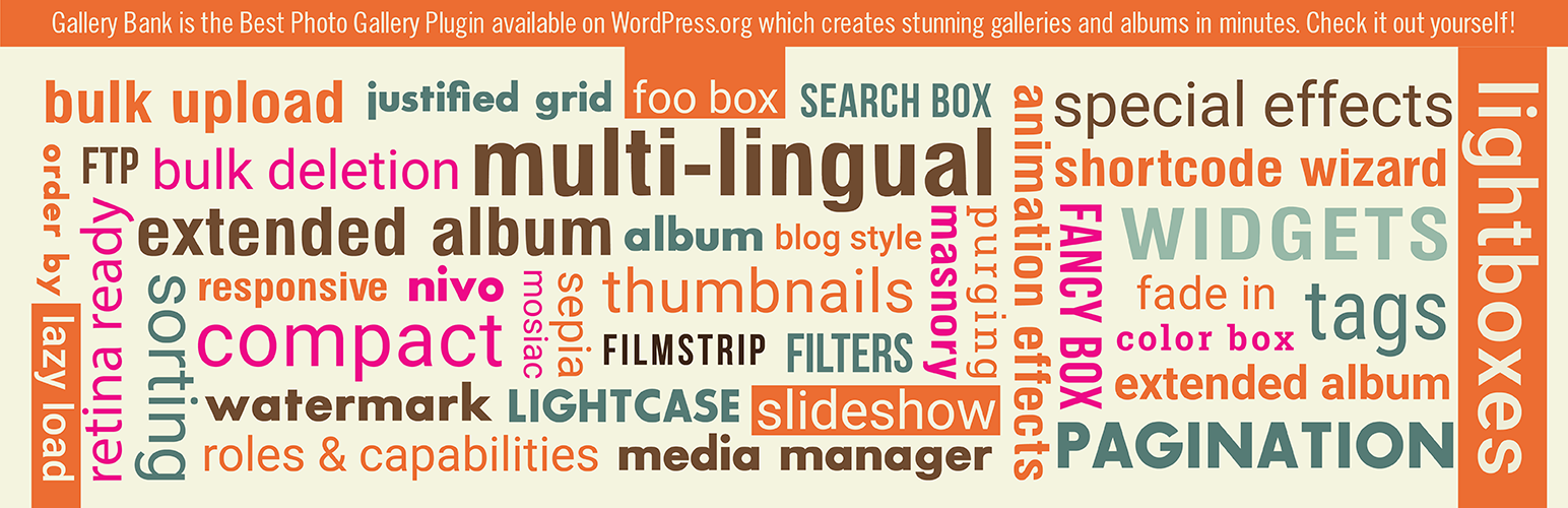
WordPress Gallery Plugin Demos for Masonry GalleryWhether you specialize in photography, creative designs, or a journalistic exploration, your photos tell a unique story and deserve to be presented in the best way possible. Gallery Bank is so popular for a reason. It's so easy to use and has loads of different functions that make your life alot easier. Perfectly what so many other photo gallery plugins try to do but always fall short. Gallery Bank is already the most powerful yet simple WordPress gallery plugin ever made. It delivers a very robust system for the management, categorization and display of your images which is a perfect combination for photographers. Gallery Bank is the best image gallery plugin for WordPress. Still asking why? Stunning gallery layouts, responsive, deeplinking, pagination, watermarking, image proofing, easy to use. Let's show off your portfolio, work and experience to prospective clients and employers with our photo gallery plugin today. Gallery Bank is highly optimized for performance because we understand the importance of speed when it comes to SEO and conversion. Create Filterable Portfolio with Premium Editions WordPress Photo Gallery Plugin is one of the Best WordPress Gallery Plugin designed to create elegant and beautiful photo gallery and photo albums using Masonry Gallery Layouts, Thumbnail Gallery Layouts, Compact Album Layouts and Extended Album Layouts along with Special Effects and Animation Effects. WordPress Photo Gallery Plugin is the only available WordPress Gallery Shortcode Plugin in the market with extra-ordinary features. It is loaded with 200+ features and you can create stunning albums, photo gallery, portfolio gallery on any of your WordPress site/blog. WordPress Photo Gallery Plugin provides a powerful photo gallery engine for uploading and managing photo albums of images, with the ability to batch upload, delete, rearrange and sort images. It is the best Gallery Plugin for WordPress which is being regularly updated for new features and its simplicity of usage along with efficient functionality makes it a perfect choice among photographers to have a stunning look for their sites. #1 WordPress Filterable Portfolio Plugin There are also Premium Editions for the Gallery Plugin for WordPress with much more useful pro features available. Gallery Bank has been downloaded over 25,00,000 times. Smart photographers, designers, and developers love Gallery Bank, and you will love too! Upgrade to Premium Editions - Best Wordpress Gallery Plugin Wordpress Photo Gallery Plugin - Key Features (Free)WordPress Gallery Images Demos for Thumbnail Grid Gallery
- Masonry Gallery - WordPress Image Gallery Plugin
- Masonry Gallery with WordPress Gallery Lightbox - Gallery Wordpress Plugin
- Masonry Gallery with 分页 - Photo Gallery WordPress Plugin
- Masonry Gallery with Lazy Load - Best WordPress Gallery Plugin
- Masonry Gallery with Filters
- Masonry Gallery with Order By
- Masonry Gallery with Search Box
- Masonry Gallery with Watermark
- Masonry Gallery with Animation Effects
- Masonry Gallery with Special Effects
Gallery Plugin Demos for Slideshow Gallery
- Thumbnail Grid Gallery - WordPress Image Gallery Plugin
- Thumbnail Grid Gallery with WordPress Gallery Lightbox - Gallery Wordpress Plugin
- Thumbnail Grid Gallery with Pagination - Photo Gallery WordPress Plugin
- Thumbnail Grid Gallery with Lazy Load - Best WordPress Gallery Plugin
- Thumbnail Grid Gallery with Filters
- Thumbnail Grid Gallery with Order By
- Thumbnail Grid Gallery with Search Box
- Thumbnail Grid Gallery with Watermarking
- Thumbnail Grid Gallery with Animation Effects
- Thumbnail Grid Gallery with Special Effects
Photo Gallery Plugin Demos for Image Browser Gallery
- Slideshow Gallery - WordPress Image Gallery Plugin
- Slideshow Gallery with Lazy Load - Best WordPress Gallery Plugin
- Slideshow Gallery with Filters
- Slideshow Gallery with Order By
- Slideshow Gallery with Search Box
- Slideshow Gallery with Watermarking
- Slideshow Gallery with Animation Effects
- Slideshow Gallery with Special Effects
Image Gallery Plugin Demos for Justified Grid Gallery
- Image Browser Gallery - WordPress Image Gallery Plugin
- Image Browser Gallery with Lazy Load - Best WordPress Gallery Plugin
- Image Browser Gallery with Filters
- Image Browser Gallery with Order By
- Image Browser Gallery with Search Box
- Image Browser Gallery with Watermarking
- Image Browser Gallery with Animation Effects
- Image Browser Gallery with Special Effects
Gallery Images Demos for Blog Style Gallery
- Justified Grid Gallery - WordPress Image Gallery Plugin
- Justified Grid Gallery with WordPress Gallery Lightbox - Gallery Wordpress Plugin
- Justified Grid Gallery with Pagination - Photo Gallery WordPress Plugin
- Justified Grid Gallery with Lazy Load - Best WordPress Gallery Plugin
- Justified Grid Gallery with Filters
- Justified Grid Gallery with Order By
- Justified Grid Gallery with Search Box
- Justified Grid Gallery with Watermarking
- Justified Grid Gallery with Animation Effects
- Justified Grid Gallery with Special Effects
Photo Albums Demos for Compact Albums
- Blog Style Gallery - WordPress Image Gallery Plugin
- Blog Style Gallery with WordPress Gallery Lightbox - Gallery Wordpress Plugin
- Blog Style Gallery with Pagination - Photo Gallery WordPress Plugin
- Blog Style Gallery with Lazy Load - Best WordPress Gallery Plugin
- Blog Style Gallery with Filters
- Blog Style Gallery with Order By
- Blog Style Gallery with Search Box
- Blog Style Gallery with Watermarking
- Blog Style Gallery with Animation Effects
- Blog Style Gallery with Special Effects
Photo Albums Demos for Extended Albums
- Photo Albums using Compact Album Layout - WordPress Image Gallery Plugin
- Compact Album with WordPress Gallery Lightbox - Gallery Wordpress Plugin
- Compact Album with Pagination - Photo Gallery WordPress Plugin
- Compact Album with Lazy Load - Best WordPress Gallery Plugin
- Compact Album with Filters
- Compact Album with Order By
- Compact Album with Search Box
- Compact Album with Watermarking
- Compact Album with Animation Effects
- Compact Album with Special Effects
Gallery Lightbox Demos
- Photo Albums using Extended Album Layout - WordPress Image Gallery Plugin
- Extended Album with WordPress Gallery Lightbox - Gallery Wordpress Plugin
- Extended Album with Pagination - Photo Gallery WordPress Plugin
- Extended Album with Lazy Load - Best WordPress Gallery Plugin
- Extended Album with Filters
- Extended Album with Order By
- Extended Album with Search Box
- Extended Album with Watermarking
- Extended Album with Animation Effects
- Extended Album with Special Effects
- Easy to use.
- 100% Responsive.
- Retina Support
- Clean and Modern Design
- Ajax Themes Compatibility
- Masonry Gallery
- Thumbnails Gallery
- Top Notch Support
- Strong SEO Foundation
- Shortcode Generator
- User Friendly Admin Panel to add Galleries.
- Create & Manage upto 5 galleries on your WordPress site/blog.
- Upload unlimited amount of photos/images in your gallery.
- Images uploaded are stored in a separate directory to avoid mess up with inbuilt wp-uploads folder.
- Photo Metadata is fetched from each image and populates to Title, Description, Alt Text Fields too.
- Photo Metadata is retrieved as per IPTC Standard mentioned here
- Add Gallery Title and Description to each of your photo galleries and albums.
- Add Image Title, Image Description, Alt Text to each of your images.
- Possibility to exclude images from displaying in a particular photo gallery.
- Add single or multiple galleries to your page or post using a shortcode.
- Supports Masonry Layout and Thumbnail Layouts.
- Custom CSS Toolbox
- Configure Thumbnail Dimensions in Global Options
- Right Click Protection Feature in Global Options
- Language Direction Feature in Global Options
- Shortcode Wizard to add gallery shortcodes on your Page/Post.
- Gallery Widget to let you use your photo albums and galleries on your widget section.
- Advanced Compatibility - in our gallery we implement advanced compatibility options to avoid conflict with libraries of another plugins and theme. You can switch between modes to find properly value for your gallery and your case.
- Multisite Support - in gallery implemented multisite support. You can install gallery in admin dashboard and enable plugin for all child blogs.
- All Standard Edition Features as mentioned above.
- Supports Thumbnail Gallery, Masonry Gallery, Slideshow Gallery, Image Browser Gallery, Justified Grid Gallery, Blog Style Gallery, Compact Album, Extended Album.
- Compact Albums displays in a grid gallery format whereas Extended Albums displays in a List format.
- Manage Galleries
- Upload Images using PL Uploader, WP Media Manager, FTP Folder, Upload Video
- Batch images upload - gallery have advanced media manager which allow to upload batch of the images by one click. Just drag and drop set of the gallery images and it�s upload automatically to the server.
- Video Gallery from Youtube, Facebook, Vimeo etc.
- Set Thumbnail as Cover Image.
- Apply Tags to use as Filters for your filterable portfolio.
- Edit Images - Crop, Rotate Anti Clockwize, Rotate Clockwize, Flip Images Vertically, Flip Images Horizontally, Restore Images, Watermarking.
- Auto-resizing for thumbnails and images - gallery media manager allow you make additional customization of the gallery images, like: rotation, flip, crop, manual resize.
- Edit Images - Effects such as Grayscale, Negative, Removal, Sepia, Slate, Saturate, Brightness, Contrast.
- Customizable Special Effects and Animation Effects - all gallery effects working in cooperation with gallery interface configuration options.
- Copy Images to other Galleries, Move Images to other Galleries.
- Sort Galleries - Drag & Drop Images to provide Custom Order/Sequence for displaying as per your needs.
- Manage Albums - Edit existing Album, Delete Album, Delete All Albums
- Add Album - Album Title & Description
- Add Album - Add Existing Galleries to your Album to display on Front End.
- Sort Galleries - Drag & Drop Images to provide Custom Order/Sequence for displaying as per your needs.
- Manage Tags - Edit Tags, Delete Tags
- Add Tags - Tag Name, Description for Filters to be applied later to Galleries, Albums
- Customize Thumbnail Gallery - Layout Settings for Thumbnails, Gallery Title & Description, Thumbnail Title & Description.
- Customize Masonry Gallery - Layout Settings for Thumbnails, Gallery Title & Description, Thumbnail Title & Description.
- Customize Slideshow Gallery - Layout Settings for Thumbnails, Gallery Title & Description, Thumbnail Title & Description.
- Customize Image Browser Gallery - Layout Settings for Thumbnails, Gallery Title & Description, Thumbnail Title & Description.
- Customize Justified Grid Gallery - Layout Settings for Thumbnails, Gallery Title & Description, Thumbnail Title & Description.
- Customize Blog Style Gallery - Layout Settings for Thumbnails, Gallery Title & Description, Thumbnail Title & Description.
- Customize Compact Album Gallery - Layout Settings for Thumbnails, Gallery Title & Description, Thumbnail Title & Description.
- Customize Extended Album Gallery - Layout Settings for Thumbnails, Gallery Title & Description, Thumbnail Title & Description.
- Customize Layouts using Custom CSS.
- Customize Lightcase Lightbox - General Settings, Image Title, Image Description.
- Customize Fancy Box Lightbox - General Settings, Image Title, Image Description.
- Customize Color Box Lightbox - General Settings, Image Title, Image Description.
- Customize Foo Box Free Edition - General Settings, Image Title, Image Description.
- Customize Nivo Lightbox - General Settings, Image Title, Image Description.
- Global Options - Configure Thumbnail Dimensions, Right Click Protection, Language Direction
- Lazy Load Settings - Customize Lazy Load Settings for loading of Images in Galleries and Albums.
- 过滤设置 - Customize Filter Settings to create Filterable Photo Gallery for your website/blog.
- Order By Settings - Customize Order By Button.
- Search Box Settings - Customize Search Button to make your galleries also searchable.
- Page Navigation Settings - Customize Page Navigation to make your galleries to divide into pages.
- Watermark Settings - Customize Watermark Settings to make your galleries enabled with watermarking.
- Advertisement Settings - Customize Advertisement Settings to make your WordPress gallery lightbox loaded with advertisement.
- WordPress Gallery Shortcode Wizard for Thumbnail Gallery, Masonry Gallery, Slideshow Gallery, Image Browser Gallery, Justified Grid Gallery Gallery, Blog Style Gallery.
- Special Effects for Gallery Images & Thumbnails
- Animation Effects for Gallery Images & Thumbnails
- Roles and Capabilities to let you choose what WordPress roles can edit your galleries.
- Awesome grid gallery layouts using compact album.
- Awesome filterable portfolio using tags in all layouts.
- Photo Gallery Widget to embed all WordPress gallery shortcodes.
- 24/7 Technical Support
屏幕截图:
常见问题:
How to Install?
Here are the below mentioned steps for installing Gallery Bank on your WordPress. If you are using the Standard Edition, you can follow the following steps:
- Login to the WordPress Administrator Panel.
- Go to "Plugins > Add New".
- In the Search box, type "Gallery Bank" and press Enter.
- In the results grid, you will get a link as "Gallery Bank", click on "Install Now" link for "Gallery Bank".
- Click "Activate Plugin" link to activate the Plugin.
How to customize Galleries?
Galleries section is divided into following three parts:
- Manage Galleries
- Add Gallery
- Sort Galleries
How to manage Galleries created?
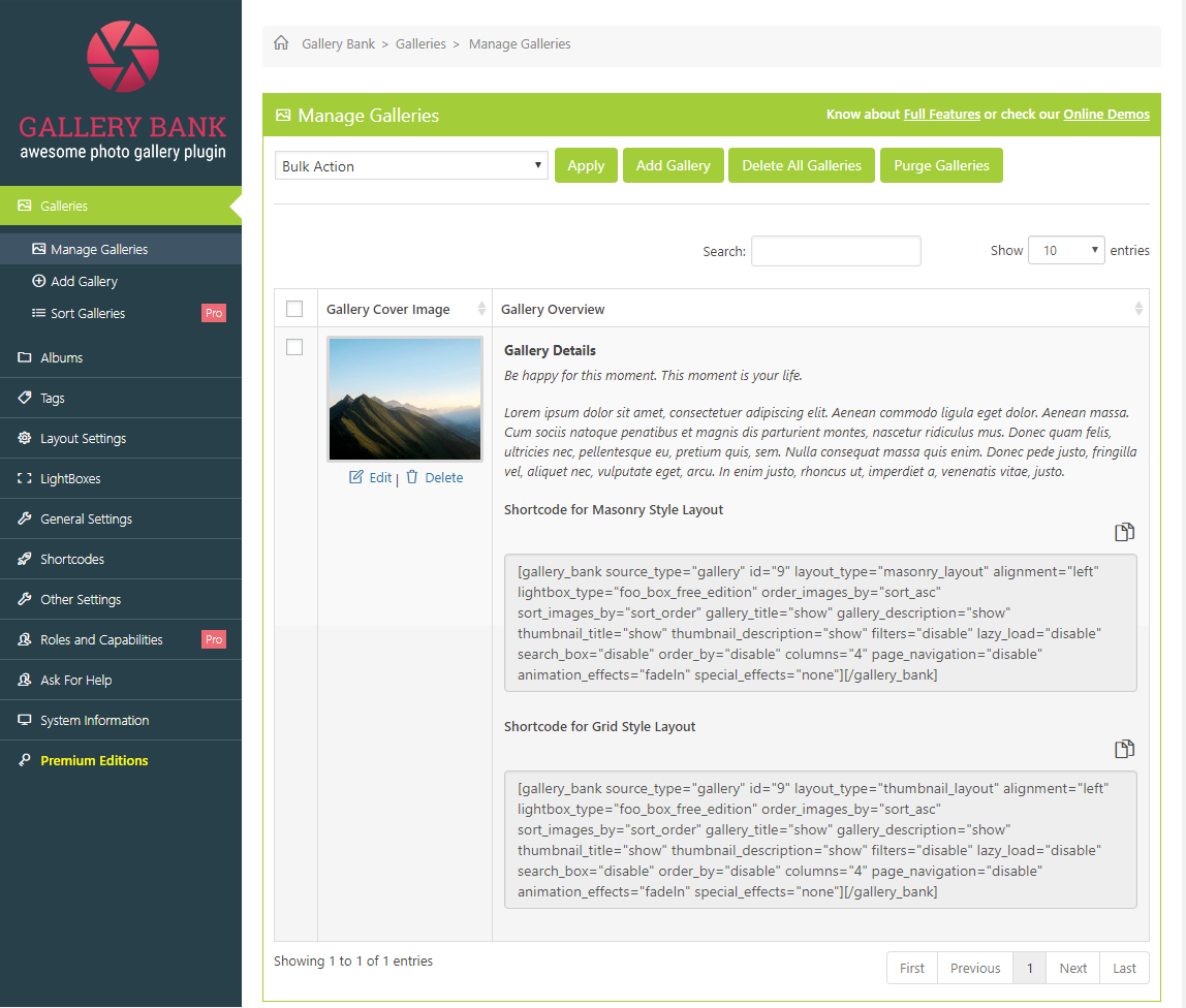
On the Gallery Bank Navigation Panel, click on Galleries - Manage Galleries. Bulk-Action: If you would like to delete or duplicate multiple galleries together, then you would need to tick the appropriate check boxes and then choose "Delete" or "Duplicate" option from the Bulk-Action drop-down. Apply Button: After selecting particular option, click on "Apply" button to perform the selected action on galleries all together. Add Gallery: If you would like to add new gallery, then you would need to click on "Add Gallery" button. It will redirect you to Add Gallery page. Delete All Galleries: If you would like to delete all galleries, then you would need to click on "Delete All Galleries" button. Purge Galleries: If you would like to remove extra or unused Images from album-thumbs, gallery-uploads, and thumbs folder, then you would need to click on "Purge Galleries".
How to Edit or Delete Gallery?
In order to "Edit Gallery" from the list of Galleries as shown above, you would need to click on "Edit" located at the bottom of Cover Image in Gallery Cover Image column in each row. Once you click on "Edit", you would be redirected to "Edit Gallery" page, where you can edit the gallery. In order to "Delete Gallery" from the list of Galleries as shown above, you would need to click on "Delete" located at the bottom of Cover Image in Gallery Cover Image column in each row. By clicking on this icon, you would see a confirmation message asking to "Confirm" whether you would like to delete the gallery? Once you press the OK button, the gallery would be deleted.
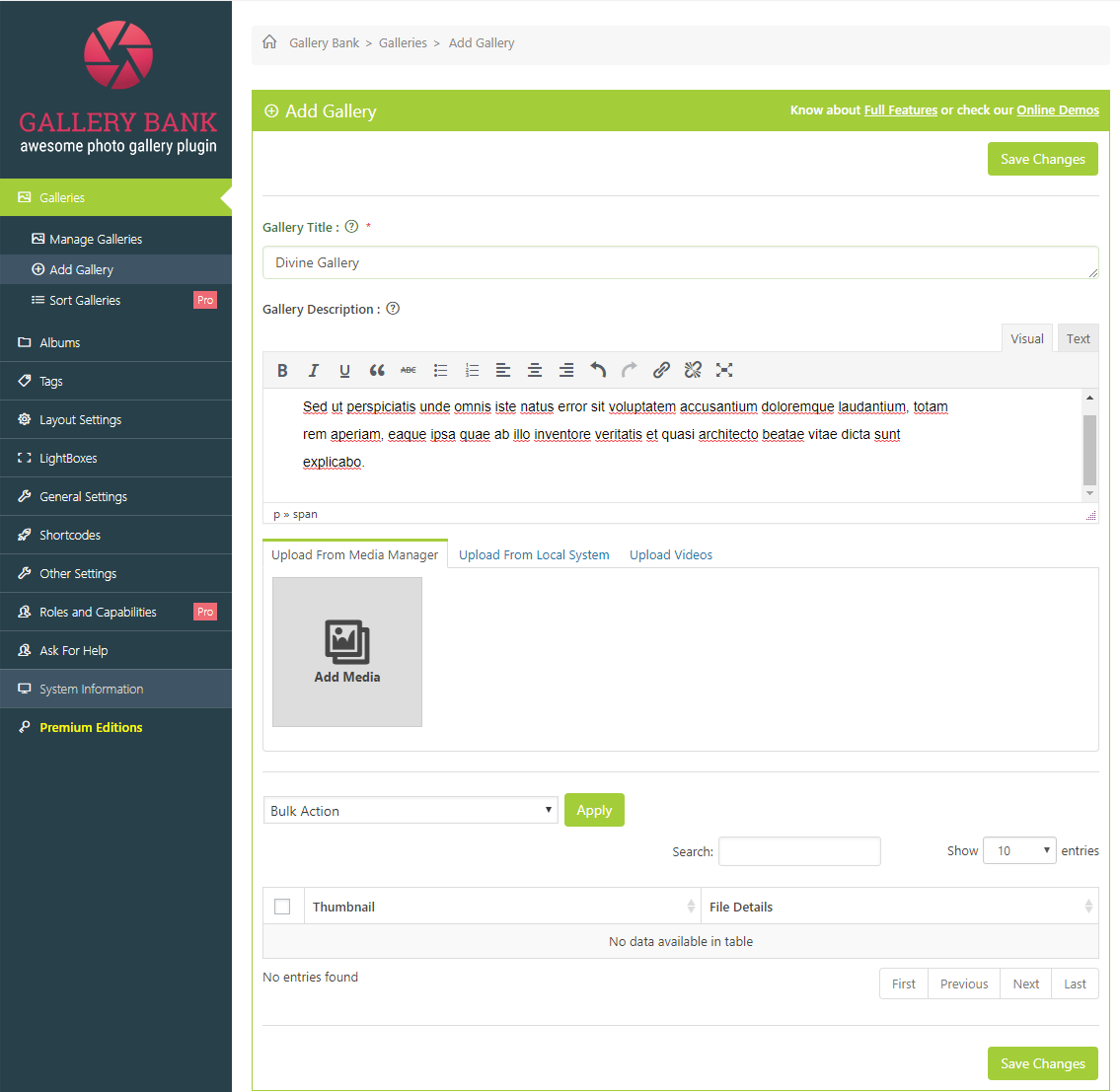
How to Add a new Gallery?
On the Gallery Bank Navigation Panel, select Galleries - Add Gallery. Gallery Title: In this field, you would need to provide "Gallery Title". Gallery Description: In this field, you would need to provide "Gallery Description". It would be displayed when using shortcode. Once everything is being setup, you would need to click on "Save Changes" button located at bottom of the screen to save the settings.
How to upload images to a Gallery?
In order to upload images to the gallery, you would need to click on "Upload Images" tab at top of the page. You can upload images from your Local System, WP Media Manager or FTP. If you would like to upload images from your own computer, then you would need to click on "Local System" tab. In order to upload files, you would need to click on "Add Files" button or you can drag and drop files from your computer. After selecting files, you would need to click on "Start Upload" button to upload the files into gallery. You would be able to view the size of files on bottom-right corner of Select Files screen. If you would like to upload images from WP Media Manager, then you would need to click on "WP Media Manager" tab. Now you would need to click on "Upload Thumbnails" button to upload images from Media Manager. If you would like to upload images from FTP, then you would need to click on "Upload From FTP" tab. You can browse and locate the images from FTP to upload them into your gallery. After uploading images in gallery, you would be able to see them in a list from where you can customize the settings of every image in gallery. Bulk-Action: If you would like to perform an action on multiple images together, then you would need to tick the appropriate check boxes and then choose required option from the Bulk-Action drop-down. Apply Button: After selecting particular option, click on "Apply" button to perform the selected action on images all together. Image Title: In this field, you would need to provide "Image Title" for image. Image Alt Text: In this field, you would need to provide alternative tags for image to make it visible for search engines and show in case of slower connections. Image Description: In this field, you would need to provide "Image Description" for image. Tags: In this field, you would need to choose "Tags" for particular image. Enable Url Redirect on click of Image: If you would like to redirect user to a specific location when clicking on an image, then you would need to select "Enable" checkbox. Url Link: This option becomes visible when "Enable" option is being selected from "Enable Url Redirect on click of Image". Now you would need to provide the URL link of location where you would like to redirect user when clicking on this image. Thumbnail: Under this column, you would be able to see thumbnail of image. If you would like to set an image as a "Cover Image", then you would need to check button for "Set As Cover Image". If you would not like to display image with other gallery images, then tick "Exclude?" checkbox. If you would like edit image, then you would need to click on "Edit" located at bottom of the Thumbnail Image. Once you click on "Edit", the following popup will appear on your screen. Now you can perform various actions like Crop, Rotate and Flip image according to your choice or you can apply various effects on image using toolbar located at top left corner. You can also adjust Brightness and Contrast of image. If you would like to scale image to particular dimension, then provide the required dimensions and click "Scale" button located at the right sidebar. If you would like to crop image in a specific "Aspect Ratio", then you would need to provide required ratio. Once everything is setup, you would need to close popup to return to the Add Gallery Page. If you would like to "Delete" image from gallery, then you would need to click on "Delete" located at bottom of the Thumbnail Image. Once everything is being setup, you would need to click on "Save Changes" button to save the settings.
How to sort images in a Gallery? (Premium Edition)
On the Gallery Bank Navigation Panel, select Galleries - Sort Galleries. Choose Gallery: In this field, you would need to choose specific Gallery for sorting. You would need to drag and drop images to arrange them in specific order. After arranging them, you would need to click on "Save Changes" button located at bottom of the page to save the settings.
How to customize created Albums? (Premium Edition)
Albums Section is divided into following three parts:
- Manage Albums
- Add Album
- Sort Albums
How to Edit or Delete Album? (Premium Edition)
In order to "Edit Album" from the list of Albums as shown above, you would need to click on "Edit" located at the bottom of Cover Image in Album Cover Image column in each row. Once you click on "Edit", you would be redirected to "Update Album" page, where you can edit the album. In order to "Delete Album" from the list of Albums as shown above, you would need to click on "Delete" located at the bottom of Cover Image in Album Cover Image column in each row. By clicking on this icon, you would see a confirmation message asking to "Confirm" whether you would like to delete the album? Once you press the OK button, the album would be deleted.
How to Add a new Album? (Premium Edition)
On the Gallery Bank Navigation Panel, select Albums - Add Album. Album Title: In this field, you would need to provide "Album Title". Album Description: In this field, you would need to provide "Album Description". Once everything is being setup, you would need to click on "Save Changes" button located at bottom of the screen to save the settings.
How to upload galleries to album? (Premium Edition)
In order to upload albums, you would need to click on "Upload Albums" tab at top of the page. Album Cover: In this field, you would need to upload image for Album Cover. From "Galleries Available" select list, you would need to choose the galleries which you would like to add in your album. In order to add multiple galleries together, you would need to hold the "Ctrl" button and choose galleries from select list. On clicking "Add >>" button, selected galleries would be added to your album and will be displayed on "Galleries Included in this Album" list. From "Galleries Included in this Album" select list, you would need to choose the galleries which you would like to remove from your album. In order to remove multiple galleries together, you would need to hold the "Ctrl" button and choose galleries from select list. On clicking "<< Remove" button, selected galleries would be added to "Galleries Available" list. Once everything is being setup, you would need to click on the "Save Changes" button located at the bottom of the page to save the settings.
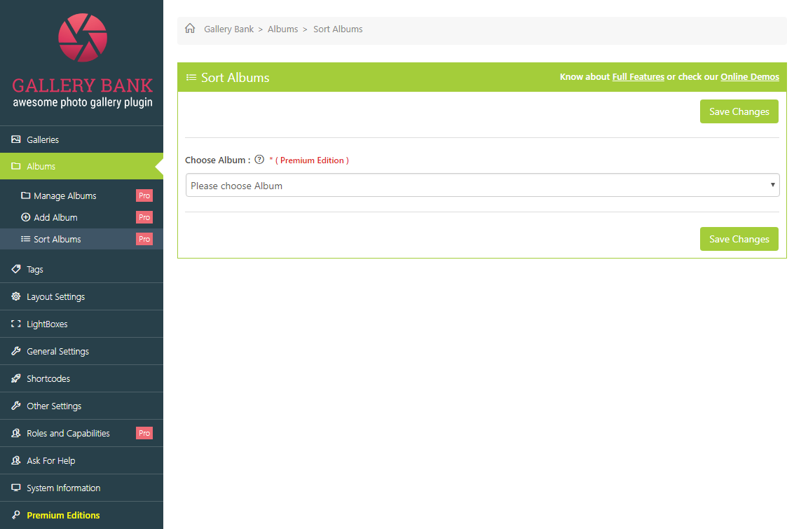
How to sort Albums? (Premium Edition)
On the Gallery Bank Navigation Panel, select Albums - Sort Albums. Choose Album: In this field, you would need to choose a specific Album for sorting. Once you reach the page as seen above, you would need to drag and drop the galleries to arrange them in specific order. After arranging them, you would need to click on "Save Changes" button to save the settings.
How to customize Tags? (Premium Edition)
Tags Page gives an idea about how to add and manage the Gallery Tags. Tags are divided into two sections.
- Manage Tags
- Add Tag
How to Manage Tags? (Premium Edition)
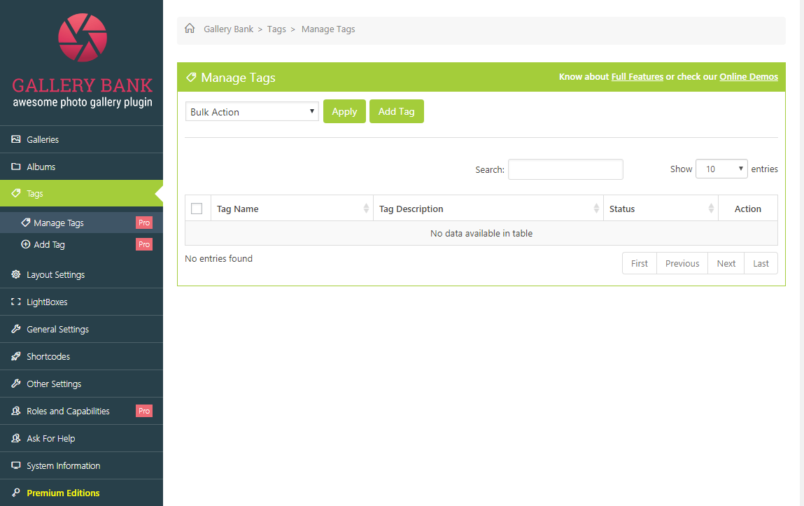
On the Gallery Bank Navigation Panel, select Tags - Manage Tags. The following information would be displayed on this page. Bulk Action: If you would like to delete multiple tags simultaneously, then you would need to tick appropriate check boxes and then choose "Delete" option from Bulk Action drop-down. Apply Button: After selecting "Delete" option, click on "Apply" button to delete selected tags all together. Add Tag: If you would like to add new tag, then you would need to click on "Add Tag" button. It will redirect you to Add Tag page. Tag Name: Under this column, you would be able to view "Tag Name". Tag Description: Under this column, you would be able to view "Tag Description". Status: Under this column, you would be able to see whether the tag is used or unused.
How to Edit or Delete Tags? (Premium Edition)
In order to "Edit Tags", you would need to click on "Edit Icon" located under the Action column in each row. By clicking on this icon, you would be re-directed to the Edit Tag page, where you can modify the tag settings. Once everything is being setup, you would need to click on the "Save Changes" button located at bottom and top of the page to save the changes. In order to "Delete Tags", you would need to click on "Delete Icon" located under the Action column in each row. By clicking on this button, you would see a confirmation message asking to "Confirm" whether you would like to delete the tag? Once you press the OK button, the tag would be deleted.
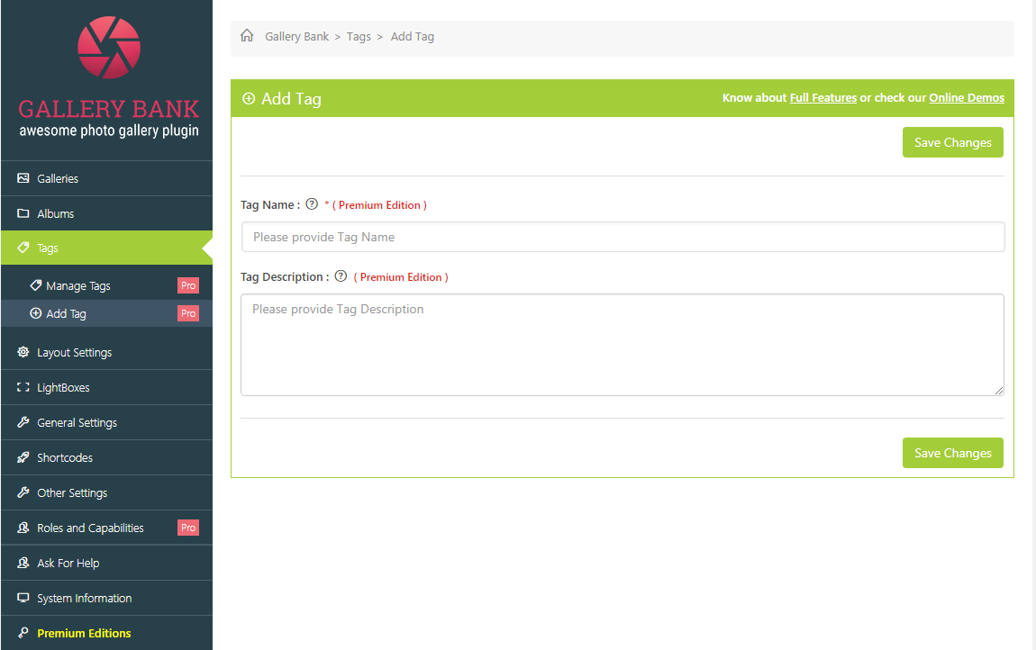
How to Add Tag? (Premium Edition)
On the Gallery Bank Navigation Panel, select Tags - Add Tag. Here is the description of each control on page. Tag Name: In this field, you would need to provide "Tag Name". Tag Description: In this field, you would need to provide a brief "Tag Description". Once everything is being setup, you would need to click on "Save Changes" button located at top and bottom of the page to save the settings. You can use these tags to filter images into different categories and display images of same categories separately.
How to manage Layout Settings? (Premium Edition)
Layout Settings are divided into nine sections.
- Thumbnail Layout
- Masonry Layout
- Slideshow Layout
- Image Browser Layout
- Justified Grid Layout
- Blog Style Layout
- Compact Album Layout
- Extended Album Layout
- Custom CSS
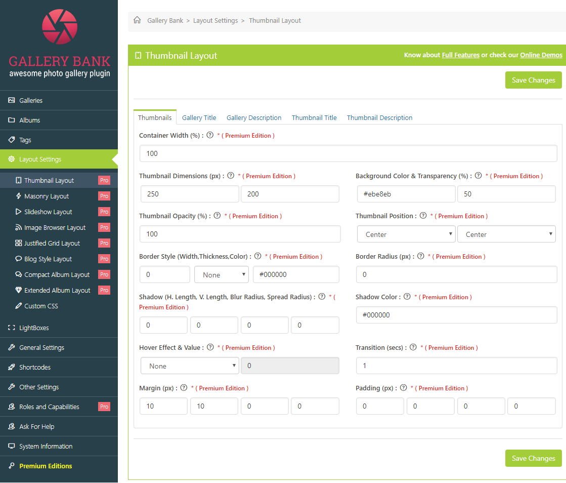
How to manage Thumbnail Layout? (Premium Edition)
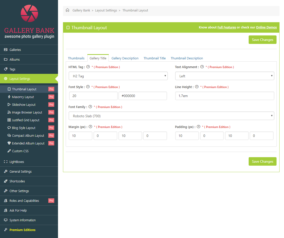
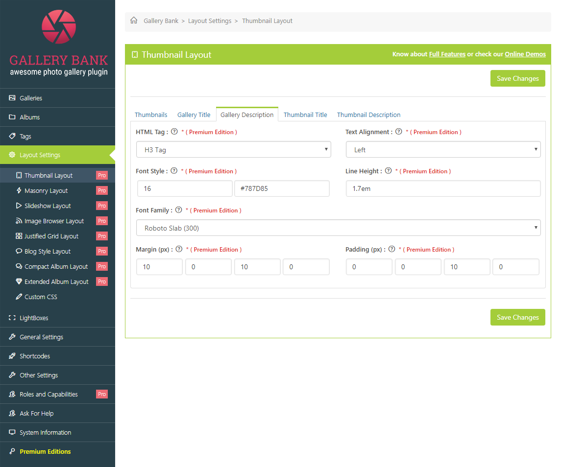
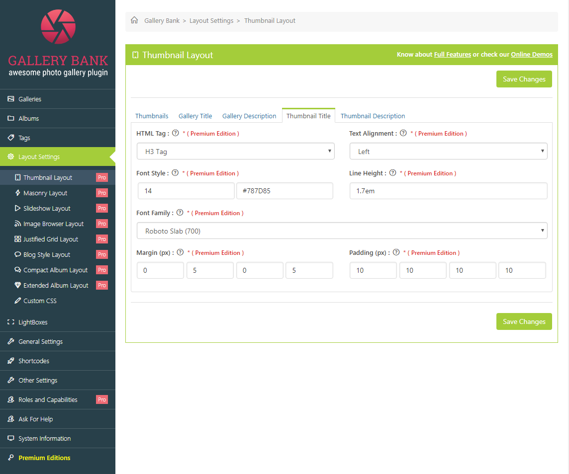
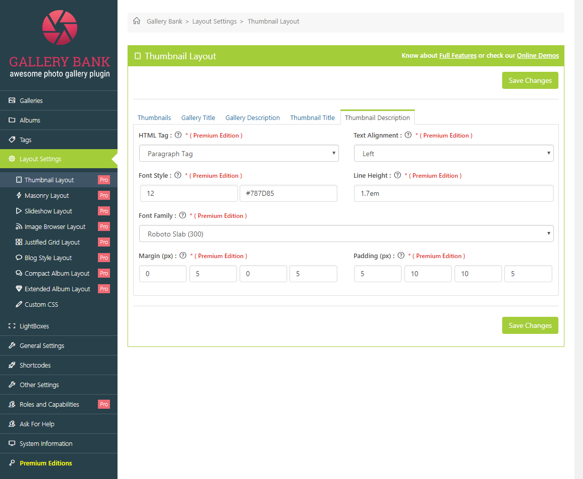
On the Gallery Bank Navigation Panel, select Layout Settings - Thumbnail Layout. You would be able to manage different Thumbnail Layout settings. For this, you would need to click on particular tabs which you would like to modify from top of the page. How to manage Thumbnails for Thumbnail Layout? In order to manage thumbnails for Thumbnail Layout, you would need to click on "Thumbnails" tab from top of the page. Here is the description of each control on this page. Thumbnail Dimensions: In this field, you would need to provide "Width and Height" for image thumbnails. Background Color & Transparency: In this field, you would need to choose "Color and Opacity" for background. Transparency should be from 0 to 100. Thumbnail Opacity: In this field, you would need to provide Opacity for Thumbnail in percentage. It should be from 0 to 100. Border Style: In this field, you would need to provide Width, Style and Color for Border of Thumbnail. Border Radius: In this field, you would need to provide "Border Radius" for Thumbnail. Shadow: In this field, you would need to provide CSS type values for "Shadow" of Thumbnail. Shadow Color: In this field, you would need to choose "Shadow Color" for Thumbnail. Hover Effect & Value: In this field, you would need to choose the effect to be applied to Thumbnail when hovered and provide specific value for selected hover effect. Transition: In this field, you would need to provide Transition time to complete the effect. It should be from 1 to 9. Margin: In this field, you would need to provide "Margin" for Thumbnail. Padding: In this field, you would need to provide "Padding" for Thumbnail. Once everything is being setup, you would need to click on "Save Changes" button to save the settings. How to customize Gallery Title for Thumbnail Layout? In order to customize Gallery Title of Thumbnail Layout, you would need to click on "Gallery Title" tab from top of the page. Here is the description of each control on this page. HTML Tag: In this field, you would need to choose "HTML Tag" for Gallery Title. Text Alignment: In this field, you would need to choose "Text Alignment" for Gallery Title. Font Style: In this field, you would need to provide "Font Size and Color" for Gallery Title. Font Family: In this field, you would need to choose "Font Family" for Gallery Title. Margin: In this field, you would need to provide "Margin" for Gallery Title. Padding: In this field, you would need to provide "Padding" for Gallery Title. Once everything is being setup, you would need to click on "Save Changes" button to save the settings. How to customize Gallery Description for Thumbnail Layout? In order to customize Gallery Description of Thumbnail Layout, you would need to click on "Gallery Description" tab from top of the page. Here is the description of each control on this page. HTML Tag: In this field, you would need to choose "HTML Tag" for Gallery Description. Text Alignment: In this field, you would need to choose "Text Alignment" for Gallery Description. Font Style: In this field, you would need to provide "Font Size and Color" for Gallery Description. Font Family: In this field, you would need to choose "Font Family" for Gallery Description. Margin: In this field, you would need to provide "Margin" for Gallery Description. Padding: In this field, you would need to provide "Padding" for Gallery Description. Once everything is being setup, you would need to click on "Save Changes" button to save the settings. How to customize Thumbnail Title? In order to customize Thumbnail Title of Thumbnail Layout, you would need to click on "Thumbnail Title" tab from top of the page. Here is the description of each control on this page. HTML Tag: In this field, you would need to choose "HTML Tag" for Thumbnail Title. Text Alignment: In this field, you would need to choose "Text Alignment" for Thumbnail Title. Font Style: In this field, you would need to provide "Font Size and Color" for Thumbnail Title. Font Family: In this field, you would need to choose "Font Family" for Thumbnail Title. Margin: In this field, you would need to provide "Margin" for Thumbnail Title. Padding: In this field, you would need to provide "Padding" for Thumbnail Title. Once everything is being setup, you would need to click on "Save Changes" button to save the settings. How to customize Thumbnail Description? In order to customize Thumbnail Description of Thumbnail Layout, you would need to click on "Thumbnail Description" tab from top of the page. Here is the description of each control on this page. HTML Tag: In this field, you would need to choose "HTML Tag" for Thumbnail Description. Text Alignment: In this field, you would need to choose "Text Alignment" for Thumbnail Description. Font Style: In this field, you would need to provide "Font Size and Color" for Thumbnail Description. Font Family: In this field, you would need to choose "Font Family" for Thumbnail Description. Margin: In this field, you would need to provide "Margin" for Thumbnail Description. Padding: In this field, you would need to provide "Padding" for Thumbnail Description. Once everything is being setup, you would need to click on "Save Changes" button to save the settings.
How to manage Masonry Layout? (Premium Edition)
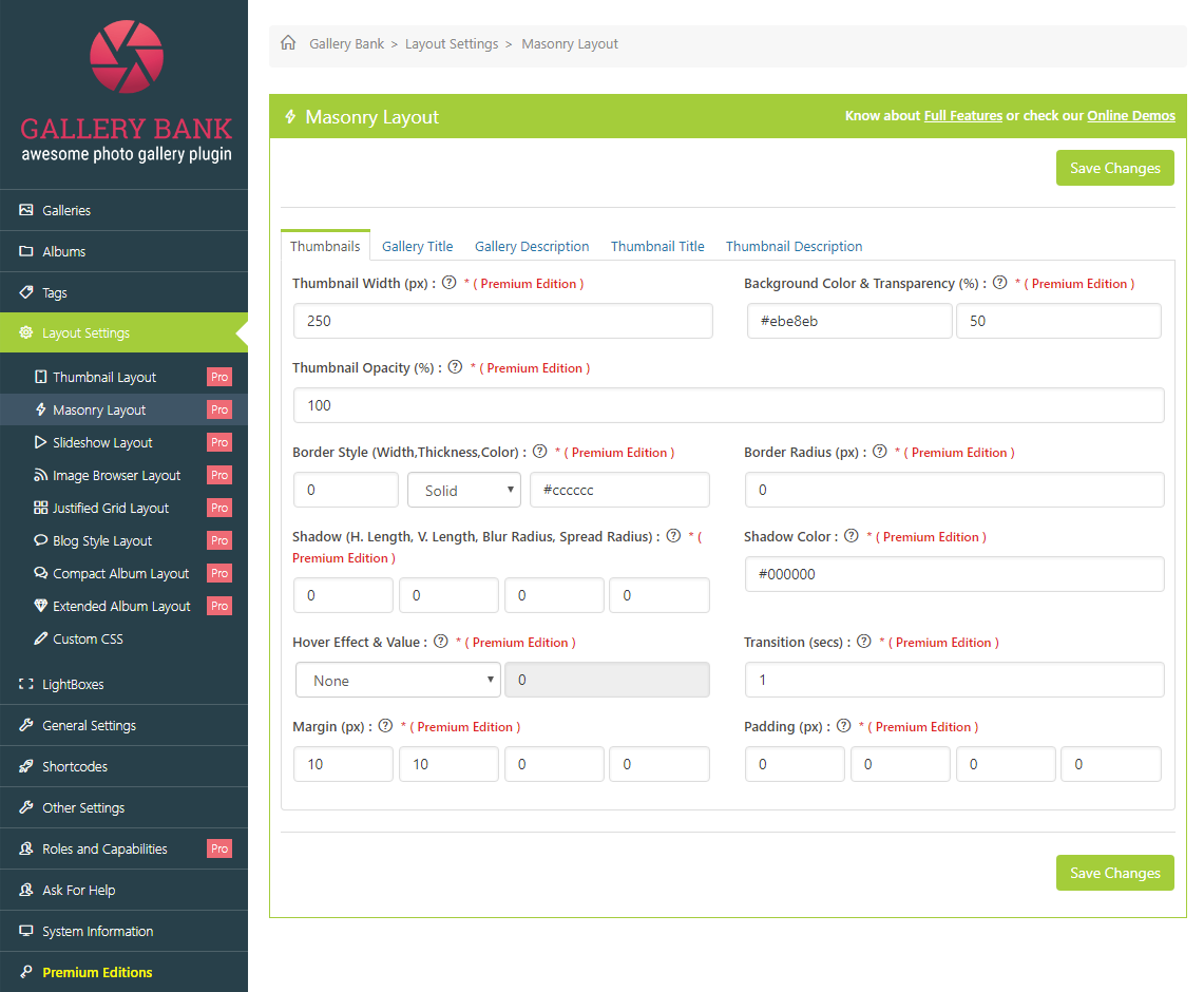
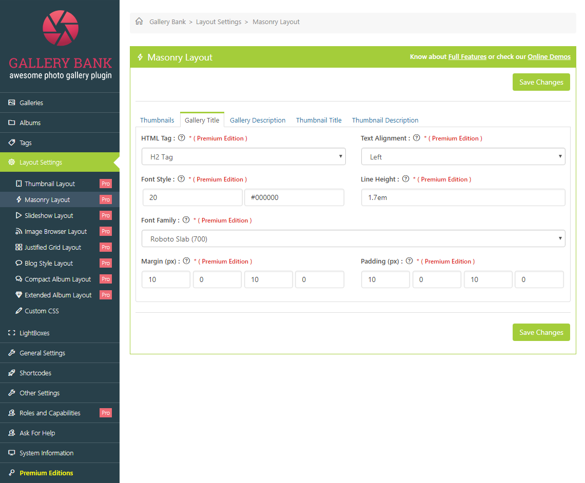
On the Gallery Bank Navigation Panel, select Layout Settings � Masonry Layout. You would be able to manage different Masonry Layout settings. For this, you would need to click on particular tabs which you would like to modify from top of the page. How to manage Thumbnails for Masonry Layout? In order to manage thumbnails for Masonry Layout, you would need to click on "Thumbnails" tab from top of the page. Here is the description of each control on this page. Thumbnail Width: In this field, you would need to provide "Width" for image thumbnails in Masonry Layout. Background Color & Transparency: In this field, you would need to choose "Color and Opacity" for background. Transparency should be from 0 to 100. Thumbnail Opacity: In this field, you would need to provide Opacity for image thumbnails in percentage. It should be from 0 to 100. Border Style: In this field, you would need to provide Width, Style and Color for Border of Masonry Layout. Border Radius: In this field, you would need to provide "Border Radius" for Masonry Layout. Shadow: In this field, you would need to provide CSS type values for "Shadow" of Masonry Layout. Shadow Color: In this field, you would need to choose "Shadow Color" for Masonry Layout. Hover Effect & Value: In this field, you would need to choose the effect to be applied to Masonry Layout when hovered and provide specific value for selected hover effect. Transition: In this field, you would need to provide Transition time to complete the effect. It should be from 1 to 9. Margin: In this field, you would need to provide �Margin� for Masonry Layout. Padding: In this field, you would need to provide "Padding" for Masonry Layout. Once everything is being setup, you would need to click on "Save Changes" button to save the settings. How to customize Gallery Title for Masonry Layout? In order to customize Gallery Title of Masonry Layout, you would need to click on "Gallery Title" tab from top of the page. Here is the description of each control on this page. HTML Tag: In this field, you would need to choose "HTML Tag" for Gallery Title. Text Alignment: In this field, you would need to choose "Text Alignment" for Gallery Title. Font Style: In this field, you would need to provide "Font Size and Color" for Gallery Title. Font Family: In this field, you would need to choose "Font Family" for Gallery Title. Margin: In this field, you would need to provide "Margin" for Gallery Title. Padding: In this field, you would need to provide "Padding" for Gallery Title. Once everything is being setup, you would need to click on "Save Changes" button to save the settings. How to customize Gallery Description for Masonry Layout? In order to customize Gallery Description of Masonry Layout, you would need to click on "Gallery Description" tab from top of the page. Here is the description of each control on this page. HTML Tag: In this field, you would need to choose "HTML Tag" for Gallery Description. Text Alignment: In this field, you would need to choose "Text Alignment" for Gallery Description. Font Style: In this field, you would need to provide "Font Size and Color" for Gallery Description. Font Family: In this field, you would need to choose "Font Family" for Gallery Description. Margin: In this field, you would need to provide "Margin" for Gallery Description. Padding: In this field, you would need to provide "Padding" for Gallery Description. Once everything is being setup, you would need to click on "Save Changes" button to save the settings. How to customize Thumbnail Title for Masonry Layout? In order to customize Thumbnail Title of Masonry Layout, you would need to click on "Thumbnail Title" tab from top of the page. Here is the description of each control on this page. HTML Tag: In this field, you would need to choose "HTML Tag" for Thumbnail Title. Text Alignment: In this field, you would need to choose "Text Alignment� for Thumbnail Title. Font Style: In this field, you would need to provide "Font Size and Color" for Thumbnail Title. Font Family: In this field, you would need to choose "Font Family" for Thumbnail Title. Margin: In this field, you would need to provide "Margin" for Thumbnail Title. Padding: In this field, you would need to provide "Padding" for Thumbnail Title. Once everything is being setup, you would need to click on "Save Changes" button to save the settings. How to customize Thumbnail Description for Masonry Layout? In order to customize Thumbnail Description of Masonry Layout, you would need to click on "Thumbnail Description" tab from top of the page. Here is the description of each control on this page. HTML Tag: In this field, you would need to choose "HTML Tag" for Thumbnail Description. Text Alignment: In this field, you would need to choose "Text Alignment" for Thumbnail Description. Font Style: In this field, you would need to provide "Font Size and Color" for Thumbnail Description. Font Family: In this field, you would need to choose "Font Family" for Thumbnail Description. Margin: In this field, you would need to provide "Margin" for Thumbnail Description. Padding: In this field, you would need to provide "Padding" for Thumbnail Description. Once everything is being setup, you would need to click on "Save Changes" button to save the settings.
How to manage Slideshow Layout? (Premium Edition)
On the Gallery Bank Navigation Panel, select Layout Settings - Slideshow Layout. You would be able to manage different Slideshow Layout settings. For this, you would need to click on particular tabs which you would like to modify from top of the page. How to manage Thumbnails for Slideshow Layout? In order to manage thumbnails for Slideshow Layout, you would need to click on "Thumbnails" tab from top of the page. Here is the description of each control on this page. Background Color: In this field, you would need to choose "Background Color" for Slideshow Layout. Border Style: In this field, you would need to provide Width, Style and Color for Border of Slideshow Layout. Border Radius: In this field, you would need to provide "Border Radius" for Slideshow Layout. Buttons Color: In this field, you would need to choose "Buttons Color". Buttons Hover Color: In this field, you would need to choose "Buttons Hover Color". Buttons Border Style: In this field, you would need to provide Width, Style and Color for Border of Buttons. Buttons Border Radius: In this field, you would need to provide "Border Radius" for Buttons. Shadow: In this field, you would need to provide CSS type values for "Shadow" of Slideshow Layout. Shadow Color: In this field, you would need to choose "Shadow Color" for Slideshow Layout. Buttons Background Transparency: In this field, you would need to provide the level of transparency you would like to apply to Buttons. It should be from 0 to 100. Filmstrip Border Style: In this field, you would need to provide Width, Style and Color for Border of Filmstrip. Filmstrip Border Radius: In this field, you would need to provide "Border Radius" for Filmstrip. Filmstrip Active Border Style: In this field, you would need to provide Border Width, Style and Color for Filmstrip item, which is currently being displayed. Filmstrip De-active Transparency: In this field, you would need to provide Transparency for Deactivated Filmstrip. Filmstrip Margin: In this field, you would need to provide "Margin" for Filmstrip. Filmstrip Padding: In this field, you would need to provide "Padding" for Filmstrip. Once everything is being setup, you would need to click on "Save Changes" button to save the settings. How to customize Gallery Title for Slideshow Layout? In order to customize Gallery Title of Slideshow Layout, you would need to click on "Gallery Title" tab from top of the page. Here is the description of each control on this page. HTML Tag: In this field, you would need to choose "HTML Tag" for Gallery Title. Text Alignment: In this field, you would need to choose "Text Alignment" for Gallery Title. Font Style: In this field, you would need to provide "Font Size and Color" for Gallery Title. Font Family: In this field, you would need to choose "Font Family" for Gallery Title. Margin: In this field, you would need to provide "Margin" for Gallery Title. Padding: In this field, you would need to provide "Padding" for Gallery Title. Once everything is being setup, you would need to click on "Save Changes" button to save the settings. How to customize Gallery Description for Slideshow Layout? In order to customize Gallery Description of Slideshow Layout, you would need to click on "Gallery Description" tab from top of the page. Here is the description of each control on this page. HTML Tag: In this field, you would need to choose "HTML Tag" for Gallery Description. Text Alignment: In this field, you would need to choose "Text Alignment" for Gallery Description. Font Style: In this field, you would need to provide "Font Size and Color" for Gallery Description. Font Family: In this field, you would need to choose "Font Family" for Gallery Description. Margin: In this field, you would need to provide "Margin" for Gallery Description. Padding: In this field, you would need to provide "Padding" for Gallery Description. Once everything is being setup, you would need to click on "Save Changes" button to save the settings. How to customize Thumbnail Title for Slideshow Layout? In order to customize Thumbnail Title of Slideshow Layout, you would need to click on "Thumbnail Title" tab from top of the page. Here is the description of each control on this page. HTML Tag: In this field, you would need to choose "HTML Tag" for Thumbnail Title. Text Alignment: In this field, you would need to choose "Text Alignment" for Thumbnail Title. Font Style: In this field, you would need to provide "Font Size and Color" for Thumbnail Title. Font Family: In this field, you would need to choose "Font Family" for Thumbnail Title. Margin: In this field, you would need to provide "Margin" for Thumbnail Title. Padding: In this field, you would need to provide "Padding" for Thumbnail Title. Once everything is being setup, you would need to click on "Save Changes" button to save the settings. How to customize Thumbnail Description for Slideshow Layout? In order to customize Thumbnail Description of Slideshow Layout, you would need to click on "Thumbnail Description" tab from top of the page. Here is the description of each control on this page. HTML Tag: In this field, you would need to choose "HTML Tag" for Thumbnail Description. Text Alignment: In this field, you would need to choose "Text Alignment" for Thumbnail Description. Font Style: In this field, you would need to provide "Font Size and Color" for Thumbnail Description. Font Family: In this field, you would need to choose "Font Family" for Thumbnail Description. Margin: In this field, you would need to provide "Margin" for Thumbnail Description. Padding: In this field, you would need to provide "Padding" for Thumbnail Description. Once everything is being setup, you would need to click on "Save Changes" button to save the settings.
How to manage Image Browser Layout? (Premium Edition)
On the Gallery Bank Navigation Panel, select Layout Settings - Image Browser Layout. You would be able to manage different Image Browser Layout settings. For this, you would need to click on particular tabs which you would like to modify from top of the page. How to manage Thumbnails for Image Browser Layout? In order to manage thumbnails for Image Browser Layout, you would need to click on "Thumbnails" tab from top of the page. Here is the description of each control on this page. Image Browser Opacity: In this field, you would need to provide Opacity for Image Browser Layout in percentage. It should be from 0 to 100. Border Style: In this field, you would need to provide Width, Style and Color for Border of Image Browser Layout. Border Radius: In this field, you would need to provide "Border Radius" for Image Browser Layout. Shadow: In this field, you would need to provide CSS type values for "Shadow" of Image Browser Layout. Shadow Color: In this field, you would need to choose "Shadow Color" for Image Browser Layout. Buttons Color: In this field, you would need to choose "Buttons Color". Buttons Hover Color: In this field, you would need to choose "Buttons Hover Color". Buttons Border Style: In this field, you would need to provide Width, Style and Color for Border of Buttons. Buttons Border Radius: In this field, you would need to provide "Border Radius" for Buttons. Buttons Font Style: In this field, you would need to provide Font Size and Color for Buttons. Buttons Font Family: In this field, you would need to choose "Font Family" for Buttons. Margin: In this field, you would need to provide "Margin" for Image Browser Layout. Padding: In this field, you would need to provide "Padding" for Image Browser Layout. Once everything is being setup, you would need to click on "Save Changes" button to save the settings. How to customize Gallery Title for Image Browser Layout? In order to customize Gallery Title of Image Browser Layout, you would need to click on "Gallery Title" tab from top of the page. Here is the description of each control on this page. HTML Tag: In this field, you would need to choose "HTML Tag" for Gallery Title. Text Alignment: In this field, you would need to choose "Text Alignment" for Gallery Title. Font Style: In this field, you would need to provide "Font Size and Color" for Gallery Title. Font Family: In this field, you would need to choose "Font Family" for Gallery Title. Margin: In this field, you would need to provide "Margin" for Gallery Title. Padding: In this field, you would need to provide "Padding" for Gallery Title. Once everything is being setup, you would need to click on "Save Changes" button to save the settings. How to customize Gallery Description for Image Browser Layout? In order to customize Gallery Description of Image Browser Layout, you would need to click on "Gallery Description" tab from top of the page. Here is the description of each control on this page. HTML Tag: In this field, you would need to choose "HTML Tag" for Gallery Description. Text Alignment: In this field, you would need to choose "Text Alignment" for Gallery Description. Font Style: In this field, you would need to provide "Font Size and Color" for Gallery Description. Font Family: In this field, you would need to choose "Font Family" for Gallery Description. Margin: In this field, you would need to provide "Margin" for Gallery Description. Padding: In this field, you would need to provide "Padding" for Gallery Description. Once everything is being setup, you would need to click on "Save Changes" button to save the settings. How to customize Thumbnail Title for Image Browser Layout? In order to customize Thumbnail Title of Image Browser Layout, you would need to click on "Thumbnail Title" tab from top of the page. Here is the description of each control on this page. HTML Tag: In this field, you would need to choose "HTML Tag" for Thumbnail Title. Text Alignment: In this field, you would need to choose "Text Alignment" for Thumbnail Title. Font Style: In this field, you would need to provide "Font Size and Color" for Thumbnail Title. Font Family: In this field, you would need to choose "Font Family" for Thumbnail Title. Margin: In this field, you would need to provide "Margin" for Thumbnail Title. Padding: In this field, you would need to provide "Padding" for Thumbnail Title. Once everything is being setup, you would need to click on "Save Changes' button to save the settings. How to customize Thumbnail Description for Image Browser Layout? In order to customize Thumbnail Description of Image Browser Layout, you would need to click on "Thumbnail Description" tab from top of the page. Here is the description of each control on this page. HTML Tag: In this field, you would need to choose "HTML Tag" for Thumbnail Description. Text Alignment: In this field, you would need to choose "Text Alignment" for Thumbnail Description. Font Style: In this field, you would need to provide "Font Size and Color" for Thumbnail Description. Font Family: In this field, you would need to choose "Font Family" for Thumbnail Description. Margin: In this field, you would need to provide "Margin" for Thumbnail Description. Padding: In this field, you would need to provide "Padding" for Thumbnail Description. Once everything is being setup, you would need to click on "Save Changes" button to save the settings.
How to manage Justified Grid Layout? (Premium Edition)
On the Gallery Bank Navigation Panel, select Layout Settings - Justified Grid Layout. You would be able to manage different Justified Grid Layout settings. For this, you would need to click on particular tabs which you would like to modify from top of the page. How to manage Thumbnails for Justified Grid Layout? In order to manage thumbnails for Justified Grid Layout, you would need to click on "Thumbnails" tab from top of the page. Here is the description of each control on this page. Justified Grid Opacity: In this field, you would need to provide Opacity for Justified Grid Layout in percentage. It should be from 0 to 100. Background Color & Transparency: In this field, you would need to choose "Color and Opacity" for background. Transparency should be from 0 to 100. Border Style: In this field, you would need to provide Width, Style and Color for Border of Justified Grid Layout. Border Radius: In this field, you would need to provide "Border Radius" for Justified Grid Layout. Shadow: In this field, you would need to provide CSS type values for "Shadow" of Justified Grid Layout. Shadow Color: In this field, you would need to choose "Shadow Color" for Justified Grid Layout. Hover Effect & Value: In this field, you would need to choose the effect to be applied to Justified Grid Layout when hovered and provide specific value for selected hover effect. Padding: In this field, you would need to provide "Padding" for Justified Grid Layout. Transition: In this field, you would need to provide Transition time to complete the effect. It should be from 1 to 9. Once everything is being setup, you would need to click on "Save Changes" button to save the settings. How to customize Gallery Title for Justified Grid Layout? In order to customize Gallery Title of Justified Grid Layout, you would need to click on "Gallery Title" tab from top of the page. Here is the description of each control on this page. HTML Tag: In this field, you would need to choose "HTML Tag" for Gallery Title. Text Alignment: In this field, you would need to choose "Text Alignment" for Gallery Title. Font Style: In this field, you would need to provide "Font Size and Color" for Gallery Title. Font Family: In this field, you would need to choose "Font Family" for Gallery Title. Margin: In this field, you would need to provide "Margin" for Gallery Title. Padding: In this field, you would need to provide "Padding" for Gallery Title. Once everything is being setup, you would need to click on "Save Changes" button to save the settings. How to customize Gallery Description for Justified Grid Layout? In order to customize Gallery Description of Justified Grid Layout, you would need to click on "Gallery Description" tab from top of the page. Here is the description of each control on this page. HTML Tag: In this field, you would need to choose "HTML Tag" for Gallery Description. Text Alignment: In this field, you would need to choose "Text Alignment" for Gallery Description. Font Style: In this field, you would need to provide "Font Size and Color" for Gallery Description. Font Family: In this field, you would need to choose "Font Family" for Gallery Description. Margin: In this field, you would need to provide "Margin" for Gallery Description. Padding: In this field, you would need to provide "Padding" for Gallery Description. Once everything is being setup, you would need to click on "Save Changes" button to save the settings. How to customize Thumbnail Title for Justified Grid Layout? In order to customize Thumbnail Title of Justified Grid Layout, you would need to click on "Thumbnail Title" tab from top of the page. Here is the description of each control on this page. HTML Tag: In this field, you would need to choose "HTML Tag" for Thumbnail Title. Text Alignment: In this field, you would need to choose "Text Alignment" for Thumbnail Title. Font Style: In this field, you would need to provide "Font Size and Color" for Thumbnail Title. Font Family: In this field, you would need to choose "Font Family" for Thumbnail Title. Margin: In this field, you would need to provide "Margin" for Thumbnail Title. Padding: In this field, you would need to provide "Padding" for Thumbnail Title. Once everything is being setup, you would need to click on "Save Changes" button to save the settings. How to customize Thumbnail Description for Justified Grid Layout? In order to customize Thumbnail Description of Justified Grid Layout, you would need to click on "Thumbnail Description" tab from top of the page. Here is the description of each control on this page. HTML Tag: In this field, you would need to choose "HTML Tag" for Thumbnail Description. Text Alignment: In this field, you would need to choose "Text Alignment" for Thumbnail Description. Font Style: In this field, you would need to provide "Font Size and Color" for Thumbnail Description. Font Family: In this field, you would need to choose "Font Family" for Thumbnail Description. Margin: In this field, you would need to provide "Margin" for Thumbnail Description. Padding: In this field, you would need to provide "Padding" for Thumbnail Description. Once everything is being setup, you would need to click on "Save Changes" button to save the settings.
How to manage Blog Style Layout? (Premium Edition)
On the Gallery Bank Navigation Panel, select Layout Settings - Blog Style Layout. You would be able to manage different Blog Style Layout settings. For this, you would need to click on particular tabs which you would like to modify from top of the page. How to manage Thumbnails for Blog Style Layout? In order to manage thumbnails for Blog Style Layout, you would need to click on "Thumbnails" tab from top of the page. Here is the description of each control on this page. Background Color: In this field, you would need to choose "Background Color" for Blog Style Layout. Background Transparency: In this field, you would need to provide the level of transparency you would like to apply to a Blog Style Layout. It should be from 0 to 100. Blog Style Opacity: In this field, you would need to provide Opacity for Blog Style Layout in percentage. It should be from 0 to 100. Border Style: In this field, you would need to provide Width, Style and Color for Border of Blog Style Layout. Border Radius: In this field, you would need to provide "Border Radius" for Blog Style Layout. Shadow: In this field, you would need to provide CSS type values for "Shadow" of Blog Style Layout. Shadow Color: In this field, you would need to choose "Shadow Color" for Blog Style Layout. Hover Effect & Value: In this field, you would need to choose the effect to be applied to Blog Style Layout when hovered and provide specific value for selected hover effect. Transition: In this field, you would need to provide Transition time to complete the effect. It should be from 1 to 9. Margin: In this field, you would need to provide "Margin" for Blog Style Layout. Padding: In this field, you would need to provide "Padding" for Blog Style Layout. Once everything is being setup, you would need to click on "Save Changes" button to save the settings. How to customize Gallery Title for Blog Style Layout? In order to customize Gallery Title of Blog Style Layout, you would need to click on "Gallery Title" tab from top of the page. Here is the description of each control on this page. HTML Tag: In this field, you would need to choose "HTML Tag" for Gallery Title. Text Alignment: In this field, you would need to choose "Text Alignment" for Gallery Title. Font Style: In this field, you would need to provide "Font Size and Color" for Gallery Title. Font Family: In this field, you would need to choose "Font Family" for Gallery Title. Margin: In this field, you would need to provide "Margin" for Gallery Title. Padding: In this field, you would need to provide "Padding" for Gallery Title. Once everything is being setup, you would need to click on "Save Changes" button to save the settings. How to customize Gallery Description for Blog Style Layout? In order to customize Gallery Description of Blog Style Layout, you would need to click on "Gallery Description" tab from top of the page. Here is the description of each control on this page. HTML Tag: In this field, you would need to choose "HTML Tag" for Gallery Description. Text Alignment: In this field, you would need to choose "Text Alignment" for Gallery Description. Font Style: In this field, you would need to provide "Font Size and Color" for Gallery Description. Font Family: In this field, you would need to choose "Font Family" for Gallery Description. Margin: In this field, you would need to provide "Margin" for Gallery Description. Padding: In this field, you would need to provide "Padding" for Gallery Description. Once everything is being setup, you would need to click on "Save Changes" button to save the settings. How to customize Thumbnail Title for Blog Style Layout? In order to customize Thumbnail Title of Blog Style Layout, you would need to click on "Thumbnail Title" tab from top of the page. Here is the description of each control on this page. HTML Tag: In this field, you would need to choose "HTML Tag" for Thumbnail Title. Text Alignment: In this field, you would need to choose "Text Alignment" for Thumbnail Title. Font Style: In this field, you would need to provide "Font Size and Color" for Thumbnail Title. Font Family: In this field, you would need to choose "Font Family" for Thumbnail Title. Margin: In this field, you would need to provide "Margin" for Thumbnail Title. Padding: In this field, you would need to provide "Padding" for Thumbnail Title. Once everything is being setup, you would need to click on "Save Changes" button to save the settings. How to customize Thumbnail Description for Blog Style Layout? In order to customize Thumbnail Description of Blog Style Layout, you would need to click on "Thumbnail Description" tab from top of the page. Here is the description of each control on this page. HTML Tag: In this field, you would need to choose "HTML Tag" for Thumbnail Description. Text Alignment: In this field, you would need to choose "Text Alignment" for Thumbnail Description. Font Style: In this field, you would need to provide "Font Size and Color" for Thumbnail Description. Font Family: In this field, you would need to choose "Font Family" for Thumbnail Description. Margin: In this field, you would need to provide "Margin" for Thumbnail Description. Padding: In this field, you would need to provide "Padding" for Thumbnail Description. Once everything is being setup, you would need to click on "Save Changes" button to save the settings.
How to manage Compact Album Layout? (Premium Edition)
On the Gallery Bank Navigation Panel, select Layout Settings - Compact Album Layout. You would be able to manage different Compact Album Layout settings. For this, you would need to click on particular tabs which you would like to modify from top of the page. How to manage Thumbnails for Compact Album Layout? In order to manage thumbnails for Compact Album Layout, you would need to click on "Thumbnails" tab from top of the page. Here is the description of each control on this page. Thumbnail Dimensions: In this field, you would need to provide "Width and Height" for image thumbnails. Background Color & Transparency: In this field, you would need to choose "Color and Opacity" for background. Transparency should be from 0 to 100. Thumbnail Opacity: In this field, you would need to provide Opacity for Thumbnail in percentage. It should be from 0 to 100. Border Style: In this field, you would need to provide Width, Style and Color for Border of Album. Border Radius: In this field, you would need to provide "Border Radius" of Album. Shadow: In this field, you would need to provide CSS type values for "Shadow" of Album. Shadow Color: In this field, you would need to choose "Shadow Color" of Album. Hover Effect & Value: In this field, you would need to choose the effect to be applied to Compact Album Layout when hovered and provide specific value for selected hover effect. Transition: In this field, you would need to provide Transition time to complete the effect. It should be from 1 to 9. Margin: In this field, you would need to provide "Margin" of Album. Padding: In this field, you would need to provide "Padding" of Album. Once everything is being setup, you would need to click on "Save Changes" button to save the settings. How to customize Album Title for Compact Album Layout? In order to customize Album Title of Compact Album Layout, you would need to click on "Album Title" tab from top of the page. Here is the description of each control on this page. HTML Tag: In this field, you would need to choose "HTML Tag" for Album Title. Text Alignment: In this field, you would need to choose "Text Alignment" for Album Title. Font Style: In this field, you would need to provide "Font Size and Color" for Album Title. Line Height: In this field, you would need to provide "Line Height" for Album Title. Font Family: In this field, you would need to choose "Font Family" for Album Title. Margin: In this field, you would need to provide "Margin" for Album Title. Padding: In this field, you would need to provide "Padding" for Album Title. Once everything is being setup, you would need to click on "Save Changes" button to save the settings. How to customize Album Description for Compact Album Layout? In order to customize Album Description of Compact Album Layout, you would need to click on "Album Description" tab from top of the page. Here is the description of each control on this page. HTML Tag: In this field, you would need to choose "HTML Tag" for Album Description. Text Alignment: In this field, you would need to choose "Text Alignment" for Album Description. Font Style: In this field, you would need to provide "Font Size and Color" for Album Description. Line Height: In this field, you would need to provide "Line Height" for Album Description. Font Family: In this field, you would need to choose "Font Family" for Album Description. Margin: In this field, you would need to provide "Margin" for Album Description. Padding: In this field, you would need to provide "Padding" for Album Description. Once everything is being setup, you would need to click on "Save Changes" button to save the settings. How to customize Gallery Title for Compact Album Layout? In order to customize Gallery Title of Compact Album Layout, you would need to click on "Gallery Title" tab from top of the page. Here is the description of each control on this page. HTML Tag: In this field, you would need to choose "HTML Tag" for Gallery Title. Text Alignment: In this field, you would need to choose "Text Alignment" for Gallery Title. Font Style: In this field, you would need to provide "Font Size and Color" for Gallery Title. Line Height: In this field, you would need to provide "Line Height" for Gallery Title. Font Family: In this field, you would need to choose "Font Family" for Gallery Title. Margin: In this field, you would need to provide "Margin" for Gallery Title. Padding: In this field, you would need to provide "Padding" for Gallery Title. Once everything is being setup, you would need to click on "Save Changes" button to save the settings. How to customize Gallery Description for Compact Album Layout? In order to customize Gallery Description of Compact Album Layout, you would need to click on "Gallery Description" tab from top of the page. Here is the description of each control on this page. HTML Tag: In this field, you would need to choose "HTML Tag" for Gallery Description. Text Alignment: In this field, you would need to choose "Text Alignment" for Gallery Description. Font Style: In this field, you would need to provide "Font Size and Color" for Gallery Description. Line Height: In this field, you would need to provide "Line Height" for Gallery Description. Font Family: In this field, you would need to choose "Font Family" for Gallery Description. Margin: In this field, you would need to provide "Margin" for Gallery Description. Padding: In this field, you would need to provide "Padding" for Gallery Description. Once everything is being setup, you would need to click on "Save Changes" button to save the settings. How to customize Buttons for Compact Album Layout? In order to customize Buttons of Compact Album Layout, you would need to click on "Buttons" tab from top of the page. Here is the description of each control on this page. Button Text: In this field, you would need to provide text that would be display on the Button. Button Text Alignment: In this field, you would need to choose "Button Text Alignment" for Button. Button Color: In this field, you would need to choose "Button Color" for Button. Button Hover Color: In this field, you would need to choose "Button Hover Color" for Button. Border Style: In this field, you would need to provide Width, Style and Color for Border of Button. Border Hover Color: In this field, you would need to choose "Border Hover Color" for Button. Border Radius: In this field, you would need to provide "Border Radius" for Button. Font Family: In this field, you would need to choose "Font Family" for Button. Font Style: In this field, you would need to provide "Font Size and Color" for Button. Margin: In this field, you would need to provide "Margin" for Button. Padding: In this field, you would need to provide "Padding" for Button. Once everything is being setup, you would need to click on "Save Changes" button to save the settings.
How to manage Extended Album Layout? (Premium Edition)
On the Gallery Bank Navigation Panel, select Layout Settings - Extended Album Layout. You would be able to manage different Extended Album Layout settings. For this, you would need to click on particular tabs which you would like to modify from top of the page. How to manage Thumbnails for Extended Album Layout? In order to manage thumbnails for Extended Album Layout, you would need to click on "Thumbnails" tab from top of the page. Here is the description of each control on this page. Thumbnail Dimensions: In this field, you would need to provide "Width and Height" for image thumbnails. Background Color & Transparency: In this field, you would need to choose "Color and Opacity" for background. Transparency should be from 0 to 100. Thumbnail Opacity: In this field, you would need to provide Opacity for Thumbnail in percentage. It should be from 0 to 100. Border Style: In this field, you would need to provide Width, Style and Color for Border of Album. Border Radius: In this field, you would need to provide "Border Radius" of Album. Shadow: In this field, you would need to provide CSS type values for "Shadow" of Album. Shadow Color: In this field, you would need to choose "Shadow Color" of Album. Hover Effect & Value: In this field, you would need to choose the effect to be applied to Compact Album Layout when hovered and provide specific value for selected hover effect. Transition: In this field, you would need to provide Transition time to complete the effect. It should be from 1 to 9. Margin: In this field, you would need to provide "Margin" of Album. Padding: In this field, you would need to provide "Padding" of Album. Once everything is being setup, you would need to click on "Save Changes" button to save the settings. How to customize Album Title for Extended Album Layout? In order to customize Album Title of Extended Album Layout, you would need to click on "Album Title" tab from top of the page. Here is the description of each control on this page. HTML Tag: In this field, you would need to choose "HTML Tag" for Album Title. Text Alignment: In this field, you would need to choose "Text Alignment" for Album Title. Font Style: In this field, you would need to provide "Font Size and Color" for Album Title. Line Height: In this field, you would need to provide "Line Height" for Album Title. Font Family: In this field, you would need to choose "Font Family" for Album Title. Margin: In this field, you would need to provide "Margin" for Album Title. Padding: In this field, you would need to provide "Padding" for Album Title. Once everything is being setup, you would need to click on "Save Changes" button to save the settings. How to customize Album Description for Extended Album Layout? In order to customize Album Description of Extended Album Layout, you would need to click on "Album Description" tab from top of the page. Here is the description of each control on this page. HTML Tag: In this field, you would need to choose "HTML Tag" for Album Description. Text Alignment: In this field, you would need to choose "Text Alignment" for Album Description. Font Style: In this field, you would need to provide "Font Size and Color" for Album Description. Line Height: In this field, you would need to provide "Line Height" for Album Description. Font Family: In this field, you would need to choose "Font Family" for Album Description. Margin: In this field, you would need to provide "Margin" for Album Description. Padding: In this field, you would need to provide "Padding" for Album Description. Once everything is being setup, you would need to click on "Save Changes" button to save the settings. How to customize Gallery Title for Extended Album Layout? In order to customize Gallery Title of Extended Album Layout, you would need to click on "Gallery Title" tab from top of the page. Here is the description of each control on this page. HTML Tag: In this field, you would need to choose "HTML Tag" for Gallery Title. Text Alignment: In this field, you would need to choose "Text Alignment" for Gallery Title. Font Style: In this field, you would need to provide "Font Size and Color" for Gallery Title. Line Height: In this field, you would need to provide "Line Height" for Gallery Title. Font Family: In this field, you would need to choose "Font Family" for Gallery Title. Margin: In this field, you would need to provide "Margin" for Gallery Title. Padding: In this field, you would need to provide "Padding" for Gallery Title. Once everything is being setup, you would need to click on "Save Changes" button to save the settings. How to customize Gallery Description for Extended Album Layout? In order to customize Gallery Description of Extended Album Layout, you would need to click on "Gallery Description" tab from top of the page. Here is the description of each control on this page. HTML Tag: In this field, you would need to choose "HTML Tag" for Gallery Description. Text Alignment: In this field, you would need to choose "Text Alignment" for Gallery Description. Font Style: In this field, you would need to provide "Font Size and Color" for Gallery Description. Line Height: In this field, you would need to provide "Line Height" for Gallery Description. Font Family: In this field, you would need to choose "Font Family" for Gallery Description. Margin: In this field, you would need to provide "Margin" for Gallery Description. Padding: In this field, you would need to provide "Padding" for Gallery Description. Once everything is being setup, you would need to click on "Save Changes" button to save the settings. How to customize Buttons for Extended Album Layout? In order to customize Buttons of Extended Album Layout, you would need to click on "Buttons" tab from top of the page. Here is the description of each control on this page. Button Text: In this field, you would need to provide text that would be display on the Button. Button Text Alignment: In this field, you would need to choose "Button Text Alignment" for Button. Button Color: In this field, you would need to choose "Button Color" for Button. Button Hover Color: In this field, you would need to choose "Button Hover Color" for Button. Border Style: In this field, you would need to provide Width, Style and Color for Border of Button. Border Hover Color: In this field, you would need to choose "Border Hover Color" for Button. Border Radius: In this field, you would need to provide "Border Radius" for Button. Font Family: In this field, you would need to choose "Font Family" for Button. Font Style: In this field, you would need to provide "Font Size and Color" for Button. Margin: In this field, you would need to provide "Margin" for Button. Padding: In this field, you would need to provide "Padding" for Button. Once everything is being setup, you would need to click on "Save Changes" button to save the settings. How to manage Custom CSS? On the Gallery Bank Navigation Panel, click on Layout Settings - Custom CSS. Custom CSS: In this field, you would need to provide CSS code manually to add extra styling to the layout of Gallery Bank. This CSS style will override the plugins css and provide you the ability to customize the settings for various layouts in Gallery Bank. Once everything is being setup, you would need to click on "Save Changes" button located at the bottom of the page to save the changes.
How to manage Lightboxes? (Premium Edition)
Gallery Bank includes the following five lightboxes:
- Lightcase
- Fancy Box
- Color Box
- Foo Box Free Edition
- Nivo Lightbox
How to customize Lightcase Lightbox? (Premium Edition)
On the Gallery Bank Navigation Panel, select Lightboxes - Lightcase. you would be able to manage different Lightcase Lightbox settings. For this, you would need to click on particular tabs which you would like to modify from top of the page. How to customize Settings for Lightcase? In order to manage settings for Lightcase, you would need to click on "Settings" tab from top of the page. Here is the description of each control on this page. Autoplay Slideshow: In this field, you would need to choose "Enable" to autoplay the slideshow in Lightcase. Transition: In this field, you would need to choose "Transition Effect" for Lightbox. Starting Transition Speed: In this field, you would need to provide Starting Transition Speed for Lightbox. Ending Transition Speed: In this field, you would need to provide Ending Transition Speed for Lightbox. Overlay Color: In this field, you would need to choose Color for Overlay. Overlay Opacity: In this field, you would need to provide Opacity for Overlay. It should be from 0 to 100. Button Style: In this field, you would need to provide Font Size and Color for Buttons in Lightcase Lightbox. Close Button: In this field, you would need to choose "Show" to display Close Button. Image Counter: In this field, you would need to choose "Show" to display image counter in Lightbox. Counter Font Style: In this field, you would need to provide Font Size and Color for image counter. Counter Font Family: In this field, you would need to choose "Font Family" for image counter. Border Style: In this field, you would need to provide Width, Style and Color for border of Lightcase Lightbox. Border Radius: In this field, you would need to provide "Border Radius" for Lightcase Lightbox. Once everything is being setup, you would need to click on "Save Changes" button to save the settings. How to customize Image Title for Lightcase? In order to manage image title for Lightcase, you would need to click on "Image Title" tab from top of the page. Here is the description of each control on this page. Title: In this field, you would need to choose "Show" to display Title for image in Lightcase. HTML Tag: In this field, you would need to choose "HTML Tag" for Image Title. Text Alignment: In this field, you would need to choose "Text Alignment" for Image Title. Font Style: In this field, you would need to provide "Font Size and Color" for Image Title. Font Family: In this field, you would need to choose "Font Family" for Image Title. Margin: In this field, you would need to provide "Margin" for Image Title. Padding: In this field, you would need to provide "Padding" for Image Title. Once everything is being setup, you would need to click on "Save Changes" button to save the settings. How to customize Image Description for Lightcase? In order to manage image description for Lightcase, you would need to click on "Image Description" tab from top of the page. Here is the description of each control on this page. Description: In this field, you would need to choose "Show" to display Description for image in Lightcase. HTML Tag: In this field, you would need to choose "HTML Tag" for Image Description. Text Alignment: In this field, you would need to choose "Text Alignment" for Image Description. Font Style: In this field, you would need to provide "Font Size and Color" for Image Description. Font Family: In this field, you would need to choose "Font Family" for Image Description. Margin: In this field, you would need to provide "Margin" for Image Description. Padding: In this field, you would need to provide "Padding" for Image Description. Once everything is being setup, you would need to click on "Save Changes" button to save the settings.
How to customize Fancy Box? (Premium Edition)
On the Gallery Bank Navigation Panel, select Lightboxes - Fancy Box. You would be able to manage different Fancy Box settings. For this, you would need to click on particular tabs which you would like to modify from top of the page. How to customize Settings for Fancy Box? In order to manage settings for Fancy Box, you would need to click on "Settings" tab from top of the page. Here is the description of each control on this page. Title Position: In this field, you would need to choose position for Title from the provided options. Button Position: In this field, you would need to choose "Button Position" for Fancy Box. Navigation Arrows: In this field, you would need to choose "Show" to display navigation arrows. Mouse Wheel: If you would like that Fancy Box will respond to mouse wheel events, then you would need to choose "Enable" from dropdown or vice-versa. Repeat Images: If you would like to repeat images in lightbox, then you would need to choose "Enable" from dropdown or vice-versa. Speed: In this field, you would need to provide "Speed" for slideshow in Fancy Box. Open speed: In this field, you would need to provide speed of opening for Fancy Box. Close speed: In this field, you would need to provide speed of closing for Fancy Box. Escape Button: In this field, you would need to choose "Enable" to close image with Esc Button on keyboard. Close Button: In this field, you would need to choose "Show" to display Close Button. Open Effect: In this field, you would need to choose an opening effect for Fancy Box. Close Effect: In this field, you would need to choose a closing effect for Fancy Box. Margin: In this field, you would need to provide "Margin" for Fancy Box. Padding: In this field, you would need to "Padding" for Fancy Box. Background Color: In this field, you would need to choose "Background Color" for Fancy Box. Background Opacity: In this field, you would need to provide "Background Opacity" for Fancy Box. It should be from 0 to 100. Overlay Color: In this field, you would need to choose Color for Overlay. Overlay Opacity: In this field, you would need to provide Opacity for Overlay. It should be from 0 to 100. Border Style: In this field, you would need to provide Width, Style and Color for border of Fancy Box. Border Radius: In this field, you would need to provide "Border Radius" for Fancy Box. Once everything is being setup, you would need to click on "Save Changes" button located at bottom of the page to save the settings. How to customize Image Title for Fancy Box? In order to manage image title for Fancy Box, you would need to click on "Image Title" tab from top of the page. Here is the description of each control on this page. Title: In this field, you would need to choose "Show" to display Title for image in Fancy Box. HTML Tag: In this field, you would need to choose "HTML Tag" for Image Title. Text Alignment: In this field, you would need to choose "Text Alignment" for Image Title. Font Style: In this field, you would need to provide "Font Size and Color" for Image Title. Font Family: In this field, you would need to choose "Font Family" for Image Title. Margin: In this field, you would need to provide "Margin" for Image Title. Padding: In this field, you would need to provide "Padding" for Image Title. Once everything is being setup, you would need to click on "Save Changes" button located at bottom of the page to save the settings. How to customize Image Description for Fancy Box? In order to manage image description for Fancy Box, you would need to click on "Image Description" tab from top of the page. Here is the description of each control on this page. Description: In this field, you would need to choose "Show" to display Description for image in Fancy Box. HTML Tag: In this field, you would need to choose "HTML Tag" for Image Description. Text Alignment: In this field, you would need to choose "Text Alignment" for Image Description. Font Style: In this field, you would need to provide "Font Size and Color" for Image Description. Font Family: In this field, you would need to choose "Font Family" for Image Description. Margin: In this field, you would need to provide "Margin" for Image Description. Padding: In this field, you would need to provide "Padding" for Image Description. Once everything is being setup, you would need to click on "Save Changes" button located at bottom of the page to save the settings.
How to customize Color Box? (Premium Edition)
On the Gallery Bank Navigation Panel, select Lightboxes - Color Box. You would be able to manage different Color Box settings. For this, you would need to click on particular tabs which you would like to modify from top of the page. How to customize Settings for Color Box? In order to manage settings for Color Box, you would need to click on "Settings" tab from top of the page. Here is the description of each control on this page. Color Box Type: In this field, you would need to choose one of designed styles for Color Box. Color Box Transition Effect: In this field, you would need to choose "Transition Effect" for Color Box. Transition Speed: In this field, you would need to provide "Transition Speed" for Color Box. Fade Out: In this field, you would need to provide speed at which the images in Color Box would Fade Out. Positioning: In this field, you would need to choose Position for Color Box. Fixed Position: If you would not like to change position of lightbox while scrolling up or down, then you would need to choose "Enable" from dropdown or vice-versa. Open when page load: In this field, you would need to choose "Enable" to display Color Box at page loading. Show Close Button: In this field, you would need to choose "Enable" to display Close Button. Slideshow: If you would like to display slideshow in Color Box, then you would need to choose "Enable" or vice-versa. Slideshow Speed: This option becomes visible when slideshow option is enabled. In this field, you would need to provide "Speed" for slideshow. Auto Slideshow: This option becomes visible when slideshow option is enabled. In this field, you would need to choose "Enable" to autoplay the slideshow. Background Color: In this field, you would need to choose "Background Color". Background Opacity: In this field, you would need to provide "Background Opacity". It should be from 0 to 100. Once everything is being setup, you would need to click on "Save Changes" button located at bottom of the page to save the settings. How to customize Image Title for Color Box? In order to manage image title for Color Box, you would need to click on "Image Title" tab from top of the page. Here is the description of each control on this page. Title: In this field, you would need to choose "Show" to display Title for image in Lightbox. HTML Tag: In this field, you would need to choose "HTML Tag" for Image Title. Text Alignment: In this field, you would need to choose "Text Alignment" for Image Title. Font Style: In this field, you would need to provide "Font Size and Color" for Image Title. Font Family: In this field, you would need to choose "Font Family" for Image Title. Margin: In this field, you would need to provide "Margin" for Image Title. Padding: In this field, you would need to provide "Padding" for Image Title. Once everything is being setup, you would need to click on "Save Changes" button located at bottom of the page to save the settings. How to customize Image Description for Color Box? In order to manage image description for Color Box, you would need to click on "Image Description" tab from top of the page. Here is the description of each control on this page. Description: In this field, you would need to choose "Show" to display Image Description. HTML Tag: In this field, you would need to choose "HTML Tag" for Image Description. Text Alignment: In this field, you would need to choose "Text Alignment" for Image Description. Font Style: In this field, you would need to provide "Font Size and Color" for Image Description. Font Family: In this field, you would need to choose "Font Family" for Image Description. Margin: In this field, you would need to provide "Margin" for Image Description. Padding: In this field, you would need to provide "Padding" for Image Description. Once everything is being setup, you would need to click on "Save Changes" button located at bottom of the page to save the settings.
How to customize Foo Box? (Premium Edition)
On the Gallery Bank Navigation Panel, select Lightboxes - Foo Box Free Edition. You would be able to manage different Foo Box settings. For this, you would need to click on particular tabs which you would like to modify from top of the page. How to customize Settings for Foo Box? In order to manage settings for Foo Box, you would need to click on "Settings" tab from top of the page. Here is the description of each control on this page. Show Count: In this field, you would need to choose "Enable" to display count of images in Lightbox. Hide Page Scrollbars: In this field, you would need to choose "Enable" to hide page scrollbars. Title Show On Hover: If you would like to display Title on hover of images, then you would need to choose "Enable" from dropdown or vice-versa. Close Overlay Click: If you would like to close lightbox by clicking on overlay, then you would need to choose "Enable" from dropdown or vice-versa. Overlay Color: In this field, you would need to choose Color for Overlay. Overlay Opacity: In this field, you would need to provide Opacity for Overlay. It should be from 0 to 100. Border Style: In this field, you would need to provide Width, Style and Color for border of Lightbox. Border Radius: In this field, you would need to provide "Border Radius" for Lightbox. Once everything is being setup, you would need to click on "Save Changes" button located at bottom of the page to save the settings. How to customize Image Title for Foo Box? In order to manage image title for Foo Box, you would need to click on "Image Title" tab from top of the page. Here is the description of each control on this page. Title: In this field, you would need to choose "Show" to display Image Title. HTML Tag: In this field, you would need to choose "HTML Tag" for Image Title. Text Alignment: In this field, you would need to choose "Text Alignment" for Image Title. Font Style: In this field, you would need to provide "Font Size and Color" for Image Title. Font Family: In this field, you would need to choose "Font Family" for Image Title. Margin: In this field, you would need to provide "Margin" for Image Title. Padding: In this field, you would need to provide "Padding" for Image Title. Once everything is being setup, you would need to click on "Save Changes" button located at bottom of the page to save the settings. How to customize Image Description for Foo Box? In order to manage image description for Foo Box, you would need to click on "Image Description" tab from top of the page. Here is the description of each control on this page. Description: In this field, you would need to choose "Show" to display Image Description. HTML Tag: In this field, you would need to choose "HTML Tag" for Image Description. Text Alignment: In this field, you would need to choose "Text Alignment" for Image Description. Font Style: In this field, you would need to provide "Font Size and Color" for Image Description. Font Family: In this field, you would need to choose "Font Family" for Image Description. Margin: In this field, you would need to provide "Margin" for Image Description. Padding: In this field, you would need to provide "Padding" for Image Description. Once everything is being setup, you would need to click on "Save Changes" button located at bottom of the page to save the settings.
How to customize Nivo Lightbox? (Premium Edition)
On the Gallery Bank Navigation Panel, select Lightboxes - Nivo Lightbox. You would be able to manage different Nivo Lightbox settings. For this, you would need to click on particular tabs which you would like to modify from top of the page. How to customize Settings for Nivo Lightbox? In order to manage settings for Nivo Lightbox, you would need to click on "Settings" tab from top of the page. Here is the description of each control on this page. Choose Open Effects: In this field, you would need to choose Effect which is to be applied on opening of Nivo Lightbox. Keyboard Navigation: If you would like to navigate images from keyboard arrow keys, then you would need to choose "Enable" from dropdown or vice-versa. Click Image To Close: If you would like to close lightbox by clicking on image, then you would need to choose "Enable" from dropdown or vice-versa. Click Overlay To Close: If you would like to close lightbox by clicking on overlay, then you would need to choose "Enable" from dropdown or vice-versa. Overlay Color: In this field, you would need to choose Color for Overlay. Overlay Opacity: In this field, you would need to provide Opacity for Overlay. It should be from 0 to 100. Border Style: In this field, you would need to provide Width, Style and Color for border of Nivo Lightbox. Border Radius: In this field, you would need to provide "Border Radius" for Nivo Lightbox. Once everything is being setup, you would need to click on "Save Changes" button located at bottom of the page to save the settings. How to customize Image Title for Nivo Lightbox? In order to manage image title for Nivo Lightbox, you would need to click on "Image Title" tab from top of the page. Here is the description of each control on this page. Title: In this field, you would need to choose "Show" to display Title for image in Nivo Lightbox. HTML Tag: In this field, you would need to choose "HTML Tag" for Image Title. Text Alignment: In this field, you would need to choose "Text Alignment" for Image Title. Font Style: In this field, you would need to provide "Font Size and Color" for Image Title. Font Family: In this field, you would need to choose "Font Family" for Image Title. Margin: In this field, you would need to provide "Margin" for Image Title. Padding: In this field, you would need to provide "Padding" for Image Title. Once everything is being setup, you would need to click on "Save Changes" button located at bottom of the page to save the settings. How to customize Image Description for Nivo Lightbox? In order to manage image description for Nivo Lightbox, you would need to click on "Image Description" tab from top of the page. Here is the description of each control on this page. Description: In this field, you would need to choose "Show" to display Description for image in Nivo Lightbox. HTML Tag: In this field, you would need to choose "HTML Tag" for Image Description. Text Alignment: In this field, you would need to choose "Text Alignment" for Image Description. Font Style: In this field, you would need to provide "Font Size and Color" for Image Description. Font Family: In this field, you would need to choose "Font Family" for Image Description. Margin: In this field, you would need to provide "Margin" for Image Description. Padding: In this field, you would need to provide "Padding" for Image Description. Once everything is being setup, you would need to click on "Save Changes" button located at bottom of the page to save the settings.
How to manage General Settings? (Premium Edition)
General Settings are divided into eight sections.
- Global Options : From here, you can change image dimensions, thumbnail dimensions, enable or disable right click protection and set language direction.
- Filter Settings : This gives an idea about how to customize filter settings like background, border, fonts, etc.
- Lazy Load Settings : This gives an idea about how to customize loader settings for lazy load.
- Search Box Settings : Using this, you can customize search box settings such as its placeholder text, background, border, fonts etc.
- Order By Settings : From here, you would be able to manage settings to show Order By for galleries or albums.
- Page Navigation : This gives an idea about how to customize Page Navigation options.
- Watermark Settings : Using this, you can add text or image watermark on images.
- Advertisement : Using this, you can add text or image advertisement on images and provide link to redirect user on clicking of image.
How to manage Global Options? (Premium Edition)
On the Gallery Bank Navigation Panel, select General Settings - Global Options. Here is the description of each control on the page. Image Dimensions: In this field, you would need to provide Dimensions for Generated Image. Thumbnail Dimensions: In this field, you would need to provide Dimensions for Generated Thumbnail. Right Click Protection: In this field, you would need to choose whether to enable right-click protection for images or not. Language Direction: In this field, you would need to choose Language Direction. Once everything is being setup, you would need to click on "Save Changes" button located at bottom of the page to save the settings.
How to manage Lazy Load Settings? (Premium Edition)
On the Gallery Bank Navigation Panel, select General Settings � Lazy Load Settings. Here is the description of each control on the page. Background Color: In this field, you would need to choose "Background Color" for Loader. Loader Color: In this field, you would need to choose "Color" for Loader. Text: In this field, you would need to choose "Show" to display Loader Text. Title: In this field, you would need to provide content for "Loader Text". Font Style: In this field, you would need to provide "Font Size and Color" for Loader Text. Font Family: In this field, you would need to choose "Font Family" for Loader Text. Once everything is being setup, you would need to click on "Save Changes" button to save the settings.
How to manage Filter Settings? (Premium Edition)
On the Gallery Bank Navigation Panel, click on General Settings - Filter Settings. Here is the description of each control on this page. Font Style: In this field, you would need to provide Font Size and Color for Filters. Font Family: In this field, you would need to choose "Font Family" for Filters. Active Font Color: In this field, you would need to choose "Active Font Color" for Filters. Font Hover Color: In this field, you would need to choose "Font Hover Color" for Filters. Background Color & Transparency: In this field, you would need to choose "Color and Opacity" for background of Filters. Transparency should be from 0 to 100. Background Hover Color: In this field, you would need to choose Background Color On Hover. Border Style: In this field, you would need to provide Width, Style and Color for Border of Filters. Border Radius: In this field, you would need to provide "Border Radius" for Filters. Border Hover Color: In this field, you would need to choose Border Color On Hover. Margin: In this field, you would need to provide "Margin" for Filters. Padding: In this field, you would need to provide "Padding" for Filters. Once everything is being setup, you would need to click on "Save Changes" button located at bottom of the page to save the settings.
How to manage Order By Settings? (Premium Edition)
On the Gallery Bank Navigation Panel, select General Settings - Order By Settings. Here is the description of each control on the page. Font Style: In this field, you would need to provide "Font Size and Color" for Order By. Font Family: In this field, you would need to choose "Font Family" for Order By. Active Font Color: In this field, you would need to choose "Active Font Color" for Order By. Font Hover Color: In this field, you would need to choose "Font Hover Color" for Order By. Background Color & Transparency: In this field, you would need to choose "Color and Opacity" for background of Order By. Transparency should be from 0 to 100. Background Hover Color: In this field, you would need to choose Background Color on Hover. Border Style: In this field, you would need to provide Width, Style and Color for Border of Order By. Border Radius: In this field, you would need to provide "Border Radius" for Order By. Border Hover Color: In this field, you would need to choose Border Color on Hover. Margin: In this field, you would need to provide "Margin" for Order By. Padding: In this field, you would need to provide "Padding" for Order By. Once everything is being setup, you would need to click on "Save Changes" button to save the settings.
How to manage Search Box Settings? (Premium Edition)
On the Gallery Bank Navigation Panel, select General Settings - Lazy Load Settings. Here is the description of each control on the page. Placeholder Text: In this field, you would need to provide "Text" for Search Box Placeholder. Font Style: In this field, you would need to provide "Font Size and Color" for Search Box. Font Family: In this field, you would need to choose "Font Family" for Search Box. Background Color & Transparency: In this field, you would need to choose "Color and Opacity" for background of Search Box. Transparency should be from 0 to 100. Border Style: In this field, you would need to provide Width, Style and Color for Border of Search Box. Border Radius: In this field, you would need to provide "Border Radius" for Search Box. Margin: In this field, you would need to provide "Margin" for Search Box. Padding: In this field, you would need to provide "Padding" for Search Box. Once everything is being setup, you would need to click on "Save Changes" button to save the settings.
How to manage Page Navigation? (Premium Edition)
On the Gallery Bank Navigation Panel, click on General Settings - Page Navigation. Here is the description of each control on the page. Background Color: In this field, you would need to choose "Background Color" for Page Navigation. Background Transparency: In this field, you would need to provide Transparency for Background of Page Navigation. It should be from 0 to 100. Numbering: If you would like to show numbering on Page Navigation, then you would need to choose "Yes" or vice-versa. Button Text: In this field, you would need to choose whether to display Text or Arrows on Page Navigation Button. Alignment: In this field, you would need to choose "Alignment" for Page Navigation. Position: In this field, you would need to provide "Position" for Page Navigation. Border Style: In this field, you would need to provide Width, Style and Color for Border of Page Navigation. Border Radius: In this field, you would need to provide "Border Radius" for Page Navigation. Font Style: In this field, you would need to provide Font Size and Color for Page Navigation. Font Family: In this field, you would need to choose "Font Family" for Page Navigation. Margin: In this field, you would need to provide "Margin" for Page Navigation. Padding: In this field, you would need to provide "Padding" for Page Navigation. Once everything is being setup, you would need to click on "Save Changes" button located at bottom of the page to save the settings.
How to manage Watermark Settings? (Premium Edition)
On the Gallery Bank Navigation Panel, click on General Settings - Watermark Settings. Watermark Type: In this field, you would need to choose what type of watermark would you like to use in your galleries and albums. It could be Text or Image. If you would not like to use watermark then choose "None". Here is the description of each control on the page. Watermark Text: In this field, you would need to provide Watermark Text which will be displayed over the gallery/album images. Font Style: In this field, you would need to provide Font Size and Color for Watermark Text. Text Angle: In this field, you would need to provide an Angle at which the Watermark Text is to be rotated. Offset: In this field, you would need to provide values for Offset X and Y for Watermark. Watermark Opacity: In this field, you would need to provide Opacity for Watermark. It should be from 0 to 100. Watermark Position: In this field, you would need to choose Position for Watermark. Once everything is being setup, you would need to click on "Save Changes" button located at bottom of the page to save the settings. If you would like to use an Image as Watermark, then you would need to choose "Image" from Watermark Type dropdown. Here is the description of each control on the page. Watermark URL: In this field, you would need to provide URL of that particular image. If you would like to add image from Media Library, then you would need to click on "Add Image" button and choose image from Media Library. Watermark Size: In this field, you would need to provide appropriate Size (in percentage for the responsive look) for Watermark Image. Offset: In this field, you would need to provide values for Offset X and Y for Watermark. Watermark Opacity: In this field, you would need to provide Opacity for Watermark. It should be from 0 to 100. Watermark Position: In this field, you would need to choose Position for Watermark. Once everything is being setup, you would need to click on "Save Changes" button located at bottom of the page to save the settings.
How to manage Advertisement?(Premium Edition)
On the Gallery Bank Navigation Panel, click on General Settings - Advertisement. Advertisement Type: In this field, you would need to choose what type of Advertisement would you like to use in your galleries and albums. It could be Text or Image. If you would not like to use Advertisement then choose "None". Here is the description of each control on the page. Advertisement Text: In this field, you would need to provide Advertisement Text which will be displayed over the gallery/album images. Advertisement Link: In this field, you would need to provide link for advertisement, which will open when the user clicks on Advertisement Text. Advertisement Opacity: In this field, you would need to provide "Advertisement Opacity" for Advertisement. It should be from 0 to 100. Font Style: In this field, you would need to provide Font Size and Color for Advertisement Text. Font Family: In this field, you would need to choose "Font Family" for Advertisement Text from dropdown. Advertisement Position: In this field, you would need to choose Position for Advertisement. Once everything is being setup, you would need to click on "Save Changes" button located at bottom of the page to save the settings. If you would like to use an Image as Advertisement, then you would need to choose "Image" from Advertisement Type dropdown. Here is the description of each control on the page. Advertisement Link: In this field, you would need to provide link for advertisement, which will open when the user clicks on Advertisement Image. Advertisement Opacity: In this field, you would need to provide "Advertisement Opacity" for Advertisement. It should be from 0 to 100. Advertisement URL: In this field, you would need to provide URL of that particular image. If you would like to add image from Media Library, then you would need to click on "Add Image" button and choose image from Media Library. Advertisement Image Width: In this field, you would need to provide Width for Advertisement Image. Advertisement Height: In this field, you would need to provide Height for Advertisement Image. Advertisement Position: In this field, you would need to choose Position for Advertisement. Once everything is being setup, you would need to click on "Save Changes" button located at bottom of the page to save the settings.
Are there some restrictions for adding images?
There is no limit for the amount of images. You can add as many images as you want. Plugin has no limitations on upload of images and galleries.
When I upgrade to the commercial version, will I lose all the images, galleries and settings that I have made up in the free version of the Gallery?
Of course Not. In order to completely remove everything from the database, you have to go Other Settings option in the Gallery Bank menu and choose Delete Tables at Uninstall to enable.
Do you have any problems with plugin installation or usage?
You can use WordPress Support Forums. They will help you to quickly install a Gallery Plugin. We are always ready to help everyone. For more information, feel free to visit the official website for the Gallery WordPress Gallery Plugin
Installation
Gallery Bank - Performing a new installation
Minimum Requirements
The following set of lists are the minimum requirements for installing Gallery Bank on your machine.
- WordPress 3.3+
- PHP 5.x
- MySQL 5.x
Using The WordPress Dashboard
- Navigate to the 'Add New' in the Plugins Dashboard
- Search for 'Gallery Bank'
- Click 'Install Now'
- Activate the Plugin on the Plugin dashboard
Uploading in WordPress Dashboard
- Navigate to the 'Add New' in the Plugins Dashboard
- Navigate to the 'Upload' area
- Select
gallery-bank.zipfrom your computer - Click 'Install Now'
- Activate the Plugin in the Plugin dashboard
Using FTP
- Download
gallery-bank.zip - Extract the
gallery-bankdirectory to your computer - Upload the
gallery-bankdirectory to the/wp-content/plugins/directory - Activate the Plugin in the Plugin's dashboard
For Mac Users
- Go to your Downloads folder and locate the folder with the Plugin.
- Right-click on the folder and select Compress.
- Now you have a newly created .zip file which can be installed as described here.
更新日志:
- FIX: Major Thumbs Generation Bug
- FIX: Uninstall Plugin Bugs
- FIX: Wizard Bugs
- FIX: Uninstall PLugin Bugs
- TWEAK: Install Script modified to rectify Background Color
- TWEAK: WP Support Forum Links Added
- TWEAK: Code Optimized
- TWEAK: Unwanted Gallery Images Removed
- TWEAK: Addon Page Updated
- TWEAK: Code Optimized
- TWEAK: Major Version Release
- TWEAK: New & Easy UI
- TWEAK: Shortcode Button Opens TinyMCE PopUp to generate Shortcode on your Page/Post.
- TWEAK: Premium Version Links Removed
- TWEAK: Upload Images from WP Media Manager Added
- TWEAK: CSS Conflictions Fixed
- TWEAK: Banners Removed
- TWEAK: Unwanted JS/CSS Files Removed
- TWEAK: Shortcode Layouts Changed
- TWEAK: CSS Conflictions Fixed
- TWEAK: Integration with Freemius
- TWEAK: Banner Updated
- FIX: Confliction with Jet Pack Contact Plugin
- TWEAK: Pricing Page
- FIX: Minor Bugs
- TWEAK: Pricing Page
- FIX: Major Bug with Gallery Description Editor
- TWEAK: Translations File Updated
- FIX: jQUery Filtree Bugs
- FIX: Minor Bugs
- TWEAK: PL Uploader updated to 2.3.1
- TWEAK: jQUery Datatables updated to 1.10.15
- TWEAK: jQUery Filtree updated to 2.1.5
- TWEAK: jQUery Clip Board updated to 1.7.1
- FIX: Footer File Bugs
- TWEAK: Tabs Removed from Add/Edit Gallery Page
- FIX: Masonry Layout Bug
- FIX: Thumbnail Layout Bug
- FIX: Overview Page Changed
- FIX: Major Shortcode Bug
- TWEAK: Compatibility with Visual Composer,
- TWEAK: Compatibility with Page Builder by Site Origin
- TWEAK: Compatibility with Divi Builder
- TWEAK: Compatibility with TinyMCE Advanced Editor
- TWEAK: Compatibility with CK Editor
- FIX: Layout Bugs
- TWEAK: Wizard Section Renoved Completely
- TWEAK: Overview Section Added
- TWEAK: New Links Added
- FIX: Global Options Bugs
- FIX: Wizard Bugs
- FIX: Layout Bugs
- TWEAK: Unwanted Asterisks removed from Add Gallery Layout
- FIX: Lightbox Caption
- TWEAK: PLUploader updated to latest release
- TWEAK: Jquery Validator updated to latest release
- TWEAK: Jquery Modal updated to latest release
- FIX: Major Bugs
- FIX: Lightbox Bugs
- FIX: Code Optimized
- FIX: Obsolete Code Removed
- FIX: Headers Output Bug
- FIX: Lightbox Bug
- TWEAK: New Lightbox Option Added
- FIX: Code Optimized
- FIX: Obsolete Code Removed
- FIX: Major Bugs
- FIX: Install Script Code Optimized
- FIX: Wizard Page Error
- FIX: Code Optimized
- TWEAK: Major Version Release
- TWEAK: Layouts Changed
- TWEAK: Layouts Changed
- TWEAK: Front End Complete Revamped
- TWEAK: Database Optimized
- TWEAK: Security Patch Added
- TWEAK: Modified JS & CSS Functions to only call on own Plugin Page
- TWEAK: Layouts Changed
- TWEAK: Obsolete Code Deleted
- TWEAK: CSS Improved
- TWEAK: Improved Performance