Gap Block
| 开发者 | wedoplugins |
|---|---|
| 更新时间 | 2020年3月7日 06:43 |
| PHP版本: | 5.6 及以上 |
| WordPress版本: | 5.4 |
| 版权: | GPLv3 |
| 版权网址: | 版权信息 |
详情介绍:
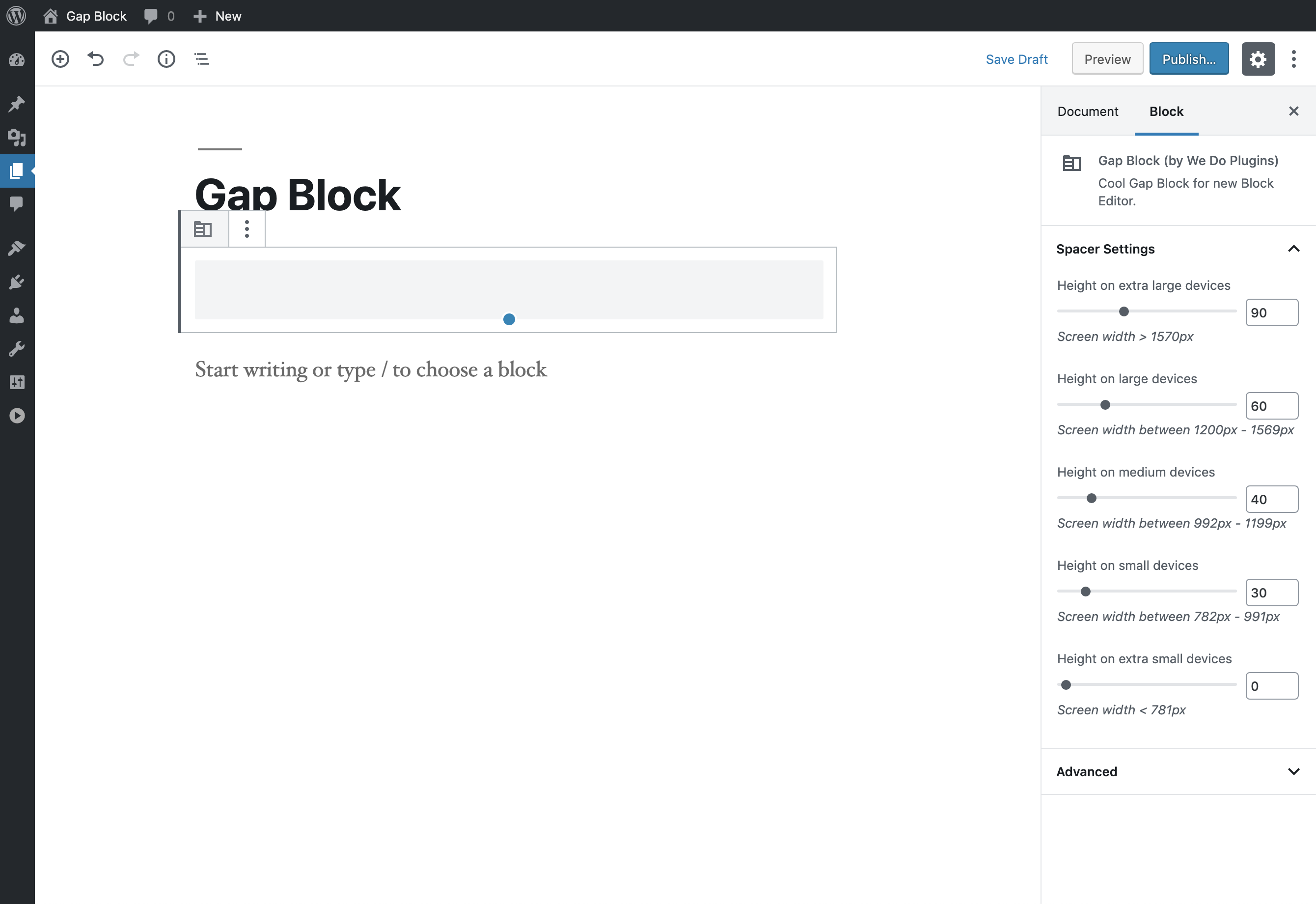
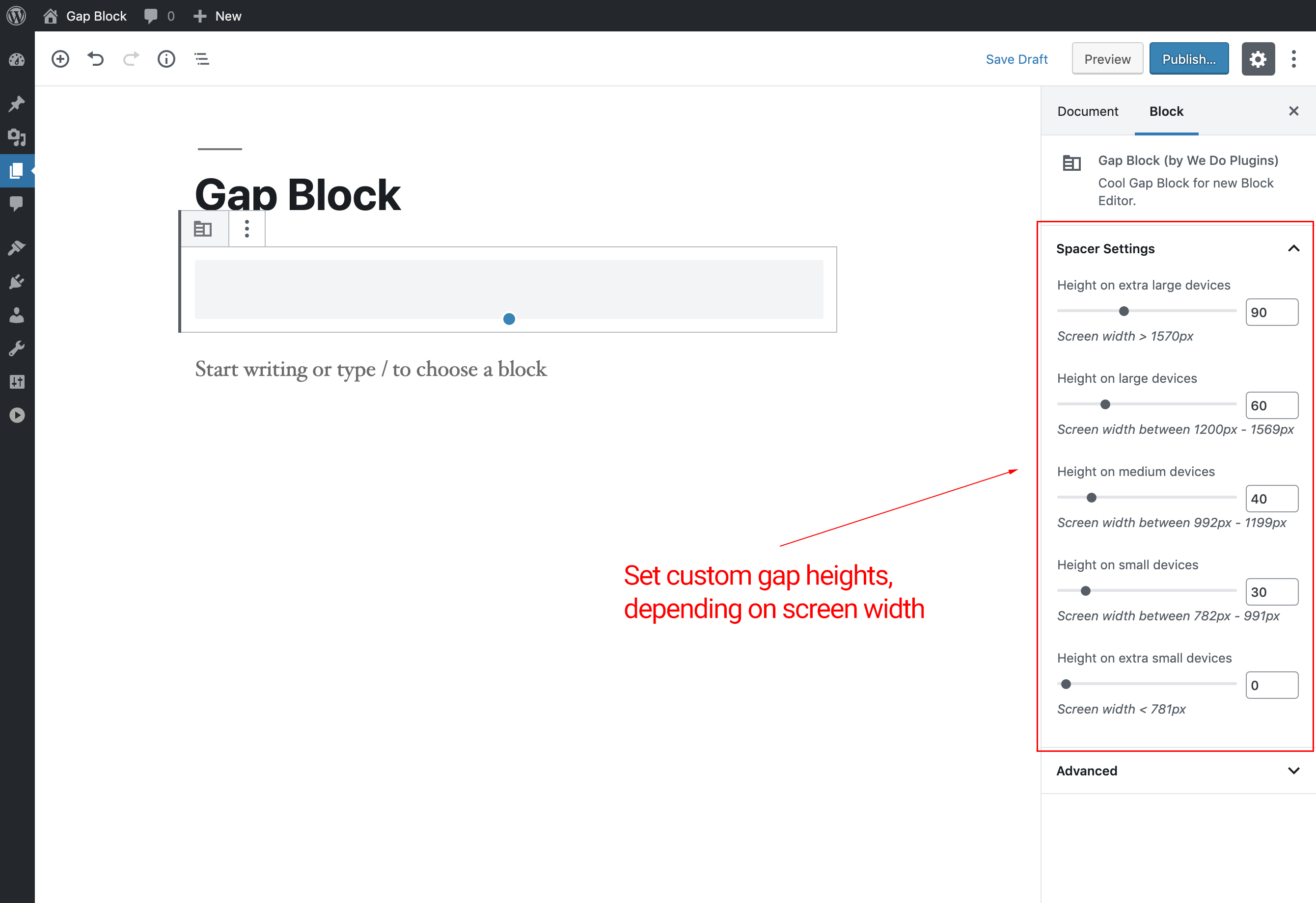
This block is intended to work with any WordPress theme that supports the new Block Editor (Gutenberg). It allow you to add responsive Gap / Spacer to your website and customize it, so you can set separate gap heights for different screen sizes (breakpoints) separately.
Features
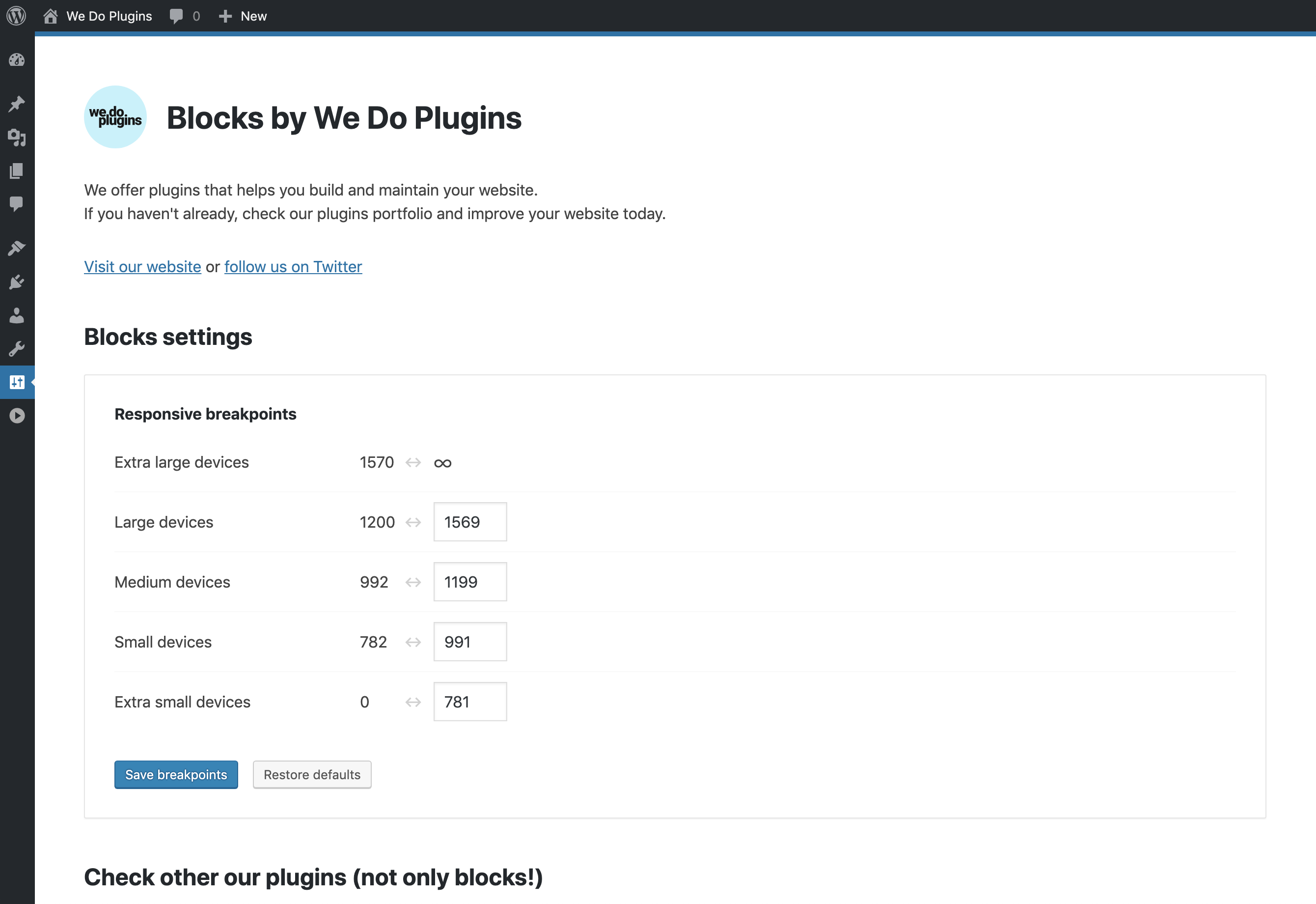
- viewport sizes can be customized in plugin options page so you can use this plugin with any theme,
- ready to use out of the box, no configuration needed,
- set same height for all viewports or for each of it separately, so you can have bigger gap on desktop and smaller on mobile device within the same block,
- customize default viewport widths settings using hooks programmatically (for theme authors),
- create unlimited number of gaps and customize each of it separately,
安装:
- Install the plugin through the WordPress plugins screen directly or upload the plugin files to the "/wp-content/plugins/gap-block" directory.
- Activate the plugin through the "Plugins" screen in WordPress
- Go to Block Editor and type /gap to use this block.
屏幕截图:
更新日志:
1.2.6
- compatibility with WP 5.4 confirmed
- custom block collection registered
- Blocks Summary page styles improved
- Blocks Summary page styles improved
- block editor outdated dependencies resolved
- Blocks Summary page updated
- fixed SSL issue
- Blocks Summary page updated
- removed outdated method from block class
- JavaScript code fully rebuilt on React, no more jQuery
- Blocks Summary page style & script improved
- AJAX replaced with custom REST endpoint
- license changed from GPL2+ to GPLv3
- block code improved
- dependencies bug fixed
- initial release


