GoogleGraph
| 开发者 | jvrtanoski |
|---|---|
| 更新时间 | 2015年7月5日 21:40 |
| 捐献地址: | 去捐款 |
| PHP版本: | 3.8 及以上 |
| WordPress版本: | 4.2.2 |
| 版权: | CC BY-NC 4.0 |
| 版权网址: | 版权信息 |
详情介绍:
安装:
- Upload the content of the ZIP archive to the
/wp-content/plugins/directory - Activate the plugin through the 'Plugins' menu in WordPress
- Use shortcodes in the text where you want the chart to appear
- At the end, please write what you like about the plug-in in the review. :) From version 0.3.2 we are adding a text with a link to our site under each graph. The text and link are wrapped in a paragraph so you can easaly use CSS to hide the text from the page if you don't want the text to appear on your page.
屏幕截图:
常见问题:
I don't see any amdin panels
The plugin provides only shortcodes. The main idea for this plugin is to allow Editors and Contributors to create their own charts inside their texts. At the moment, the shortcodes are created manualy. We are working on widget that will help users to graphicaly create the shortcodes for the chrat.
Why is the "Powered by" text appearing under the chart
We had spend effort to create this plug-in and we are investing our time in improving it and incorporating your suggestions. We don't charge for the non-commercial use of the plug-in, all we ask is from our users to share thier comments for improvement of the plug-in and to attribute our work to us. If you want to make the text invisible, you are free to use CSS and set the paragrah's display attribute to "none".
I am placing the shortcode in the text, but the chart doesn't appear on the page
Most common reason for this problem are the HTML tags that the visual editor inserts in the text for the new line. If you have this problem first remove all new lines (so the whole text of the shortcode will be in only one line). If the problem persists, swithc to "Text" view in the editor and verify that there are no HTML tags between the start of the shortcode and the end of the shortcode. In version 0.3.3, we had added explicit filter for the HTML tags inside the shortcode. If you expreriance this problem and you can not resolve it with the above steps, please send us the text (from the "Text" tab of the editor) and we will try to fix the problem for you.
Supported shortcodes
- geoChart
- lineChart
- columnChart
- barChart
- pieChart
- bubbleChart
- ScatterChart
General format of the shortcodes
The detailed user manual can be found on our website http://tsba.mobi/project/googlegraph-wp-plug-in/ The shortcodes in this plug-in have general format of [tpeOfGraph] data [/typeOfGraph]. The data in the shortcodes is in JSON format as expected by Google's JavaScript library. For more details on the supported options for each chart, refer to the google's developer page at https://google-developers.appspot.com/chart/interactive/docs/gallery
Supported attributes to the short codes
Global attributes
- "width" Width of the graph (including the legend, titile and axes labels)
- "height" Height of the graph (including the legend, titile and axes labels)
- "title" Title of the graph
- "legend" Styling attributes for the legend in a form of JavaScript object
- "vaxis" Title and styling attributes for the vertical axes
- "haxis" Title and styling attributes for the horizontal axes
- "chartarea" Control of the styling and size of the chart area
- "curvetype" Type of the curvature of the line
- "interpolate" If the lines should interpolate for the values which are "null" in the table. By default this option is "ture" and if the interpolation is not required, this option should be set to "false"
- "displaymode" Display mode of the chart
- "region" Region of interest
- "colorstart" Start color of the gradient
- "colorend" End color of the gradient
- "slices" Attributes of the slices
- "bubble" Attributes and styles of the bubbles
- "colorstart" Start color of the gradient
- "colorend" End color of the gradient
- "trendlines" Create a trend line
- "trendlines" Create a trend line
- "trendlines" Create a trend line
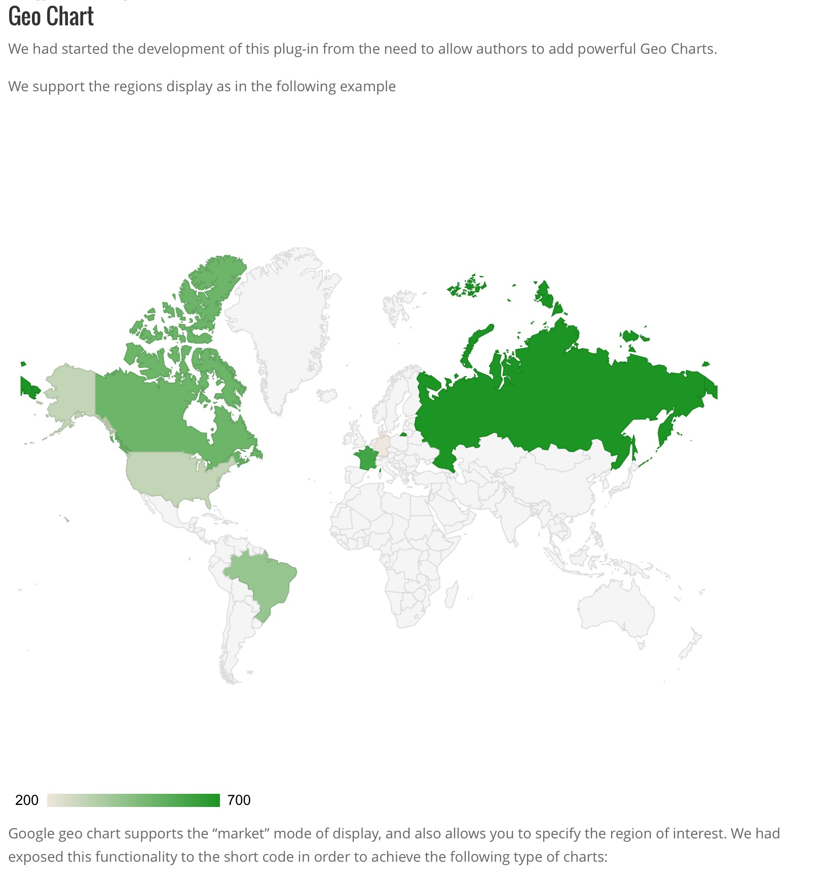
Geo Chart Example
[geoChart width="700px" height="700px" ] ['Country', 'Popularity'], ['Germany', 200], ['United States', 300], ['Brazil', 400], ['Canada', 500], ['France', 600], ['RU', 700] [/geoChart]
Google geo chart supports the "markers" mode of display, and also allows you to specify the region of interest. We had exposed this functionality to the short code in order to achieve the following type of charts:
[geoChart width="700px" height="700px" displaymode="markers" region="MK"] ['City', 'Population', 'Area'], ['Skopje', 2761477, 1285.31], ['Bitola', 1324110, 181.76], ['Prilep', 959574, 117.27], ['Ohrid', 907563, 130.17], ['Shtip', 655875, 158.9], ['Gevgelija', 607906, 243.60], ['Resen', 380181, 140.7], ['Kriva Palanka', 371282, 102.41], ['Kavadarci', 67370, 213.44], ['Negotino', 52192, 43.43], ['Tetovo', 38262, 11] [/geoChart]
We have also added the ability to control the colour gradient
[geoChart width="700px" height="700px" colorstart="#e7711c" colorend="#4374e0"] ['Country', 'Popularity'], ['Germany', 200], ['United States', 300], ['Brazil', 400], ['Canada', 500], ['France', 600], ['RU', 700] [/geoChart]
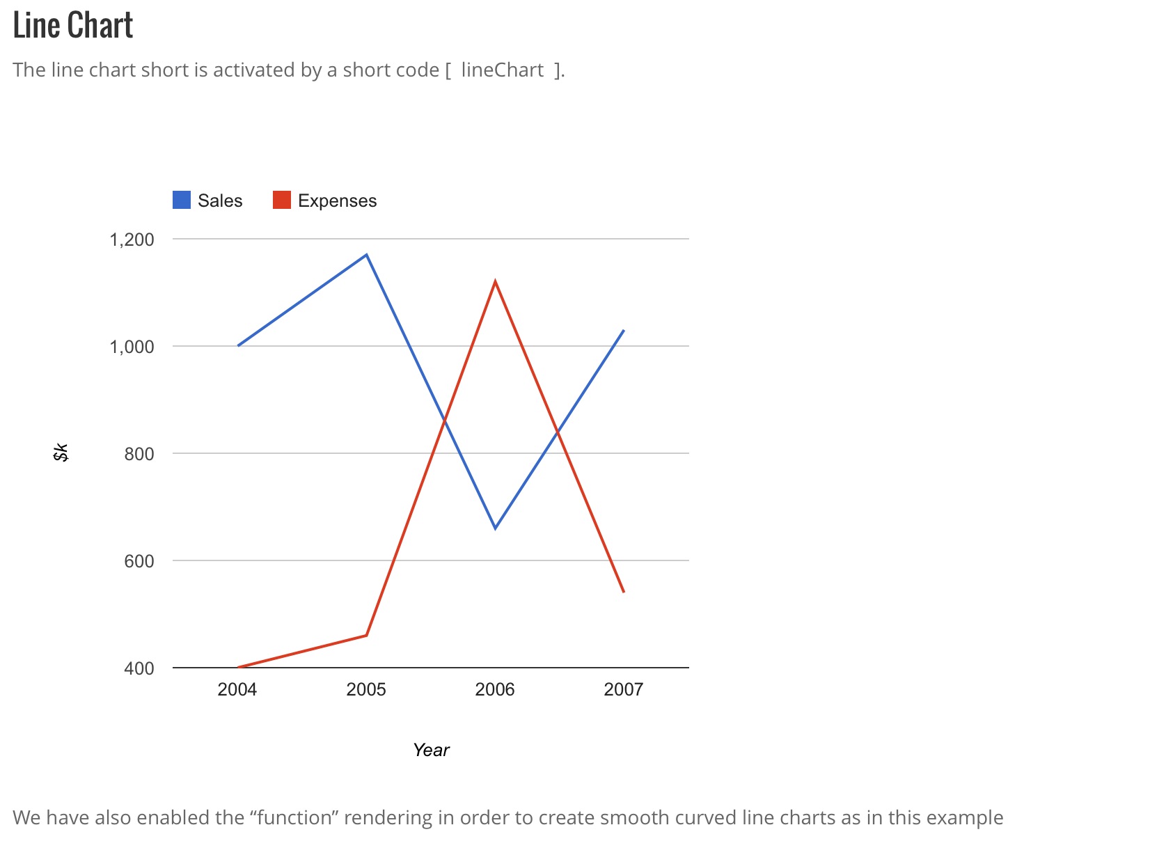
Line Chart Example
The line chart short is activated by a short code [ lineChart ].
[lineChart width="600px" height="500px" legend="{ position: 'top', maxLines: 1 }" vaxis="{title: '$k', titleTextStyle: {color: 'black'}}" haxis="{title: 'Year', titleTextStyle: {color: 'black'}}" curvetype="none"] ['Year', 'Sales', 'Expenses'], ['2004', 1000, 400], ['2005', 1170, 460], ['2006', 660, 1120], ['2007', 1030, 540] [/lineChart]
We have also enabled the "function" rendering in order to create smooth curved line charts as in this example
[lineChart curvetype="function" width="600px" height="500px" stacked="1" legend="{ position: 'top', maxLines: 1 }" vaxis="{title: '$k', titleTextStyle: {color: 'black'}}" haxis="{title: 'Year', titleTextStyle: {color: 'black'}}" curvetype="function"] ['Year', 'Sales', 'Expenses'], ['2004', 1000, 400], ['2005', 1170, 460], ['2006', 660, 1120], ['2007', 1030, 540] [/lineChart]
Column Chart Example
The column chart type is activated by a short code [ columnChart ].
[columnChart width="500px" legend="{ position: 'top', maxLines: 2 }" vaxis="{title: 'in $000', titleTextStyle: {color: 'blue'}}" haxis="{title: 'Year', titleTextStyle: {color: 'blue'}}"] ['Year', 'Sales', 'Expenses'], ['2004', 1000, 400], ['2005', 1170, 460], ['2006', 660, 1120], ['2007', 1030, 540] [/columnChart]
Adding a visual style to the columns is very easy and done as annotation on the data in the short code. Here is one example of styled columns
[columnChart width="300px" stacked="1" legend="{ position: 'top', maxLines: 2 }" vaxis="{title: 'in $000', titleTextStyle: {color: 'blue'}}" haxis="{title: 'Year', titleTextStyle: {color: 'blue'}}"] ['Year', 'Visitations', { role: 'style' } ], ['2010', 10, 'color: gray'], ['2010', 14, 'color: #76A7FA'], ['2020', 16, 'opacity: 0.2'], ['2040', 22, 'stroke-color: #703593; stroke-width: 4; fill-color: #C5A5CF'], ['2040', 28, 'stroke-color: #871B47; stroke-opacity: 0.6; stroke-width: 8; fill-color: #BC5679; fill-opacity: 0.2'] [/columnChart]
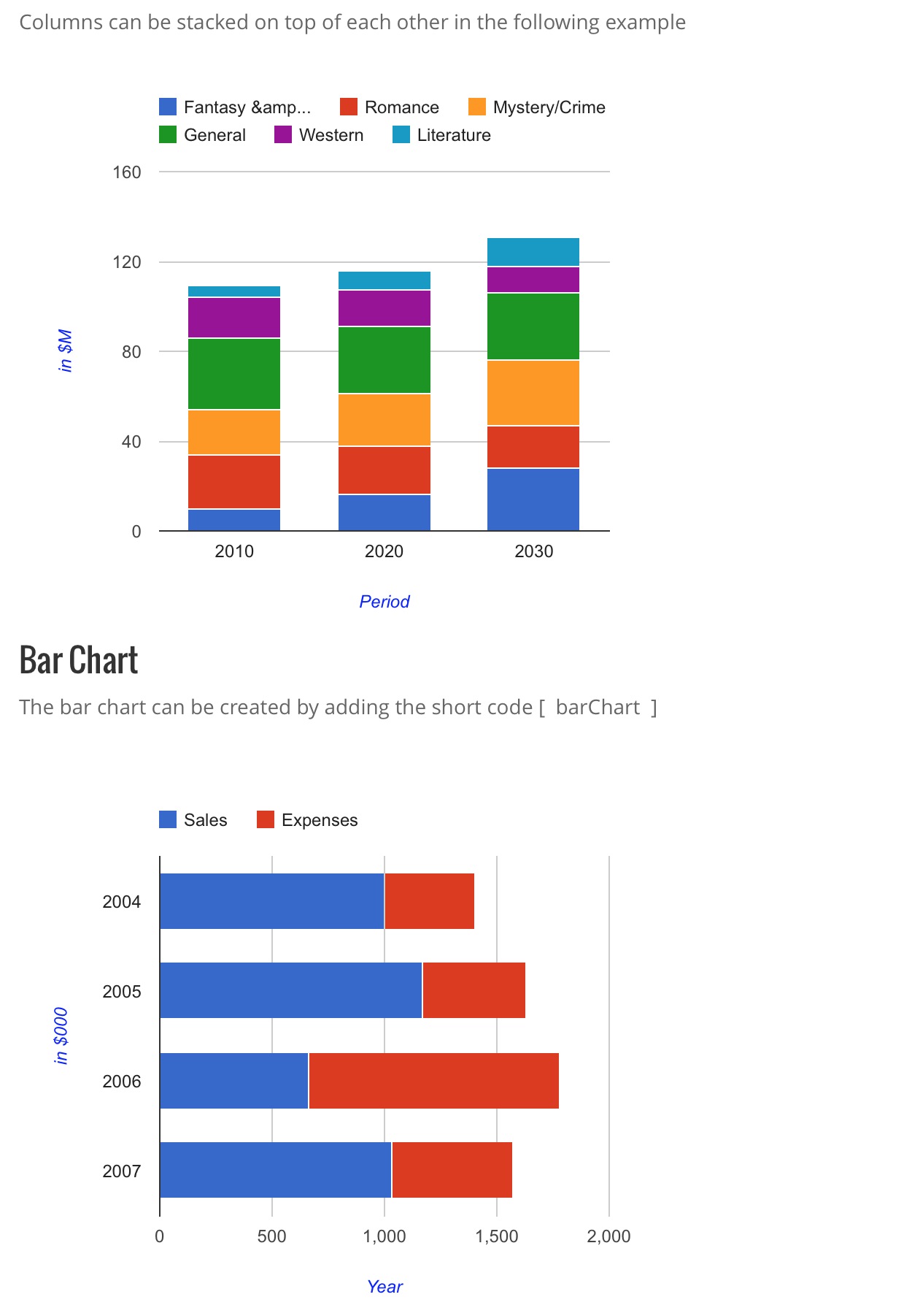
Columns can be stacked on top of each other in the following example
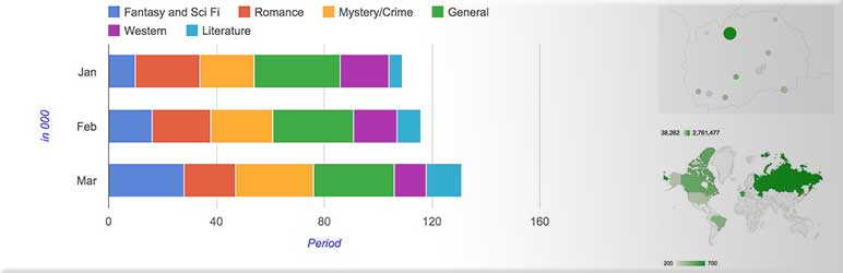
[columnChart width="500px" stacked="1" legend="{ position: 'top', maxLines: 2 }" vaxis="{title: 'in $M', titleTextStyle: {color: 'blue'}}" haxis="{title: 'Period', titleTextStyle: {color: 'blue'}}"] ['Genre', 'Fantasy & Sci Fi', 'Romance', 'Mystery/Crime', 'General','Western', 'Literature', { role: 'annotation' } ], ['2010', 10, 24, 20, 32, 18, 5, ''], ['2020', 16, 22, 23, 30, 16, 9, ''], ['2030', 28, 19, 29, 30, 12, 13, ''], [/columnChart]
Bar Chart Example
The bar chart can be created by adding the short code [ barChart ]
[barChart width="500px" stacked="1" legend="{ position: 'top', maxLines: 2 }" vaxis="{title: 'in $000', titleTextStyle: {color: 'blue'}}" haxis="{title: 'Year', titleTextStyle: {color: 'blue'}}"] ['Year', 'Sales', 'Expenses'], ['2004', 1000, 400], ['2005', 1170, 460], ['2006', 660, 1120], ['2007', 1030, 540] [/barChart]
The modified style
[barChart width="500px" stacked="1" legend="{ position: 'top', maxLines: 2 }" vaxis="{title: 'in $000', titleTextStyle: {color: 'blue'}}" haxis="{title: 'Year', titleTextStyle: {color: 'blue'}}"] ['Year', 'Visitations', { role: 'style' } ], ['2010', 10, 'color: gray'], ['2010', 14, 'color: #76A7FA'], ['2020', 16, 'opacity: 0.2'], ['2040', 22, 'stroke-color: #703593; stroke-width: 4; fill-color: #C5A5CF'], ['2040', 28, 'stroke-color: #871B47; stroke-opacity: 0.6; stroke-width: 8; fill-color: #BC5679; fill-opacity: 0.2'] [/barChart]
and the bars stacked / connected with each other
[barChart width="500px" stacked="1" legend="{ position: 'top', maxLines: 2 }" vaxis="{title: 'in $M', titleTextStyle: {color: 'blue'}}" haxis="{title: 'Period', titleTextStyle: {color: 'blue'}}"] ['Genre', 'Fantasy & Sci Fi', 'Romance', 'Mystery/Crime', 'General','Western', 'Literature', { role: 'annotation' } ], ['2010', 10, 24, 20, 32, 18, 5, ''], ['2020', 16, 22, 23, 30, 16, 9, ''], ['2030', 28, 19, 29, 30, 12, 13, ''], [/barChart]
Pie Chart Example
The pie chart is triggered by short code [ pieChart ]
[pieChart width="400px" ] ['Task', 'Hours per Day'], ['Work', 11], ['Eat', 2], ['Commute', 2], ['Watch TV', 2], ['Sleep', 7] [/pieChart]
The position and color of the slices can be altered by adding the "slices" option to the shortcode as follows:
[pieChart width="400px" slices="{ 0: {offset: 0.2, color: 'black'}, 3: {color: white} }"] ['Task', 'Hours per Day'], ['Work', 11], ['Eat', 2], ['Commute', 2], ['Watch TV', 2], ['Sleep', 7] [/pieChart]
At the moment we support only the basic pie chart, however we plan to add the 3D and Donut type soon.
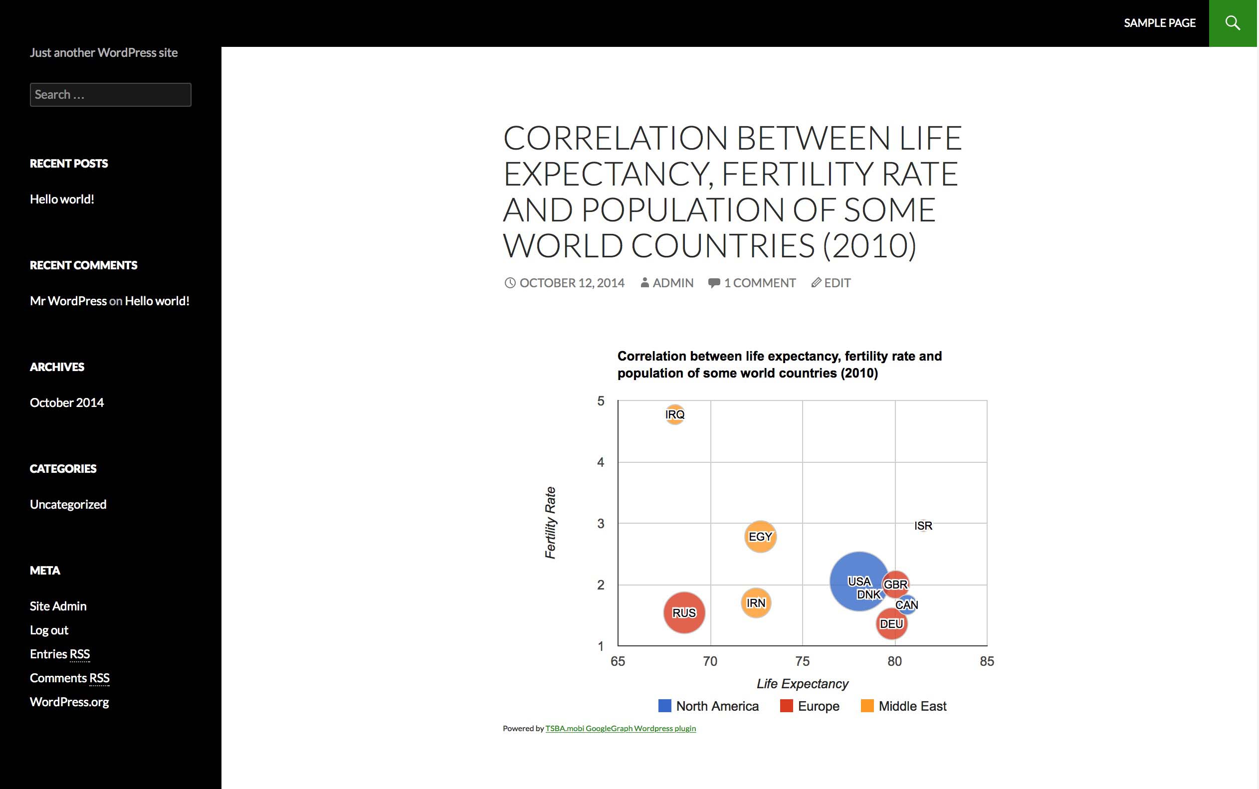
Bubble Chart Example
To crate a bubble chart, you can use the [ bubbleChart ] short code as shown on the following example
[bubbleChart width="400px" vaxis="{title: 'X', titleTextStyle: {color: 'black'}}" haxis="{title: 'Y', titleTextStyle: {color: 'black'}}" colorstart='yellow' colorend='red' bubble="{textStyle: {auraColor: 'none'}}"] ['ID', 'X', 'Y', 'Temperature'], ['a', 80, 167, 120], ['b', 79, 136, 130], ['c', 78, 184, 50], ['d', 72, 278, 230], ['e', 81, 200, 210], ['f', 72, 170, 100], ['g', 68, 477, 80] [/bubbleChart]
Bubble charts support classification (by color type) and size of the bubble. To add color class and size you will need to add two more columns to your data as shown on the example below:
[bubbleChart width="600px" vaxis="{title: 'Fertility Rate'}" haxis="{title: 'Life Expectancy'}" bubble="{textStyle: {fontSize: 11}}" title="Correlation between life expectancy, fertility rate and population of some world countries (2010)"] ['ID', 'Life Expectancy', 'Fertility Rate', 'Region', 'Population'], ['CAN', 80.66, 1.67, 'North America', 33739900], ['DEU', 79.84, 1.36, 'Europe', 81902307], ['DNK', 78.6, 1.84, 'Europe', 5523095], ['EGY', 72.73, 2.78, 'Middle East', 79716203], ['GBR', 80.05, 2, 'Europe', 61801570], ['IRN', 72.49, 1.7, 'Middle East', 73137148], ['IRQ', 68.09, 4.77, 'Middle East', 31090763], ['ISR', 81.55, 2.96, 'Middle East', 7485600], ['RUS', 68.6, 1.54, 'Europe', 141850000], ['USA', 78.09, 2.05, 'North America', 307007000] [/bubbleChart]
PHPLeague integration
Since v0.4 we have added integration for the PHPLeague plugin, allowing you to create charts showing the statisics for the teams of the league. We support two shortcodes, as follows:
- phpLeagueGraphPerCategory
- phpLeagueGraphPerTeam
- league - The ID of the league for which the chart should be generated. By default this value is set to 1
- club_list - List of the clubs for the statistics. By default, we will generate graph with all clubs in the league.
更新日志:
- Introducing the "chartarea" attribute
- Fixing compatibiliti issue with the Wordpress 4.0.1 security patch
- Prevented texturization of the shortcode content
- Fixing the issue with older versions of PHP (prior PHP 5.4)
- New admin screen showing a reference for the shortcodes and commands
- Integration with PHPLeague
- Public API for charting (for developers)
- New chart type "Scatter Chart" added. Use the shortcode "scatterChart" to render the scatter chart.
- Added new feature for the Line Chart that will allow the chart to interpolate the missing data points
- Added new feature for rendering trend lines for Column Charts, Bar Charts, Line Chart and Scatter Chart. !!!! Impartent, the first row should be number or date in order for the trend line to be activated.
- Added new chart type "bubbleChart"
- Added QuickTags to the "Text" are of the editor
- Added support for "slices" on the Pie Charts
- Added link for donations
- Added text with link to the plug-in page under each chart
- Added filter for HTML tags inside the shortcode tags
- Updated to the examples
- Addedd tribute link
- Updated donation link
- Addedd support for option for "slices"
- Verification of the support for WordPress 4.0
- Adding the banner for the Wordpress.org plug-in page
- Fixing the versioning across the files
- Moving Screenshots to assets folder
- Minor changes on the readme.txt file
- Cleanup for WordPress.org submission
- Initial Release