Header Customizer Lite
| 开发者 | markzero |
|---|---|
| 更新时间 | 2016年3月25日 16:18 |
| PHP版本: | 4.2.2 及以上 |
| WordPress版本: | 4.4.2 |
| 版权: | GPLv2 or later |
| 版权网址: | 版权信息 |
详情介绍:
Header Customizer Lite is a WordPress plugin which enables you to modify your
header by live previewing it at the same time. Only after you are happy
with your settings, you can save and publish it safely. This
Documentation is intended to help you configure and get the most of your Header.
With this plugin you replace your header entirely with your own customizable header.
It's purpose is to make your website more useful, user friendly and to
improve the general look and feel, even on narrow screens.
You can modify your header visually using WordPress Customizer
API,
which enables you to make changes to the header while looking at your
website at the same time.
Simply insert following code right below <body> tag:
<?php echo apply_filters('hc_print_header', ''); ?>
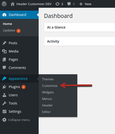
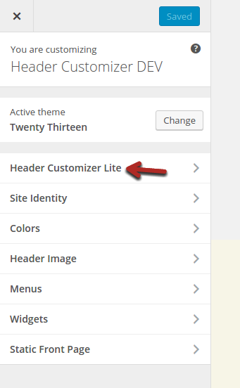
And that's it. All you need to do is to activate your plugin and go to Appearance -> Customize -> Header Customizer Lite section, to start modifying your header.
You'll be able to see changes while modifying your header through Header Customizer Lite!
If you want sticky header, more menus, breadcrumbs, search box, or simply much more settings, while live previewing them all, you may consider non-lite or PRO version WordPress Header Customizer.
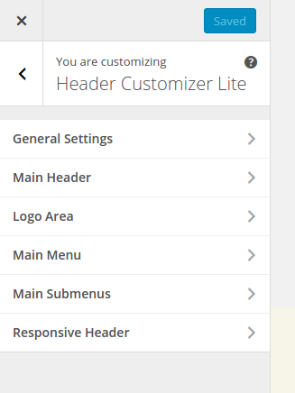
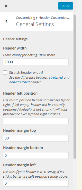
General Settings
This panel contains following settings:
- Header width - width of the header content
- Stretch header width? - should header wrapper stretch the whole width of a browser?
- Header left position - if your header is sticky, you should use this option if you don't want header to be horizontally on the center
- Margin top
- Margin bottom
- Margin left
- Margin right
- Google Font - choose font for the header; there are more specific options for fonts (e.g. only for logo area) but this is for the whole header at once
- Custom CSS - you can type any CSS here; make sure to start your CSS definitions with ".hc-wrap {" so you don't mess with other website's CSS definitions
- Header type - how are your logo and menus placed; by default logo goes on the left side, while main menu goes to the right side of the header; you can set them both centrally aligned, or move menu to the left next to the logo
- Background color - background color of middle header, solid color with transparency set optionally through color picker
- Background image - background image of middle header (overrides background color)
- Background image repeat - background image of middle header (overrides background color)
- Background image attachment - the background-attachment property sets whether a background image is fixed or scrolls with the rest of the page; it's great to set parallax effect for example if set to "fixed"
- Background image position - the background-position property sets the starting position of a background image
- Background image size - the background-size property specifies the size of the background images
- Padding (top/bottom) - padding of middle header so you can fit vertically your menu or logo nicely
- Padding (left/right) - padding of middle header so you can set the distance of inner content from left or right side of the screen
- Border top (and bottom, left, right) color - not visible until border width is set to at least 1 (one) pixel (px)
- Border top (and bottom, left, right) width - width of the border
- Top left (and bottom left, top right, bottom right) radius - border radius of the middle header
- Logo image - image as your logo
- Logo type - set type of your logo: link image or link text
- Logo text - site title by default
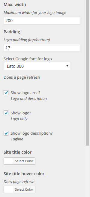
- Maximum width - it's useful not to stretch when header goes responsive
- Padding (top/bottom) - top and bottom paddings; play around to set it vertically nicely against main menu
- Google font family - for textual logo only
- Google font family for description - for description only
- Show logo area? - yes or no (checkbox); if you need to remove logo area completely
- Show logo? - yes or no (checkbox); if you need to remove logo only
- Show logo description? - yes or no (checkbox); if you need to remove description (tagline) only
- Site title color (and hover color) - if your logo is textual, set it's color here
- Site description color - color of logo description (tagline)
- Site title font size - font size for textual logo
- Site description font size - font size for description (tagline)
- Link color (and hover color, active color) - these options are only for link (<a> tags) colors; active color is color of a link when on current page
- Font size - font size of menu items
- Google font family - font family of menu items
- Show submenu arrows? - checkbox; show arrow pointing down for menu items which have submenus
- Menu margin left (and right) - margin left and right of the whole menu (not menu items!)
- Link background color (and hover and active background colors) - only for links
- Link border radius - only for links, so they can be "rounded"
- Menu item background colors (and hover, active background colors) - for list items (<li> tags!)
- Menu items padding (top/bottom) - list tag paddings, so you can align with logo area nicely
- Menu items padding (left/right)
- Menu items margin (top/bottom)
- Menu items margin (left/right)
- Menu links padding (top/bottom) - for links (<a> tags)
- Menu links padding (left/right) - same
- Menu item border top (and bottom, left, right) color - border colors for list items
- Menu item border top (and bottom, left, right) width - border width
- Menu item top-left (and top-right, bottom-left, bottom-right) radius - each of these options have possibility to exclude all other items except first or last item, so the whole menu looks "rounded" (take a look at the gif example below!)
- Submenus depth - like stated previously, you can choose how many levels of submenus you've got
- Show submenu on mouse hover? - whether to click or hover main menu items or submenu items in order to show submenus; responsive header will always react on tap (click)
- Background color - background color of all submenus
- Min. width - minimum width that your submenus take; by default it's set to auto
- Font size - font size of all submenu items
- Border color - border color of all four sides of one submenu column: top, bottom, left, right
- Border top (and bottom, left, right) width - four separate options for borders' width
- Menu items border top (and bottom) color - border color of submenu links (except first one, or last one if it's bottom color)
- Menu items border top (and bottom) width - border width of submenu links (except first one, or last one if it's bottom width)
- Shadow - shadow set using CSS property box-shadow; it's set in text field using full definition, e.g. 2px 2px 2px 2px rgba(85, 85, 85, 0.8) and when you make changes to any of the values you can see them live as you type
- Responsive Width - width which defines breaking point between desktop and responsive header; when you load your website on screen sizes below this point your header will look "minified"
- Hamburger Color - "hamburger" icon appears instead of your main menu, which you can click on to show the menu on small screens but this time the menu items are ordered below each other
安装:
- Download the plugin from this page and extract it
- Copy the extracted header-customizer-lite directory to \"/wp-content/plugins/\" directory
- Activate the plugin through the \"Plugins\" menu in WordPress dashboard
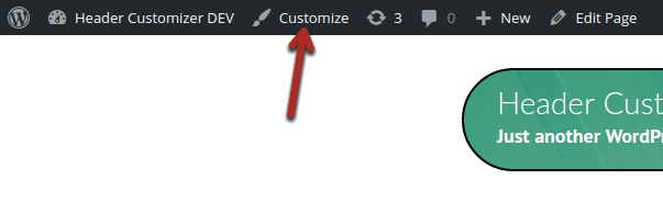
- Done! You can visit your website and see your header in action! Setup your header from Appearance > Customize or by clicking on Customize button on admin bar, and then go to Header Customizer Lite section.
屏幕截图:
常见问题:
Where can I find settings?
In WordPress admin area, under Appearance -> Customize or by clicking on Customize button on admin bar, and then go to Header Customizer Lite section.
Which PHP version do I need?
At least 5.4.
更新日志:
1.0.0
- Initial release.


