Linear Checkout for WooCommerce by Cartimize
| 开发者 |
cartimize
amritanandh rajkuppus midhubala aghilesh |
|---|---|
| 更新时间 | 2023年4月20日 18:45 |
| PHP版本: | 7.0 及以上 |
| WordPress版本: | 6.2 |
| 版权: | GPLv3 |
| 版权网址: | 版权信息 |
详情介绍:
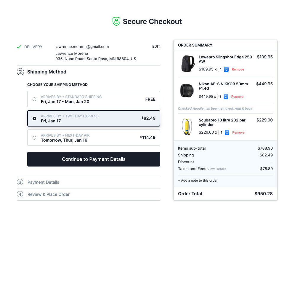
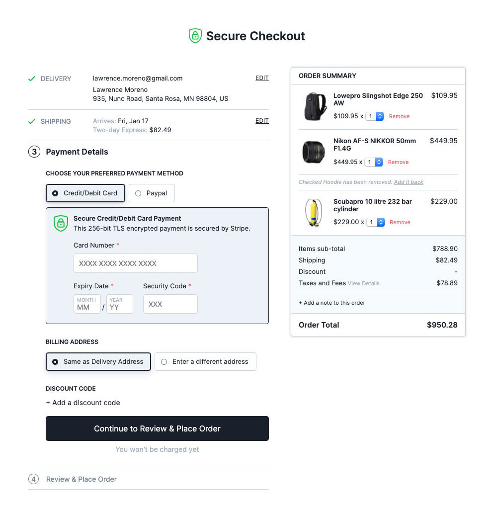
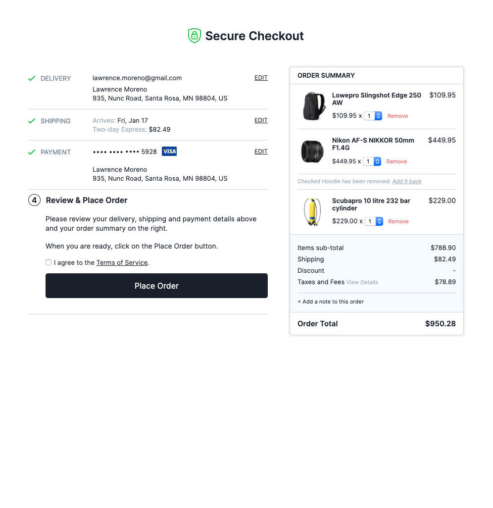
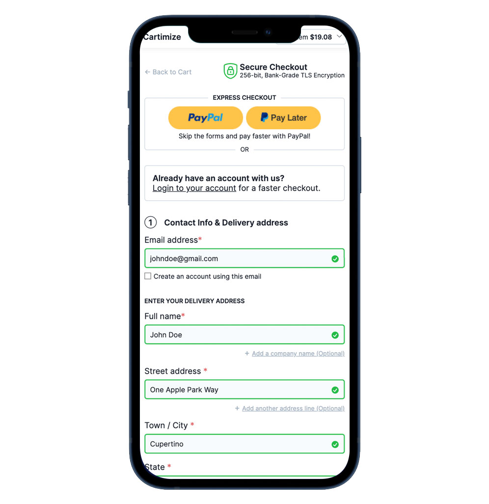
All design and user-experience decisions are based on 134 checkout-specific guidelines distilled from Baymard Institute‘s 54,000+ hours of large scale e-commerce UX research. The very same research used by leading e-commerce companies like Amazon, Nike, Walmart, Target, Google, Macy’s, and Office Depot to name a few.Implement The Best WooCommerce Checkout UX and gain as much as a 35% increase in conversion rate, in under 5 minutes. Live Demos -
- Simple product
- Virtual product
- Custom-styled checkout Check out the Demo Video below -
- A Better Thank you page [PRO] -The order confirmation page (thank you page) is the final leg in the checkout process. The first job of the confirmation step is to let all users know that their order has been successfully completed. It’s important that this information is communicated clearly to users to avoid them looking for further tasks that have to be completed before the order is placed. When this isn’t communicated clearly, users would wonder if they needed to do something else to finalize the order.Another key aspect of the confirmation step is to clearly prioritize the information, making the order confirmation information sufficiently prominent. This includes not collapsing all the order information or plastering the page with auxiliary options that are much more dominant than the actual order information.
- Google Address Auto-complete [PRO] -Reduce post-order headaches and cut down address form fields by auto-completing your customers' address entry.
- Cart editing in checkout page [PRO] - Keep customers in the checkout page itself by allowing them to edit their cart without having to go back to the cart page.
- Delayed account creation [PRO] - While users should always be allowed to complete the checkout process as a guest, having an optional account creation option is often appreciated by users. This begs the question of at which point during the checkout flow is it best to ask for the optional account creation.Based on previous checkout usability tests, it's clear that delaying the optional account creation option performs the best. In fact, it's often best delayed until the order is finalized; hence presenting the optional account creation option on the order confirmation page works best. This concept is called 'Delayed Account Creation'.
- Hide or make billing address optional for virtual and downloadable products [PRO] - For stores that do not need to get a billing address from their users, it is best to hide the form altogether.
- Remove Cartimize branding [PRO] - Remove the 'Checkout Powered by Cartimize' badge and make the checkout your own.
安装:
- Visit the Plugins page within your dashboard and select ‘Add New’.
- Search for ‘cartimize’ and in the 'Linear Checkout for WooCommerce by Cartimize' plugin, click on the 'Install Now' button and once installed, click Active button.
- Upload the ‘linear-checkout----’ folder to the /wp-content/plugins/ directory.
- Activate the plugin through the ‘Plugins’ menu in WordPress
屏幕截图:
常见问题:
Is this compatible with my theme?
Yes. This plugin works independently of your theme and will not be affected by your theme's styles. If you face any issues with your theme, send us an email to support@cartimize.com and we'll get it fixed asap.
Can I style the checkout to better reflect my brand and website's theme?
Absolutely. You have full CSS control over all aspects of the checkout page. We also provide a custom-styled checkout service to help you make your checkout completely your own.
Why are my store's header, navigation, sidebar and footer not included?
Read this article to know more about Enclosed Checkout and why leading e-commerce sites, including Amazon, use it.
What payment gateways do you support?
We have developed the plugin in such a way that most payment gateways work out-of-the-box. The plugin simply uses existing payment methods that you have already set up. In other words, if it works with the default checkout, it'll work with the plugin. If you face any issues with your payment plugin, let us know at support@cartimize.com and we'll fix it immediately.
Will it work with my shipping plugin to calculate and display shipping rates from carriers?
We have developed the plugin in such a way that most shipping plugins work out-of-the-box. If you face any issues with your shipping plugin, let us know at support at cartimize dot com and we'll fix it immediately.
How can I report a bug?
If you think you have identified a bug or a compatibility issue, send us a Bug Report using the link inside the plugin settings. If you would like a quick resolution, please avoid using the plugin's WP support forum.
How can I request a new feature?
You can use the 'Request a feature' link inside the plugin settings. It will send you to our idea management platform where you can post, vote on and discuss about your idea and other ideas from other users as well.
How can I get support?
For anything other than bugs, compatibility issues and feature requests, send us an email at: support at cartimize dot com
更新日志:
- Improvement: Support for TwentyTwentyThree
- Fix: PHP Deprecated: Required parameter $value follows optional parameter $setting in \includes\Controllers\SettingsController.php on line 31
- Fix: Noticed this invalid HTML showing up at the top of the checkout page only when LCW is enabled
- Fix: Product images not showing in item summary with Woodmart theme and Lazy load option enabled
- Fix: Shipping form hiding while YITHWooCommerceCheckoutManager plugin active
- Improvement: Mobile payment UI Improved
- Improvement: UI improved WooCommerce Payment Gateway - SUMIT
- Fix: Country UI issue If we set the default country and sell only one country
- Fix: Full width does not apply to the form element. If the checkout field editor plugin active
- Fix: update_order_review ajax call keeps on going if the woo-payment-gateway-officeguy payment plugin active
- Fix: Some of the translation strings not present for translation
- Fix: Switzerland Postal Code always throwing error in both biling and shipping
- Fix: RTL css has some UI issues
- Fix: Not able to submit the first step if Elementor Pro plugin v3.7.1 installed
- Feature: Support added for All Custom WooCommerce checkout Fields plugins
- Improvement: Support added for SiteGround Optimizer plugin
- Improvement: Support added for Twenty Twenty-Two theme
- Improvement: Support added WooCommerce Extended Coupon Features PRO plugin
- Improvement: New Item summary UI for mobile mini cart
- Improvement: New Payment UI if single payment available
- Improvement: Coupon code field moved to Item summary from payment step
- Improvement: Extra Billing fields (not present in shipping address form) will show while choosing same as "Same as Delivery Address"
- Improvement: The email field will show in the checkout if logged in user doesn’t have a saved email address.
- Improvement: Email field placeholder removed
- Improvement: Place order button name changed to Place order securely
- Improvement: Shipping and Billing Zip/Postal code inline validation improved
- Improvement: Zip/Postal code field Input mask added for a few countries (Hungary, Bosnia and Herzegovina, Belgium, India, Puerto Rico, Liechtenstein)
- Improvement: Error messages will show in the initial page load if any error is present
- Fix: RTL Site form not filling from right to left
- Fix: Item summary text not available for translation
- Fix: Fatal error for get_label() function includes/Actions/UpdateCheckoutAction.php line 190
- Fix: Down scroll arrow showing in mobile mini cart at review step
- Fix: Vat price not included in shipping method summary
- Fix: UK zipcode inline validation not working properly
- Fix: Horizontal page scroll showing in mobile if more number of payment methods present
- Improvement: Support for FluentCRMPro plugin added
- Improvement: Support for Ultimate Member plugin added
- Improvement: Support for Gift message for WooCommerce plugin added
- Improvement: Support for Themify theme added
- Improvement: Variable products variables design improved in item summary
- Improvement: Alert messages now will display in every active step
- Fix: Klarna payment UI not showing.
- Fix: The United Kingdom County field had placeholder
- Fix: Stripe recent update caused a validation issue
- Fix: Free shipping method was not choosing while applying free shipping coupon
- Fix: PHP Fatal error: Uncaught Error: Call to a member function is_type() on bool in SettingsPage.php:157
- Fix: While pressing Return key in order notes text field, the active step was being submitted in form
- Improvement: Support for Authorize.Net - WooCommerce plugin added
- Improvement: Support for Kidz theme added
- Improvement: Support for Flatsome theme added
- Improvement: Support for WooCommerce Delivery Slots plugin added
- Fix: Paypal plugin Place order button not showing if Stripe payment activated in WooCommerce payment plugin.
- Fix: Translated string from WordPress not working.
- Fix: Update checkout ajax call keep on going if Divi BodyCommerce plugin activated
- Fix: Demo link not working in Cartimize Setting page if store contains only variation product.
- Fix: Paypal payment button showing after placing order.
- Fix: UI overlap if account email has more character in the checkout page for logged-in users.
- Fix: GPay and Apple Pay payment request button not showing in checkout page if Stripe plugin installed.
- Fix: Fatal error in the review step in certain servers.
- Fix: Shipping and Estimated shipping value not showing in the item summary
- Fix: GPay Payment request button not working in cart page
- Fix: Recent update in Elementor plugin causing checkout freeze.
- Improvement: Cartimize account creation made optional.
- Feature: Pro plugin support
- Improvement: Payment method icons will show in payment step
- Improvement: Shoptimize theme support improved
- Improvement: AfterPay payment support
- Improvement: Billing field syncing added to support all payment m
- Improvement: Country field moved before state field
- Improvement: Place Order loader improved
- Improvement: Global notice added on failure case if return URL does not come back to the review or payment step
- Improvement: Added viewport meta tag
- Improvement: Logo link changed to home page URL
- Fix: iPad 8th gen and safari browser v14 - in the landscape view fields of the country, state & Pincode UI was breaking.
- Fix: Empty Express checkout fields showing while activating Apple Pay option in Stripe gateway
- Fix: Out of stock product added to cart and landed in checkout page - Now a message will be displayed.
- Fix: The country does not get displayed in the summary tab for Germany.
- Fix: Default base address country Austria showing empty state filed in billing address
- Fix: Checkout UI collapse for certain users if the applied style for .row CSS class
- Fix: Billing address fields UI is breaking in tab desktop view.
- Fix: Delivery address fields & billing address fields UI is breaking in tab desktop view (Landscape view).
- Fix: Number and neighborhood value now show in shipping and billing address summary in checkout field while using Brazilian Market on WooCommerce plugin
- Fix: Review step content will show based on product type
- Fix: Billing address postcode field is not set based on the country. It's setting based on the shipping address post code.
- Fix: Mobile Billing checkout field title for Postcode / ZIP becomes scrambled while choosing Singapore country
- Fix: Without payment checkout page not working in mobile
- Fix: Countries like Germany, Austria in billing address empty state/country (optional) field heading is showing.
- Feature: Support for 'Brazilian Market on WooCommerce' plugin added
- Improvement: Internal top-aligned label for form elements for a more minimal look
- Improvement: Logo aligned to the centre of the header
- Improvement: Auto apply coupon code logic improved while submitting payment step
- Improvement: Bigger loading indicator for Order Total amount
- Improvement: Docs link added in cartimize settings page and plugin list page.
- Improvement: Admin toolbar hidden from the checkout page.
- Improvement: Support for latest release of the 'WooCommerce Stripe Payment Gateway' plugin
- Fix: Support added for tablet portrait and landscape mode
- Fix: Delivery and billing address form not validating while enabling option Shipping-> Force shipping to the customer billing address
- Fix: Checkout page not loading sometimes in Safari browser below 13.3 in iOS
- Fix: After placing the first order by using the direct bank transfer payment method, form steps are not resetting while the same customer places a second order
- Fix: Select2 form element error case UI issue
- Feature: WooCommerce Points and Rewards support added
- Improvement: Initial checkout page load time reduced
- Improvement: Removed title of shipping and payment if only one option is displayed
- Improvement: Setting for Shipping method ordering
- Improvement: Coupon code will display in the item summary
- Fix: All steps collapsed for logged in users when Woocommerce setting -> guest checkout turned off
- Fix: Payment and shipping options were not refreshing while changing country
- Fix: In mobile "Billing" is being added for delivery address labels when turning on Woocommerce setting -> Force shipping to the customer billing address
- Fix: Default loading class conflict with other themes
- Fix: wd_shortcode plugin causing the UI break issue
- Fix: Custom Terms and condition page are not working
- Improvement: Woocommerce field description support added
- Fix: Translation text-domain loaded to detect other translation plugins
- Fix: Fatal error: Uncaught Error: Call to undefined function Cartimize\Admin\wp_get_available_translations() for certain users
- Feature: Translation support added
- Improvement: Blocksy theme support
- Improvement: Greenmart theme support
- Improvement: Metro theme support
- Improvement: All internal CSS declarations are now removed
- Improvement: Logout option for connected Cartimize account in Cartimize setting page
- Improvement: Company name improved in Billing/Shipping address summary.
- Improvement: Product icon in item summary height will be set automatically.
- Improvement: Privacy policy content will open in modal instead of a new tab
- Improvement: Apply coupon ajax call improved
- Improvement: Coupon code will apply when clicking on Continue to Review & Place Order button without clicking the Apply button.
- Improvement: Remove coupon code will be performed via ajax call instead of page reload
- Improvement: Link added to login 'You must be logged in to checkout' page.
- Fix: On the Media Library page, Js script error (Uncaught TypeError: Cannot read property \'model\' of undefined) causes issues to other plugins (Image Regenerate & Select Crop)
- Fix: Cartmize feedback integration API loading all the admin pages instead of Cartimzie setting page
- Fix: Keyboard tab index added for Terms and Condition checkbox
- Fix: Singapore Town/City field is supposed to be optional but it says that the value is required.
- Fix: Page scrolling to top while applying coupon code in mobile
- Feature: Option to report a bug
- Feature: Option to Become an insider
- Feature: Option to use the custom store name instead of logo
- Feature: Custom CSS on the checkout page
- Improvement: I accept terms check-box error box out of view in mobile
- Improvement: WeaverXtreme theme support
- Improvement: PeakShops theme support
- Fix: Required Billing fields are not validating in Square and brain tree payments
- Fix: TypeError: Cannot read property 'msie' of undefined in WordPress v5.6.
- Fix: Fatal error: Cannot declare class WordPress_SimpleSettings, because the name is already in use in /public_html/wp-content/plugins/linear-checkout-for-woo-by-cartimize/includes/Utility/wordpress-simple-settings.php
- Fix: Fatal error: Uncaught Error: Class 'CartimizeCompatibilityThemesCartimize' not found in /www/wp-content/plugins/linear-checkout-for-woo-by-cartimize/includes/Compatibility/Themes/Astra.php:28
- Fix: Shipping summary currency symbol not following in currency options in WooCommerce general
- Fix: Empty Express checkout box showing if Stripe payment enabled
- Fix: Country success border not showing if Default customer location selected as No default location in WooCommerce general option
- Fix: "button" class assigned to a non-buttons element in the checkout page
- Initial Public release
- Feature: Custom Logo upload for checkout
- Improvement: Oxygen Builder Plugin with PayFast plugin support
- Improvement: Email field removed if a user logged in to the site
- Improvement: Braintree For WooCommerce Plugin support
- Improvement: WooCommerce Braintree Payment Gateway Plugin support
- Improvement: PayPal for WooCommerce Plugin support
- Improvement: PayPal PLUS for WooCommerce Plugin support
- Improvement: WooCommerce Square Plugin support
- Improvement: PayPal Plus for WooCommerce Plugin support
- Improvement: Cart Flows Plugin support
- Improvement: Astra Theme support
- Improvement: Atelier Theme support
- Improvement: Atik Theme support
- Improvement: Avada Theme support
- Improvement: BeaverBuilder Theme support
- Improvement: Blaszok Theme support
- Improvement: Divi Theme support
- Improvement: Electro Theme support
- Improvement: Flevr Theme support
- Improvement: GeneratePress Theme support
- Improvement: Genesis Theme support
- Improvement: Jupiter Theme support
- Improvement: Jupiterx Theme support
- Improvement: Konte Theme support
- Improvement: Listable Theme support
- Improvement: Optimizer Theme support
- Improvement: Porto Theme support
- Improvement: Savoy Theme support
- Improvement: The7 Theme support
- Improvement: TMOrganik Theme support
- Improvement: Verso Theme support
- Improvement: Zidane Theme support
- Improvement: Multisite Support
- Improvement: Make the 'Terms and Conditions' hyperlinks open in a popup modal box
- Improvement: Decimal separator disappear in checkout page
- Improvement: Option to disable coupon field
- Improvement: Review steps modification
- Improvement: Add compatibility with TC Extra Product Options Plugin
- FIx: Visible bullet list at top of page
- Feature: Klarna Payment support
- Improvement: Oxygen Builder Plugin support
- Improvement: OCeanWP Theme support
- Improvement: Woodmart Theme support
- Fix: Name field validation will not pass with Cyrillic names
- Fix: Full name not auto completing.
- Fix: Removed unwanted element in footer.
- Improvement: Shoptimizer theme support
- Fix: Fatal error when trying to enable plugin
- Fix: Some PHP notices were blocking the checkout page load if we set WP_DEBUG true
- Initial Private Beta release


