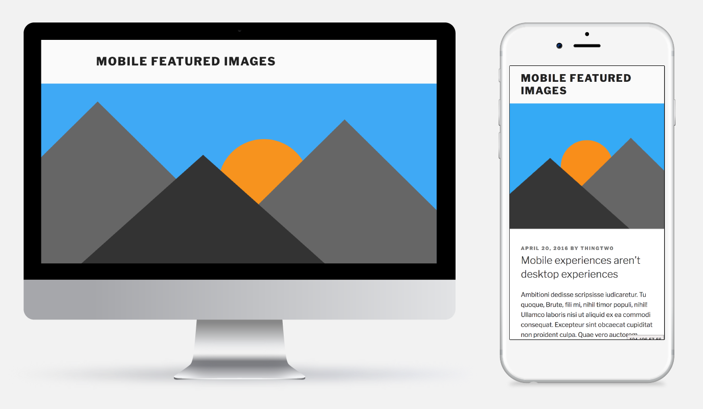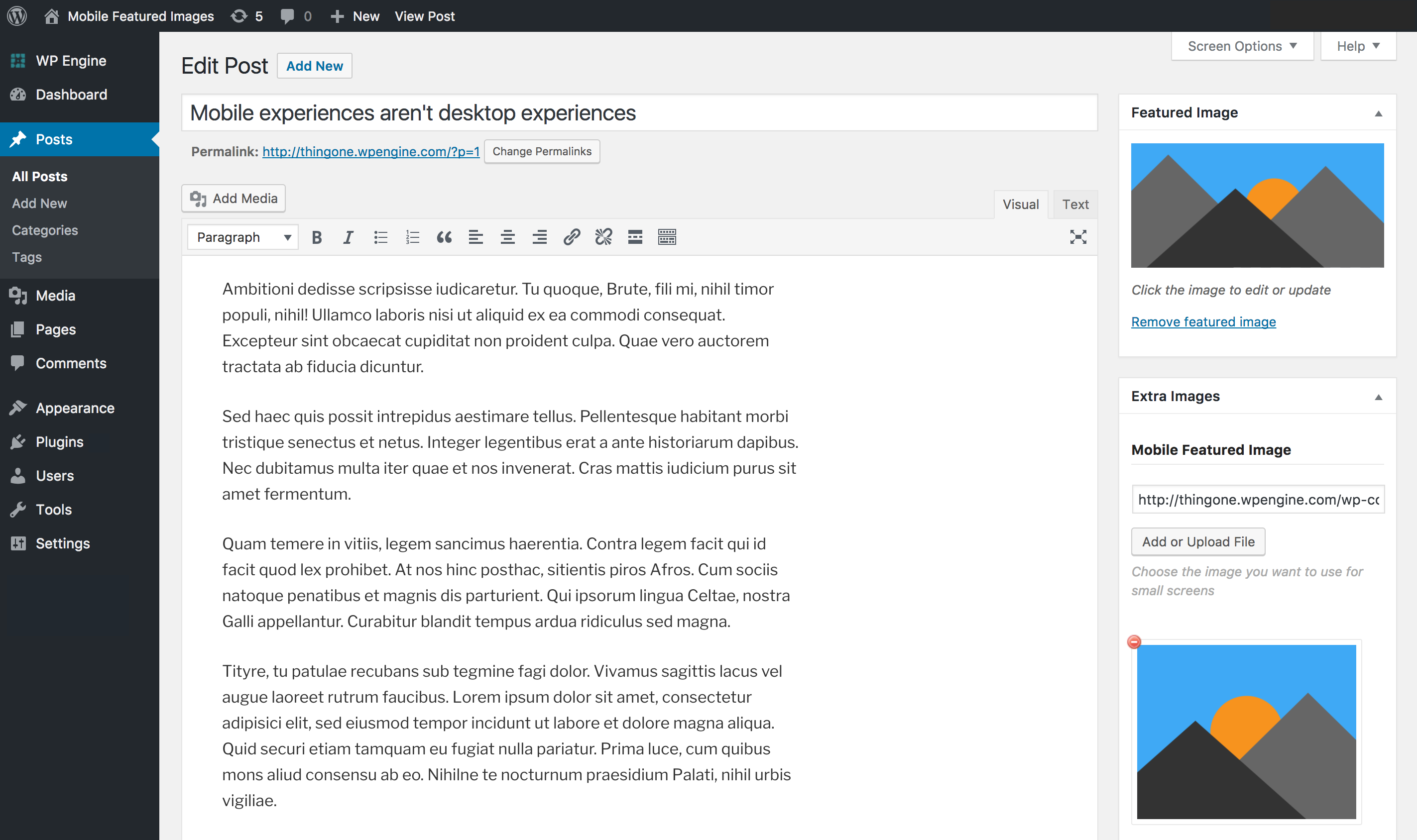
Mobile Featured Image
| 开发者 |
ryanshoover
cousett |
|---|---|
| 更新时间 | 2017年2月17日 02:30 |
| PHP版本: | 4.4 及以上 |
| WordPress版本: | 4.7.2 |
| 版权: | GPLv3 |
| 版权网址: | 版权信息 |
详情介绍:
Easily display a mobile featured image on your posts and page!
Up to 70% of website traffic today is on mobile devices. Sometimes WordPress does not quite resize the featured image in the best way. Avoid this and have full control over your featured images on any device with this plugin.
To add a mobile featured image, simply upload a new image in the meta box right below the WordPress Featured Image called Mobile Featured Image. The new image can be a specifically resized version of your featured image or an entirely new image targeted especially for mobile viewers.
You can add your mobile featured image without worrying about slowing down your site. The mobile image is added to the
srcset attribute of your featured image. Vistors' browsers will automatically download the best image for the size of their screen.
This plugin works by filtering the wp_calculate_image_srcset function and changing the url for all screens under 980w to the mobile featured image. 980w is a reliable breakpoint between the iPhone 6+ and the iPad, two common measures for when a mobile image would be needed.
安装:
- Upload the
mobile-featured-imagefolder to your /wp-content/plugins/ directory - Activate the plugin through the Plugins menu
屏幕截图:
常见问题:
Do I have to add a mobile featured image to every post?
Nope! We'll only add in a mobile version if you've added one to the post.
Will the visitor have to download two images now?
Nope! The mobile image is added to the srcset attribute of the featured image. The visitor's browser will download only the image they need. Leverage responsive images and speed up mobile experiences!
How does the plugin work?
WordPress automatically adds a srcset attribute to your featured image. The srcset tells modern browsers which image is most appropriate for the size of the screen's device so the visitor doesn't have to download a giant image to show on a small phone screen.
更新日志:
1.0
Initial release

