Movable Mobile Menu
| 开发者 |
ukischkel
fab22 qanva.tech |
|---|---|
| 更新时间 | 2023年7月24日 15:49 |
| PHP版本: | 7 及以上 |
| WordPress版本: | 6.3 |
| 版权: | GPLv2 or later |
| 版权网址: | 版权信息 |
详情介绍:
安装:
- Upload 'movablemobilemenu.zip' through Wordpress 'Plugins' installation menu
- Activate the plugin through the 'Plugins' menu in WordPress
屏幕截图:
常见问题:
Why having a Movable Mobile Menu?
In times when more and more use a mobile device to browse the internet, give your visitors the opportunity to decide where they prefer to have the navigation drawer.
How does it work?
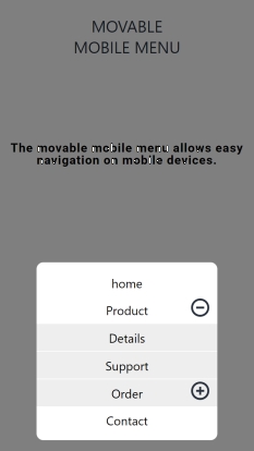
The Movable Mobile Menu has two areas: one for dragging it and one for open a modal which contains your menu. The menu appears on the top position of the Movable Mobile Menu, so it is easy reachable. Tapping the modal outside the menu closes the modal and menu.
Does it work with any menu?
After installing and activating you got a new menu in Appearance -> Menus -> Display location named "Movable Mobile Menu". You have to create a menu that you connect to this menu-position. This one then is used as your Movable Mobile Menu.
How much space need the Movable Mobile Menu?
It adds a 50px wide and 120px high button to your site. This button has 60% transparency which prevents to disturb your website.
更新日志:
- Movable Mobile Menu for navigation on mobile devices
