Responsive Column Widgets
| 开发者 |
Michael Uno
miunosoft |
|---|---|
| 更新时间 | 2018年6月10日 05:39 |
| 捐献地址: | 去捐款 |
| PHP版本: | 3.3 及以上 |
| WordPress版本: | 4.9.6 |
| 版权: | GPLv2 or later |
| 版权网址: | 版权信息 |
标签
下载
详情介绍:
- Add widgets.
- Enter the number of columns.
- Enable Auto-insert or insert the shortcode.
屏幕截图:
其他记录:
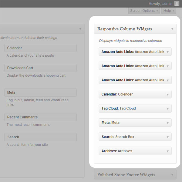
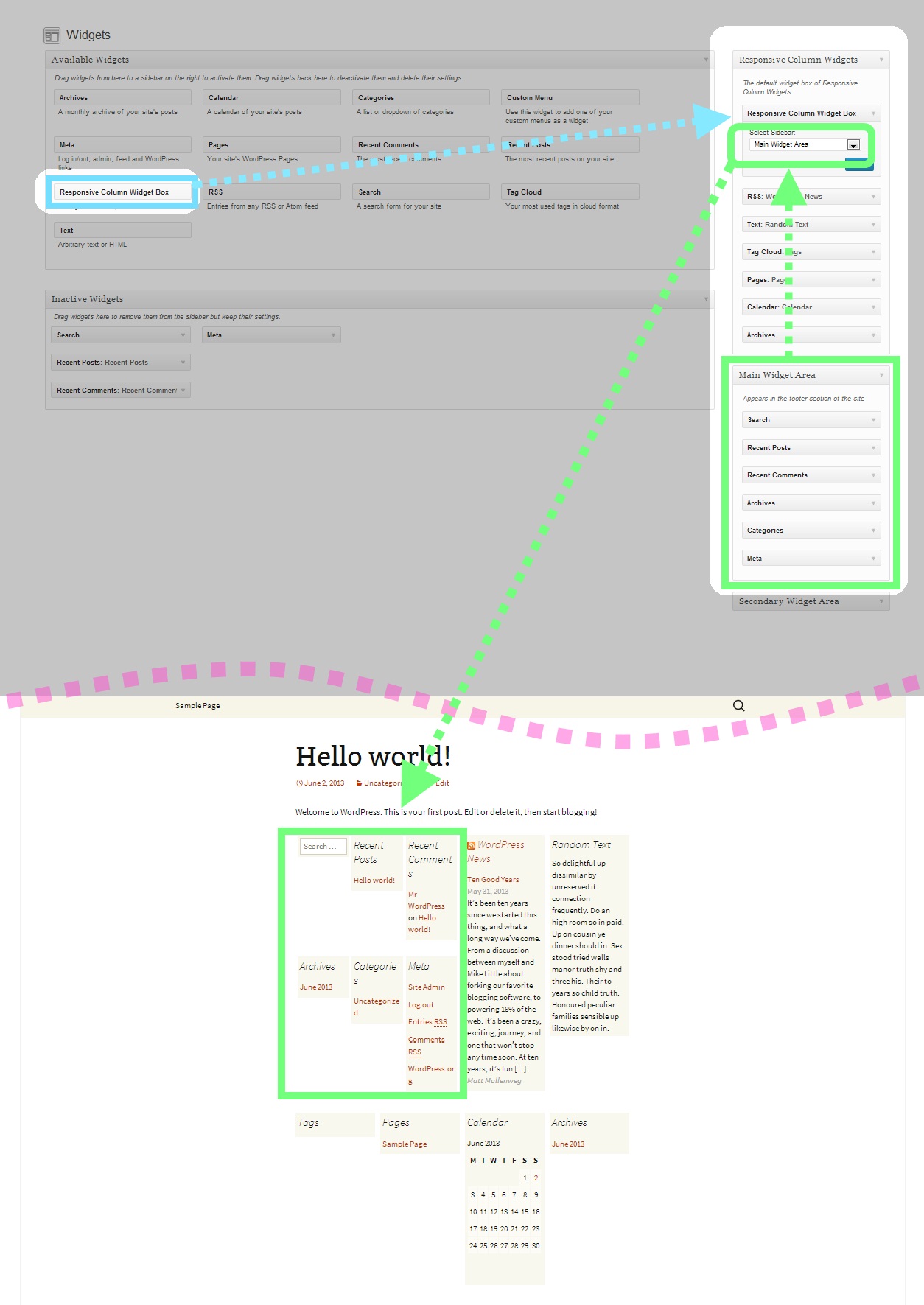
- Go to Appearance > Widgets. You'll see a new custom sidebar box named Responsive Custom Widgets.
- Add widgets to it.
- To display the added widgets in a post, there are mainly two different means.
- Option A: add the shortcode in the post.
[responsive_column_widgets]
- Option B: use the auto-insert feature by enabling the Enable Auto-insert option in the plugin setting page, New / Edit.
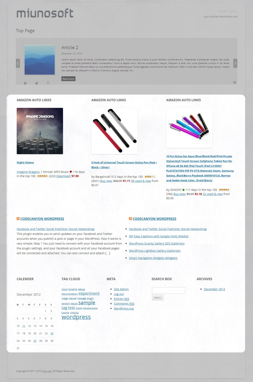
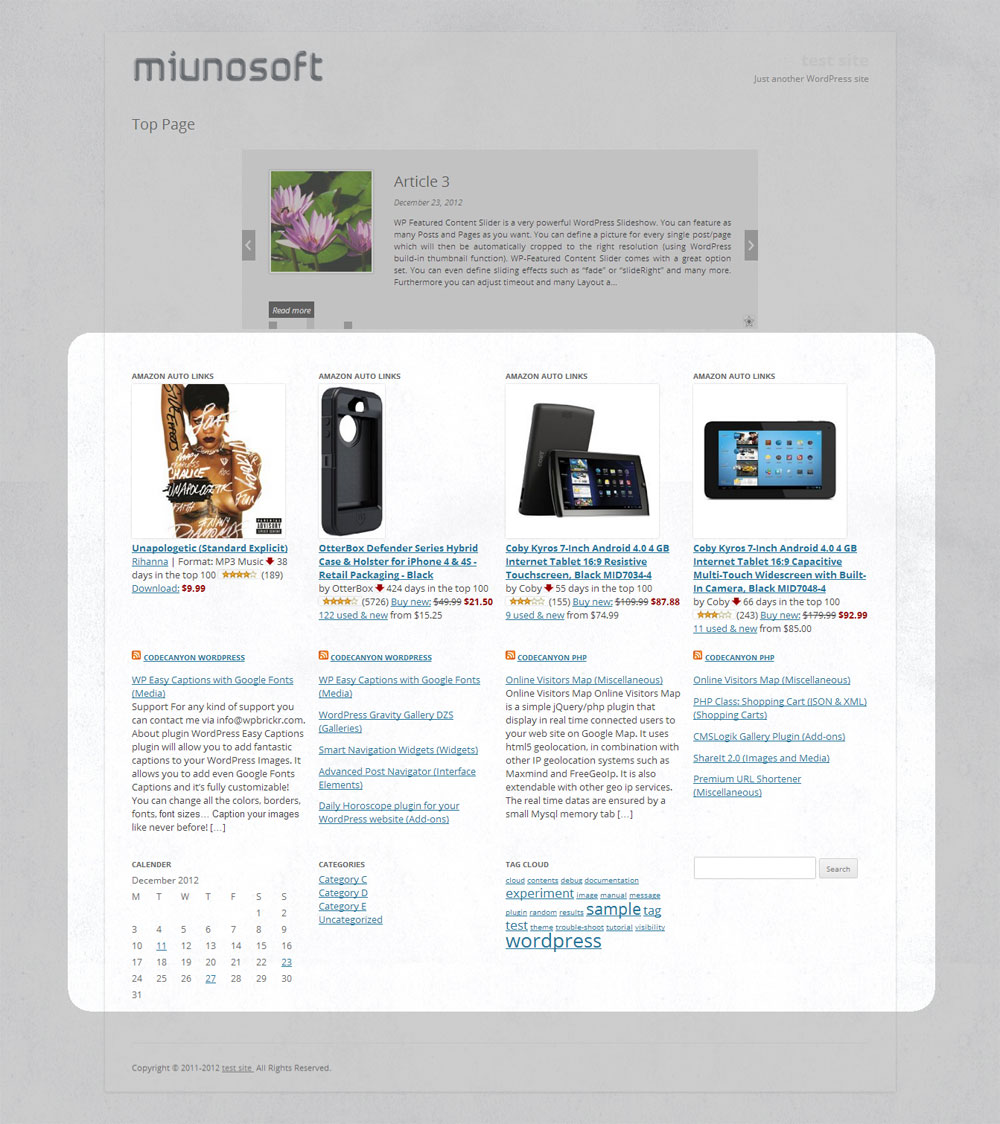
[responsive_column_widgets columns="4"] will display the widgets in 4 columns.
Optionally, if you like to change the number of columns in each row, use sequential numbers separated by commas.
For instance,
[responsive_column_widgets columns="3,2,5"] will show the widgets in 3 columns in the first row, 2 columns in the second, and 5 to the third. Change the numbers accordingly for your needs.
To set the number of columns for each screen max-width, use the pipe (|) character as the delimiter and place the width in pixel followed by a colon (:). Omit the width for no limitation. For instance,
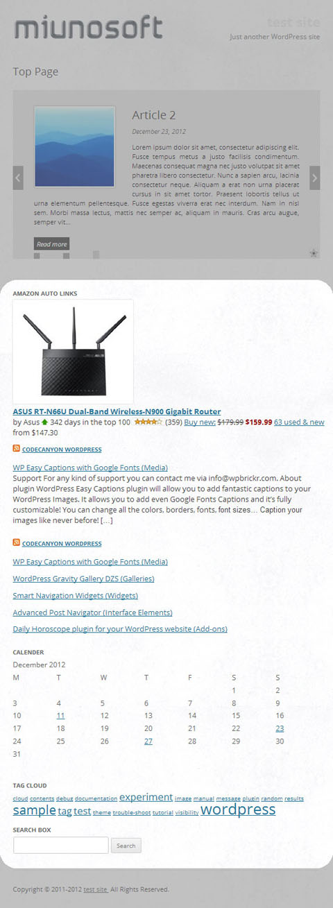
[responsive_column_widgets columns="5 | 800: 4 | 600 : 2 | 480: 1"] will show the widgets in 5 columns when the browser widths is greater than 800, and 4 when the browser width is 800 to 601, and 2 when the browser width is 600 to 481, and 1 when the browser width is less than or equal to 480.
Use PHP code for Themes
The widget box can be displayed outside post/pages. Putting a PHP code into the theme is one way of doing it. Use the ResponsiveColumnWidgets() function.
For instance,
<?php if ( function_exists( 'ResponsiveColumnWidgets' ) ) ResponsiveColumnWidgets( array( 'columns' => 5 ) ); ?> will display the widgets in 5 columns.
= 参数 =\
There are other parameters besides columns.
- columns - the number of columns to show. Default: 3. If you want to specify the number of columns in each row, put the numbers separated by commas. For instance, 3, 2, 4 would display 3 columns in the first row and 2 columns in the second row and four columns in the third row and so on. The rest rows follow the last set number. To set the number of columns by screen max-width, use the colon(:) character after the width, and use the pipe (|) character to delimit each set of number of columns. If the pixel is omitted, it is considered no limit. If the pipe delimiter is not present, the plugin will add 600: 1 internally by default.
column value | pixel: column value | pixel: column value | ...
The following example displays widgets in 5 column when the browser width is greater than 800, and four when the width is 601 to 800, and three when the width is 481 to 600, and one when the width is 1 to 480.
5 | 800: 4 | 600: 3 |480: 1
- sidebar - the ID of the sidebar to show. Default: responsive_column_widgets. For the twenty-twelve theme, sidebar-1, would show the default first sidebar contents.
- maxwidgets - the allowed number of widgets to display. Set 0 for no limitation. Default: 0.
- maxrows - the allowed number of rows to display. Set 0 for no limitation. Default: 0.
- omit - the numbers of the widget order of the items to omit, separated by commas. e.g. 3, 5 would skip the third and fifth registered widgets.
- showonly - the numbers of the widget order of the items to show, separated by commas. e.g. 2, 7 would only show the second and seventh registered widgets. Other items will be skipped.
- label - the label name of the widget box. Default: Responsive Column Widgets.
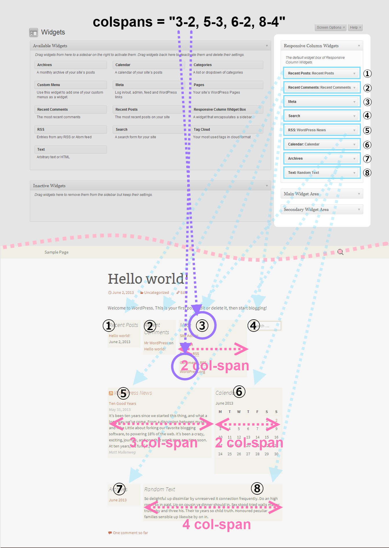
- colspans - the column spans. This determines how wide the specified widget item is.
widget index - column span, widget index - column span, widget index - column span, ...
The following parameter value of colspans will set the first widget with 3 column space and the fourth widget with two column space and the seventh takes four column space. Unspecified widget items will have one column span.
1-3, 4-2, 7-4
To set them by screen max-width, like the columns parameter, use the colon(:) character after the width in pixel, and use the pipe (|) character to delimit each set of column spans. If the pixel is omitted, it is considered no limit. These widths need to correspond to the value passed to the columns parameter. e.g.
1-3, 4-2, 7-4 | 600: 1-2, 3-2, 7-3 | 480: 1-2
If the column span exceeds the set number of max column, the column span will follow the max column. Note that the widget index of omitted widgets will not be considered(counted) in the widget index of this parameter.
- cache_duration - the cache lifespan in seconds which determines how long the cache remains. Default: 0. e.g.
3600 - call_id - this is for developers. This is used to identify the callback when a plugin hook is used so that the callback method assigned to the hook can know if it is theirs or not. This parameter does not affect the style based on the parameter values.
[responsive_column_widgets call_id="days" columns="7"]
The value for the call_id parameter can be any string that identifies the call.
Now we need to hook into the RCW_filter_widget_output_array filter so that we can intervene the process of plugin's rendering widgets. It accepts two parameters. The first one will be the output array and the second one is the parameter array.
In the callback function for the filter, we check if the parameter call_id holds the correct value. You should change the value to suite your needs, which should be unique and not conflict with others.
`
add_filter( 'RCW_filter_widget_output_array', 'RCW_CustomArrayOutput', 10, 2 );
function RCW_CustomArrayOutput( $aOutput, $aParams ) {
if ( ! isset( $aParams['call_id'] ) ) {
return $aOutput;
}
if ( 'days' === $aParams['call_id'] ) {
return array( 'Sunday', 'Monday', 'Tuesday', 'Wednesday', 'Thursday', 'Friday', 'Saturday' );
}
return $aOutput;
}
`
This will display the days in 7 columns. The plugin will generate the CSS rules based on the parameter values. And the rules will be inserted inside the body tag.
If you like to insert the style in the head tag, use the ResponsiveColumnWidgets_EnqueueStyle function. Tell the function that which parameters are going to be used.
add_filter( 'wp_loaded', 'RCW_CustomArrayAddStyle' ); function RCW_CustomArrayAddStyle() { if ( function_exists( 'ResponsiveColumnWidgets_EnqueueStyle' ) ) { ResponsiveColumnWidgets_EnqueueStyle( array( 'columns' => "7" ) ); } }
Note that 'call_id' => 'days' can be omitted. The other parameters should not be omitted.
For cases that the shortcode is not used, you can use the ResponsiveColumnWidets() function.
$aYourArray = array( 'a', 'b', 'c', 'd' ); if ( function_exists( 'ResponsiveColumnWidets' ) ) { ResponsiveColumnWidets( array( 'columns' => 4 ), $aYourArray ); }
This will output a, b, c, d in four columns.
Video Tutorials
http://en.michaeluno.jp/responsive-column-widgets/tutorials/常见问题:
How do I get started?
Go to Appearance > Widgets and add widgets to the plugin's custom sidebar box. Then use the shortcode in a post. That's it. If you still cannot figure it out, take the screenshots of the wp-admin/widgets.php page and the page of the post you added the shortcode. And request a support with the screenshots.
How do I customize the style?
You can add your rules to the classes named .responsive_column_widget_box .widget. Go to the widget box's edit page and enter your custom rules in the Custom CSS section or define it in your theme's style.css.
e.g.
.responsive_column_widget_box .widget { padding: 4px; line-height: 1.5em; background-color: #EEE; }
Are there video instructions?
Yes. Hope this helps.
Is it possible to create multiple widget boxes?
Yes, with Pro.
It seems the plugin conflicts with my theme. Can you help?
It happens occasionally. Please ask for support with a link to your live site and the screenshots. In most cases, it can be solved by adjusting CSS rules causing the conflicts.
Up to how many columns can I create
You can set up to 12 columns.
I have a feature request. Would you listen?
Sure. Please post it in the forum or the comment section of the plugin page.
更新日志:
- Fixed a compatibility issue with PHP 7.1 which caused an error of illegal string offset.
- Fixed a WordPress notice,
Notice: get_screen_icon is deprecated since version 3.8.0., appeared in setting pages.
- Fixed a compatibility issue with WordPress 4.7 that caused a warning
wp_kses_js_entities is deprecated.
- Fixed a compatibility issue with PHP 7 which caused a fatal error.
- Added an icon in the setting page which appears when no widget is added.
- Fixed a compatibility issue with WordPress 4.2 that category terms were not listed in the widget box definition page.
- Fixed a compatibility issue with WordPress 4.2 in plugin setting pages.
- Fixed a bug with a zero left-margin inherited from different screen widths.
- Fixed an issue that columns were not properly displayed in Internet Explorer 8.
- Tweaked the layout of the plugin setting page.
- Optimized the performance.
- Changed some option names.
- Fixed a PHP warning undefined constant WPLANG.
- Fixed a PHP warning
Warning: strpos() empty delimiter....
- Tweaked: the styling of the plugin admin setting page.
- Changed: the tab label
General OptionstoGeneralin the plugin admin setting page. - Changed: the default option
Delay Sidebar Registrationto be checked by default.
- Fixed: a bug that column margins were not calculated correctly in different set max-widths.
- Added: the option to delay sidebar registration.
- Added: the Serbo-Croatian language file.
- Fixed: a compatibility issue with the Twenty Fourteen theme.
- Tweaked: the styles of the setting pages of the plugin for WordPress v3.8.
- Fixed: a compatibility issue with Twenty Thirteen.
- Fixed: the minimum required WordPress version number to 3.3.
- Fixed: a bug that comma delimited option values could not be saved as of 1.1.7.
- Fixed: an issue that when an integer is passed to the columns or colspans parameter with the the ResponsiveColumnWidgets() function, the parameter value did not get recognized.
- Added: the second parameter to the ResponsiveColumnWidgets() function that enables to render custom array in responsive columns.
- Fixed: a bug undefined object error occurred when a cache is expired.
- Added: the call_id parameter that does not affect the CSS rules based on parameter values.
- Added: the RCW_filter_widget_output_array filter that enables to render custom PHP array in responsive columns.
- Fixed: an issue that the page load gets too slow in the plugin's setting pages.
- Fixed: the warning, Notice: Undefined property: ResponsiveColumnWidgets_AutoInsert::$arrClassSelectors...
- Fixed: the warning, Strict standards: Only variables should be passed by reference in ...\wp-content\plugins\responsive-column-widgets\classes\ResponsiveColumnWidgets_Option_.php on line 367.
- Fixed: the warning, Strict standards: Only variables should be passed by reference in ...\wp-content\plugins\responsive-column-widgets\classes\ResponsiveColumnWidgets_StyleLoader.php on line 55.
- Fixed: the warning, Strict standards: Declaration of ResponsiveColumnWidgets_Admin_Page_Framework_Walker_Category_Checklist::start_el() should be compatible with Walker::start_el(&$output, $object, $depth = 0, $args = Array, $current_object_id = 0) in ...\wp-content\plugins\responsive-column-widgets\classes\ResponsiveColumnWidgets_Admin_Page_Framework.php on line 2593.
- Fixed: a bug that a log file was created when WP_DEBUG is true.
- Fixed: an issue that the page in widgets.php freezes in IE in WordPress 3.6.
- Tweaked: the plugin's JacaScript script loaded in the widgets.php page.
- Changed: the Responsive Column Widget Box widget form selector option to have the first item with the empty value which prevents unwanted sidebar dependency conflicts.
- Fixed: a bug that orphaned sidebars named Inactive Sidebar (not used) appeared in the select option items of the plugin's Responsive Column Widget Box widget's form after switching the theme.
- Fixed: a bug that the error "FATAL ERROR: MAXIMUM FUNCTION NESTING LEVEL OF '100' REACHED, ABORTING!" occurs when a sidebar dependency conflict occur with the sidebar encapsulation functionality and added an plugin error message instead.
- Fixed: a bug introduced in 1.1.7 that undefined index warnings and errors with array_filter() occur when a theme's sidebar is used instead of the plugin's widget box.
- Fixed: a typo of the newly added option description in v1.1.7 in the New/Edit settings page.
- Fixed: a bug that options were not loaded properly after updating to 1.1.7.
- Added: the Container Background Color, Container Paddings, and Widget Box Maximum Width options.
- Changed: not to go to the Manage tab page when editing a widget box setting.
- Changed: the sidebar class selector to have own div element enclosing the widget box output. Accordingly the users who were using the CSS rule with the class selector such as
.responsive_column_widgets_box.responsive_column_widgets { ... }shuold change it to.responsive_column_widgets .responsive_column_widgets_box. - Added: the Widget Box Beginning Tag and Widget Box Ending Tag options.
- Updated: the Japanese translation.
- Updated: the POT file.
- Added: the Clear Caches option in the General Options setting page.
- Added: the cache_duration parameter, which sets the cache for the widget box's output.
- Fixed: a bug that caused importing widget boxes to fail.
- Tweaked: the code to reduce one database query performed with the Auto-insert feature when no widget box item enables it.
- Tweaked: the code to reduce the number of database queries performed in the settings pages.
- Tweaked: the code to reduce the used memory size in the settings pages.
- Tweaked: the code to reduce the number of database queries performed in the settings pages of the plugin.
- Fixed: a bug that updating the options in the General Options page removed a license value for the Pro version.
- Tweaked: the layout in the settings pages.
- Added: the Execute Shortcodes in Widget Boxes option.
- Added: the RCW_filter_widgetbox_output filter that applies to the widget box outputs.
- Added: the Minify CSS Code option.
- Updated: the POT file.
- Fixed: a bug that the registered code with a blank parameter was listed twice in the Enqueue Styles in Head Tag option area in the setting page.
- Tweaked: the style for Twenty Thirteen 0.1.
- Added: the colspans parameter.
- Tweaked: to return the passed value for filters of the Auto-Insert feature if it is not a string.
- Supported: Twenty Thirteen 0.1.
- Tweaked: the administration object not to load if non-admin pages are loaded.
- Tweaked: the plugin not to load when accessed directly.
- Fixed: a bug that a freeze occurred in the widgets.php page in IE.
- Added: the option to enable/disable the Responsive Column Widget Box widget.
- Added: the ability for the ResponsiveColumnWidgets() function to be called without a parameter.
- Fixed: a bug that updating the options in the General Options page caused the Areas to Load and Class Selector Names values to be empty.
- Fixed: an issue that images in the plugin setting pages sometimes did not load properly.
- Reduced: the memory usage in the plugin setting pages for servers with PHP below 5.3.
- Added: the Debug Mode option.
- Added: the widget that encapsulates a sidebar.
- Changed: the base style to use the parent class selector of the sidebar ID, which was removed in 1.1.2.
- Added: the option to enqueue styles to avoid style tags to be embedded in the body tag.
- Added: the ability to load CSS rules without the scoped attribute for the ones with the Auto-Insert option.
- Changed: the method of rendering widget boxes not to use display:none for different screen max-widths.
- Added: the option to decide whether ID attributes should be removed or not.
- Fixed: an issue that updating option items of the General Options removed some of the internal settings.
- Added: the edit icon in the Manage page.
- Tweaked: user input sanitisation for string option values including Number of Columns and Class Names.
- Tweaked: the CSS rules for widget box rows.
- Fixed: a typo in the setting page, Min to Max.
- Fixed: an issue that a custom number of columns with the parameter of the percentage offset for column numbers caused a row not to start from the very first column when there was a widget with longer height than the other widgets in the previous row.
- Added: the ability to specify the number of columns by screen max width.
- Deprecated: (Breaking Change) the parameter of the percentage offset for column numbers to support the ability to directly specify the number of columns by screen max width.
- Removed: the ID attribute from the default Widget Beginning Tag value.
- Added: (Breaking Change) the ability to automatically remove ID attributes from the rendered widget HTML code.
- Fixed: an issue that scoped style tag contained a white space in the name attribute value.
- Added: the RCW_filter_base_styles filter that enables to modify the plugin's base CSS rules.
- Added: the CSS rules, width: auto; height: auto;, to the responsive_column_widgets_box class.
- Added: the option for the timing of loading the plugins' CSS base rules.
- Changed: from loading the CSS file in the header but to insert the CSS rules as text to support variadic class attribute names.
- Added: the options for specifying the class name attributes for the CSS rules.
- Added: the options for selecting the areas to load the plugin CSS rules.
- Added: the ability to load the plugin CSS rules in login pages. To display the widget box in the login page, either use the PHP code or set the custom filter in the Auto-Insert section of the plugin admin page.
- Added: the ability to add custom filter/action hooks for the widget box auto-insertion.
- Added: the ability to restrict the widget box auto-insertion by category, post-id, post-type, and page-type.
- Added: the ability to disable the widget box auto-insertion by category, post-id, post-type ( post, page, custom post types ), and page-type ( archives, search, 404, etc. ).
- Fixed: a bug in the Information page that the sub menu list items were displayed with bullet marks in WordPress 3.4.x.
- Renewed: (Breaking Change) the entire Auto-Insert section of the plugin admin page. Accordingly, the previous auto-insert options should be reconfigured.
- Removed: (Breaking Change) the responsive_column_widget_area class attribute. Those who have been using it, should simply change it to responsive_column_widget_box instead.
- Tweaked: the form data sanitisation functionality for the numeric sequence values with the comma delimiter.
- Changed: the class attribute name for each column from, col, to responsitve_column_widgts_column, in order to avoid being too generic which may result on conflicts with other plugins or themes.
- Fixed: a bug the responsitve_column_widgts_column_1 class attribute was not displayed correctly introduced in 1.0.8.6.
- Fixed: typos in plugin admin pages.
- Added: the class attributes, responsitve_column_widgts_column_{n} and responsitve_column_widgts_row_{n}, to each div tag containing a widget, where _{n} indicates the position of the column and row.
- Fixed: a bug that the notification which appears when no added widget is added appeared in other plugin pages.
- Fixed: a bug that the WordPress version 3.4.x or below got Fatal error: Cannot make non static method SimplePie::sort_items() static in class ResponsiveColumnWidgets_SimplePie_ in .../wp-content/plugins/responsive-column-widgets/classes/ResponsiveColumnWidgets_SimplePie_.php on line 21.
- Fixed: a typo in the plugin admin page footer.
- Updated: the information page.
- Changed: the requirement check to perform only upon the plugin activation from loading the plugin admin page.
- Fixed: the warning that occurred in debug mode in a Not Found page, Undefined property: WP_Query::$post.
- Fixed: a bug that the widget box was inserted below the comment form regardless of whether the option was checked or not.
- Fixed: a bug that when multiple widget boxes with different sidebar IDs were present in one page, only the first widget box's custom style was loaded; the other custom styles' set to each box did not load.
- Fixed: a bug that when multiple widget boxes with different sidebar IDs were present in one page, only the first widget box was responsive; the responsive rules did not apply to the other widget boxes.
- Added: the ability to auto-insert the widget box into the comment form section.
- Fixed: the warning that occurred in some servers, "Parameter 1 to ResponsiveColumnWidgets_Startup() expected to be a reference, value given in .../wp-includes/plugin.php on line 406."
- Added: a warning message when there is no widget added to the widget box in the edit page.
- Added: the setting to attempt to override the memory limit for PHP set by the server.
- Added: the Japanese translation.
- Added: the localization support with the text domain, responsive-column-widgets.
- Added: the ability to disable the auto-insert option for both footer and posts/pages by post IDs and the checkbox for the front page.
- Added: the ability to auto-insert the widget box into post and pages above/below the contents.
- Fixed: a minor bug that merging with the default option values did not perform correctly when the subject option key had a null value.
- Raised: the required WordPress version to 3.2 from 3.0.
- Fixed: an issue that the user with a custom access level could not change the options.
- Fixed: minor typographical errors in the setting page.
- Added: the sanitisation functionality for option values with delimiters including Numbers of Columns, Omitting Widgets, Show-only Widgets, Width Percentage Offsets, and Additional Allowed HTML Tags.
- Added: the requirement check which includes PHP version to 5.2.4 or higher.
- Tweaked: the code to load the pages faster in the admin pages.
- Fixed: a bug that saving in the General Options page redirected to the Manage page in the plugin admin pages.
- Added: the ability to set custom style rules per widget box.
- Added: the ability to automatically insert the widget box in the footer if the option is checked in the setting page.
- Fixed: a bug that the same ID attribute was applied to the aside tags.
- Changed: a filter name that the plugin internally uses to make the names consistent.
- Changed: the Access Rights option not to appear for members other than administrators.
- Added: some base files for plugin extensions.
- Added: an action hook for plugin extensions.
- Fixed: a bug that the default widget box options could not be retrieved properly in the table of the Manage tab page when the option initialization was performed.
- Fixed: a bug that when settings are saved in one of the pages and the other pages settings get erased introduced since supporting the alternatives of array_replace_recursive().
- Fixed: a bug that debug output appeared after submitting the form in General Options page.
- Fixed: typos and applied minor description changes to the parts not clear enough.
- Fixed: the parts using array_replace_recursive() which is incompatible with below PHP 5.3.
- Fixed: an issue that the server below PHP 5.3 got Fatal error: Call to undefined function array_replace_recursive().
- FIxed: the version number in the main file.
- Fixed: a bug in the file name which contains case-mismatch with the include/require statement, which caused a fatal error during the activation.
- Added: the ability to reset all saved option values.
- Added: the ability to set custom HTML tags to be posted in the setting page.
- Added: the Access Rights option in the setting pages.
- Changed: the default value of the offsets parameter to 600:12, which is 100% compatible with the versions prior to 1.0.3.
- Added: the ability to set the options without the parameters; the saved option values in the setting page will be used.
- Added: the ability to set a custom message when no widget is added.
- Added: the ability to set opening/closing HTML code in front of the widget output and title.
- Added: the ability to specify the widget box by label name.
- Added: the setting pages under the Appearance menu.
- Changed: (Breaking Change) the default number of columns to 3 from 1.
- Added: the ability to flexibly change the number of columns by pixel width with the offsets parameter.
- Added: an additional class attribute to the enclosing div tag named "widget-area," which helps to match the site's sidebar style.
- Added: an enclosing div tag with the class attribute named "widget," which helps to match the site's sidebar style.
- Cleaned: some code.
- Changed: the misleading class attribute name, responsive_column_widgets_newrow, to responsive_column_widgets_firstcol.
- Fixed a minor issue in the stylesheet.
- Added the parameter options including, maxwidgets, maxrows, omit, showonly.
- Added the ability to set the number of columns to show in each row.
- Initial Release
