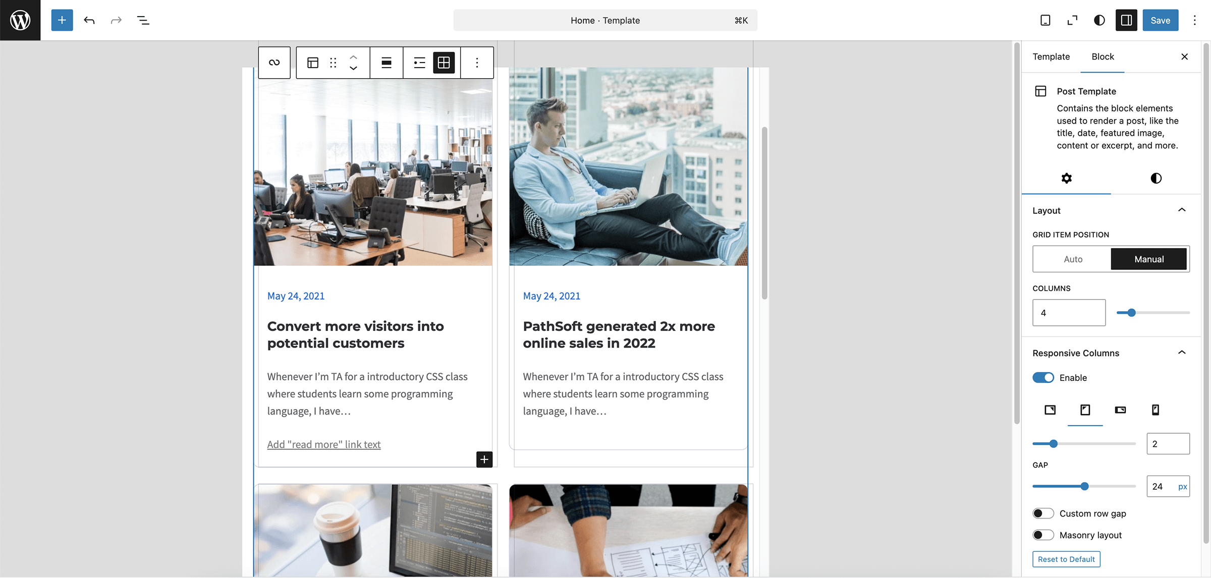
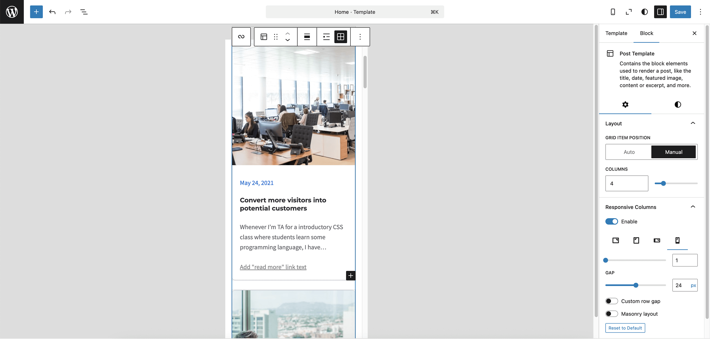
Responsive Columns
| 开发者 | specia1ne |
|---|---|
| 更新时间 | 2025年5月14日 21:43 |
| 捐献地址: | 去捐款 |
| PHP版本: | 7.4 及以上 |
| WordPress版本: | 6.8 |
| 版权: | GPL-2.0-or-later |
| 版权网址: | 版权信息 |
详情介绍:
Stop guessing how many columns will show on a phone.\ Responsive Columns lets you set an exact column count for four breakpoints right inside the core block inspector.Key features
- Desktop / Tablet-Landscape / Tablet-Portrait / Mobile\ Pick 1 – 6 columns for each breakpoint.
- Theme-aware gaps\
Reads
--wp--style--block-gap, lets you tweak Gap X and Gap Y without hard-coding pixels. - Masonry layout for Query Loop (Grid) — one click, zero jQuery.
- Works with core/Columns and core/Post Template (Query Loop Grid).
- Lightweight — one helper class, pure CSS variables; editor JS ≈ 3 kB.
has-s1-rc-columns and these CSS variables:
--s1-rc-columns-mobile-portrait
--s1-rc-columns-mobile-landscape
--s1-rc-columns-tablet-portrait
--s1-rc-columns-tablet-landscape
--s1-rc-columns-desktop / auto-added for Masonry /
--s1-rc-gap-x / horizontal /
--s1-rc-gap-y / vertical, falls back to X /
Your theme keeps its own display:grid / flex rules —\
only grid-template-columns and gaps are overridden inside media queries.
Deactivate the plugin and everything gracefully falls back to the default block behaviour.
安装:
- Upload the folder to
/wp-content/plugins/or search “Responsive Columns” in Plugins → Add New. - Activate the plugin.
- Select any Columns block (or Query Loop → Grid), open the sidebar and find the “Responsive Columns” panel.
屏幕截图:
更新日志:
1.0.0
- Initial public release — breakpoints, Gap X / Y and Masonry option.