Responsive Image Sizes Plugin For Divi
| 开发者 | wpt00ls |
|---|---|
| 更新时间 | 2019年6月30日 13:15 |
| PHP版本: | 7.0 及以上 |
| WordPress版本: | 5.2.2 |
| 版权: | GPLv2 or later |
| 版权网址: | 版权信息 |
详情介绍:
Make your website load faster in Divi Theme using image srcsets.
The Problem – Images on divi webpage serving single image size irrespective of devices sizes
- Is your divi webpage slow?
- Do the tags serve a single size irrespective of the device size?
A slower website causes decrease in sales due to increase in bounce rate.A responsive image offers different sizes of the same image. The browser decides the best image size to render. Divi includes a fullsize and regular image module. They don't serve a responsive image. It's a one-size-fits-all. The non-responsive image have a single image size. The same image loads on large desktop, tablet and mobiles.
Let's say you use the native divi image module with image of size 2000px. Serving the 2000px wide image on a device with width 400px serves no purpose other than to slow down the webpage.The Solution – Divi responsive image size plugin The Divi Responsive Image Size plugin has two modules.
- Responsive Image divi module – It's available in regular divi section.
- Fullwidth Responsive Image divi module – It's available in fullwidth divi section.
Both the modules help creates a image tag with responsive image sizes.A responsive image adds the srcset and sizes attributes to the image markup. What does srcset and sizes do? Consider the example of an <img> tag
<img alt="Divi responsive image sizes" src="default.jpg" srcset="small.jpg 240w, medium.jpg 300w, large.jpg 720w" sizes="(max-width: 360px) 300px, 100vw">Let's go over each attribute.
alt="Divi responsive image sizes"`The
alt attribute describes the alternative text for the image. Browser loads this text when it can't find the image.
src="default.jpg"The
src attribute defines a fallback image path for browsers that don't support srcset and sizesattributes
srcset="small.jpg 240w, medium.jpg 300w, large.jpg 720w"The
srcset attribute lists images at different sizes. Along with each image path we specify it's width in pixels.
sizes="(max-width: 360px) 300px, 100vw"The sizes attribute instructs the browser on how to pick the right image from the srcset based on the viewport (device) size. Going by the above example,
- For viewport size 360px and below, browser displays medium.jpg (300px) image.
- For viewport size above 360px, browser displays large.jpg image that is 720px wide.
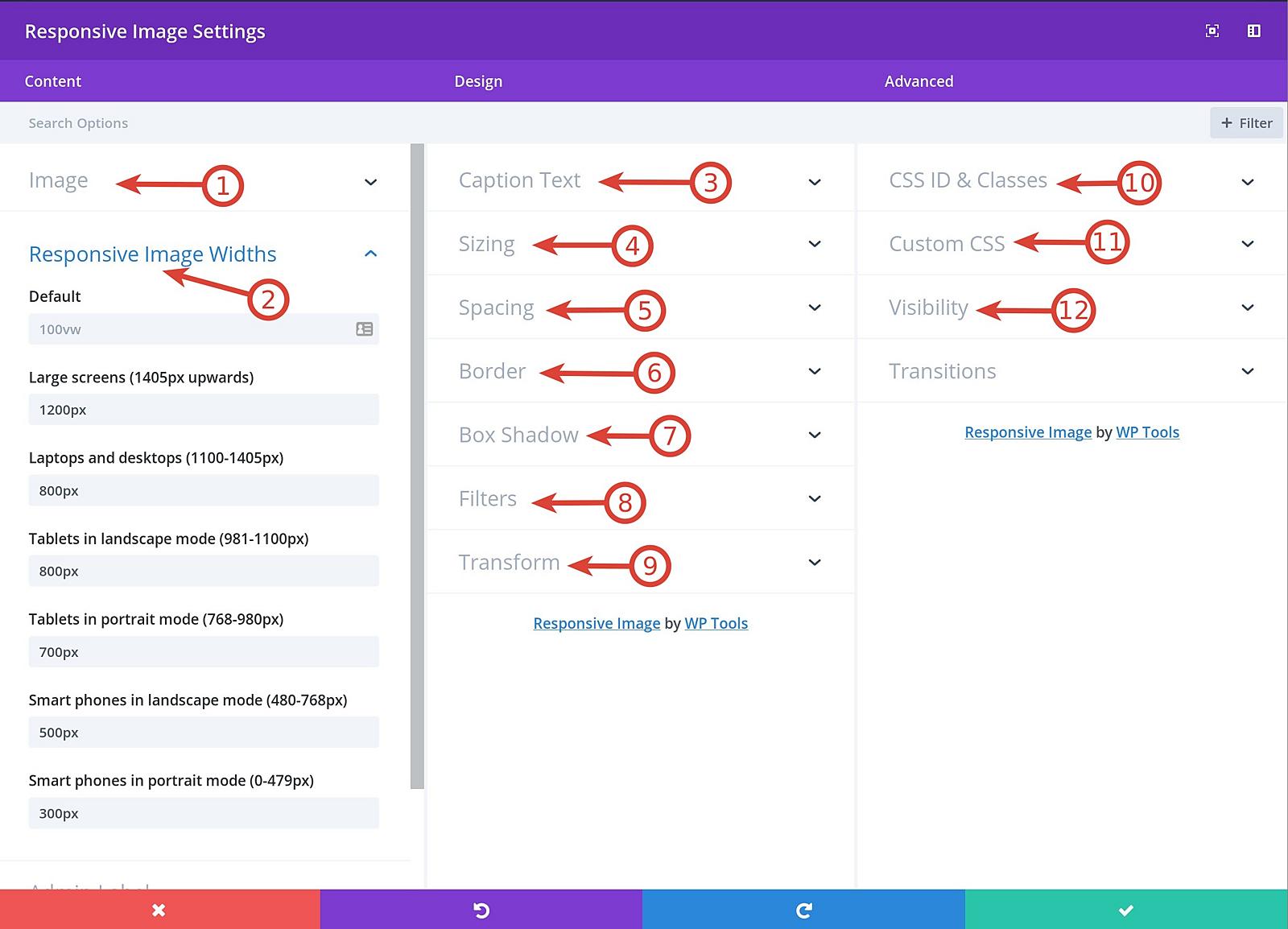
- Large screens (1405px upwards)
- Laptops and desktops (between 1100px and 1405px)
- Tablets in landscape mode (between 981px and 1100px)
- Tablets in portrait mode (between 768px and 980px)
- Smart phones in landscape mode (between 480px and 768px)
- Smart phones in portrait mode (between 0 and 479px)
- The responsive divi modules wraps the image in a tag.
- It can display a caption for the image using the tag.
- The alt attribute text is got from the WordPress media attachment or custom text.
- Image section – Upload/select an image, set alt and figcaption tags. If alt and caption values are empty, it uses corresponding values from WordPress media attachment.
- Responsive Image Width section – Define the image sizes at different media breakpoints.
- Caption Text section – Add custom style to the caption text.
- Sizing section – Change the max and standard width for the element.
- Spacing section – Set the padding and margin values for the figure
- Border section – Set border styles for the tag.
- Box shadow section – Set box shadow styles for the tag.
- Filters section – Set filters for the figure element.
- Transform section – Set transforms for the figure element
- CSS ID & Classes section – Set css id and classes for figure element
- Custom CSS section – Add custom css for , and tags
- Visibility section – Set visibility for the tag on desktop, tablet and mobile.
屏幕截图:
常见问题:
Does this plugin have any dependencies?
Divi Theme from Elegant Themes is a pre-requisite to this plugin.
Does this work with Extra theme from Elegant themes
We haven't tested it on Extra theme. If you happen to get it working, let us know :-)
更新日志:
1.1.0
- Updated for release on wordpress.org
- Initial version
Responsive Imagedivi module added for standard divi section.Fullwidth Responsive Imagedivi module added for fullwidth divi section.
