Plugin Name
| 开发者 | ItayXD |
|---|---|
| 更新时间 | 2017年12月18日 19:15 |
| PHP版本: | 3.0.1 及以上 |
| WordPress版本: | 4.3.1 |
| 版权: | GPLv2 or later |
| 版权网址: | 版权信息 |
详情介绍:
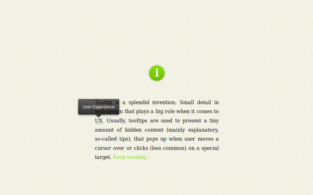
tooltips are used to present a tiny amount of hidden content (mainly explanatory, so-called tips), that pops up when user moves a cursor over or clicks (less common) on a special target.
Key Features
- It's responsive. It relies on a maximum width value when viewed on large screens, adopts to narrow environments and picks the best viewable position relatively to the target (top, bottom; left, center, right).
- It's mobile-friendly. It pops up when a call-to-action button is tapped and disappears when tapped on the tooltip itself.
- It's HTML formatting capable. Need to write some words in italic or so? No problem, this will work out.
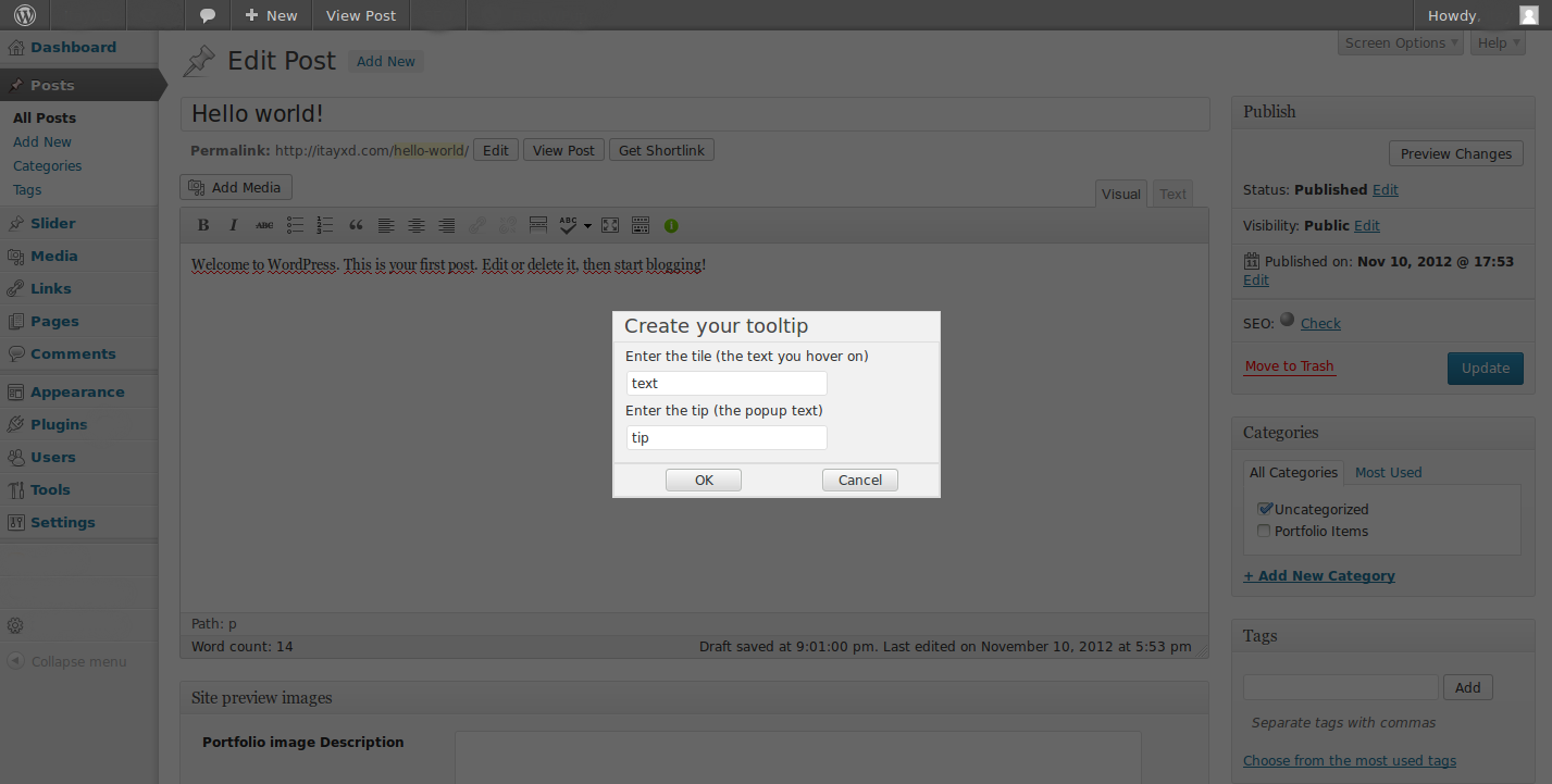
- It's extremely easy to use: A tooltip button in added to the default WordPress editor, all you have to do it click it and fill the pop-up dialog, the rest is taken care of automatically.
- The button adds a WordPress short-code, if you want the tip to be HTML formated (avoid block level elements) you can just wrap it with [tooltip tip=""][/tooltip] in tinyMCE.
- You can also assign the attribute rel="tooltip" and title="Enter your tip here" to any of body tags in HTML file where you want the tooltip to pop up when called.
- You can change the pop-up look by editing responsive-tooltip.css. change it to what ever suits your website best!
安装:
- Upload the unzipped folder to the
/wp-content/plugins/directory. - 通过WordPress的“插件”菜单激活插件。
- Check out your new button on the WordPress editor.
屏幕截图:
更新日志:
1.6.5
- Fix admin panel.
- Fix arrow in down position.
- Fix up position.
- Both "Invert" and "Hover" attributes are deprecated.
- Hopefully all bugs fixed.
- Dialog is working again.
- added the ajax folder we.. lost
- Allow the "hover" attribute to provide nested shortcode available in bubble content
- "invert" attribute is still available but it's deprecated
- Allow the "invert" attribute to provide nested shortcode available in bubble content
- Nested Shortcodes in tooltip base content (not the bubble content)
- Bug fix- Dialog underlay.
- Bug fix- Fixed the blinking\flashing tip (Hopefully).
- Bug fix - fixed problem when using '.
- Adds CSS editor and style options (image in tooltip coming soon).
- Bug fix - fix tip flashing when the target (the content to be hovered) is a block level element.
- first version!

