Responsive Picture Block
| 开发者 | coreessentials |
|---|---|
| 更新时间 | 2026年3月12日 16:40 |
| PHP版本: | 7.4 及以上 |
| WordPress版本: | 6.9 |
| 版权: | GPLv2 or later |
| 版权网址: | 版权信息 |
详情介绍:
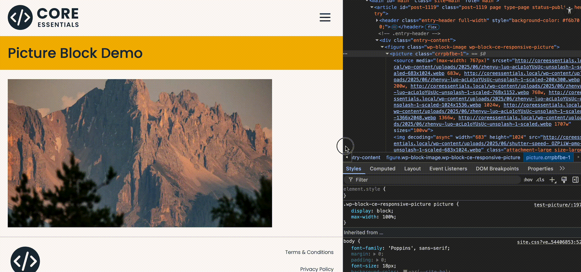
Core Essentials – Responsive Picture Block turns several standard Image blocks into one semantic, front-end
<picture> HTML element. It’s built for art direction: choose different crops, compositions, or formats for different breakpoints (e.g., a tight mobile crop, a wider desktop crop, or an AVIF/WebP source).
Why this matters:
<picture>vs<img srcset>\srcsetis great for picking the right resolution of the same image. But when you need different content (crop/ratio/composition) at different viewport widths, you need art direction — that’s exactly what<picture>does by letting you swap entire sources via<source media="…">.- Editor-first UX\ Authors see a single “Responsive Picture (Block)” wrapper, then insert one Image per breakpoint. The plugin mirrors the link /caption from the Desktop image. Per-image design controls (aspect ratio, object-fit, width/height) are respected. The block’s preview shows the native Desktop / Tablet / Mobile toolbar:
- Desktop preview ⇒ show all child images
- Tablet preview ⇒ show Tablet, else Desktop, else Mobile
- Mobile preview ⇒ show Mobile, else Tablet, else Desktop
- Perfect source ordering\
Custom media queries are auto-sorted so the correct
<source>wins (most specific first). Works withmax-width,min-width, and range queries.
- Wraps multiple core Image blocks into a single semantic
<picture> - Pick Desktop / Tablet / Mobile / Custom images (true art direction)
- Override
mediaper Tablet/Mobile/Custom (e.g.,(max-width: 1200px)) - Optional
sizesoverride per source (advanced bandwidth tuning) - Allows width, height, aspect-ratio, object-fit per breakpoint
- Uses link + caption from the Desktop (fallback) image
- Editor preview follows WordPress’ device switcher (Desktop/Tablet/Mobile)
- Prevents layout overflow; picture wrapper is fully responsive
- Works with standard WP image sizes and responsive
srcset - Lightweight, no front-end JS — pure HTML/CSS on the front end
<picture> (Art Direction 101)
When your layout needs different imagery across breakpoints (e.g., a vertical crop on phones and a wide landscape on desktops), you’re doing art direction. The <picture> element enables this by letting the browser choose an entire source based on media conditions (and even file type, like AVIF/WebP), not just a different width of the same file. The result is better design control and faster pages because each device downloads only the most appropriate asset for its layout saving you bandwidth as well as having compositions control.
Use Cases
- Hero banners with different crops for mobile vs desktop
- Product images where the subject framing changes on small screens
- Editorial layouts that require portrait vs landscape compositions
- File format switching (e.g., AVIF/WebP with PNG/JPEG fallback)
安装:
- Upload the plugin folder to
/wp-content/plugins/or install via the Plugins screen. - Activate Core Essentials – Responsive Picture Block.
- In the block editor, add Responsive Picture (Block) and insert one Image per breakpoint.
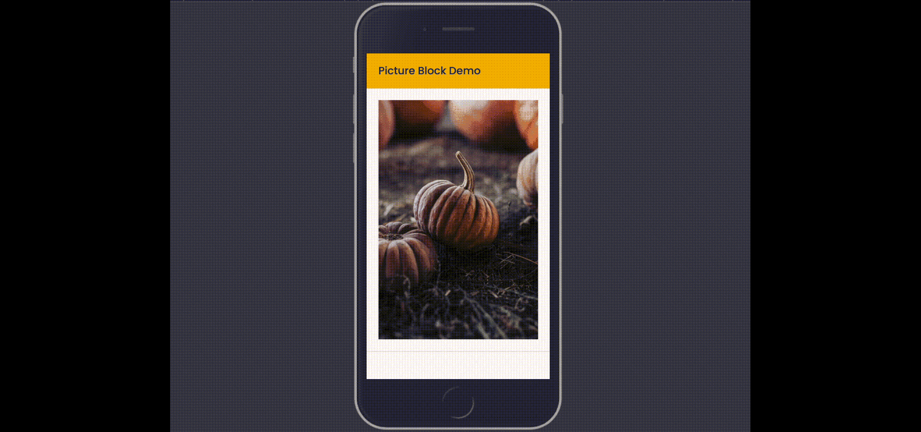
屏幕截图:
更新日志:
1.1.1
- Fixed: Classes and alignments added to the main block are now included
- Thanks: Huge thank you to the @spinndevs team for their feedback and functionality suggestions which powered this version
- Added: Full support for WordPress Synced Patterns with Override images per pattern instance
- Added: Block Bindings API integration for pattern overrides (id, url, alt, caption attributes)
- Changed: Default preview mode is now "Show All" for better user experience
- Changed: Auto mode now correctly mirrors frontend behaviour (shows only relevant image / fallback per viewport)
- Improved: Block toolbar simplified to All/Auto toggle (full controls remain in inspector panel)
- Fixed: Floating toolbar now appears correctly when block is selected
- Fixed: Block now properly receives pattern override context via uses_context
- Initial release