Responsive Table for Elementor
| 开发者 | porteaudesign |
|---|---|
| 更新时间 | 2026年5月21日 08:26 |
| PHP版本: | 7.8 及以上 |
| WordPress版本: | 7.0 |
| 版权: | GPLv2 or later |
| 版权网址: | 版权信息 |
详情介绍:
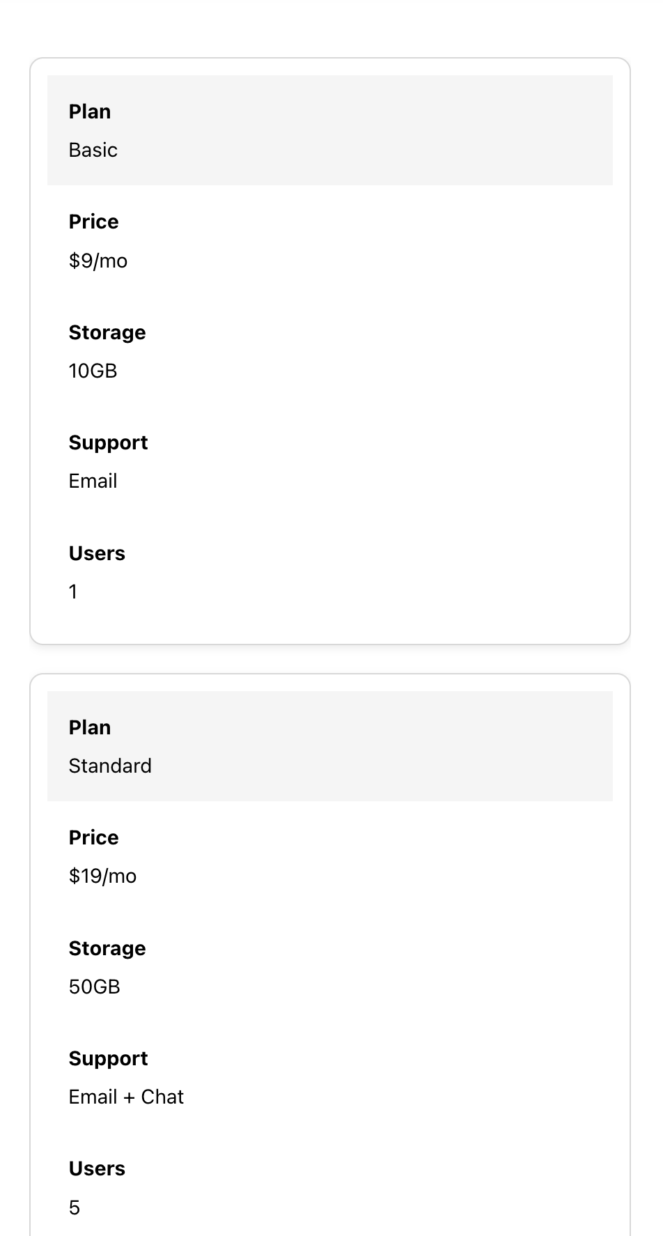
Responsive Table for Elementor is a lightweight, easy-to-use widget designed to make small tables look beautiful on any device. Unlike bulky table plugins, this widget focuses on simplicity and readability — perfect for tables with up to 5 columns that automatically transform into a clean card-style layout on mobile.
If you don’t need huge spreadsheets or endless columns, and just want a sleek, responsive table that works out of the box, this widget is for you.
Perfect for:
- Pricing tables
- Schedules and timetables
- Feature comparisons
- Any compact dataset that must look great on mobile Features (Free Version):
- Fully responsive tables that stack into cards on mobile
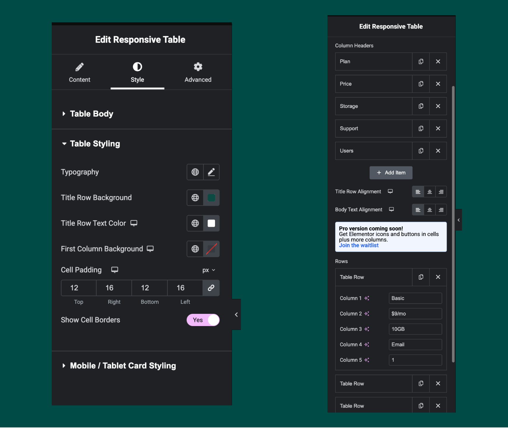
- Customizable table header and body styles
- Toggle borders on/off
- Unlimited rows (up to 5 columns)
- Simple Elementor widget interface — no shortcodes needed
- Input HTML into cells
- Easily adjust row background colours for better readability Pro version (coming soon!)
- Icons inside cells
- Add buttons to cells
- More than 5 columns
- Border styling
- Horizontal Scrolling for larger tables
- Priority support If you want to be notified when the Pro version launches, click here.
安装:
- Upload the plugin files to the
/wp-content/plugins/responsive-table-for-elementordirectory, or install via the WordPress Plugins screen. - Activate the plugin through the ‘Plugins’ screen in WordPress.
- Open Elementor, search for "Responsive Table", and add it to your page.
屏幕截图:
更新日志:
1.2.0
- Tested with WordPress 7.0
- Added WPML and Polylang compatibility for translatable table content (title, headers, and cells)
- Tested with WordPress 6.9
- Major update with significant styling improvements and new responsive options
- Added mobile card styling options (card header background, text color, border radius)
- Added border toggle for mobile cards
- Added capability to input HTML in table cells for more flexible content
- Added row labels in the editor for better organization of table rows
- Fixed styling conflicts with Hello Elementor theme
- Removed first column background control for better UX
- Improved responsive table behavior on mobile devices
- Fixed title row text color behavior on stacked cards Note: This is a major styling update that improves responsiveness and adds mobile card customization options. You may need to recheck your table colors and backgrounds after updating.
- Initial release with responsive stacking table widget for Elementor
- Basic styling controls for table, header, and body