Responsive UI for Beaver Builder
| 开发者 | readysteadywebsites |
|---|---|
| 更新时间 | 2025年5月2日 13:54 |
| 捐献地址: | 去捐款 |
| PHP版本: | 7.0 及以上 |
| WordPress版本: | 6.8.2 |
| 版权: | GPLv2 or later |
| 版权网址: | 版权信息 |
详情介绍:
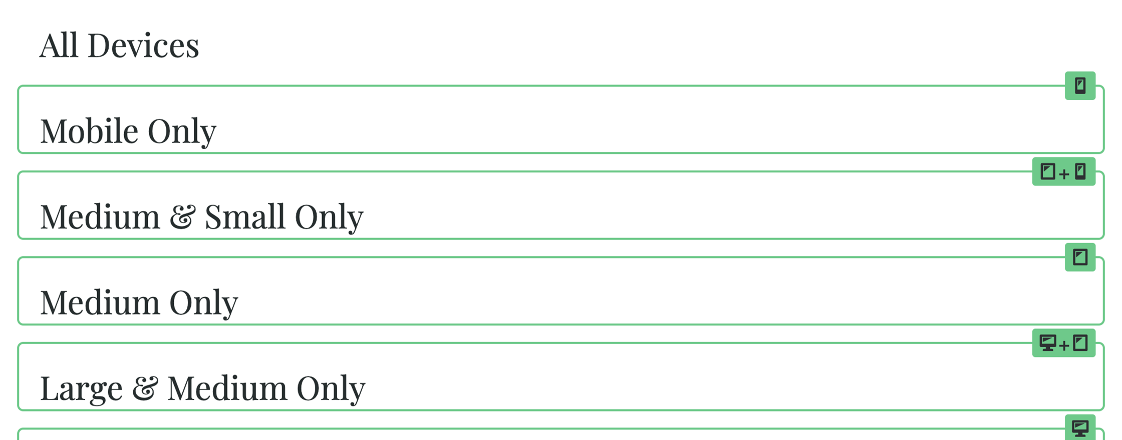
When you have set Visibility settings in Beaver Builder, it's not easy to see what rows, columns and modules appear on different devices. This plugin adds a visual guide with a click of a button.
屏幕截图:
常见问题:
How does it work
Beaver Builder lets you hide and show elements based on "Visibility" settings dependent on device size. You can control these via the 'Advanced' tab in row, column and module settings in the 'Visibility' section. Which is great, but the only problem is you can't then see which elements are hiding and showing until you click on each of their settings. In order to see which modules, columns and rows are showing/hiding, edit any page with Beaver Builder and you will see the "UI" button appear in the top bar. Click on that to see which elements you have with Visibility settings and which devices they are set to.
更新日志:
1.0.5
- Tested for WP 6.4+ and edge cases added for separated responsive choices.
- Updated for new responsive Extra Large breakpoint in Beaver Builder 2.6
- Updated compatibility for WP 5.9.
- jQuery updates for WP 5.7
- Amendments to styling so it is more obvious when it is on / off
- Initial Version
