Rolo Slider
| 开发者 | pressfore |
|---|---|
| 更新时间 | 2018年10月10日 04:37 |
| PHP版本: | 3.9.0 及以上 |
| WordPress版本: | 4.9.6 |
| 版权: | GPLv2 or later |
| 版权网址: | 版权信息 |
详情介绍:
Slider Demo | DocumentationDemos with addons :
Controller Addon Demo | Layer Colors Addon Demo | Posts Slider Addon Demo | Products Slider Addon DemoVideo Preview [youtube https://www.youtube.com/watch?v=WfxwUrSyN9Q] Main Features:
- Responsive
- Ken Burns Effect
- Supports Full Width Mode
- Easy to use
- Animated Layers
- Simple To Customize
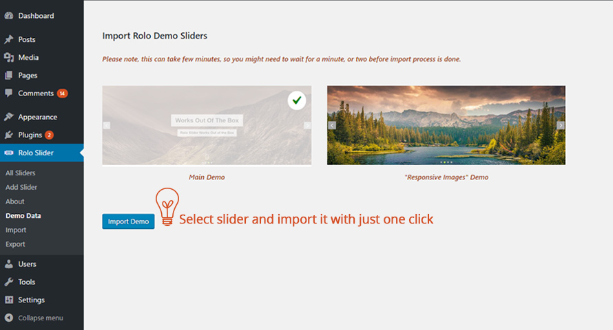
- Demo Data Import
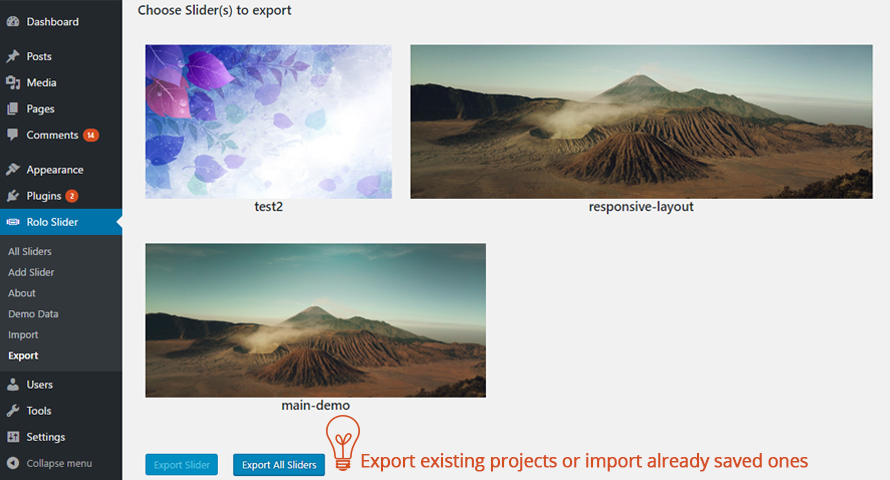
- Import and Export option for sliders
- Modern Look
- Comes With 2 Layouts
- Simple integration via Shortcode
- Full Height
- Ken Burns Effect Direction Per Slide
- Zooming factor for ken burns per slide
- Ken Burns Effect Moving factor per slide
- Customize Layer colors per slide
- 2 Additional Slide Transitions
- Dynamic posts listing
- Dynamic woo commerce products listing
- And more ++ Want to see some new feature ? Propose us a feature Here . We are looking forward to hear from you!
安装:
- Via WordpPress uploader
- or via FTP Client
- go to WordPress admin panel and click on "plugins" from the dashboard menu.
- Then from Plugins -> Add New -> Upload -> Choose file -> and then choose rolo-slider.zip and press Open-> Install Now -> Activate Plugin
- Unzip the file
- Upload unziped rolo-slider folder to your WordPress plugins directory (/wp-content/plugins/)
- Activate from WordPress menu Plugins section
屏幕截图:
常见问题:
[Q] Why my images are not scaling on small screens in default layout
[A] Slider background images for default layout are set with css – background-size: cover and it is best and usual way for setting background for containers because in that way image will be forced to cover entire container regardless of the image size. So, it is important to know that most of the time, parts of the slide background won’t be visible. The actual visible portion will vary depending on screen orientation and width/height aspect ratio. For instance, the common aspect ratio of portrait orientated tablets is 3:4 (iPad), and for desktop monitors it is 16:9 (full-HD resolution). In all instances the background is scaled to be as large as possible so that the slider area is completely covered by the background image. In simple words, some background clipping must occur, while the “content-safe” area is the very center of each slide – this area is always visible. Keeping this safe area in mind, if you are using slider background as an important part of your visual message, like an image showing your product for example, make sure that product is placed within that safe area so it won’t be clipped out.
[Q] Why slider height is not applied for Responsive Images layout
[A] Responsive images layout is taking the height of the tallest image. This way it will ensure the proper scaling of the images across devices, while keeping the proper proportions. This layout do not support layered elements, because the elements wouldn't fit in this layout, as on the smaller screens images can get really small in height. To add layers use Default layout which is displaying images differently on small devices, using background protpery. For more details how it works read the answer for the first question above.
更新日志:
- Fixed paths to some images in rolo.css file
- Fixed some text strings which couldn't be translated
- Updated translation POT file
- Fixed plugin text domain
- Fixed translation POT file
- Overall improvement of transitions for cross browser support
- Fixed horizontal scrollbar on some instances
- Improved Force Full screen option
- Extended autoplay scroll option up to 15s
- Included new hooks
- Improved code quality
- Improved backend js
- Added new pages
- Minor Bug Fixes
- Added Import page
- Added Export page
- Added Demo Data page
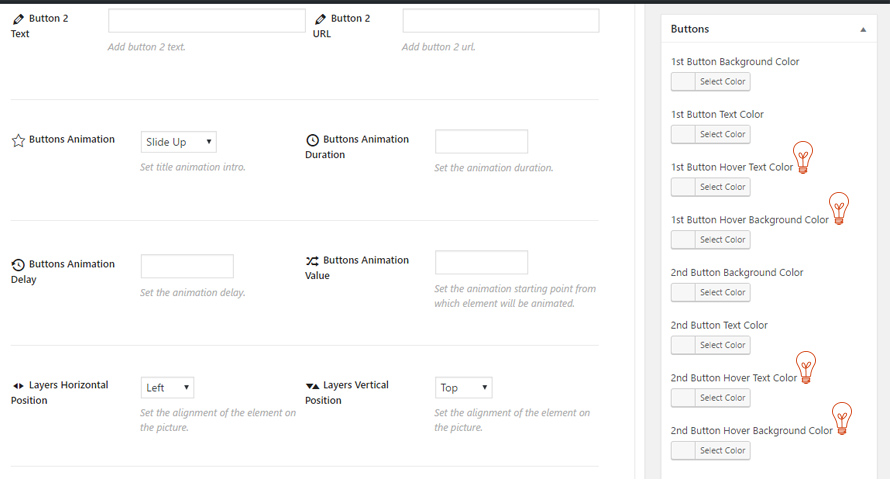
- Added Buttons hover text color
- Added Buttons hover background color
- Added Ken Burns to the "responsive images" layout
- Improved options UI
- Organized slider options into tabs
- Refactored and optimized code
- Fixed multiple sliders per page issue
- Added WP 4.7 compatibility
- Increased circle pagination size
- Increased slider height on mobile devices
- Fixed inverted button styles
- Fixed buttons styles when captions are included
- Fixed conditional on admin submenu pages
- Added captions background color
- Added captions text color
- Added transparent captions option per slide
- Improved styles
- Added missed name parameter in generated shortcode
- Fixed duplicate slides issue for "Responsive Images" layout
- Fixed Slider not showing issue
- Added unistall function
- Fixed rolo force full width on screen resize
- Fixed js error
- Added Force Full width option
- Added FadeUp slide transition
- Integrated alt tags for images
- Removed Ken Burns effect from "responsive image" slider layout
- Added "Responsive Images" layout
- Fixed doubled slider issue
- Fixed arrow background color on hover
- Improved compatibilty with some themes that are including owl carousel
- Added pot file
- Replaced color picker to include custom color input field
- Improved Mouse scroll animation
- Slower fade transition between slides
- Added feature proposal link inside the plugin
- Added link to online documentation inside the plugin
- Initial Release


