Simple Tooltips
| 开发者 | clevelandwebdeveloper |
|---|---|
| 更新时间 | 2023年1月14日 09:37 |
| 捐献地址: | 去捐款 |
| PHP版本: | 2.9 及以上 |
| WordPress版本: | 5.0.3 |
| 版权: | GPLv2 |
| 版权网址: | 版权信息 |
详情介绍:
安装:
- From WP admin > Plugins > Add New
- Search "Simple Tooltips" under search and hit Enter
- Click "Install Now"
- Click the Activate Plugin link
屏幕截图:
常见问题:
How do I add a tooltip (new, easy way)?
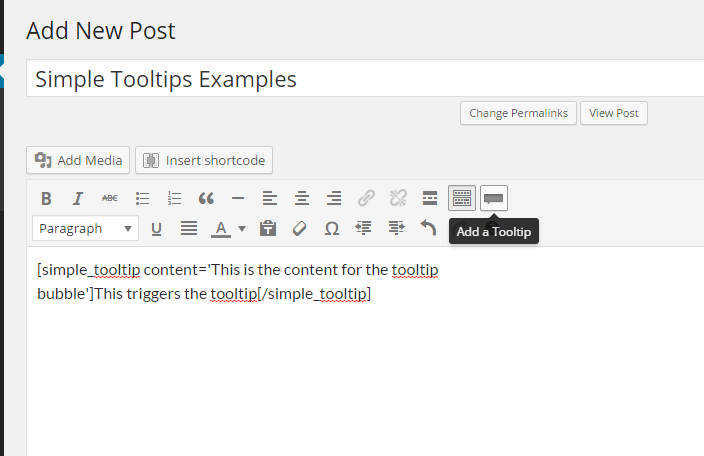
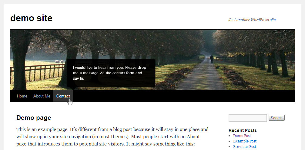
Click the tooltip icon on your visual content editor to add the tooltip shortcode. Change the content attribute to whatever you want to be the content inside the tooltip bubble. Change the tooltip trigger to whatever content you want to be used to trigger the tooltip, when hovered. (see screenshots).
How do I add visual elements inside the tooltip and as tooltip trigger?
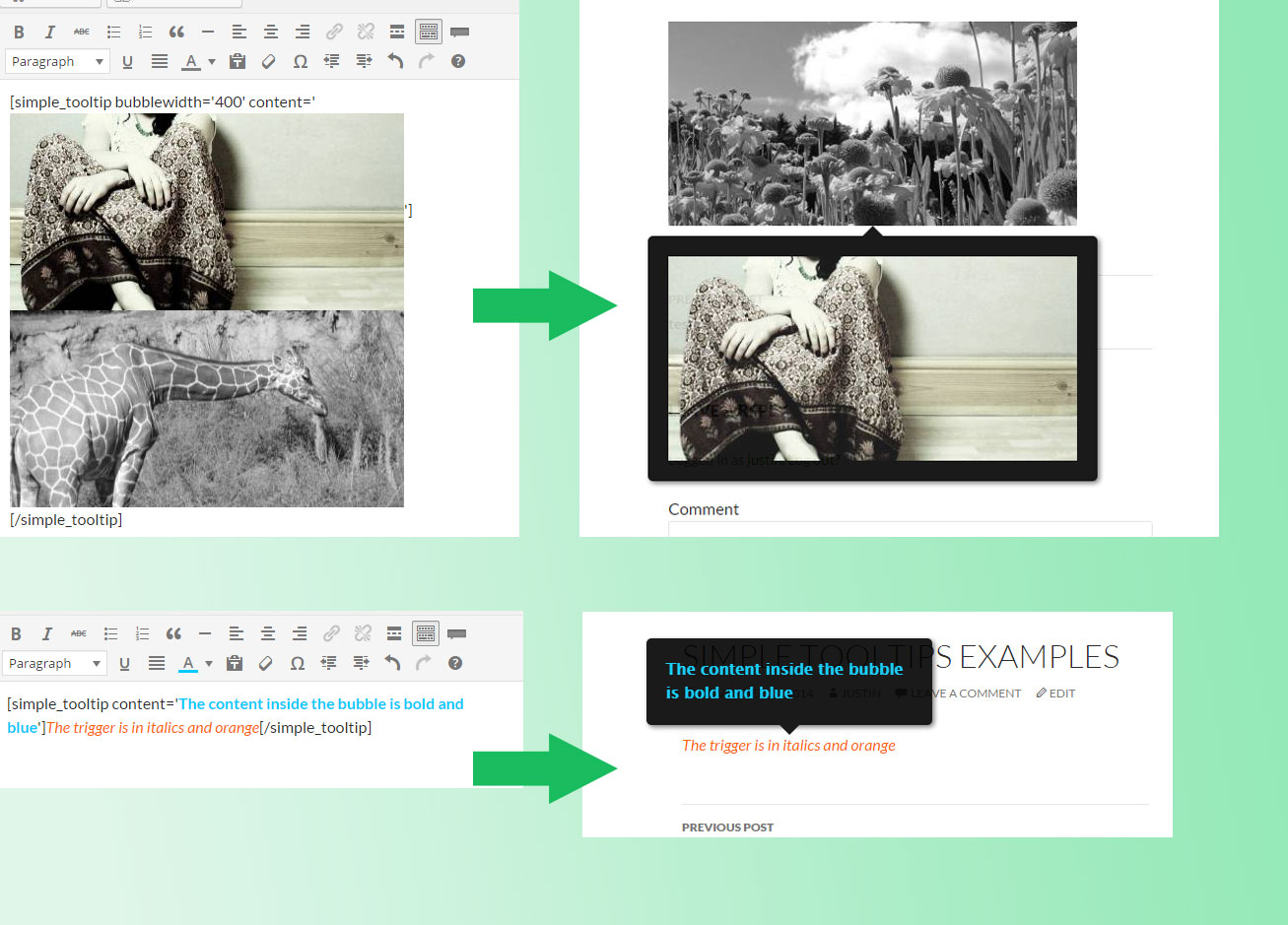
You should be able to edit the tooltip content and/or trigger to allow for html elements via the visual editor (such as links, images, colored text, bold, etc). One note of caution: if you are trying to use an image inside the bubble content, it's a good idea to set the image width and height directly by editing the inline style attribute (which you can access via the image html) for the img tag. This helps ensure that the bubble will register the image size correctly. Also, make sure to adjust the max bubble width to allow for the image. (see screenshots)
How do I customize individual tooltips?
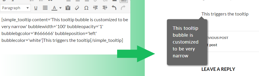
The tooltip style settings you set on the Simple Tooltips setting page will apply to all your tooltips by default. However, you can now override the default tooltip style by editing the shortcode for that toolltip. Here is the list of customizable parameters:
- bubblewidth (integer, in pixels) - Sets the max width for tooltip bubble. If you are trying to fit an image inside the bubble, and the image is too big for the tooltip bubble area, try adjusting the max bubble width to make sure it is big enough to the fit the desired image.
- bubbleopacity (integer, between 0 and 1) - Sets the bubble opacity. 0 is invisible and 1 is totally solid.
- bubblebgcolor (color name or hex value) - sets the bubble background color. Could be a color name, like green, or a hex value, like #666666.
- bubbleposition (left | center | right) - the position of the tooltip, relative to the trigger element
- bubblecolor (color name or hex value) - sets the bubble text color. Could be a color name, like green, or a hex value, like #666666. or a hex value.
How do I edit the inline style for a trigger element?
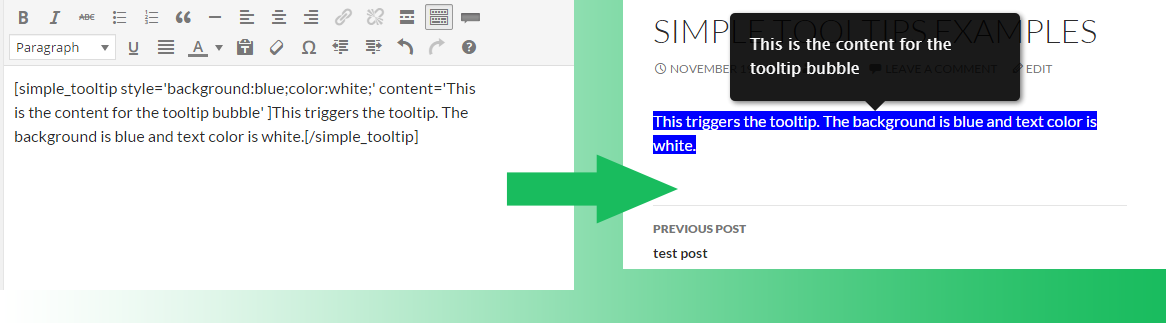
You can add inline style attributes to the trigger element by adding the style attribute to the [simple_tooltips] shortcode. For example, add style='background:blue' to the simple_tooltip shortcode, to make the background color for the trigger element blue. Like this... [simple_tooltip style='background:blue;color:white;' content='This is the content for the tooltip bubble. The tooltip bubble has the default style' ]This triggers the tooltip. The trigger background is blue and text color is white.[/simple_tooltip] (see screenshots)
How do I add a tooltip (older, html way)?
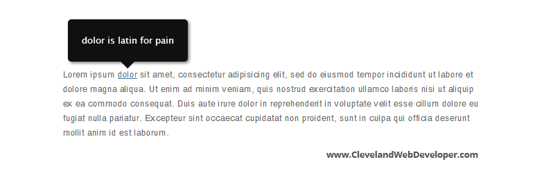
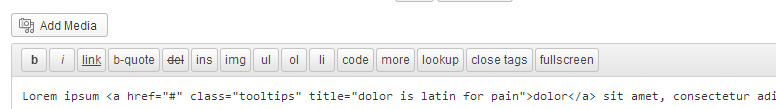
Add class "tooltips" to the target html element. The title attribute will be used for tooltip content (see screenshot).
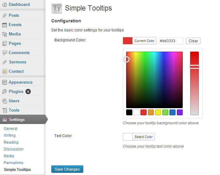
How do I change tooltip color settings?
Settings > Simple Tooltips.
更新日志:
- Security update
- Resolved error noticed in debug mode
- Adds compatibility with languages that use RTL (right to left) text
- Adds the option to disable tooltips on mobile
- Click tooltip button on visual editor to easily add tooltips
- Add visual elements like images, links, bold text, etc, inside tooltips and as tooltip trigger
- Customize individual tooltips
- Edit inline style for trigger element
- Set max width for tooltip
- Set tooltip opacity
- Set tooltip position
- Apply tooltips to WordPress menus
- Initial version