Responsive Content
| 开发者 | senlin |
|---|---|
| 更新时间 | 2019年6月3日 04:41 |
| 捐献地址: | 去捐款 |
| PHP版本: | 4.0 及以上 |
| WordPress版本: | 5.2 |
| 版权: | GPLv2 or later |
| 版权网址: | 版权信息 |
详情介绍:
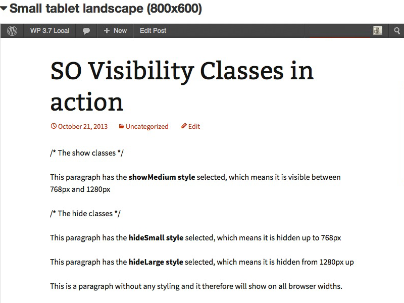
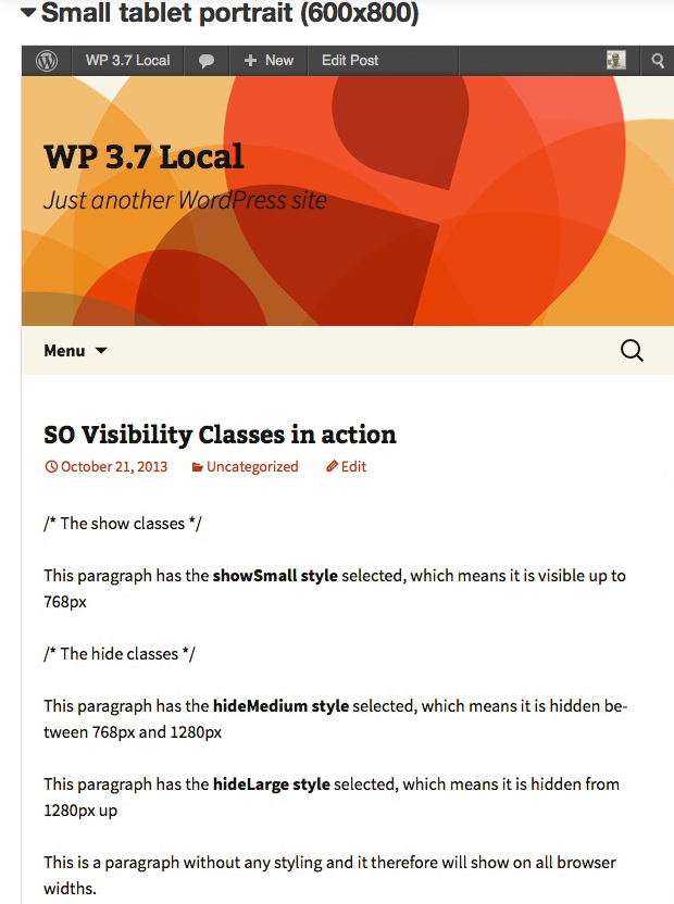
The Responsive Content plugin enables you to adjust the content depending on the device/viewport.
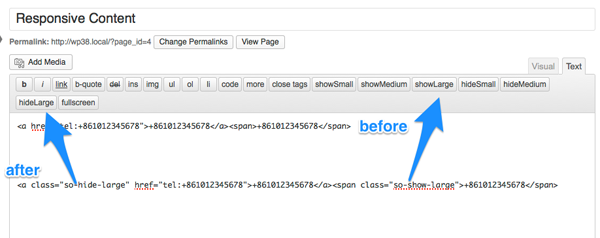
An example where this can be very handy for is telephone numbers. On a mobile device, a telephone number can be a link from which it can be dialed immediately, whereas from a lap/desktop the number does not have to be a link.
With the Responsive Content plugin it is as simple as adding a class to the content to show/hide it for different devices.
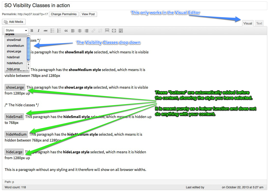
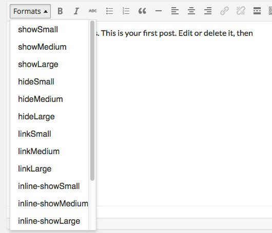
The Responsive Content plugin adds a Formats drop down menu (pre WP 3.9 the menu is called "Styles") to the first line of the TinyMCE Editor. Once you have selected a visibility class, the plugin shows that in 3 locations:
- as selected in the drop down menu
- with a "button" in front of the selector (the only function of this "button" is to show you that the element behind it has one of the visibility classes)
- in the path
- 6 for paragraphs (3 to show and 3 to hide)
- 3 for links (only to show as hiding can be done with the inline classes below)
- 6 for spans (3 to show and 3 to hide)
安装:
Go to Plugins > Add New in your WordPress Dashboard, do a search for "Responsive Content" and install it.
… OR …
Follow these steps:
- Download zip file.
- Upload the zip file via the Plugins > Add New > Upload page … OR … unpack and upload with your favorite FTP client to the /plugins/ folder.
- Activate the plugin on the Plugins page.
屏幕截图:
其他记录:
Usage
You can use the Responsive Content plugin basically for any Post Type.
Although possible, I strongly discourage using the classes with images. The reason is that the Responsive Content plugin only uses media queries with
display: block;, display: inline-block; and display: none;. If you were to add a large image to only show on large screens, a medium image to show on tablets and a small image to show on smart phones, then the person visiting your site using a phone has to download all 3 images, which can have a major impact on the data plan of the visitor!常见问题:
Is this plugin compatible with the new editor of WP 5.0 (codenamed Gutenberg)?
The plugin works on WP 5.0, but only on a Classic Block. Alternatively we would like to suggest to either using the Classic Editor or to install ClassicPress once it is released. = Is it possible to hide shortcodes with this plugin? As reported here it is not possible to hide shortcodes in the WP Editor. A workaround can be to add the code to your template (sample in the ticket), but that largely depends on what you want to show/hide.
I have an issue with this plugin, where can I get support?
Please open an issue over at Github, as I will not use the support forums here on WordPress.org
更新日志:
20181.2.2
- November 9, 2018
- make dismissible admin notices actually work
- November 9, 2018
- plugin actually works with WP 5.0, but only with Classic Block, change readme to reflect that
- re-code admin notices and make them dismissible
- rewrite/cleaning up/updates here and there
- November 1, 2018
- add condition that checks for higher than WP 4.9.8 and then displays a warning notice that the Classic Editor plugin needs to be installed to continue using the Responsive Content plugin.
- add a condition that checks whether ClassicPress has been installed and if it is a sentence is shown that the Responsive Content plugin also works on ClassicPress.
- removed SO icon on Settings page
- attempt to revert to Semantic Versioning
- tested up to WP 4.8
- some CSS changes on Settings page
- tested up to WP 4.7
- remove version check
- tested up to WP 4.6
- TWEAK: header settings page; only showed half logo after 2015.08.05 update
- changed header settings page to h1 (https://make.wordpress.org/plugins/2015/08/03/4-3-change-to-plugin-dashboard-pages/)
- show 4.3 compatibility
- changed logos
- new banner image for WP.org Repo by Oliver Berghold
- bump minimum required WP version up to 3.8
- tested up to 4.0-beta-2
- compatible with TinyMCE 4.x
- added different instructions/images for WP pre/post 3.9
- additional screenshot of Formats dropdown for WP post 3.9
- updated language files
- change px for em in frontend stylesheet (css/style.css) and make it more precise
- change version number format
- change links to reflect new SO WP website
- tested up to WP 3.9-alpha
- add Serbian translation files (thank you Borisa Djuraskovic)
- add settings stylesheet to replace inline styling settings page
- move stylesheets to separate directory (css)
- change text domain to prepare for language packs (via Otto - http://otto42.com/el)
- update language files
- make correction to version check function to actually output the correct plugin name
- enhance styling: when class is inside a paragraph
display: block;should bedisplay: inline-block; - 3 additional styles for links
- 6 additional styles for inline text (in
<span>s) - 6 additional styles for the text editor
- name change to Responsive Content (from SO Visibility Classes)
- update readme files with new name
- update language files with new name
- tested up to 3.7
- Change color coding visual editor styles to button-like text before the selected content
- Initial release on Github.
