
SoulButtons
| 开发者 |
gingersoulrecords
ideag |
|---|---|
| 更新时间 | 2017年8月6日 06:20 |
| 捐献地址: | 去捐款 |
| PHP版本: | 4.6 及以上 |
| WordPress版本: | 4.8 |
详情介绍:
SoulButtons was designed to give WordPress developers a simple, consistent, effective approach to using buttons (and other actionable links) in their layouts.
SoulButtons was conceived by a designer who found it difficult to maintain the balance between priority (e.g. how to make more important buttons/links stand out from others), consistency (limiting button styles and their behaviors so that site visitors understand how to find the right information/conversion paths), and ease of use (so non-CSSers and non-UXers could join the party) with respect to custom-coding button styles and behaviors.
SoulButtons also makes important (yet complex) button functions available just by assigning a shortcode attribute. Got Google Analytics installed? Add the track attribute and you'll see what buttons your users are clicking on more than others in your Analytics 'events' area. Need to show an element inside a dialog/modal window when a button is clicked? Assign target and targetEvent attributes to a SoulButton and you're all set.
For videos and examples, visit https://gingersoulrecords.com/soulbuttons.
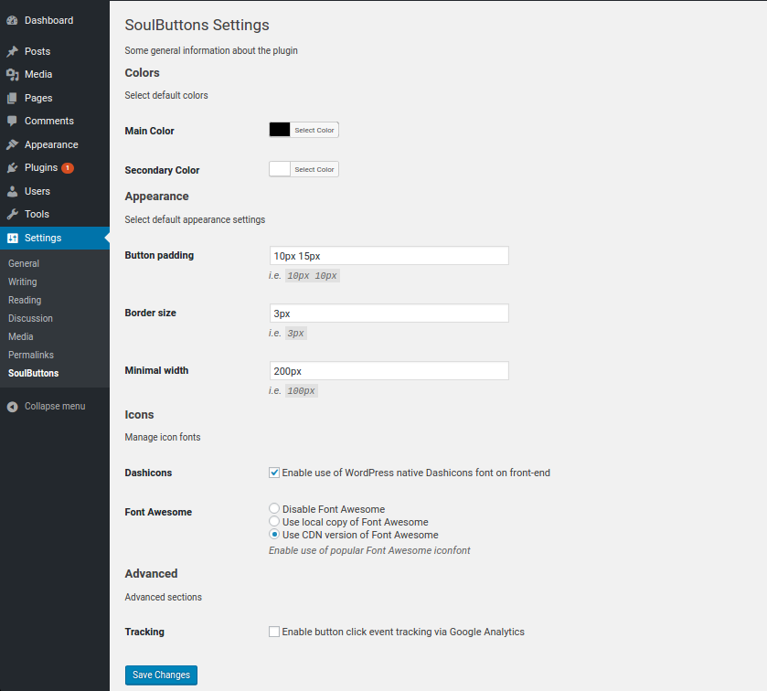
安装:
- Upload the plugin files to the
/wp-content/plugins/soulbuttonsdirectory, or install the plugin through the WordPress plugins screen directly. - Activate the plugin through the 'Plugins' screen in WordPress
- Use the
Settings -> SoulButtonsscreen to configure the plugin - Insert buttons into your posts/pages via
[soulbutton]shortcode
屏幕截图:
常见问题:
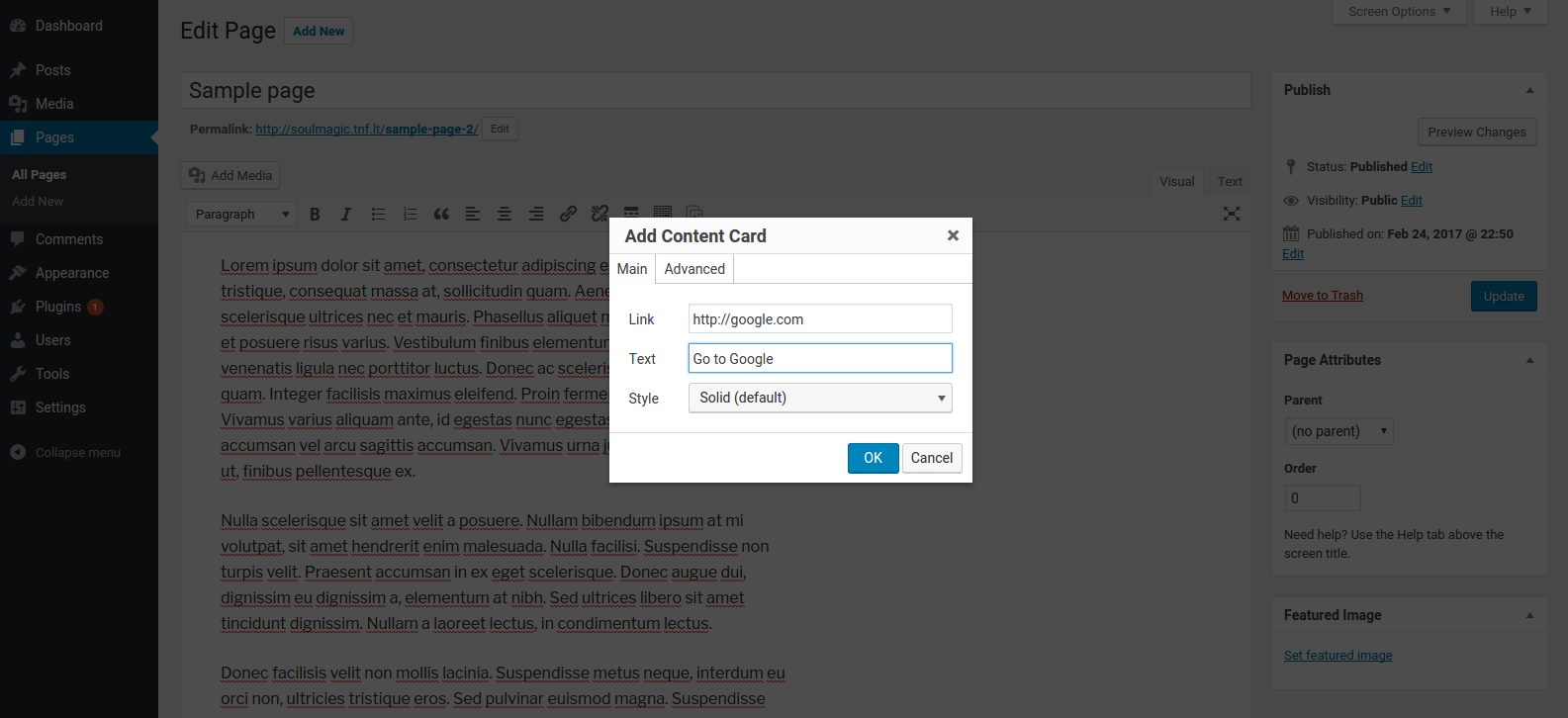
How do I create a button?
Use [soulbutton] shortcode or a button in WP Editor to generate it.
How do I use the shortcode?
The same way you use other WordPress shortcodes. Just wrap your button text with [soulbutton] and [/soulbutton] tags. You can use several different attributes to customize appearance and functionality of the button. See them in the next question.
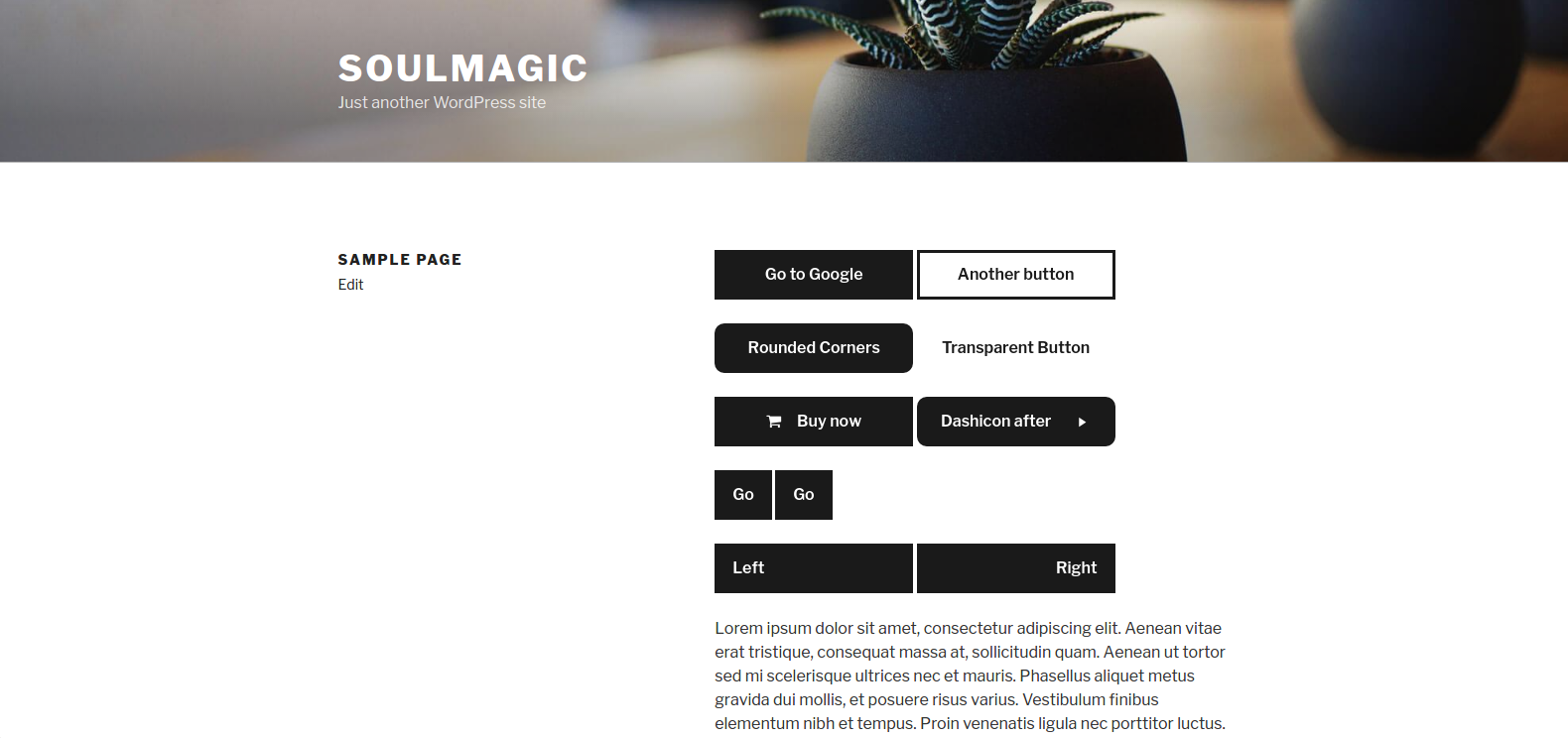
Sample usage: [soulbutton link="http://google.com"]Go to Google[/soulbutton]
What attributes does [soulbutton] shortcode have?
Here is the list of available attributes:
style- allows to choose button appearance. Available styles currently includesolid(default),rounded,borderandtransparent.link- where button link should point to. Defaults to#.href- an alias oflink.css- custom inline CSS styles.class- to add a custom class to the button.id- to add a custom id attribute to the button.color- the color of the button (to override global setting).text- the color of the text in the button (to override global setting).border- the color of the border of the button (to override global setting).track- should button click be recorded on Google Analytics.true/falseto override global setting, custom string to set custom button name.icon- allows to insert a Dashicons / Font Awesome icon to be inserted into the button. Define using full name of the icon, i.e.dahsicons-arrow-leftorfa-shopping-cart.icon-position- set the icon position within the button.before(default) - icon is inserted before button content.after- icon is inserted after button content.hover- defines additional hover effects. Space-separated list. Available effects includeicon-left,icon-right,icon-top,icon-bottom.align- changes text alignment in the button. Available options -center(default),left,right.padding- changes button padding.border-width- changes button border-width.width- changes button minimal width.scrollto- adds a visual "Scroll To" effect for anchor links (true/false).scrollto-speed- set scrollto effect speed (default 0.5).scrollto-offset- add a vertical offset for scrollto effect (default 0).offcanvas-target- define an element (via CSS selector) to take out of DOM and animate as off-canvas item.offcanvas-effect- define which effect should be used the off-canvas target. Available effect includefadeInFromCenter,slideOverFromRight(default),pushOverFromRightoffcanvas-open- determine if offcanvas element should initially be in open or closed state (default - false).prevent-default- allows to disable default action of the link (i.e. appending hash values to url) (default -false).
更新日志:
0.1.6
- add
prevent-defaultattribute (#27); - add
offcanvas-openattribute (#29) to allow initializing off-canvas element in open state; - rename
target/target-effectattributes tooffcanvas-target/offcanvas-effect(#31); - fix
cssattribute values not being applied correctly (#32); - restructe the shortcode generation modal, separating options into Content and Behaviour tabs (#34);
- resizing Dashicons to 80% by default;
- moved screenshots to assets
- added
target/target-effectattributes - added a Settings link in plugins list
- added shortcode builder tag to Beaver Builder WP Editor fields
- added a
scrollto-speedattribute - fix missing bracket in JS
- cleanup code, add docblock comments
- added a
scrollto-offsetattribute
- added a
scrolltoattribute
- updated plugin description
- fixed colorpicker bug in settings
- added
font-size:inheritfor Dashicons - added target/target-effect attributes to the shortcode
- first version to be submitted to wordpress.org