WooCommerce Checkout Optimization by Cartimize
| 开发者 |
cartimize
amritanandh |
|---|---|
| 更新时间 | 2020年11月30日 17:42 |
| PHP版本: | 7.0 及以上 |
| WordPress版本: | 5.3.1 |
详情介绍:
After you have invested vast resources into building your store and customer acquisition through pay per click campaigns etc., it seems almost unbearable that 69% of users – after having added items to their cart – then choose to abandon their purchase.
Why is it that this many orders are abandoned? And what exactly can online retailers like yourself do to improve this sad state of affairs?
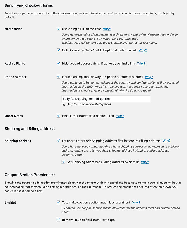
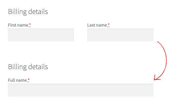
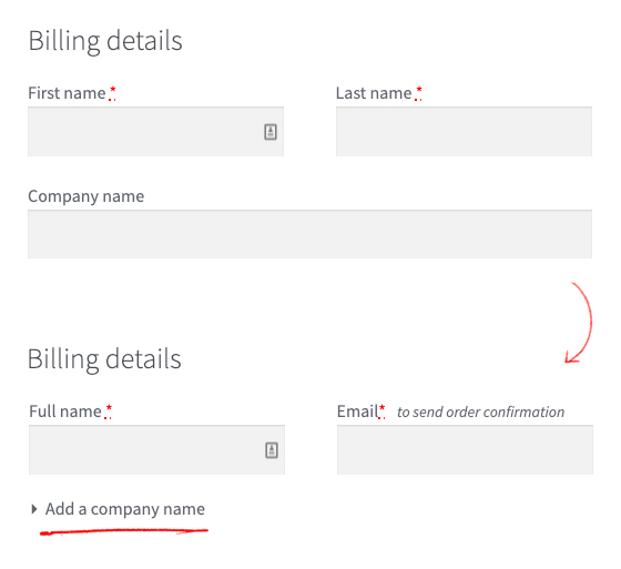
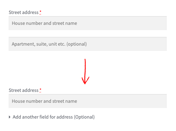
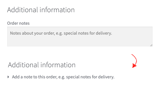
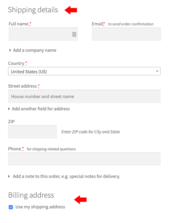
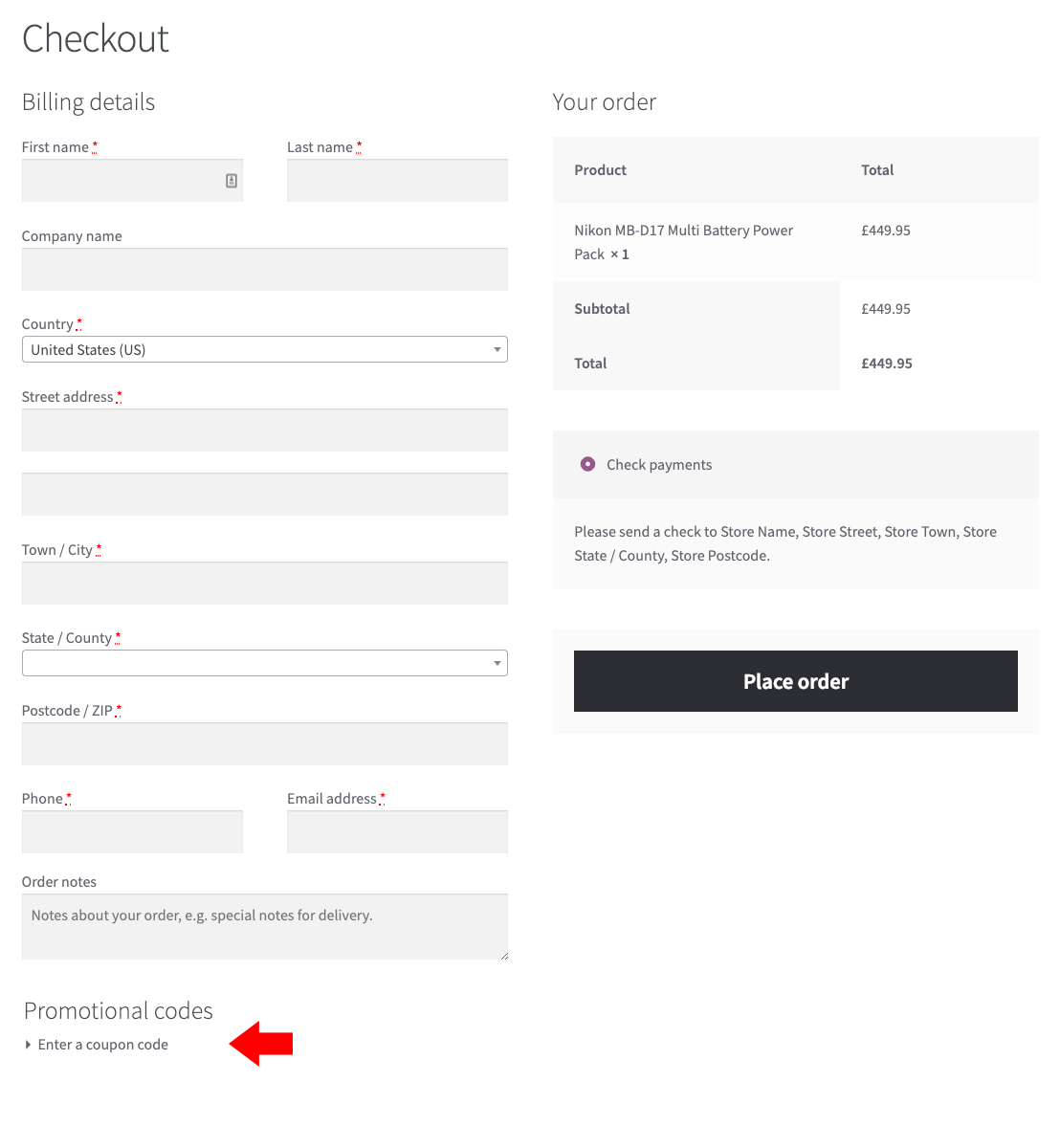
Our WooCommerce Checkout Optimization plugin is being built based on learnings from Baymard Institute's 9-year-long ecommerce UX study including 37,000+ hours of UX research findings — insights already used by several of the world's leading e-commerce sites.Implement The Best WooCommerce Checkout UX and gain as much as a 35% increase in conversion rate, in under 5 minutes. Discover more at our website SIMPLIFY Make the checkout form short & simple Minimizing the default number of displayed form fields and selections are particularly important for the WooCommerce one-step checkout implementation. It's key to achieve the perceived simplicity that the one-step style can afford. * Use a Single 'Full Name' Field instead of a First Name and a Last Name field - Users generally think of their name as a single entity and, therefore, a large proportion of users often type out their full name in 'First Name' field. Using a single "Full Name" field will at a minimum cut the number of form fields by one – ~7% reduction. * Hide Optional fields behind a link - The main component in reducing the amount of needless attention drawn to optional fields is collapsing them behind a link. This performs well, as empty form fields in the checkout are generally seen by users as a potential task that has to be completed. Removing the form field from the default checkout flow will greatly reduce the amount of needless attention. * Make the coupon section much less prominent - Showing a coupon code field and apply button directly in the checkout flow is one of the best ways to make sure all users without a coupon notice that they could be getting a better deal on their purchase. A well-performing way of reducing the amount of emphasis on the coupon field, while still keeping it discoverable for users who do have a coupon, is to collapse it behind a link. Although WooCommerce hides the actual coupon field and apply button behind a link, both the design and placement of the link still demand needless attention. REDUCE Reduce shoppers' cognitive load Making users think, evaluate or make up their mind during the checkout causes interruptions. Since these interruptions lapses a user's ability to progress in their checkout, it's important to reduce them to any extent possible. * Let users enter their 'Shipping Address' first instead of 'Billing Address' - A shipping address determines where the product is being delivered – a straightforward terminology which users have no issues understanding. A billing address, on the other hand, can be used for several purposes. Asking users to type their shipping address instead of a billing address performs better. * Use 'Shipping Address' as 'Billing Address' by default - For most B2C sites, the majority of customers typically order products to their own address. Setting the "Billing Address to equal the Shipping Address", by default, performs vastly better than either not having the feature or not having it as a default selection. * Explain why you need the users' phone number - Users continue to be concerned about the security and confidentiality of their personal information on the web. This can range from serious concerns over identity theft to more mundane concerns, such as an aversion to receiving marketing phone calls – making them reluctant to hand out personal information. When it's truly necessary to require users to supply the information, it should clearly be explained why the data is required. One well-performing pattern is simply using a short inline explanation, in close proximity to the field, such as "Used for payment validation", "For order questions only", or whatever the information is actually used for. PRO VERSION - What's in PRO? Delight users with a thoughtful checkout flow Besides speeding up the completion of the form, a thoughtfully designed checkout flow has the potential to bring delight to users in an otherwise dull typing process. * Auto-Detect City and State from ZIP [PRO] - While we can't avoid requiring some information from users, we should minimize the amount of typing required whenever possible. Both "State" (/region) and "City" inputs present such an opportunity, as both can be auto-detected from a ZIP or Postal code in most countries. * Live inline error validation of form fields [PRO] - "Live inline validation" is where the validity of the user's inputs are checked live as the user progresses through the form, as opposed to checking the inputs in a lump sum when the user submits the form. We time and again observe that there's a direct correlation between how and when users are presented with form validation errors and the pace and effort with which they are able to resolve those errors. * Delayed account creation [PRO] - While users should always be allowed to complete the checkout process as a guest, having an optional account creation option is often appreciated by users. This begs the question of at which point during the checkout flow is it best to ask for the optional account creation. Based on previous checkout usability tests, it's clear that delaying the optional account creation option performs the best. In fact, it's often best delayed until the order is finalized; hence presenting the optional account creation option on the order confirmation page works best. This concept is called 'Delayed Account Creation'. Learn more about the Pro version.
安装:
This section describes how to install the plugin and get it working.
e.g.
- Upload the plugin folder to your /wp-content/plugins/ folder, or install the plugin through the WordPress plugins screen directly.
- Activate the plugin through the 'Plugins' screen in WordPress
- Use the Settings->Plugin Name screen to configure the plugin
- (Make your instructions match the desired user flow for activating and installing your plugin. Include any steps that might be needed for explanatory purposes)
屏幕截图:
常见问题:
Is this compatible with my theme?
Yes. We developed this to be compatible with most themes. If you have any compatibility issues, send us an email to help@cartimize.com and we'll look into it.
更新日志:
1.0.4 - Dec 13th 2019
- Improvement: WooCommerce templates used are updated till WooCommerce v3.8.1.
- Fix: Order notes are displayed on top of the shipping address fields in the checkout page when WooCommerce shipping destination is set to "Force shipping to the customer billing address." and the Cartimize shipping address is checked.
- Fix: Full name field class changed from 'form-row-first' to 'form-row-wide'.
- Improvement: When hiding company name behind a link - Changed "Add a company name (optional)" to "Add a company name"
- Improvement: When hiding 2nd address field behind a link - Changed "Add another field for address (Optional)" to "Add another address line"
- Fix: Placeholder issue when address 2 is hidden behind a link.
- Fix: Minor bug fixes.
- Fix: When 'Let users enter their Shipping Address first instead of Billing Address' is enabled, changing shipping address details like country, state and zip code did not update the shipping methods (or anything in order review summary).
- Fix: When 'Let users enter their Shipping Address first instead of Billing Address' is enabled and when "Use my shipping details" is checked, billing address based changes in the order review summary did not update.
- Fix: When 'Let users enter their Shipping Address first instead of Billing Address' is enabled and when "Use my shipping details" is checked / unchecked, order review details did not update.
- Fix: Some hooks were being called twice which was creating issues.
- Fix: Bug that affected Pro version.
