Design Upgrade for LearnDash
| 开发者 |
escapecreative
davewarfel |
|---|---|
| 更新时间 | 2022年8月10日 04:01 |
| 捐献地址: | 去捐款 |
| PHP版本: | 5.6 及以上 |
| WordPress版本: | 6.0 |
| 版权: | GPLv3 |
| 版权网址: | 版权信息 |
标签
下载
详情介绍:
- NEW: Improved styles for the new LearnDash registration process/page
- Global: Larger clickable areas for all course content, navigation & Focus Mode areas
- Buttons: All buttons have matching rounded corners & increased font size
- Font Sizes: These will now be inherited from your theme, which should increase your font sizes across the board
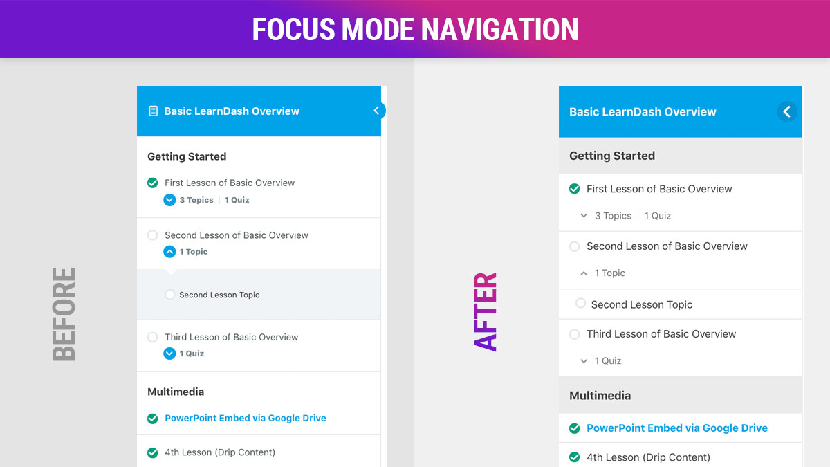
- Focus Mode: Improved sidebar tray design, Course Sections, shadow added to mobile menu, collapse arrow flips to show current menu state, and more.
- Focus Mode: Top navigation bar received several small improvements
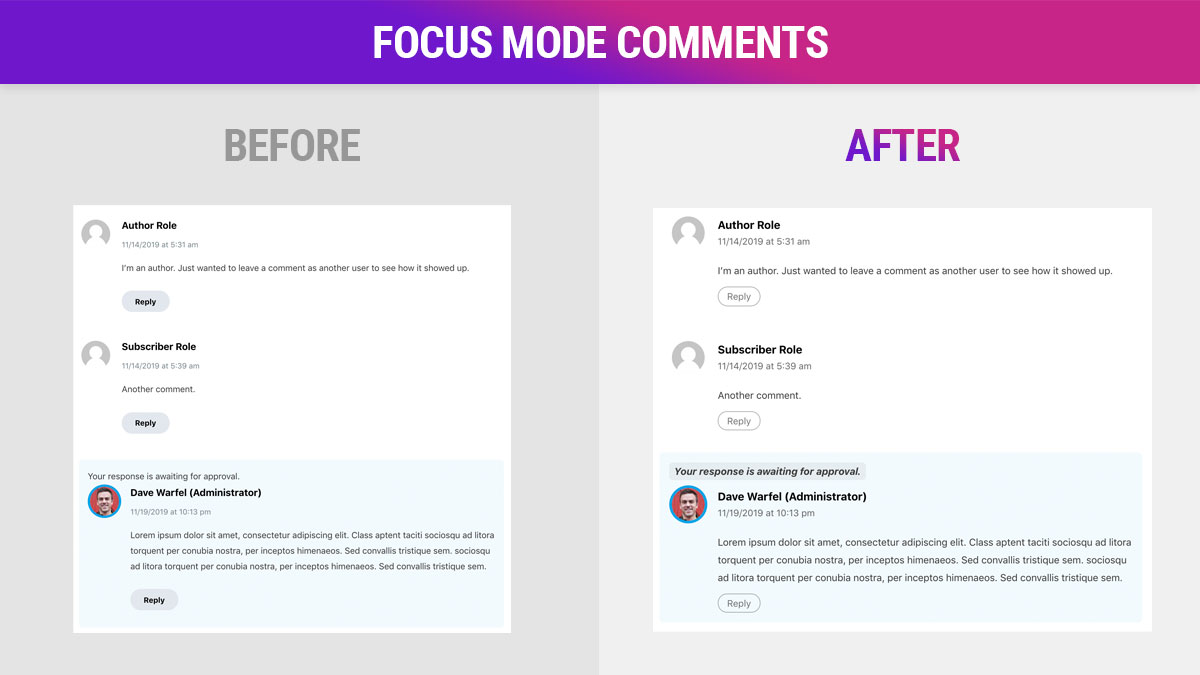
- Focus Mode: Improved styles for Focus Mode comments, which were added in LearnDash 3.1
- Animations: Subtle animations for LearnDash tooltips & the Focus Mode top menu
- Profile: Several styles were improved & standardized
- Login/Registration: Unified styles for all form fields
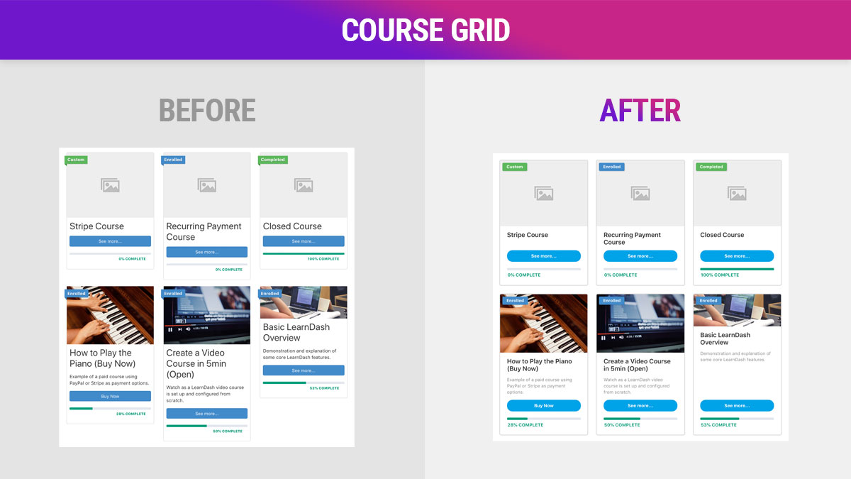
- Course Grid: Equal height columns & other small tweaks
- WisdmLabs Ratings, Reviews & Feedback design upgrades
- Design improvements for WisdmLabs' LearnDash Group Registration plugin
- Improved print styles
- Much improved course grid styles, equal height cards & no more weird spacing issues 👍
- All fonts have been reset to use your theme's default font family, size & color
- All PNG icons have been replaced with comparable SVGs
- All complete/incomplete icons for lesson/topic/quiz lists have been moved to the right for better consistency
- Spacing around & between elements has been adjusted to provide greater consistency throughout
- All LearnDash widgets now have more consistent spacing & sizing, including improvements to Course Info & Course Navigation
- Styling for the
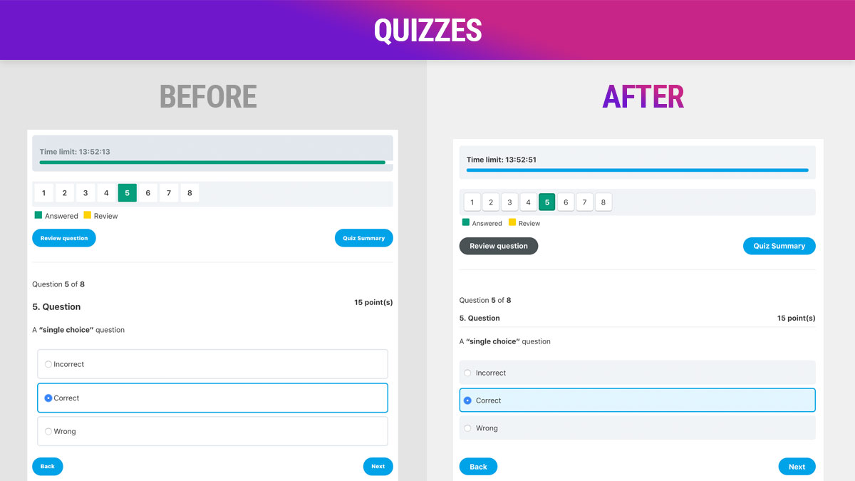
[ld_profile]shortcode has been completely revamped - Completely revamped & restyled quiz elements 💯
- Improved design of the statistics modal window (for quizzes), including row highlights on hover
- Larger pager navigation buttons to improve usability
- Full support for RTL languages
- Achievements Add-On: 10 new customization options
- Show/Hide various course & profile features
- Disable expand/collapse links & show all by default
- Course Content Lists: Update background & text colors, hover effects, customize line separators, remove the list count numbers and more
- Progress Bar: Customize the color, border radius & height, add stripes, and animate the bar on page load
- Buttons: Add your own background & text colors
[ld_profile]: Avatar shape, custom "edit profile" link, hide profile info, hide quiz information, and more- Login/Registration Popup: 10+ design options
- Focus Mode: 20+ design options, including 7 for Focus Mode comments
- Course Navigation Widget: 15+ design options
- Course Grid Add-On: 20+ design options
- Alerts: 9 custom colors, plus a few other options
- Tooltips: customize the background & text color
- Uncanny Groups: buttons, border radius & improved styles are applied to many Uncanny Groups frontend elements
- Tin Canny Reporting: 12 design options for Tin Canny reports on the front-end
- Astra
- Divi
- GeneratePress
- eLumine (when using the "LearnDash 3.0" active template or eLumine's "Elementary Layouts")
- LearnMate
- Edufire
- Neve
- OceanWP
- BuddyBoss Platform (released June 2019)
- Boss. / Social Learner (If you deactivate the "Boss for LearnDash" plugin, it will still work in "Legacy" mode)
- eLumine (when using the "Legacy" active template or any version of LearnDash before 3.0)
- LearnDash Visual Customizer by SnapOrbital: The Visual Customizer takes a similar approach to designing LearnDash components, and thus the code conflicts with ours.
- Reset Progress button: Button styles upgraded
- Simple Course Timer modal: Button styles upgraded
[uo_dashboard]: Styles upgraded[uo_courses]: Styles upgraded[uo_breadcrumbs]: Compatible; Considering upgrades[uo_lessons_topics_grid]: Compatible; Considering upgrades[uo_login_ui]: Compatible; Considering upgrades
[wdm_group_users] shortcode.
Browser Support
A few techniques we use to improve the LearnDash design are only supported in the latest versions of major browsers. For the most part, as long as you're not using Internet Explorer, most (if not all) of our plugin's design upgrades will work.
We support the latest versions of the following browsers:
- Google Chrome
- Mozilla Firefox
- Apple Safari
- Microsoft Edge
- Chrome for Android
- Firefox for Android
- iOS Safari (not tested, but should work)
- New features for the Quiz Reporting Extension by WisdmLabs
- Compatibility with more Uncanny LearnDash Toolkit modules
- Paint brush icon made by Freepik, courtesy of flaticon.com. Licensed under CC3.0 BY.
- Gradient by colorful gradients
屏幕截图:
常见问题:
Where are the settings?
The free version doesn't have any. It simply applies a fresh coat of paint behind the scenes. Check out our pro version that includes 100+ settings you can customize.
Will this affect the rest of my site?
No. We've carefully crafted it to only apply to LearnDash elements. The rest of your site (header, footer, pages, blog posts, etc.) will continue to use the styles determined by whichever WordPress theme you are using.
Can I use this plugin with the LearnDash Visual Customizer?
Technically, yes, but you will encounter some weird design issues. We recommend you check out our similar pro plugin to customize LearnDash styles.
Is this compatible with the Elementor for LearnDash Integration?
The general design & UX improvements that Design Upgrade makes will still take effect. However, any customizations you make to LearnDash elements in Elementor will override our plugin's styles. But yes, you can use the two together without any issues.
Can I use this plugin with the Divi LearnDash Kit?
I have done some testing with the Divi LearnDash Kit, but I haven't tested every element. It should work in most cases, but you'll want to test all your pages. If you find something that isn't compatible, please let us know in the support forum so we can fix it.
Can I make design changes in addition to what the plugin makes?
Absolutely. Feel free to add your own CSS if you want to further customize the look & feel of your LearnDash site. Just place your CSS in a child theme or the Additional CSS area of the WordPress Customizer. Or check out our pro plugin.
Will this slow down my site?
No. We do add one CSS file to the header, but as long as you're using a reliable WordPress host with decent performance, you shouldn't notice a difference.
IE11 Support & Bug Fixes
The two main CSS features we use that cause issues in IE11 are CSS custom properties (variables) and flexbox. You can use the following CSS to fix some of these issues if you're using IE11.
To fix some layout issues with the course grid:
`.ld-course-list-items div.ld_course_grid .thumbnail.course {
display: block !important;
}
.ld-course-list-items div.ld_course_grid .thumbnail.course .caption {
display: block;
}`
To fix colors not appearing, you'll need to use the dev tools to look for all CSS properties that start with var(--. These represent CSS custom properties, and they don't work in IE11.
For example, replace var(--ldx-color-link) with #000000, or whatever hexadecimal color value you'd like to use for your link color.
My course/lesson/topic/quiz still looks weird. Can you help?
Most likely, yes. We'll certainly try. We designed this plugin to be flexible so that it takes on many of the characteristics of your WordPress theme. But every theme is built differently, so styles will differ from site to site. Shoot us a message in the support forum with a link to your site and we'll try to help out.
更新日志:
- Added: Improved styles for new LearnDash registration process/page
- Tweak: Increased size of prev/next buttons at the bottom of lesson/topic pages to prevent wrapping onto two lines
- Fix: Course Grid: "Legacy" active template only: No longer hiding course short description.
- Updated: CSS changes to accomodate the course grid CSS changes LearnDash made in 2.0.5 of the Course Grid plugin (mostly with ribbons)
- Updated: Course Page: Content & Materials tabs: Added CSS to override default theme styles that were adding button styles to the tabs
- Fixed: Small CSS issue with Focus Mode background color in Pro version when using the Kadence theme
- Fixed: MathJax: Removed extra spacing when using LaTeX in quiz answers for single & multiple choice questions
- Fixed: Achievements Add-On: Image size now works again with Achievements version 1.1.0 (available in Pro)
- New: Achievements Add-On: Small update to CSS to allow for customizations in Pro version
- Update: Compatibility with WisdmLabs Group Registration (version 4.2)
- Update: Compatibility with WisdmLabs Ratings, Reviews & Feedback (version 2.1)
- Fixed: Mobile: Focus Mode: Clickable area of "Mark Complete" button in header
- Tweak: Course Content List: Adjusted background color of drip content message
- Fixed: Login Modal: Text color for "Lost Your Password?" link
- Tweak: Uncanny Toolkit: Enhanced Course Grid: "View Course Outline" buttons improved with better styling & default LearnDash colors
- Added: Improved styles for LearnDash pagination
- Fixed: Focus Mode Header: Mobile navigation buttons spacing issue
- Fixed: Focus Mode Header: Mobile navigation font size issue
- Fixed: Quizzes: Not honoring custom LearnDash colors for "review" and "answered" in the review box
- Fixed: Quizzes: Removed extra blue outline on current questions in the review box
- Tweak: Quizzes: Adjusted colors for answered, review, correct & incorrect labels in the review box (to match new LearnDash default colors)
- Tweak: Small change to allow all HTML tags to display properly in the course grid short description (compatibility with Course Grid add-on v1.7)
- New: Improved styles for print
- Fixed: RTL: A few small spacing & alignment issues
- Fixed: Group Courses List: a small spacing issue
- Tweak: Increased indentation for topics & quizzes in focus mode navigation & course content lists
- Tweak: Focus Mode: Slightly reduced font size in sidebar navigation
- Tweak: Progress Bar: "% Complete" was off-center on mobile devices
- Tweak: Lesson/Topic Timer now inherits text color
- Tweaks: CSS updates for compatibility with LearnDash 3.2.3.3 (see below)
- Tweak: Focus Mode: Header content action buttons spacing/layout
- Tweak: Focus Mode: Sidebar Navigation: Removed rotation on collapse arrow because LearnDash is now including it
- New: Slight improvements to the
[ld_group_list]grid output - New: Slight improvements to the Group Courses List output
- Tweak: A few small adjustments to help with Pro features for Groups
- New: eLumine theme: A few design upgrades for the course grid
- New: eLumine theme: Adjusted styles for progress bar in course grid
- Fixed: Width adjustment on buttons within LearnDash alert messages
- Tweak: More specific CSS selectors for buttons in course grid
- Changed: Focus Mode Sidebar: Adjusted sizing of calendar/unlock icons for drip/sample lessons so the icon fits better inside of the circle
- Added: Framework for new Tin Canny Reporting styles in the Pro version
- Fixed: Quizzes: Proper correct/incorrect highlighting for cloze (fill in the blank) questions
- Fixed: Width adjustment on buttons within LearnDash alert messages
- Tweak: Course Grid: Adjusted CSS to account for issues on some sites using the SG Optimizer plugin to combine CSS files
- Compatibility: Updated styles to fix a few small issues with LearnDash 3.1.4 (very minor)
- Integration: Upgraded styles for WisdmLabs Group Registration plugin
- Changed: Course Navigation: Removed background color on inner lesson
<div>tag - Changed: Focus Mode: Progress Bar: Increased space between bar & "% Complete"
- Fixed: RTL: Focus Mode sidebar close icon positioning
- Fixed: RTL: Focus Mode "Mark Complete" checkmark icon overlap
- Removed: Transition styles on tooltips because they were conflicting with default LearnDash behavior
- Tweak: Updated CSS animation names to avoid theme/plugin conflicts
- Fixed: Course Grid Video Previews: Border radius now works properly for top corners
- Changed: Course Grid Video Previews: Black background color added behind video embeds
- Changed: Font sizes & weights of several elements within the
[ld_profile]summary section - Added: Framework for a few more profile styles in the Pro version
- Integration: Upgraded styles for WisdmLabs Reviews, Ratings & Feedback Plugin (learn more)
- Added: Max-width for the login & registration forms so they don't stretch all the way across larger screens
- Removed: Styling on Focus Mode logo images that was causing some taller logos to expand beyond the header area
- Tweak: Login/Register Buttons: Slightly reduced the opacity of the shadows on hover
- Added: CSS compatibility for upcoming Widget Areas for LearnDash plugin
- Added: Class name (
.ldx-grid-course-complete) is applied to completed courses in the course grid - Tweak: Quiz Results: Added spacing between paragraphs & lists in the quiz response message displayed on the results page
- Compatibility: Hello Elementor: Improved styles for better compatibility with the Hello Elementor theme
- Fixed: Single & Multiple Choice Questions: When an answer is answered incorrectly, the correct answer is highlighted in green (bug introduced in LD 3.1 with a class name change)
- Fixed: Tooltip alignment
- Added: Improved styles for Focus Mode comments
- Fixed: Quizzes: Matrix sorting questions spacing issues
- Tweak: Quizzes: Matrix sorting questions use a slightly different style when viewing correct/incorrect answers after a quiz
- Added: Uncanny LearnDash Toolkit Pro: The Simple Course Timer idle timeout modal now uses consistent button styles
- Added: Uncanny LearnDash Toolkit Pro: The "Reset Progress" button now uses consistent button styles
- Added: Uncanny LearnDash Toolkit Pro: Many
[uo_dashboard]elements now inherit LearnDash default styles, buttons & colors - Added: Uncanny LearnDash Toolkit Pro: The
[uo_courses]enhanced course grid now matches the style of the LearnDash Course Grid add-on. - Updated: A handful of small improvements for quizzes
- Added: Improved styles for the Course Status area at the top of course pages (for non-enrolled users)
- Added: Focus Mode: Brand logo no longer gets squished on medium-sized devices
- Added: Button styles for Login/Logout button when using the
[learndash_login]shortcode - Added: Login/Registration Modal: Close Icon: Increased size & added hover effect
- Added: Login/Registration Modal: More consistent
<input>styles - Added: Login/Registration Modal: Improved button styles
- Added: Framework for adding custom login/registration styles into Pro
- Fixed: Icon spacing for "Download Certificate" button
- Added: Compatibility for RTL languages
- Added: Framework for adding custom alert styles into Pro
- Fixed: Alert icon position on smaller screens
- Added: Framework for adding custom ribbon colors back into Pro
- Added: Alerts: Vertically center all icons
- Added: Focus Mode: Small improvements to spacing of username in header
- Added: Improved styles when "Mark Complete" button is disabled
- Fix: Add space for "Download Certificate" button icon, and other small tweaks to buttons within alerts
- Tweak: More specific button style to avoid some theme conflicts with link colors
- Added: Many more CSS custom properties, preparing for Pro version release
- Added: Course Grid styles are back: equal height columns & other small improvements
- Added: Stop images from overflowing outside the answer label area when used in single & multiple choice quiz questions (props Anthony)
- Added: Styles for Uncanny LearnDash Toolkit Resume button
- Fixed: Updated all font sizes for broader theme compatibility (specifically with OceanWP)
- Tweak: Removed more empty
<p>tags that are output with some LearnDash widgets - Tweak: A few other minor adjustments for broader theme compatibility
- NEW: Now compatible with the "LearnDash 3.0" Active Template
- NOTE: We're still compatible with LearnDash 2.x, as well as the "Legacy" template, but there are no changes for those versions. All future development will be focused around the new design.
- Changed: Course Grid: Buttons are now displayed at the very bottom of each grid item.


![Simplified & cleaned up the `[ld_profile]` shortcode/block](https://cdn.jsdelivr.net/wp/design-upgrade-learndash/assets/screenshot-5.jpg)