Widget Areas for LearnDash
| 开发者 |
escapecreative
davewarfel |
|---|---|
| 更新时间 | 2025年7月13日 23:19 |
| 捐献地址: | 去捐款 |
| PHP版本: | 8.0 及以上 |
| WordPress版本: | 6.8 |
| 版权: | GPLv3 |
| 版权网址: | 版权信息 |
详情介绍:
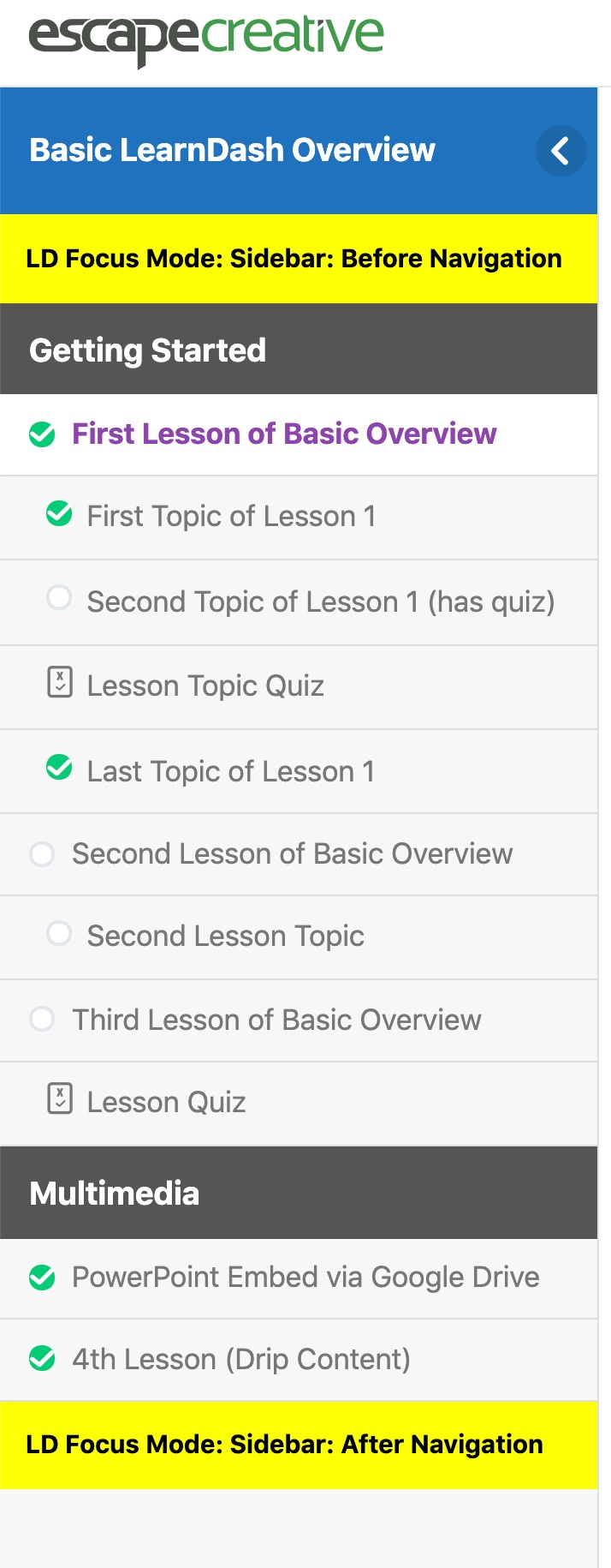
- Focus Mode: Sidebar: Above Navigation
- Focus Mode: Sidebar: Below Navigation
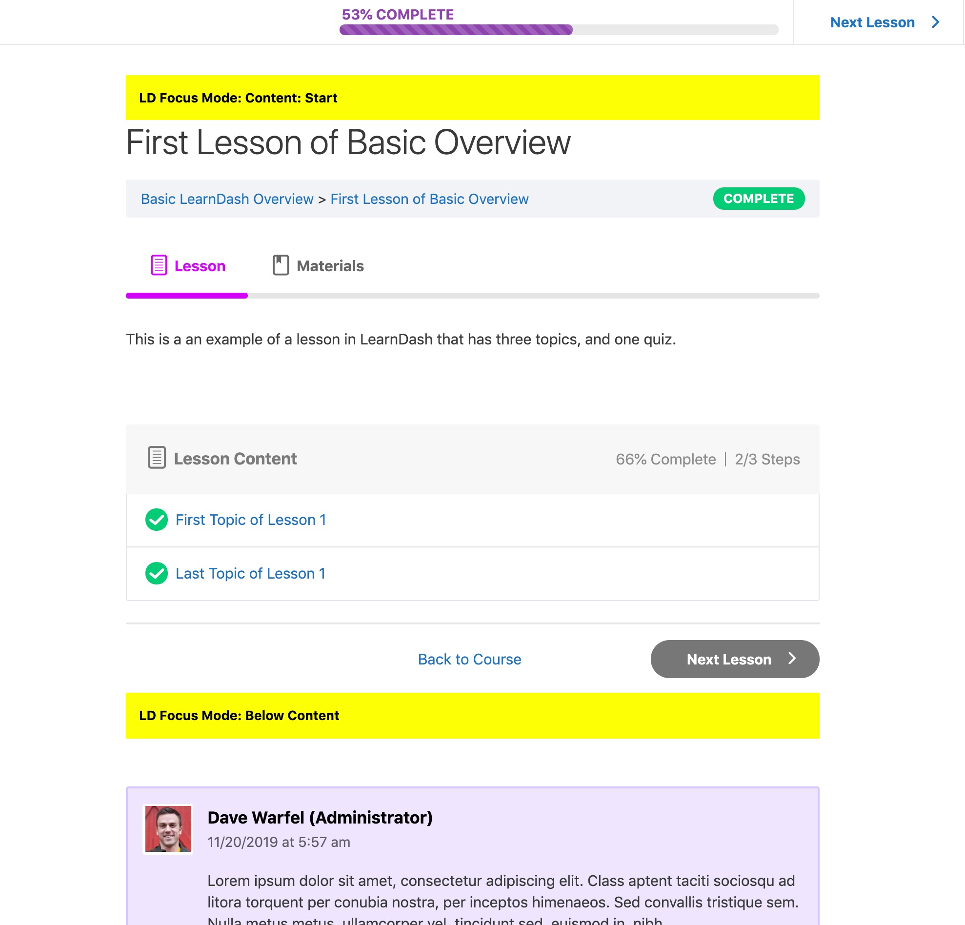
- Focus Mode: Content: Start
- Focus Mode: Below Content
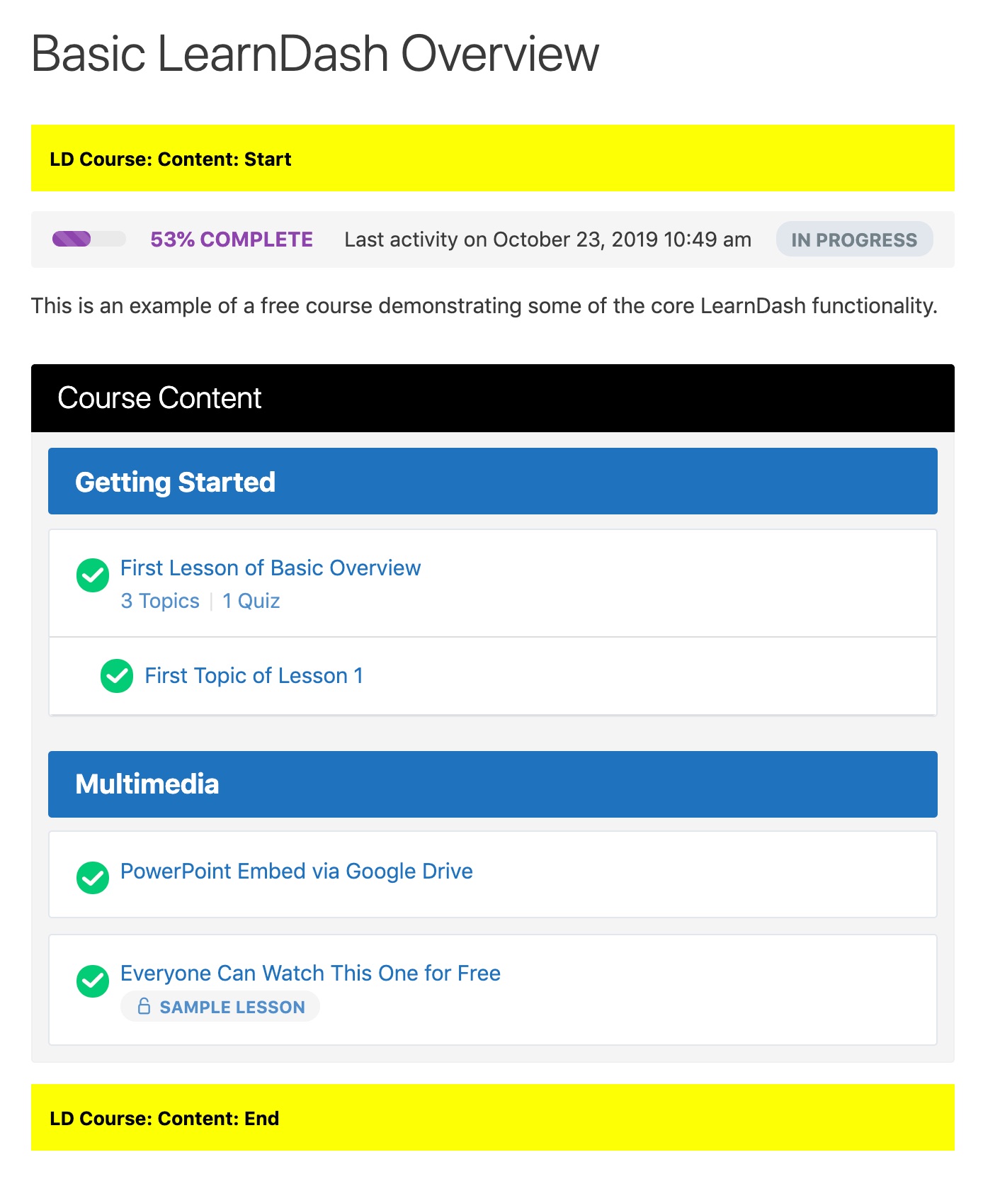
- Course Page: Content: Start
- Course Page: Content: End
- Group Page: Content: Start
- Group Page: Content: End
- Add a simple Paragraph block with some basic text
- Add an Image or Video/Embed block for more visual content
- Add a Navigation Menu widget to insert a custom menu you've created
- Add your own Custom HTML widget to embed an
<iframe>or write your own code
- Add a Course Progress Bar to the top or bottom of your Focus Mode sidebar
- When you go to insert a block/widget, select the Elementor Library widget. Choose a template from the dropdown menu. Click "Save."
- Navigate to Templates > Saved Templates. Copy the shortcode next to the template you want to insert. Now you'll insert a Shortcode block into the widget area, and paste the shortcode.
.ldx-widget-area class.
- Focus Mode: Sidebar: Above Navigation -
.ldx-widget-area.fm-nav-before - Focus Mode: Sidebar: After Navigation -
.ldx-widget-area.fm-nav-after - Focus Mode: Content: Start -
.ldx-widget-area.fm-content-start - Focus Mode: Below Content -
.ldx-widget-area.fm-content-bottom - Course Page: Content: Start -
.ldx-widget-area.course-content-start - Course Page: Content: End -
.ldx-widget-area.course-content-end - Group Page: Content: Start -
.ldx-widget-area.group-content-start - Group Page: Content: End -
.ldx-widget-area.group-content-end
.ldx-widget-area.fm-nav-before { margin: 1em; }
This would add 1em of spacing around the widget area that appears above the navigation in the Focus Mode sidebar.
In addition, all widgets placed inside of a widget area have a class of .ldx-widget.
Show/Hide Widgets on Certain Devices
https://www.youtube.com/watch?v=X-5I_JqB3NU
While not a direct feature of this plugin, you can show/hide widgets on different devices using another free plugin.
- Install & activate the Widget Options plugin
- Navigate to the widget that you'd like to adjust the visibility on
- Scroll to the bottom and click on the tab with the mobile phone
- Choose to either show or hide on the checked devices
- Check the appropriate devices
- Click "Save"
- Install & activate the Widget Options plugin
- Navigate to the widget that you'd like to adjust the visibility on
- Scroll to the bottom and click on the settings cog icon
- Click on the Logic tab
- In the text box, you can use the
is_single()conditional tag to only display that widget on a specific page - Use the ID of the course, lesson, topic or quiz
7:
is_single( '7' )
If you wanted to display a widget on multiple pages (with IDs of 1, 2 and 3), your code would look like this:
is_single( array( 1, 2, 3 ) )
There are many more WordPress conditional tags you can use.
屏幕截图:
常见问题:
How do I add widgets?
There are two ways you can add widgets to the new widget areas that this plugin creates.
- Navigate to "Appearance > Customize" and click on the "Widgets" panel
- Make sure you're previewing a page that contains the widget areas
- Click on the widget area in which you'd like to add content
- Click the
+icon or use the/key to choose a block or widget - Customize the content to your liking
- Navigate to "Appearance > Widgets"
- Locate the widget area you want to add content to
- Click on it to open it up
- Click the
+icon or use the/key to choose a block or widget - Customize the content to your liking
Will this work with my theme?
Yes. Widget Areas for LearnDash should work with almost all themes. We use standard LearnDash action hooks, so as long as your theme is not modifying this LearnDash code (they shouldn't be), then it should work. You might experience some spacing irregularities, depending on how your theme styles its default widgets. Please reach out in the support forum so we can help you adjust spacing. Incompatible Themes:
- BuddyBoss (LD Course: Content: End works, but the other widget areas do not)
- eLumine (The Focus Mode widget areas work, but not the ones on course pages)
The Focus Mode sidebar widgets are touching the edge. How do I fix this?
If you're already using the Design Upgrade for LearnDash plugin (free or pro), the spacing is automatically added for you. Not only does it add spacing, but it upgrades many other aspects of the LearnDash design.
If you'd like to write your own CSS, add the following code to the style.css file of your child theme, or the "Additional CSS" area in the Customizer.
.ldx-widget-area.fm-nav-before, .ldx-widget-area.fm-nav-after { margin: 1em; }
This will add 1em of margin around the widget areas in the Focus Mode sidebar. Feel free to adjust the value to achieve the spacing you want.
Can I add a background color to a widget area?
Sure thing. Add the following code to the style.css file of your child theme, or the "Additional CSS" area in the Customizer. You'll need to adjust it for the specific widget area you'd like to target (see class names in description above).
.ldx-widget-area.fm-content-start { padding: 0.75em; border-radius: 5px; background: #000; color: #fff; }
This would change the Focus Mode: Content: Start widget area to have a black background and white text. The padding is there so the text doesn't run up against the edge of the box. Feel free to adjust the border-radius to match your site's style, or just delete it.
The widget area I want isn't listed.
That's probably because we haven't added it. There are 50+ different areas we could've added widgets to, but that would clutter your WordPress admin area, and we didn't want to do that to you. We carefully selected the areas we thought course creators would want most. However, it's possible we got this wrong. If there's enough demand for a particular widget area, and LearnDash allows us to target it, we'll consider adding it.
更新日志:
- Update: Confirmed compatibility with WordPress 6.8, LearnDash 4.23, and PHP 8.4
- Added: 2 new widget areas for group pages
- Initial Release


![Use LearnDash's `[student]` & `[visitor]` shortcodes to display widget content to enrolled or unenrolled users](https://cdn.jsdelivr.net/wp/widget-areas-learndash/assets/screenshot-5.jpg)