Plugin Name
| 开发者 | wescleveland |
|---|---|
| 更新时间 | 2017年12月15日 05:53 |
| 捐献地址: | 去捐款 |
| PHP版本: | 4.0 及以上 |
| WordPress版本: | 4.9.1 |
| 版权: | GPLv2 |
| 版权网址: | 版权信息 |
标签
CSS
mobile
class
post type
scroll
post tags
body
post category
post categories
custom CSS
post tag
custom Body Classes
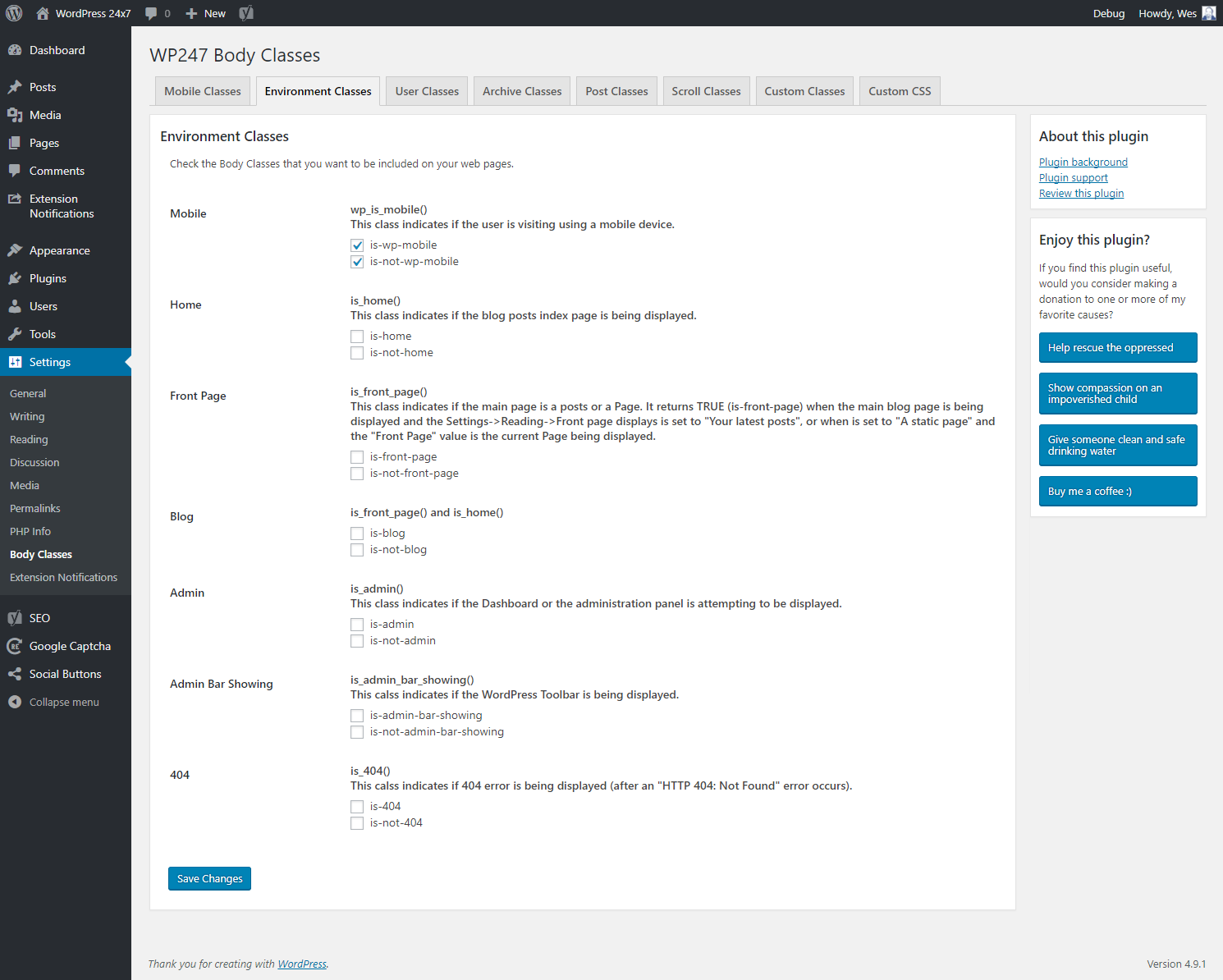
wp_is_mobile
is_home
is_front_page
is_blog
is_admin
is_admin_bar_showing
is_404
is_super_admin
is_user_logged_in
is_search
is_archive
is_author
is_category
is_tag
is_tax
is_date
is_year
is_month
is_day
is_time
is_single
is_sticky
is-mobile
is-tablet
is-phone
mobile_detect
下载
详情介绍:
Add unique classes to the body tag for easy styling based on post attributes (post type, slug, and ID) and various WordPress "is" functions:
- wp_is_mobile()
- is_home()
- is_front_page()
- is_blog()
- is_admin()
- is_admin_bar_showing()
- is_404()
- is_super_admin()
- is_user_logged_in()
- is_search()
- is_archive()
- is_author()
- is_category()
- is_tag()
- is_tax()
- is_date()
- is_year()
- is_month()
- is_day()
- is_time()
- is_single()
- is_sticky()
- $post->post_type
- $post->name
- $post->ID
- wp_get_post_categories() (Page/Post Categories)
- wp_get_post_tags() (Page/Post Tags)
- $user->nicename
- $user->id
- $archive->slug (e.g. Category slug, Tag slug, etc.)
- $archive->id (e.g. Category id, Tag id, etc.)
- is-scroll-top (at the top of the page - synonym for is-not-scroll)
- is-not-scroll-top (not at the top of the page - synonym for is-scroll)
- is-scroll (not at the top of the page - synonym for is-not-scroll-top)
- is-not-scroll (at the top of the page - synonym for is-scroll-top)
- is-scroll-top-px (has not reached the scroll start value for scroll measurement by pixels)
- is-scroll-top-vh (has not reached the scroll start value for scroll measurement by viewport height)
- is-scroll-top-dh (has not reached the scroll start value for scroll measurement by document height)
- is-scroll-10-px (scrolled down 10 pixels)
- is-scroll-8-vh (scrolled down 8% of the viewport height)
- is-scroll-5-dh (scrolled down 5% of the document height)
- is-scroll-mid-px (has reached the scroll start value but not the scroll limit for scroll measurement by pixels)
- is-scroll-mid-vh (has reached the scroll start value but not the scroll limit for scroll measurement by viewport height)
- is-scroll-mid-vh (has reached the scroll start value but not the scroll limit for scroll measurement by document height)
- is-scroll-max-px (has reached the scroll limit for scroll measurement by pixels)
- is-scroll-max-vh (has reached the scroll limit for scroll measurement by percent of viewport height)
- is-scroll-max-dh (has reached the scroll limit for scroll measurement by percent of document height)
- is-mobile
- is-tablet
- is-phone
- Mobile Operating System
- Mobile Browser
- Type of tablet
- Type of phone
- whether or not the requesting device is a mobile device (.is-mobile or .is-not-mobile)
- the type of post being viewed (.is-? where ? is the post type (page, post, whetever special post types are defined) ). E.g. .is-page or .is-post
- the slug of the post being viewed (.is-?-! where ? is the post type and ! is the post slug). E.g. a post with slug "hello-world' would have class .is-post-hello-world
- the ID of the post being viewed (.is-?-# where ? is the post type and # is the post ID). E.g. a post with ID "1" would have class .is-page-1
- whether or not the requested page shows archived results (.is-archive or .is-not-archive)
- the type of archive being viewed (.is-? where ? represents the type of archive (author, category, date, tag) ) E.g. .is-author
- the slug of the archive being viewed (.is-?-! where ? is the archive type and ! is the archive slug) E.g. a category with slug "uncategorized' would have class .is-category-uncategorized
- the ID of the archive being viewed (.is-?-# where ? is the archive type and # is the archive ID) E.g. a category with ID "1" would have class .is-category-1
- How far down the page the viewer has scrolled in pixels or as a percentage of viewport height or as a percentage of document height
if (current_user_can('manage_options')) $classes[] = 'user-can-manage-options';
Then we can use the body.user-can-manage-options qualifier in our CSS styling.
Example
Suppose you have a large h1 top margin that you want to eliminate on mobile devices to avoid a lot of white space. After activating the wp247-body-classes plugin and indicating that the .is-mobile class is desired, all you need to do is add this line to your CSS:
body.is-mobile h1 {
margin-top: 0;
}
Suppose you have a sticky header but want to shrink it by dynamically reducing the top and bottom padding from 25px to 5px as the viewer scrolls down the page based on 20 pixel scroll increments up to 80 pixels of scrolling:
Set WP247 Body Classes Scroll setting to "Scroll by Pixel" with a 10 pixel increment and an 80 pixel limit and then add the following to your CSS:
body.is-scroll-20-px header {
padding-top: 20px;
padding-bottom: 20px;
}
body.is-scroll-40-px header {
padding-top: 15px;
padding-bottom: 15px;
}
body.is-scroll-60-px header {
padding-top: 10px;
padding-bottom: 10px;
}
body.is-scroll-max-px header {
padding-top: 5px;
padding-bottom: 5px;
}
安装:
In the WordPress backend:
- Go to Plugins->Add New
- Search for the plugin 'wp247 Body Classes'
- Click the "Install" button
- Click on "Activate"
屏幕截图:
更新日志:
2.0.1
Fix Settings API bug
2.0
Added Scroll Classes
Added page categories, post categories, and post tags options
Added ability to choose Mobile-Detect Version
Added Mobile-Detect version 2.8.26
Improved performance
Improved memory footprint
Added security to disallow script direct execution
1.1.3
Remove namespace use in WP247 Settings API to due errors
1.1.2
Make all admin classes unique to WP247 in order to avoid conflict in Admin Settings API
1.1.1
Correct potential 'active_tab' storage conflict in Admin Settings API
1.1
Implement Mobile classes based on mobiledetect.net's Mobile_Detect script
1.0.1
Fix PHP Error in wp247-settings-api
1.0
First release on 2015-March-1